Home Property Management Landing Page Template
A polished single-page landing page built for modular home property managers who want to turn passive owners into confident clients. The template uses a zigzag alternating layout, a dark-mode map header, and contextual call-to-action blocks to guide visitors toward a portfolio assessment click-through. It looks and feels as calm and precise as the service it represents.
by Rocket studio
Quick summary
This template is a click-through landing page for a modular home property management firm. It combines a map-based hero, a left-right zigzag content rhythm, and a single repeating call-to-action that funnels every visitor toward one destination: a property assessment flow. The design is luxe minimal, dark, and deliberate.
Who this template is for
This template suits property management businesses that place and manage architect-designed modular homes on behalf of busy, high-earning owners. It speaks directly to investors who want operational proof before they hand over the keys.
- Remote professionals who own a modular unit or accessory dwelling unit on private land
- Dual-income couples renting a modular cabin as a passive income property
- Small portfolio holders managing three to five factory-built units across multiple locations
What problem this template solves
Most property management landing pages either overwhelm visitors with forms or undersell the service with vague promises. Investors in modular homes need confidence, not clutter. They want to see real numbers and real results before they take any action.
- No form lives on this page, removing friction before trust is established
- Operational proof such as tenant placement timelines and maintenance response figures appears before any ask is made
- The single call-to-action focus prevents distraction and keeps every visitor on one clear path
What you get with this template
You get a fully structured, single-page layout that mirrors the precision of the service it markets. Every section is ready to receive your real content: photographs, performance figures, and property details.
- A dark-mode animated map header with gold pin markers and a sliding property card
- A zigzag section layout alternating between deep ink and lunar white backgrounds, with full-bleed photography on one side and management insights on the other
- Repeating contextual call-to-action blocks with micro-copy lines tied to specific service proof points
Feature list
This template is built around a small set of high-impact structural decisions. Each one serves the goal of earning the click.
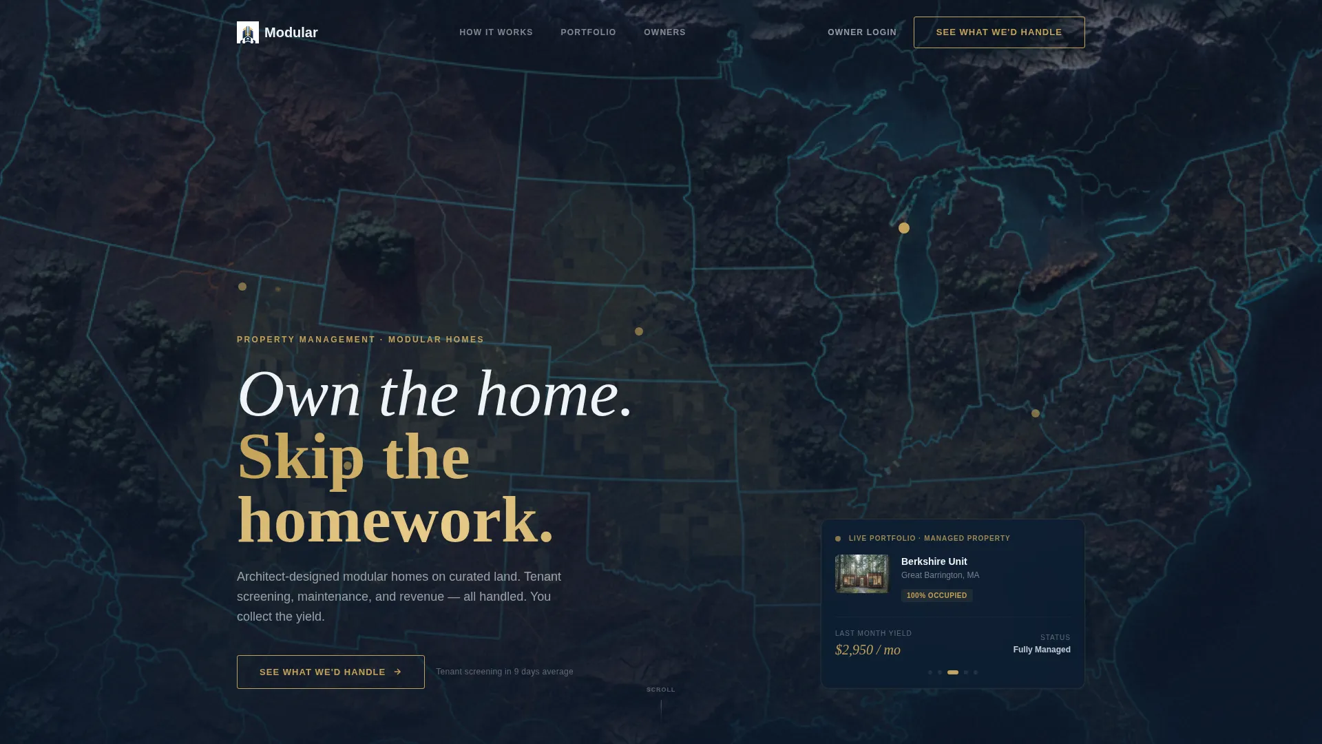
Animated Map-Based Hero
The header fills the full viewport with a stylized dark-mode terrain map. Gold pins mark managed properties across desert, forest, coastline, and mountain landscapes. The map drifts slowly as if the viewer is flying over the portfolio. One pin pulses, and a minimal property card slides in beside it showing a thumbnail, occupancy status, and last-month yield figure.
Zigzag Alternating Section Layout
Each content row pairs a full-bleed photograph of a modular unit with a management insight panel on the opposite side. Backgrounds alternate between deep naval ink and crisp lunar white. Steel blue panels serve as visual breathing room between rows. The left-right rhythm keeps the eye moving and the reader engaged through the full scroll.
Contextual Repeating Call-to-Action
The primary call-to-action button, labeled "See What We'd Handle," appears at the close of every zigzag pair. Each instance carries a different micro-copy line beneath it, such as tenant screening timelines, maintenance dispatch availability, or owner dashboard setup speed. This repetition reinforces trust without feeling mechanical.
Click-Through Destination Architecture
No form lives on this page. Every call-to-action click leads to a separate qualification flow where visitors input property type, unit count, current occupancy, and location details. The landing page earns that click by front-loading operational proof across every section.
Luxe Minimal Visual System
The color palette uses deep naval ink for primary backgrounds, muted steel blue for divider panels, lunar white for text and open space, and brushed gold exclusively for interactive elements and key data figures. Typography is clean and wide-tracked. Gold appears only where the eye needs to land, never as decoration.
Scale-Shifting Photography Direction
The image sequence moves between wide landscape shots of a unit on its site, tight crops of details like a smart-lock interface, and aerial views of multiple properties on a single parcel. This range of scale holds attention and communicates the full operational picture without a single word of extra copy.
Page sections overview
| Section | Purpose |
|---|---|
| Animated Map Hero | Establishes portfolio presence and draws the visitor in with a living property card |
| First Zigzag Row | Pairs a wide exterior photograph with a tenant placement insight panel |
| Second Zigzag Row | Shows a tight detail shot alongside a maintenance response data panel |
| Third Zigzag Row | Uses an aerial property view to present revenue and owner dashboard context |
| Repeating call to action Blocks | Closes each zigzag pair with a gold button and a service-specific proof line |
| Click-Through Footer call to action | Delivers the final push toward the portfolio assessment destination page |
Design & branding system
The visual identity follows a Luxe Minimal theme built around a Midnight Blue color system. Every color choice is intentional and restrained, giving the page the calm authority of a well-managed property at night.
- Deep naval ink (#0B1D33) sets the primary background tone, muted steel blue (#3A506B) divides sections, and lunar white (#F0F3F7) handles all text and open space
- Brushed gold (#C4A35A) appears exclusively on interactive elements, call-to-action buttons, and key data figures, never as ambient decoration
- Wide-tracked sans-serif typography sits clean over the dark map header, reinforcing the precision and confidence of the brand voice
Mobile & speed optimization
The template is structured to translate cleanly from wide desktop layouts to smaller screens without losing the visual logic of the zigzag rhythm. Stacked sections on mobile maintain the same alternating background sequence and photography-to-copy pairing.
- Full-bleed images are positioned to crop gracefully on narrower viewports, keeping the subject matter readable at any size
- The repeating call-to-action button remains prominent and tappable at every scroll depth on mobile devices
How this template helps you convert
This template is designed around one conversion goal: the portfolio assessment click. Every structural and visual decision supports that outcome without pressure or noise.
- The animated map hero immediately signals that this is a real, active portfolio, not a concept pitch, building credibility before the visitor reads a single line of body copy
- Each zigzag section adds a new layer of operational proof, linking specific numbers to specific service promises, so the call-to-action button feels earned rather than forced
- The absence of any on-page form removes the most common friction point and lets the dedicated assessment flow handle qualification on its own terms
Other information about this template
This template is well suited for modular home real estate businesses that want a premium digital presence matching the quality of their physical product. It is built as a single landing page, not a multi-page website, so all content lives in one structured scroll.
- The template style is zigzag alternating, a layout pattern that works especially well when you have strong photography assets paired with performance data
- The click-through landing page direction means the page does not ask for information; it builds the case for why a visitor should want to share it
- Property management firms operating across varied geographies, such as desert parcels, coastal plots, and forested mountain sites, will find the map header concept particularly fitting
- The template is designed to support modular home property management positioning, including accessory dwelling unit rentals, prefab investment properties, and multi-county portfolio oversight


Theme
Executive Suite
Creative direction
Case Study Narrative
Color system
Charcoal & Amber
Style
Zigzag/Alternating
Direction
Quiz/Assessment
Page Sections
Animated Dark-mode Map Hero
Zigzag Alternating Layout
Contextual Proof-based Ctas
No-form Click-through Structure
Scale-shifting Image Sequence
Luxe Minimal Branding System
Related questions
Does this template include the portfolio assessment form?
What kind of photography works best in the zigzag sections?
Is this template suitable for a firm managing only one or two properties?
How many call-to-action placements does this template include?
Can this template support a modular cabin rental or accessory dwelling unit management business?


