Residential Construction Booking Website Template
A split-screen landing page built for modular and prefab home builders. It walks visitors through five factory-to-foundation phases using a numbered scroll experience, sticky booking bar, and weld-spark orange interactive elements. The Monochrome Steel palette and bold industrial typography create instant credibility with buyers who want a faster, simpler path to a finished home.
by Rocket studio
Quick summary
This is a single-page, split-screen (50/50) landing page for modular and prefab home builders. It guides visitors through a five-phase factory-to-handover process, earns trust before asking for anything, then converts with a pinned "Book a Site Consultation" bar. The design feels industrial and purposeful, built around a Monochrome Steel palette with weld-spark orange accents.
Who this template is for
This template is designed for home builders, developers, and sales teams working in the modular and prefab residential construction space. If your business turns factory-built modules into finished homes on private land, this page was made for your pitch.
- Modular home builders who want a clear, process-driven sales page
- Prefab housing companies targeting first-time buyers, rural landowners, or downsizers
- Residential construction teams replacing slow brochure sites with a focused booking funnel
What problem this template solves
Most prefab and modular home builders lose potential buyers before the first call. Visitors land on a page, find technical jargon or a wall of marketing copy, and leave without understanding how the process actually works. The uncertainty kills the conversion.
- Buyers don't know what "modular" means in practice, so they don't trust the timeline
- Contractors and builders struggle to communicate value before prospects disengage
- Generic construction sites don't build enough trust to justify a consultation booking
What you get with this template
You get a fully structured, single-page layout that takes a visitor from curious stranger to confident booking in one scroll. Every section is designed to reduce doubt, not just announce services.
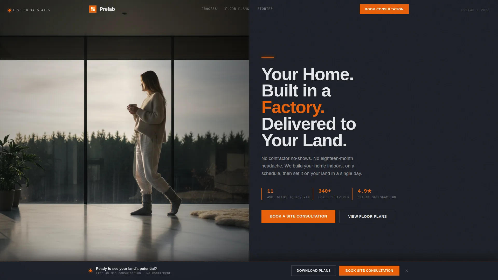
- A lifestyle-shot hero header split 50/50 between warm interior photography and a bold industrial headline
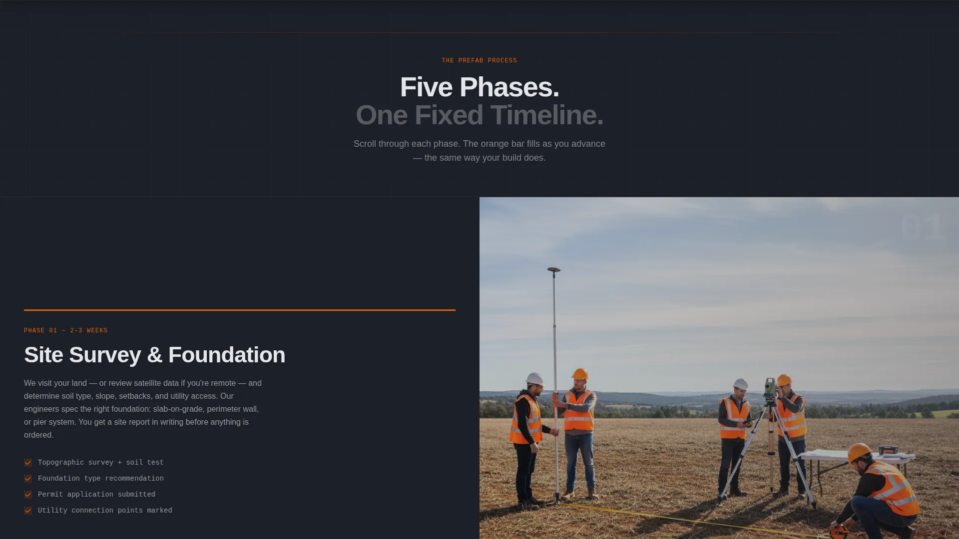
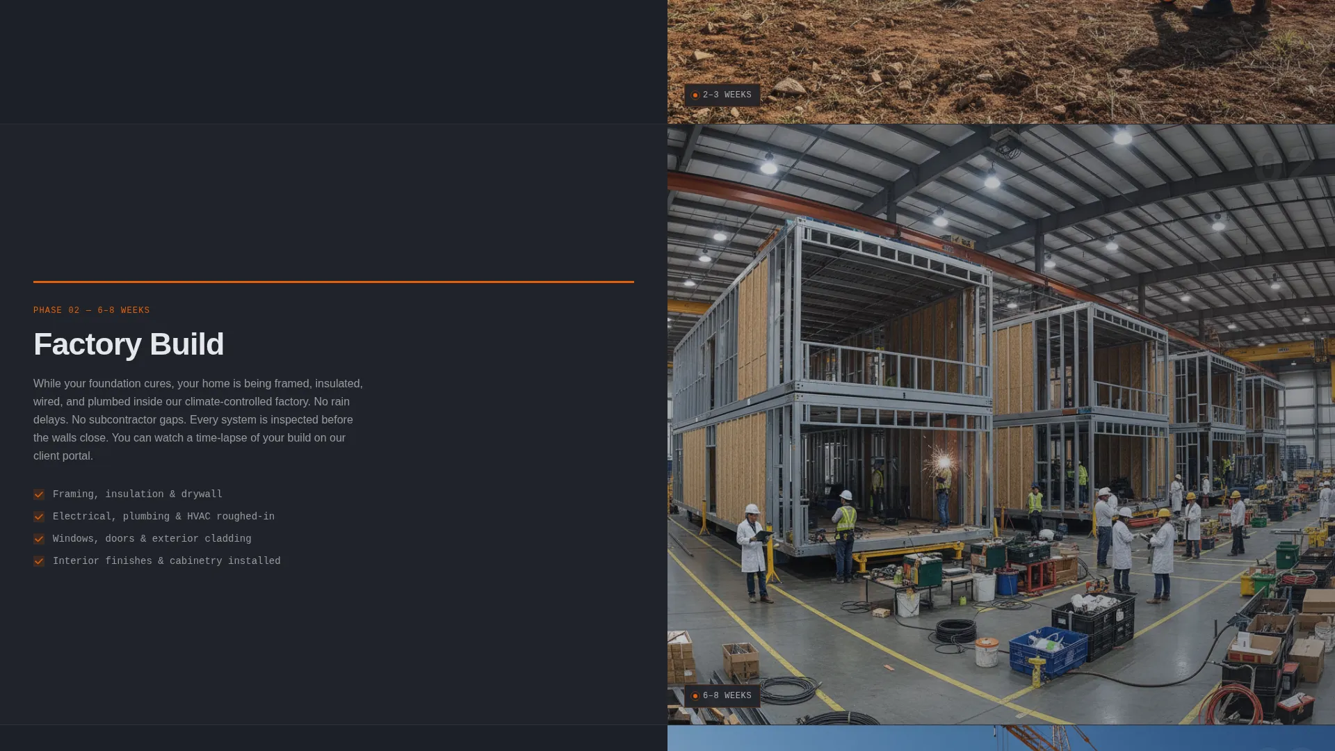
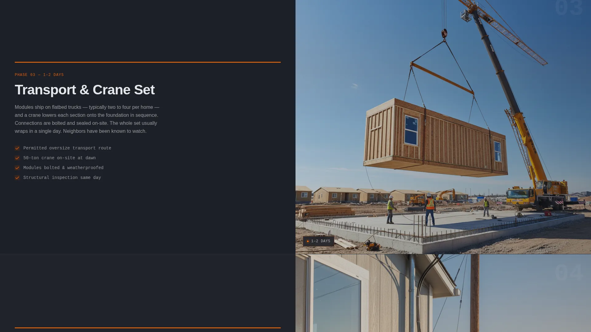
- Five numbered phase sections, each split with a factory or site photo on the left and plain-language explanation on the right
- A sticky "Book a Site Consultation" bar with a land location field, ownership status selector, square footage slider, and date picker
- A secondary "Download Our Floor Plans" email capture path for visitors who need more time
Feature list
This template ships with layout decisions already made. Every component below is grounded in the source brief and serves a defined role in the conversion flow.
Split-Screen Phase Sections
Five numbered phases run down the page, each divided 50/50 between a visual and a plain-language explanation. Phases cover Site Survey and Foundation, Factory Build, Transport and Crane Set, Utility Hook-Up and Finishing, and Walkthrough and Handover. By the final phase, the visitor has mentally moved through the entire build process.
Horizontal Scroll Progress Bar
Each phase section includes a horizontal progress bar in weld-spark orange that fills as the visitor scrolls. The bar turns the page into a physical timeline, giving visitors a clear sense of how far through the process they are and building anticipation toward the final phase.
Sticky Booking Bar
After Phase 2, a pinned consultation bar locks to the bottom of the viewport. It contains a land location input (state and zip code), an ownership status selector, a square footage range slider, and a preferred date picker. The bar appears only after the visitor understands the process, so the ask feels earned.
Secondary Email Capture Path
A "Download Our Floor Plans" prompt gives undecided visitors a low-commitment alternative to booking. It captures an email address and gives the visitor a reason to return, keeping them in the funnel without pressure.
Lifestyle Shot Hero Header
The header splits the screen between a warm interior scene on the left and a bold industrial headline on the right. The contrast between lived-in warmth and blunt factory promise creates immediate visual tension that communicates both quality and efficiency in a single frame.
Service Utility Visual Theme
The Monochrome Steel color system uses cold-rolled steel dark, galvanized mid-gray, factory primer light, and weld-spark orange exclusively for interactive elements. The heavy industrial sans-serif typeface reinforces a build-site credibility that generic home templates cannot replicate.
Page sections overview
| Section | Purpose |
|---|---|
| Hero Header | Introduce the brand promise with a split lifestyle and headline panel |
| Phase 1 Block | Explain the site survey and foundation preparation step |
| Phase 2 Block | Show the factory build with a time-lapse thumbnail and description |
| Sticky call to action Bar | Pin the consultation booking form after Phase 2 |
| Phase 3 Block | Cover transport logistics and the crane-set moment |
| Phase 4 Block | Describe utility hook-up and interior finishing work |
| Phase 5 Block | Close the process with walkthrough and handover details |
| Floor Plans Capture | Offer a secondary email opt-in for floor plan downloads |
Design & branding system
The visual identity follows a Service Utility theme that feels like a fabrication shop at dawn. Every color and type decision serves function over decoration, which reinforces the builder's core promise: nothing wasted, everything intentional.
- Color palette: cold-rolled steel dark (#1C1F26), galvanized mid-gray (#6B7280), factory primer light (#E5E7EB), and weld-spark orange (#E8600A) used only for buttons, progress bars, and interactive hotspots
- Typography: heavy industrial sans-serif headlines for authority, with clean body copy for plain-language phase descriptions
- Layout structure: strict 50/50 column splits throughout, keeping every section visually balanced and scannable on any screen size
Mobile & speed optimization
The 50/50 split layout is designed to reflow cleanly on smaller screens, stacking the visual and text panels vertically without losing the phase-by-phase narrative structure. The sticky booking bar adjusts to remain accessible without blocking content.
- Phase sections stack vertically on mobile, keeping the photo above the explanation for natural reading flow
- The weld-spark orange progress bar remains visible on mobile to preserve the scroll-timeline experience
- The sticky consultation bar collapses to a minimal height on smaller viewports so visitors can still read phase content without obstruction
How this template helps you convert
This layout is built around a simple principle: earn the click before you ask for it. The page demystifies the modular build process step by step, so by the time the booking bar appears, scheduling a consultation feels like the obvious next move, not a cold ask.
- The five-phase scroll structure builds trust progressively, so visitors feel informed rather than sold to before the primary call to action appears
- The sticky booking bar surfaces only after Phase 2, timed to appear when the visitor already understands the value and is most likely to commit
- The secondary floor plans capture keeps undecided visitors in the funnel, offering a low-pressure touchpoint that supports a later return and booking
Other information about this template
This template is part of the Modular - Factorybuilt Residential Landing Page collection and is matched to the modular and prefab home niche within the broader residential construction category. It is built for builders who need a single-page funnel, not a full multi-page site.
- Template style: Split Screen (50/50), single-page landing page format
- Theme classification: Service Utility with a Monochrome Steel color system
- Creative direction: Step-by-Step Guide scroll experience
- Header concept: Lifestyle Shot with split-panel contrast
- Primary conversion goal: Booking and scheduling via a site consultation form
- The template supports a dual-path funnel: direct booking for ready buyers and email capture for visitors still in the research phase
Theme
Service Utility
Creative direction
Step-by-Step Guide
Color system
Monochrome Steel
Style
Split Screen (50/50)
Direction
Booking/Scheduling
Page Sections
Split-screen Phase Scroll Layout
Weld-spark Orange Progress Bar
Sticky Site Consultation Bar
Secondary Floor Plans Capture
Industrial Lifestyle Hero Header
Monochrome Steel Color System
Related questions
Can I edit the five-phase section content to match my own build process?
Does the template include the consultation booking form fields already laid out?
Is this template suitable for a builder who only sells one or two home models?
Can the weld-spark orange accent color be changed to match my brand?
Does the sticky booking bar appear immediately or partway through the page?



