Home Developer Landing Page Template | Precision Card Grid
A dark-emerald, card-grid landing page built for modular home developers who want to show their process before asking for a commitment. The template walks visitors from aerial community views through floor plan cards and material close-ups, then closes with a two-step booking scheduler. Every section earns the next click, turning curiosity into a confirmed factory tour.
by Rocket studio
Quick summary
This is a single-page, card-grid landing page designed for a precision modular home developer. It opens with a nine-tile photo mosaic, moves visitors through a spatial scroll sequence of aerial site cards, floor plan cards, and material detail cards, and closes with a two-step scheduler. The design palette centers on deep forest black-green, architectural charcoal, and polished brass accents.
Who this template is for
This template is built for modular home developers who want a premium digital presence that reflects the quality of their physical product. It speaks directly to buyers who are serious, time-conscious, and already past the "should I build?" question.
- Modular home developers offering factory-built, crane-set residential units
- Sales teams targeting young professionals, retiring downsizers, and rural landowners with permits ready
- Builders who want to lead with process transparency and convert visits into booked tours
What problem this template solves
Traditional real estate landing pages feel generic. They rely on a single hero image, vague copy, and a contact form that goes nowhere fast. A modular developer's product is fundamentally different, and the page needs to prove it.
- Visitors leave before they understand what precision factory construction actually means
- No existing template shows the build process, material quality, and scheduling pathway in a single scroll
- The gap between curiosity and commitment is wide when a purchase is this large
What you get with this template
You get a fully structured, single-page layout that guides a visitor from first impression to booked appointment without a single dead end. Every section has a clear job, and no section asks for trust it has not yet earned.
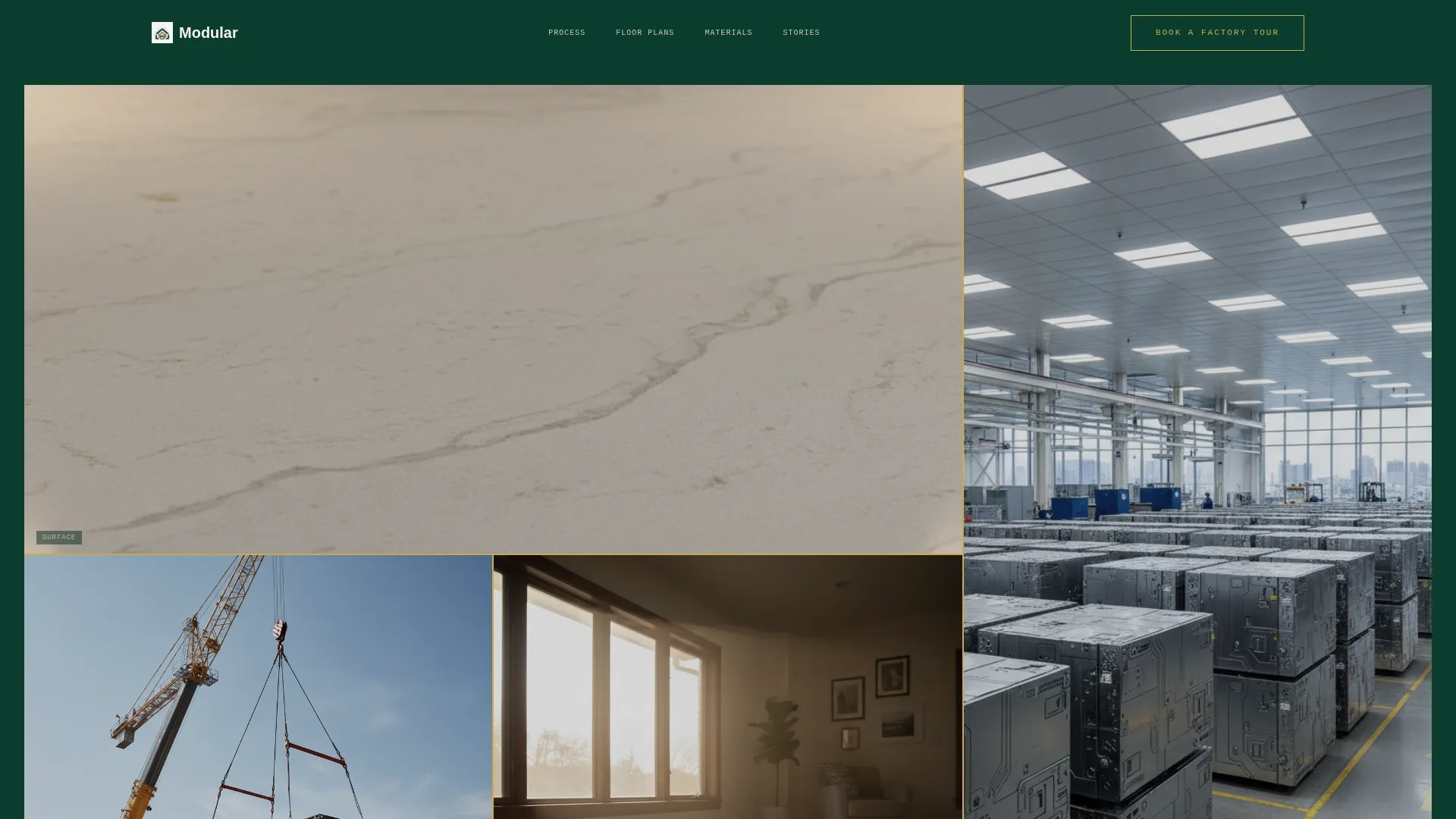
- A nine-tile photo grid mosaic header with a centered headline and a brass-outlined "Book a Factory Tour" call-to-action button
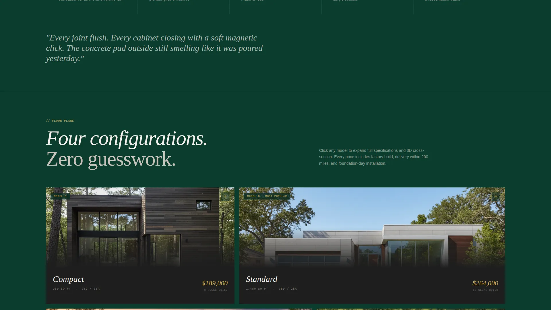
- A spatial scroll sequence: aerial site cards, expandable floor plan cards with 3D cross-section reveals, and material detail cards
- A sticky bottom booking bar that appears after the second scroll section, leading into a two-step scheduler
Feature list
This landing page template is built around one core idea: show the product in full detail before you ask for anything. Every feature supports that principle.
Nine-Tile Photo Grid Mosaic Header
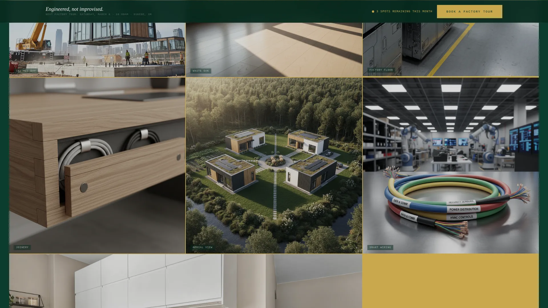
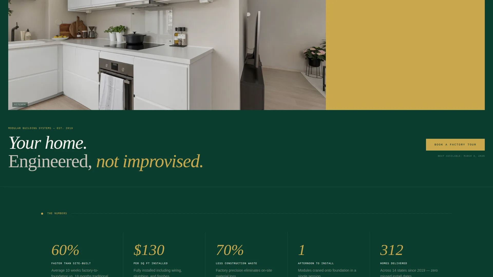
The header is an architectural grid of nine images locked with hairline brass borders. Each tile shows a distinct material moment, from a crane lowering a module to sunlight crossing white oak flooring. A single centered headline sits below: "Your home. Engineered, not improvised."
Spatial Scroll Card Sequence
The page scrolls like a walk-through, not a brochure. Sections move from macro to micro: aerial community cards first, then individual floor plan cards, then tight close-up material cards. The grid tightens and opens rhythmically between sections to give the page an architectural breathing pattern.
Expandable Floor Plan Cards
Floor plan cards expand on click to reveal 3D cross-section views of each module. This gives buyers a structural understanding of what they are purchasing before they ever speak to a sales representative.
Material Detail Card Grid
A dedicated section features close-up photography of joints, insulation layers, and smart-home wiring harnesses. These cards prove that the hidden interior of every module is as carefully considered as the visible finish surfaces.
Two-Step Booking Scheduler
The primary call-to-action opens a two-step scheduler. Step one lets the visitor choose a tour type and preferred week. Step two captures name, email, phone, and one optional field asking whether the visitor already has land.
Sticky Booking Bar
After the second scroll section, a persistent bottom bar carries the "Book a Factory Tour" call-to-action across the rest of the page. The bar stays visible without blocking content, keeping the conversion path open at all times.
Page sections overview
| Section | Purpose |
|---|---|
| Photo Grid Mosaic | Sets the architectural tone and introduces the brand headline |
| Aerial Site Cards | Shows completed communities from drone perspective |
| Floor Plan Cards | Presents expandable layouts with 3D cross-section reveals |
| Material Detail Cards | Proves interior construction quality through close-up imagery |
| Sticky Booking Bar | Keeps the tour-booking call-to-action accessible during scroll |
| Two-Step Scheduler | Captures tour preference, availability, and contact details |
Design & branding system
The visual identity follows a Corporate Precision theme. Every color and surface choice reinforces the idea that this builder operates at a level above standard residential construction.
- Deep forest black-green (#0B3D2E) as the primary background, architectural charcoal (#1E1E1E) on card surfaces, and pale birch (#F4F0EB) for all body text
- Polished brass (#C9A84C) used exclusively for call-to-action buttons, hover states, and pricing figures to create focal points without visual noise
- The overall palette evokes a private, after-hours showroom: cool surfaces, accent lighting, and a sense of considered restraint throughout
Mobile & speed optimization
The card-grid layout is structured to adapt cleanly across screen sizes. Mosaic tiles, floor plan cards, and material detail cards restack into readable columns on smaller screens without losing their visual hierarchy.
- The nine-tile header grid collapses gracefully so key images remain legible on mobile viewports
- The sticky booking bar repositions on smaller screens to stay functional without covering critical content
- The two-step scheduler is designed with large tap targets and a minimal field count to reduce friction on mobile devices
How this template helps you convert
This template is built on a clear behavioral logic: earn trust visually before asking for personal information. Every scroll section adds a layer of proof, and the booking flow is structured to feel like a natural next step rather than a hard sell.
- The mosaic header and spatial scroll sequence establish process credibility before any call-to-action appears, so visitors arrive at the scheduler already informed and more willing to commit.
- The two-step scheduler reduces friction by breaking a potentially intimidating form into two short, focused steps, and the optional land-status field gives the developer immediate qualifying context without requiring the visitor to answer it.
Other information about this template
This template is purpose-built for the modular home real estate category. It is especially well-suited for developers in the modular home market who want to differentiate on quality and transparency rather than price alone.
- The template's card-grid structure is adaptable for developers offering multiple floor plan configurations or tiered finish packages
- The "Do you have land yet?" toggle in the scheduler doubles as a lightweight lead-qualification tool, helping the sales team prioritize follow-up
- Because the page leads with process imagery and material proof before the scheduling ask, it is particularly effective for first-time modular buyers who need education before they are ready to commit
Theme
Executive Suite
Creative direction
Case Study Narrative
Color system
Charcoal & Amber
Style
Zigzag/Alternating
Direction
Quiz/Assessment
Page Sections
Nine-tile Photo Grid Mosaic Header
Spatial Scroll Card Sequence
Expandable Floor Plan Cards
Material Detail Card Grid
Two-step Booking Scheduler
Sticky Bottom Booking Bar
Related questions
Can I replace the mosaic header tiles with my own project photos?
How does the two-step booking scheduler capture leads?
Is this template a good fit for developers with multiple floor plan configurations?
What type of visitor does this landing page target?
Where does the 'Book a Factory Tour' call-to-action appear on the page?



