Dental Procedure Comparison Blog Website Template
Molar is a card grid landing page template built for dental practice blogs. It uses a Dashboard Pro theme with a Slate & Sky color system to present procedure comparisons as clinical decision cards. Each card surfaces cost ranges, timelines, and recovery data at a glance, turning midnight research sessions into confident, click-ready decisions.
by Rocket studio
Quick summary
Molar is a modular, card grid landing page template designed for dental practice blogs. It pairs a Dashboard Pro theme with a Slate & Sky palette to make procedure comparisons feel like consulting a clinical reference sheet. Visitors see key data before they tap anything, building trust fast and driving deeper engagement on every card.
Who this template is for
This template is built for dental content teams and practice marketers who need to turn complex procedure questions into clear, scannable reading experiences. It serves the exact visitor who lands on a blog at midnight with a real, unresolved question.
- Dental practices publishing educational blog content on procedures like implants, veneers, and sealants
- Content marketers who need a structured layout that surfaces comparison data before the click
- Practice owners who want a blog page that converts curious visitors into engaged readers and appointment seekers
What problem this template solves
Most dental blog pages look like plain article lists. They give no data upfront, so anxious visitors bounce before finding what they need. Molar fixes this by turning every article entry into a data-forward comparison card.
- Visitors comparing procedures like implants versus bridges often leave pages that hide cost and timeline information
- Parents and retirees researching treatment options need structure, not long paragraphs, to feel confident
- Standard blog layouts give no visual hierarchy between cosmetic, restorative, and preventive content categories
What you get with this template
You get a fully structured, single-page blog layout built around modular comparison cards. The layout is ready to present procedure matchups with clinical precision and a clean visual identity.
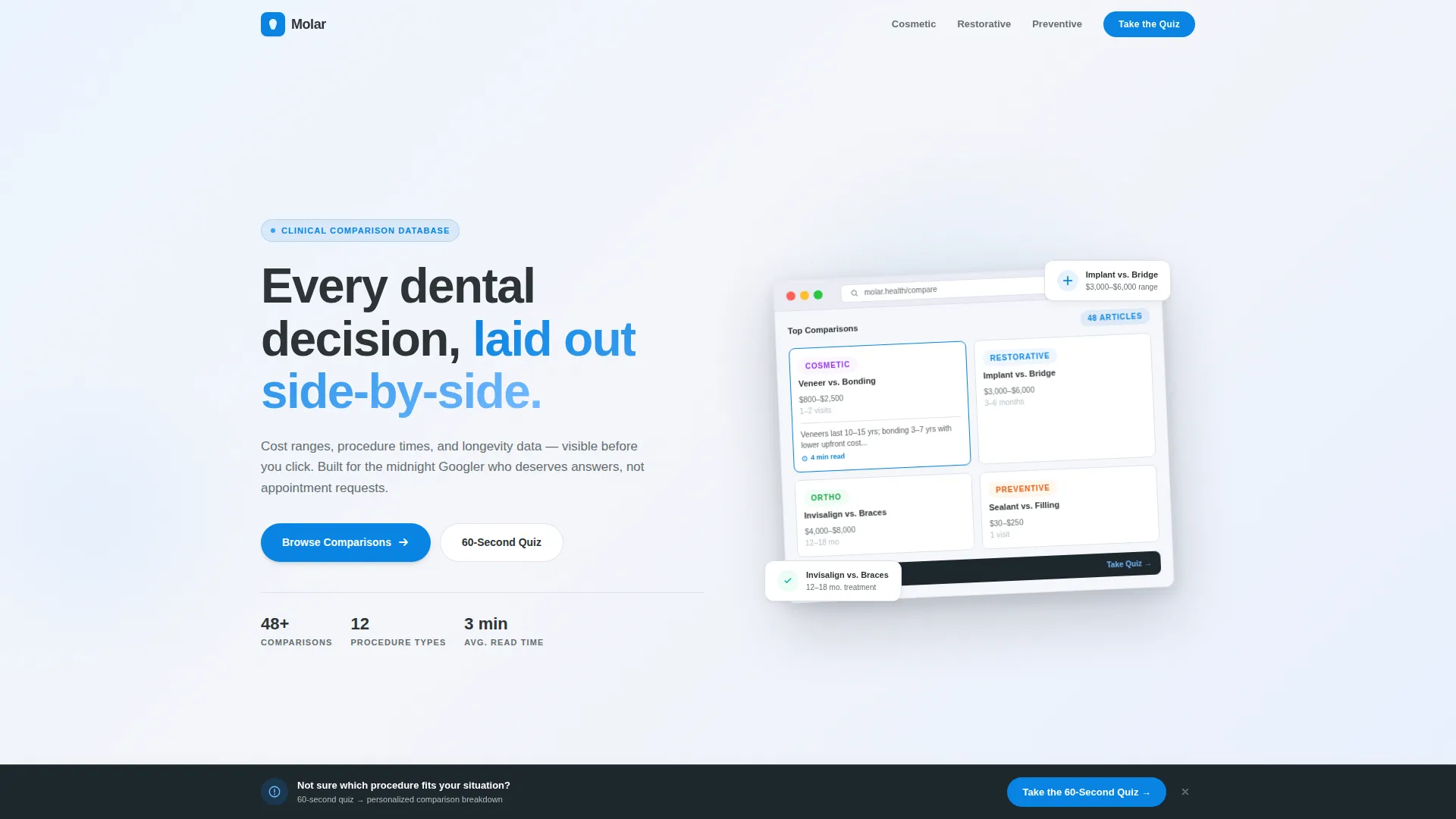
- A header section with a product screenshot concept showing a browser-framed dashboard grid of article cards
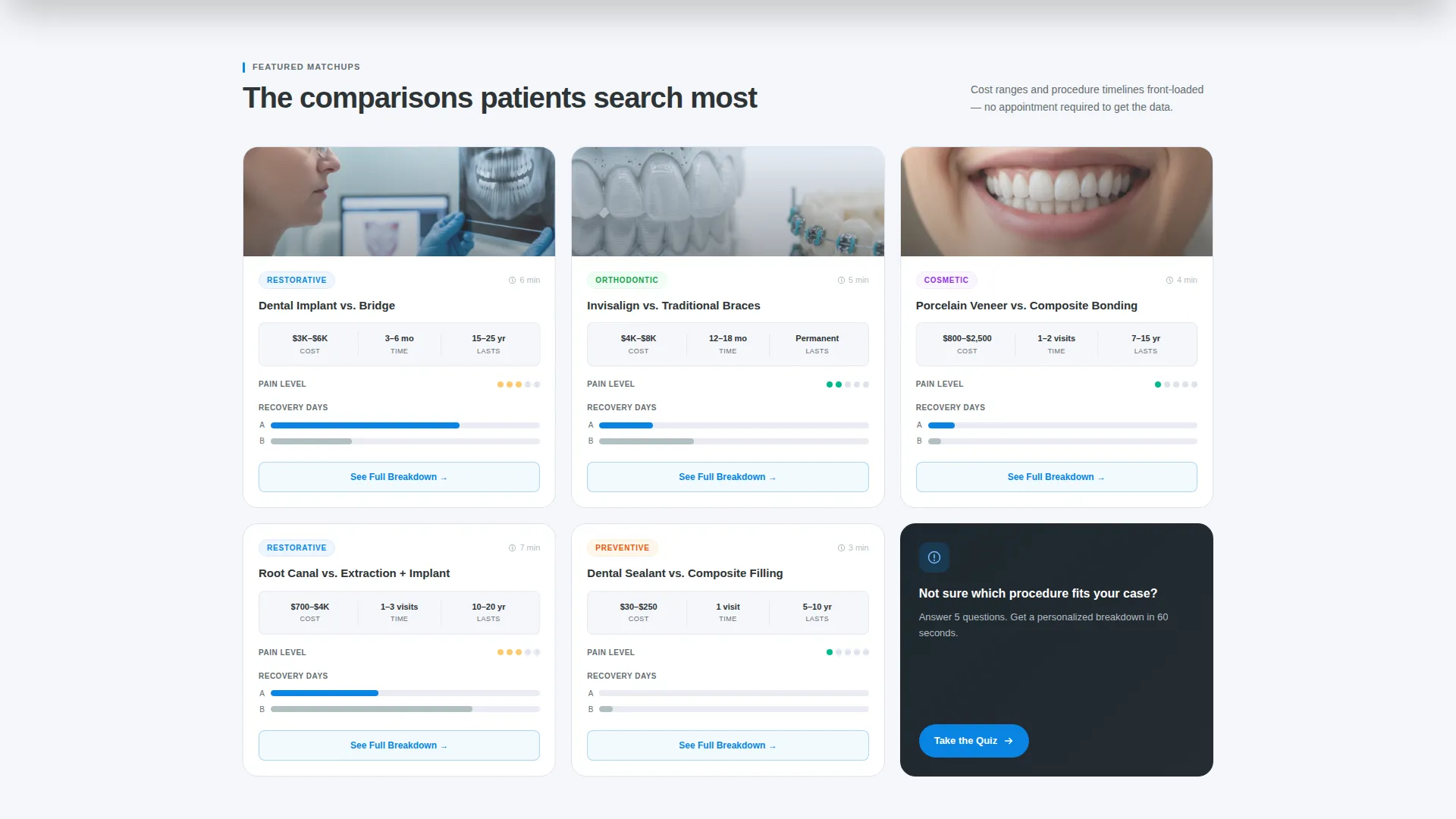
- Modular comparison cards that display cost range, procedure time, longevity, pain level, and a mini recovery bar chart
- A persistent bottom conversion bar with a secondary call to action and a single-field email gate after a quiz result
Feature list
This section covers the core built-in components that make Molar distinct from a generic blog template.
Clinical Comparison Card Grid
Each card is structured as a "A versus. B" matchup module. Cards surface procedure specs at a glance: average cost range, procedure time in hours, longevity in years, a pain-level indicator, and a mini bar chart comparing recovery days. Visitors get the data before they click, which earns the tap to the full breakdown article.
Dashboard Pro Header with Product Screenshot
The header presents a pixel-perfect browser frame showing the blog's dashboard view. The frame is slightly rotated on a subtle gradient with a faint shadow, giving the impression of being inside a working tool. One card is shown mid-hover with an expanded preview paragraph and a reading-time chip visible.
Category Row Navigation
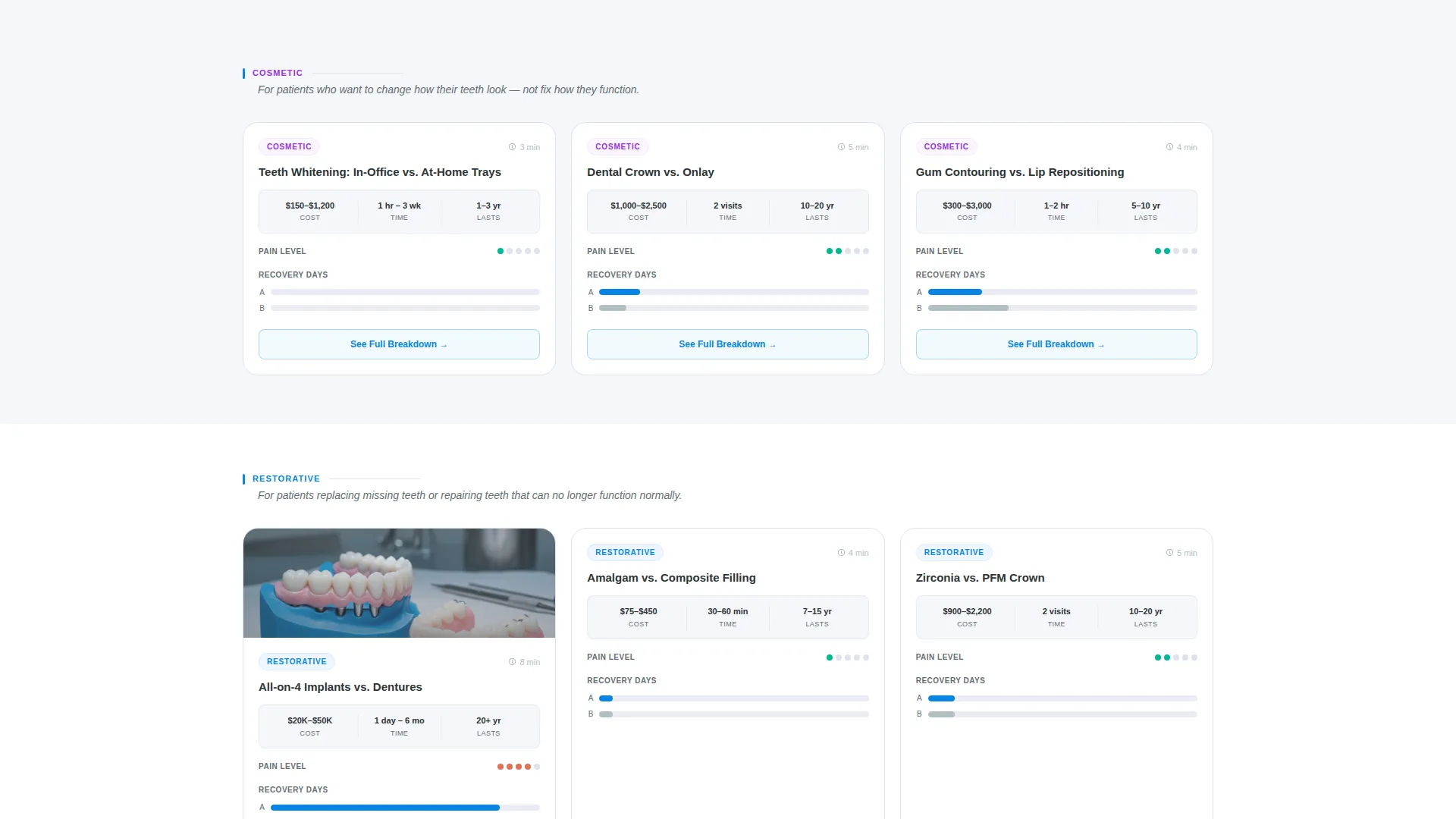
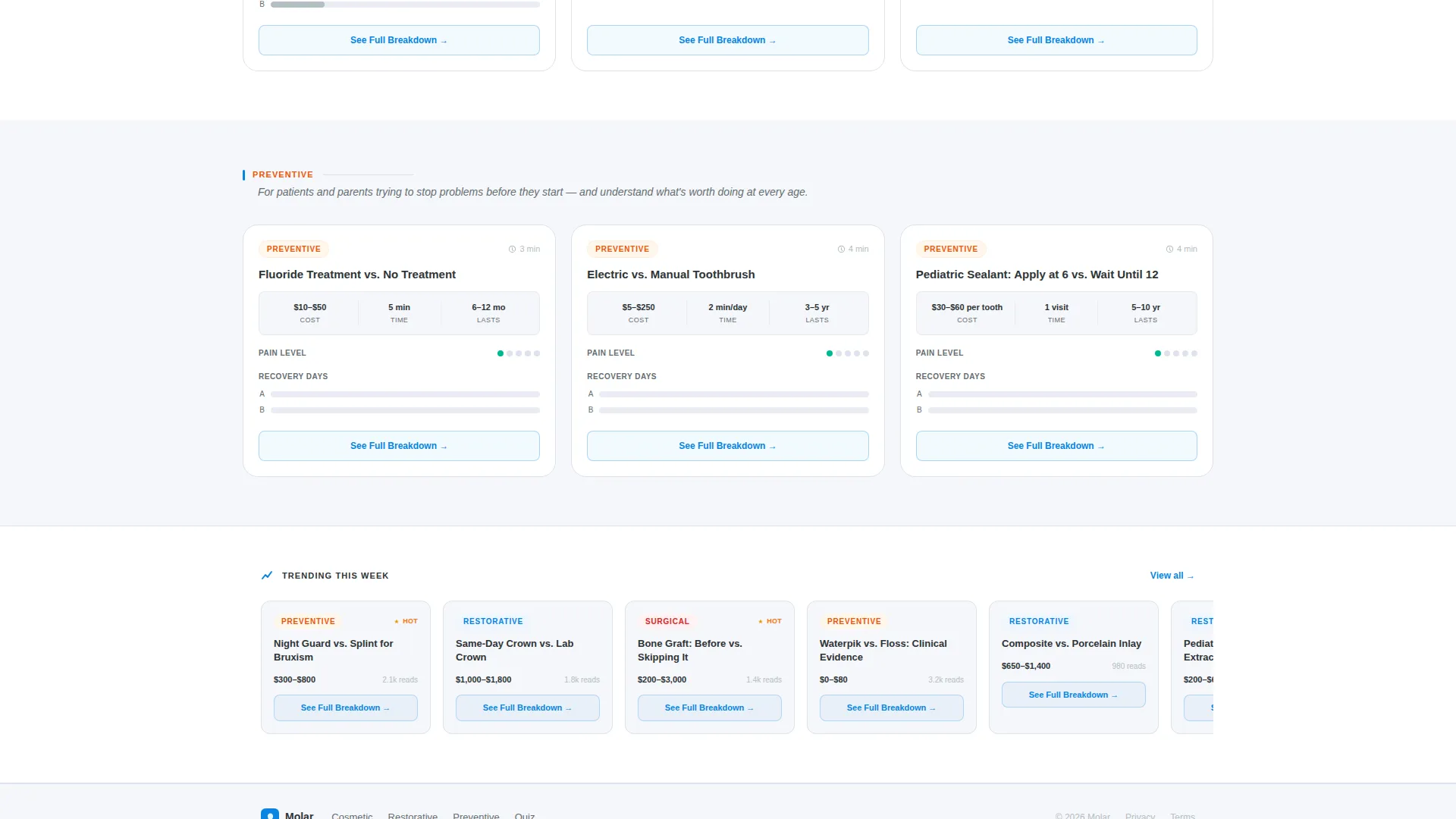
Blog cards are grouped into three content rows: cosmetic, restorative, and preventive. Each row is introduced by a single-line context sentence that orients the reader before they scan the cards. This structure keeps the page feeling organized rather than overwhelming.
Per-Card Primary Call to Action
Every comparison card carries a primary call to action labeled "See Full Breakdown." This button leads directly to the deep-dive article for that procedure matchup. Placing the action on each card keeps the conversion path short and consistent.
Persistent Bottom Conversion Bar
A fixed bottom bar remains visible as the visitor scrolls. It presents the secondary conversion prompt: "Not Sure Which Procedure? Take the 60-Second Quiz." After the quiz result, a single-field email gate captures the lead without friction.
Spec Sheet Visual Logic
The overall creative direction follows a spec sheet format. Titles use structured "versus" framing. Comparison badges like "Implant versus. Bridge" and "Veneer versus. Bonding" appear on card thumbnails. This layout pattern makes the page feel less like a blog and more like a trusted decision matrix.
Page sections overview
| Section | Purpose |
|---|---|
| Header Screenshot Frame | Establishes dashboard aesthetic and shows the blog grid in a browser mockup |
| Cosmetic Procedures Row | Groups cosmetic comparison cards with a single-line category intro |
| Restorative Procedures Row | Groups restorative matchup cards under a dedicated category label |
| Preventive Procedures Row | Presents preventive content cards including sealants and hygiene topics |
| Persistent Bottom Bar | Delivers the secondary quiz conversion prompt with an email gate |
Design & branding system
The Slate & Sky color system is applied consistently across every surface of the template. The palette feels clinical, calm, and trustworthy without feeling cold or intimidating.
- Surgical-instrument charcoal (#2D3436) anchors all card headlines and primary text
- Sterilization-tray slate (#636E72) softens body text, and enamel white (#F5F6FA) fills card backgrounds for a clean contrast field
- Open-sky cerulean (#0984E3) carries every link, tag pill, comparison badge, and hover state across the page
Mobile & speed optimization
The card grid layout is built with a modular structure that adapts naturally to smaller screens. Comparison data stays readable without requiring the visitor to zoom or scroll horizontally.
- Card columns reflow for single-column display on mobile without losing the spec data hierarchy
- The persistent bottom bar remains anchored at the viewport base on both desktop and mobile viewports
- Thumbnail X-rays and procedure icons are sized to stay legible at smaller display widths
How this template helps you convert
Molar is designed around a front-loading principle: give the visitor enough data on the card that clicking feels like confirmation, not a leap of faith.
- Every card surfaces cost ranges, timelines, and recovery data before any interaction, so the visitor arrives at the article already trusting the source and primed to read deeply.
- The "See Full Breakdown" call to action on each card creates a direct, low-friction path from curiosity to full article engagement, keeping bounce rates low across the blog grid.
- The persistent bottom bar with the quiz prompt and email gate offers a secondary conversion path for visitors who are not yet ready to choose a procedure, capturing them at the moment of peak indecision.
Other information about this template
This template is categorized under dental practice website templates within the broader technology category. It is purpose-built for the dental practice blog page niche, where visitors need comparison-led content structures rather than traditional article lists.
- The template style is Card Grid (Modular), making individual cards easy to reorder or extend as new procedure comparison articles are added
- The Dashboard Pro theme gives the page a tool-like feel that signals competence and depth to first-time visitors
- Comparison badges and procedure icons included in the header mockup reflect real content categories such as cosmetic, restorative, and preventive dentistry
- The Intersection Match Score of 13 reflects a tightly aligned combination of theme, creative direction, color system, template style, and landing page direction for this specific niche
Theme
Dashboard Pro
Creative direction
Spec Sheet
Color system
Slate & Sky
Style
Card Grid (Modular)
Direction
Comparison/Versus
Page Sections
Clinical Comparison Card Grid
Dashboard Pro Header Screenshot
Category Row Structure
Per-card See Full Breakdown Call to Action
Persistent Bottom Conversion Bar
Spec Sheet Comparison Badges
Related questions
Can I add more comparison cards as my blog grows?
Does the template include the quiz functionality or just the design?
Who is the target reader this template is designed to reach?
Is the header browser frame a real interactive component?
Can this template work for a practice that covers all three content categories?



