Premium Dental Practice Proof-First Website Template
Molar is a scroll-reveal dental practice landing page template built around a Bold Brutalist visual identity and a Glassmorphic color system. It leads with a dashboard-style header, escalates through spec-sheet service sections, and drives bookings with a pinned progressive form. Designed for modern dental practices ready to project clinical confidence and convert hesitant visitors into booked patients.
by Rocket studio
Quick summary
Molar is a single-page dental practice landing page template that pairs a frosted-glass visual system with brutalist grid structure. Each scroll reveal escalates precision, treating services like product specifications. The pinned bottom bar keeps the primary call to action in view at all times, while a secondary email capture path handles visitors who need more time before booking.
Who this template is for
This template is built for dental practices that want to move beyond generic stock photography and soft reassurances. It speaks directly to practices ready to demonstrate clinical rigor through design and data presentation.
- Dental practices targeting young professionals, parents managing orthodontic schedules, and patients making long-deferred smile investments
- Dentists and clinic owners who want their homepage to feel like a confident, modern clinical brand rather than a standard healthcare brochure
- Designers and agencies building a dental practice homepage template for clients who demand a high-end, conversion-focused layout
What problem this template solves
Most dental websites create hesitation. They rely on stock smiles and vague reassurances, which do little to convince a nervous patient or a busy professional to book. Molar replaces that softness with structured confidence.
- Visitors who keep postponing care need proof of a working system, not warm photography, and this template opens with exactly that proof
- Practices lose leads when their call-to-action gets buried; the pinned booking bar in this template keeps the next step visible without interrupting the reading flow
- Generic templates fail to differentiate services; this template treats each offering as a technical specification, building trust through detail rather than decoration
What you get with this template
You get a fully structured, scroll-reveal landing page with a clear visual hierarchy and a conversion path built in from the first section. Every component is defined in the brief and ready to adapt to your practice's copy and branding.
- A frosted-glass dashboard header, progressive service spec sections, and a pinned lead-generation bar that persists after the second scroll reveal
- A three-panel progressive booking form with icon-based selectors, name and phone capture, and a preferred time-of-day toggle
- A secondary email capture path offering a downloadable pre-visit checklist for visitors not yet ready to book an appointment
Feature list
This template delivers a tightly scoped set of components, each serving a specific role in the conversion flow.
Dashboard-Style Header Panel
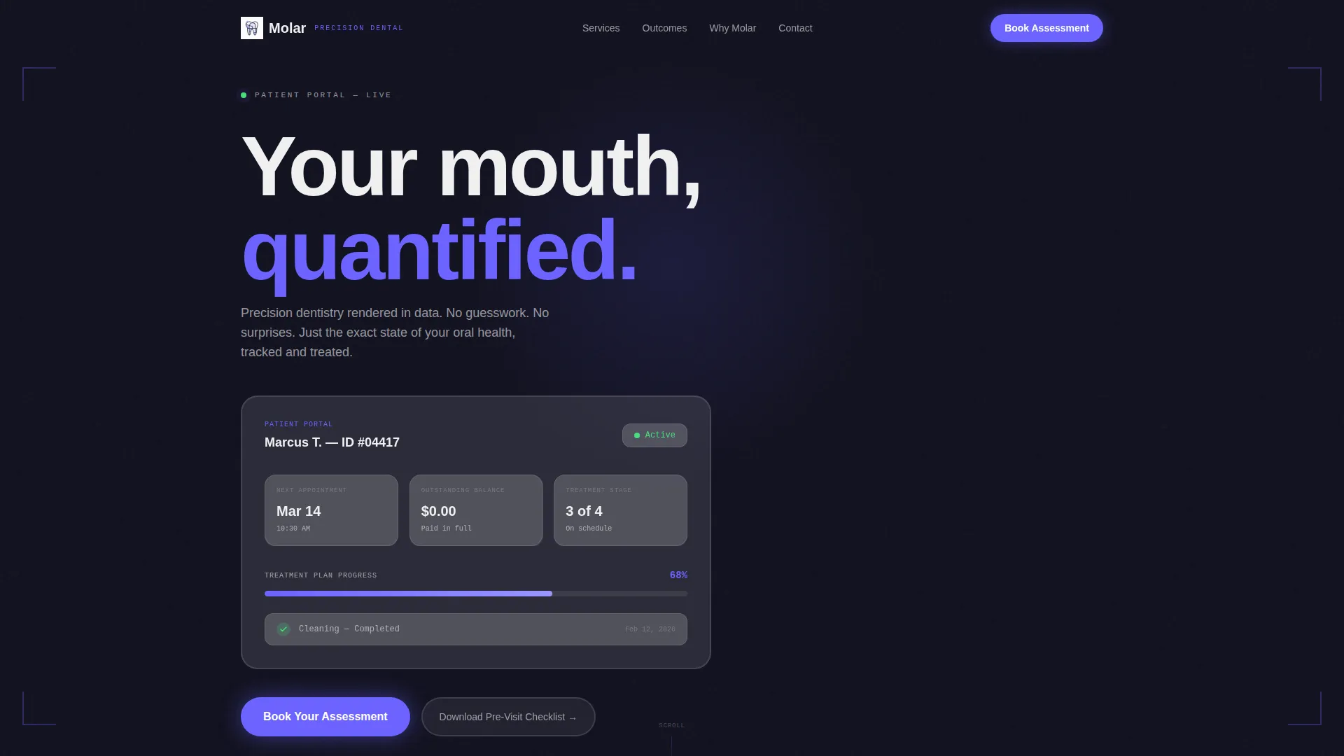
The header opens with a frosted-glass patient portal preview rather than a photograph. It displays a next appointment date, a treatment plan progress bar at 68 percent, an outstanding balance of $0.00, and a green checkmark beside a completed cleaning entry. The headline "Your mouth, quantified." appears above in brutalist typography, establishing clinical credibility within the first viewport.
Scroll-Reveal Spec Sheet Sections
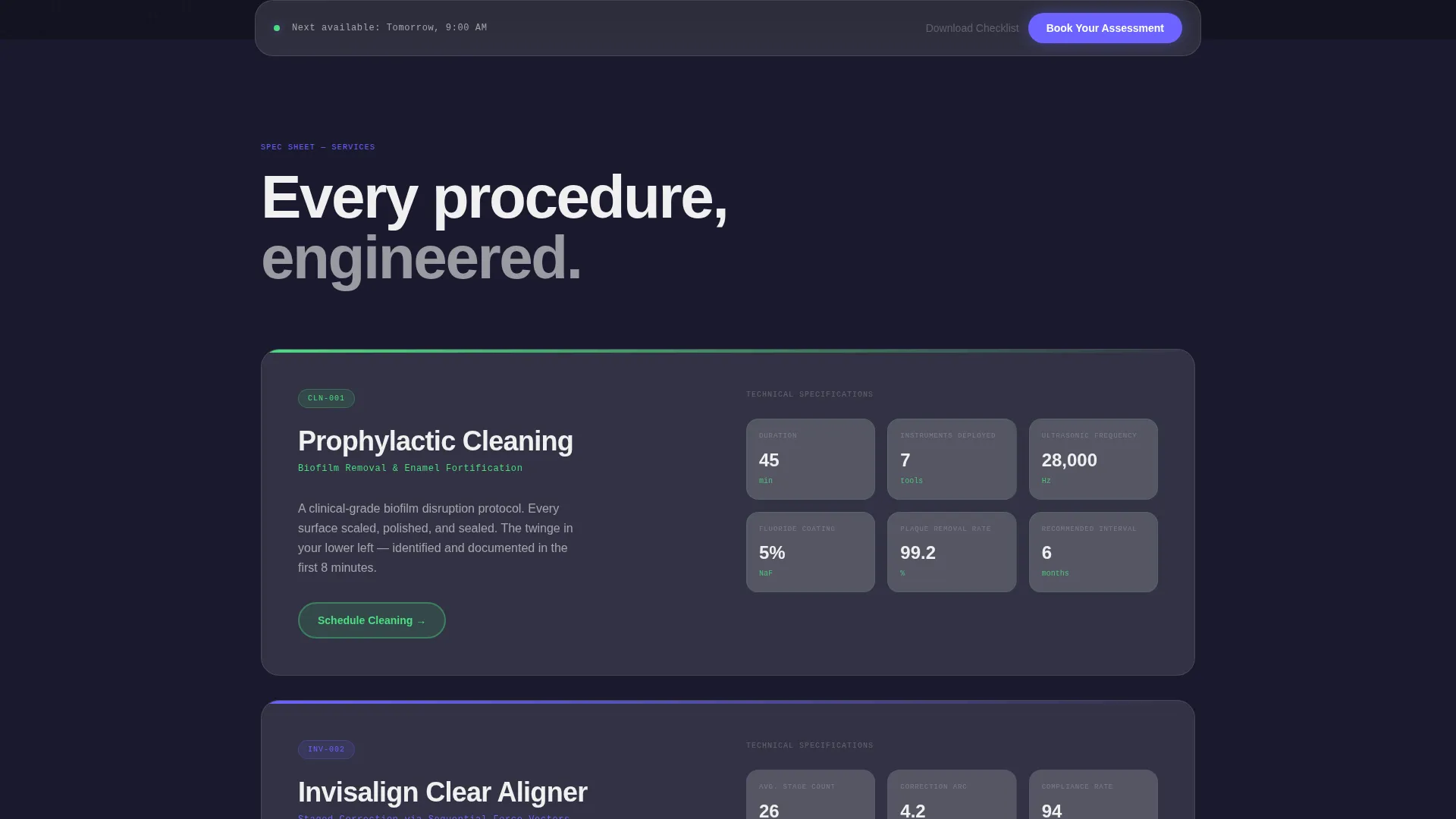
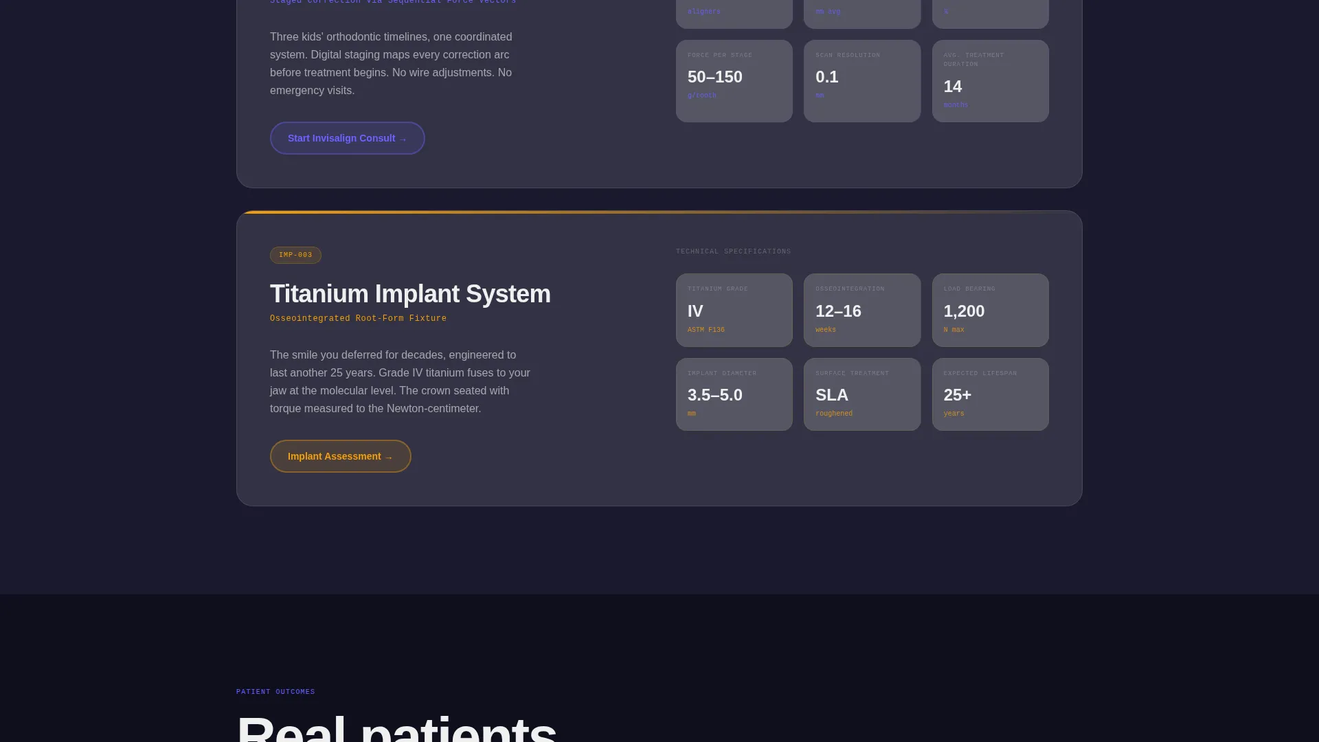
Each service section reveals on scroll and treats its subject like a product data sheet. Cleanings include duration, tool count, and coating type. Invisalign listings show stage count, average correction arc in millimeters, and a compliance rate percentage. Implant sections display titanium grade, osseointegration timeline, and load-bearing specifications in Newtons. The progressive reveal builds a case for engineering-grade practice standards.
Pinned Progressive Booking Form
After the second scroll reveal, a frosted-glass bar locks to the bottom of the viewport and stays visible for the rest of the page. Inside it lives a three-panel booking flow: the first panel asks what brings the visitor in, using icon-based selectors for pain, cosmetic, routine, and orthodontic intent. The second captures name and phone. The third offers a preferred time-of-day toggle.
Secondary Email Capture Path
A "Download Your Pre-Visit Checklist" option gives undecided visitors a low-commitment next step. It captures an email address without requiring a full appointment commitment, keeping those leads inside the funnel.
Bold Brutalist Grid Layout
Thick borders, hard grid lines, and unapologetic structural edges define every section boundary. The brutalist framework provides the scaffolding that makes the glassmorphic card system feel precise rather than decorative. Color appears only where the visitor needs to act, preventing visual noise from diluting the call to action.
Glassmorphic Card System
Each data card uses heavy backdrop blur and frosted translucent white panels floating over a deep charcoal substrate. The effect is clinical and layered, like viewing a sterilized instrument tray through a fogged visor. Cards carry the spec-sheet content and reinforce the impression of a practice that operates with measurable standards.
Page sections overview
| Section | Purpose |
|---|---|
| Dashboard Header Panel | Opens with patient portal proof and primary headline |
| Service Spec Sections | Reveals dental service data in escalating detail on scroll |
| Pinned Booking Bar | Keeps "Book Your Assessment" call to action visible after second reveal |
| Progressive Booking Form | Captures intent, contact info, and time preference in three steps |
| Pre-Visit Checklist Capture | Secondary email path for visitors not ready to commit |
Design & branding system
The visual identity blends Bold Brutalist structure with a Glassmorphic color system. The result is a layout that feels simultaneously clinical and modern, with restraint applied to color so that every accent carries clear meaning.
- Core palette: frosted translucent white (#FFFFFFB3) panels, charcoal substrate (#1A1A2E), clinical ultraviolet (#6C63FF) for interactive states and accent pulses, and enamel bright (#F0F0F0) for typography
- Glassmorphic cards use heavy backdrop blur layered over the dark substrate, while brutalist borders and thick grid lines hold every component in a precise structural frame
- Color appears only at action points, keeping the visual field clean and ensuring the ultraviolet accent draws attention exactly where conversion is intended
Mobile & speed optimization
The scroll-reveal structure and pinned booking bar are designed to translate across viewport sizes without losing the core conversion flow. The progressive form panels keep the mobile interaction linear and uncluttered.
- The three-panel form breaks the booking process into small, manageable steps that suit thumb navigation and shorter attention spans on mobile
- Icon-based selectors in the first form panel replace typed input with a single tap, reducing friction for mobile visitors arriving with a specific need
- The pinned bottom bar remains accessible on smaller screens, keeping the primary call to action reachable without requiring the visitor to scroll back to the top
How this template helps you convert
Molar is structured around a single conversion goal: turning a hesitant visitor into a booked patient. Every design and layout decision serves that outcome.
- The dashboard header replaces persuasion with proof. A visitor sees a working patient system before reading a single word of marketing copy, which builds immediate credibility.
- The spec-sheet scroll sections escalate trust progressively, so by the time a visitor reaches the booking form, the practice has already demonstrated clinical standards through data rather than claims.
- The pinned booking bar and the secondary checklist download create two separate conversion paths, capturing both ready-to-book visitors and those who need a lower-stakes first step.
Other information about this template
Molar is categorized under dental practice website templates within the broader technology template category. It is purpose-built as a dental practice homepage template with an intersection match score of 13, reflecting a tightly aligned design brief. The template style is Scroll Reveal (Progressive), the header concept is Dashboard Preview, the creative direction is Spec Sheet, and the lead-generation direction is the primary structural intent. This template is a strong fit for practices that want to stand apart from the typical dental website aesthetic and present their services with the confidence of a clinical brand.
- Template style: Scroll Reveal (Progressive) with section-by-section progressive disclosure
- Header concept: Dashboard Preview using a stylized patient portal card rather than photography
- Creative direction: Spec Sheet, treating each dental service as a measurable, data-backed product
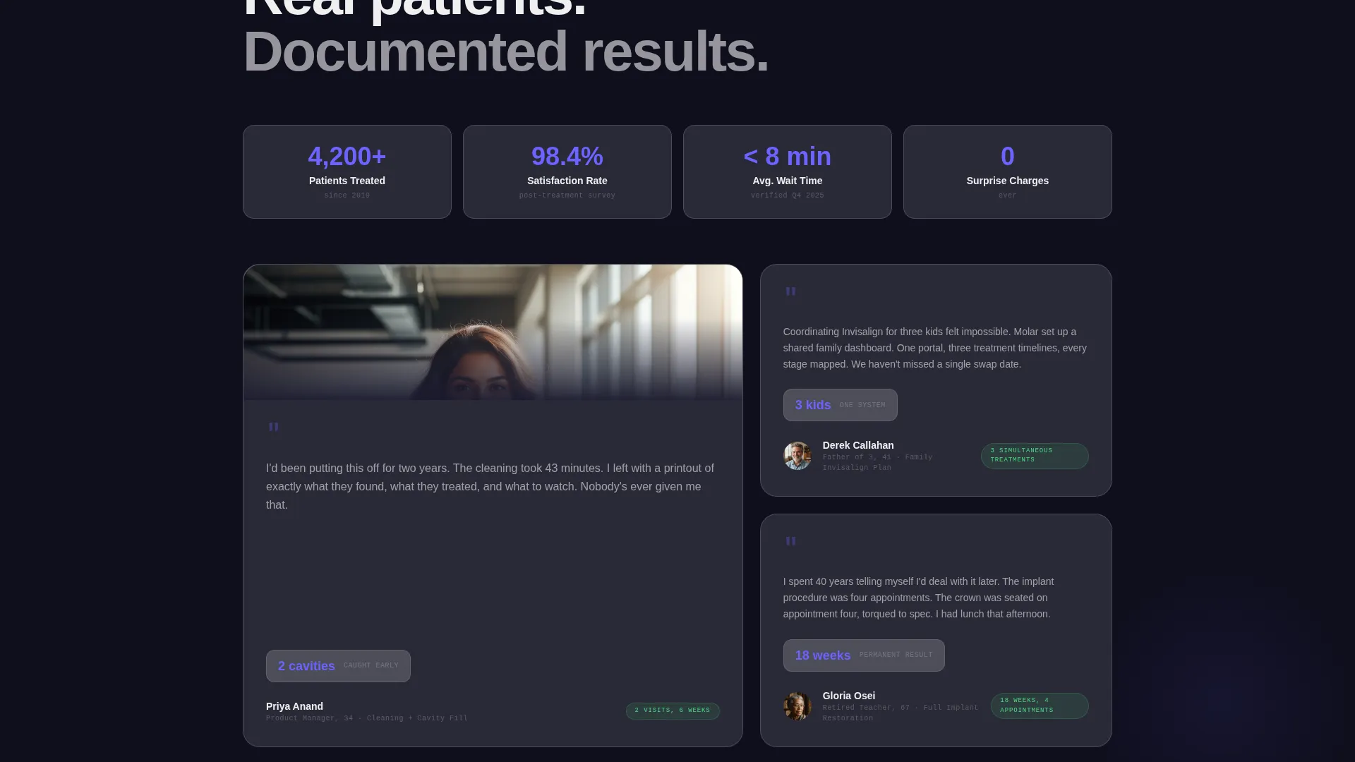
- Best suited for practices ready to invest in a design identity that communicates precision before a visitor reads a single patient testimonial
Theme
Bold Brutalist
Creative direction
Spec Sheet
Color system
Glassmorphic
Style
Scroll Reveal (Progressive)
Direction
Lead Generation
Page Sections
Dashboard-style Header Panel
Scroll-reveal Spec Sheet Sections
Pinned Progressive Booking Form
Secondary Email Capture Path
Bold Brutalist Grid Layout
Glassmorphic Card System
Related questions
Can I replace the dashboard header content with my own practice data?
Does the pinned booking bar appear on all devices?
What is the secondary conversion path in this template?
How does the progressive booking form work?
Is this template suitable for a multi-service dental practice?



