Fitness Studio Specialist Pricing Website Template
Pulse is a scroll-reveal fitness studio pricing landing page built around raw performance data. A dark cockpit header opens with live studio stats counting up in real time. Three pricing tiers reveal progressively as visitors scroll, each card building detail before a side-by-side comparison closes the argument. A low-friction lead capture form with no credit card requirement earns the click through undeniable value-per-session math.
by Rocket studio
Quick summary
Pulse is a high-performance fitness studio pricing landing page that leads with data, not imagery. The header displays real studio metrics in oversized monospace type. Pricing tiers scroll into view one by one, building context before a side-by-side comparison locks in the decision. A single "Claim Your Trial Week" call to action appears at two strategic points to capture leads without friction.
Who this template is for
This template is built for fitness studio owners and operators who want their pricing page to do serious persuasion work. It suits studios that compete on results, accountability, and community rather than price alone.
- Boutique strength and conditioning studios moving members away from large commercial gyms
- Small-group training facilities with multiple membership tiers and session formats
- Studio operators who want leads collected before a sales conversation, not after
What problem this template solves
Most fitness studio pricing pages list plans in a static table and hope the visitor reads them. That approach loses people who need context before they commit. Pulse flips the sequence entirely.
- Visitors often leave before understanding the real cost-per-session value of higher tiers
- Studios with strong retention numbers and class attendance data rarely put those figures front and center
- Generic pricing layouts give no momentum toward action, leaving conversions on the table
What you get with this template
You get a fully structured single-page layout designed around progressive disclosure. Each section earns the next scroll rather than dumping all information at once.
- A stats wall header with animated count-up numbers replacing the traditional hero image
- Three scroll-revealed pricing tier cards that build individually before displaying a side-by-side comparison
- A lead generation form with minimal fields and a sticky call-to-action bar that appears after all tiers are visible
Feature list
This template ships with a focused set of purpose-built components. Each one plays a specific role in moving a first-time visitor toward submitting their details.
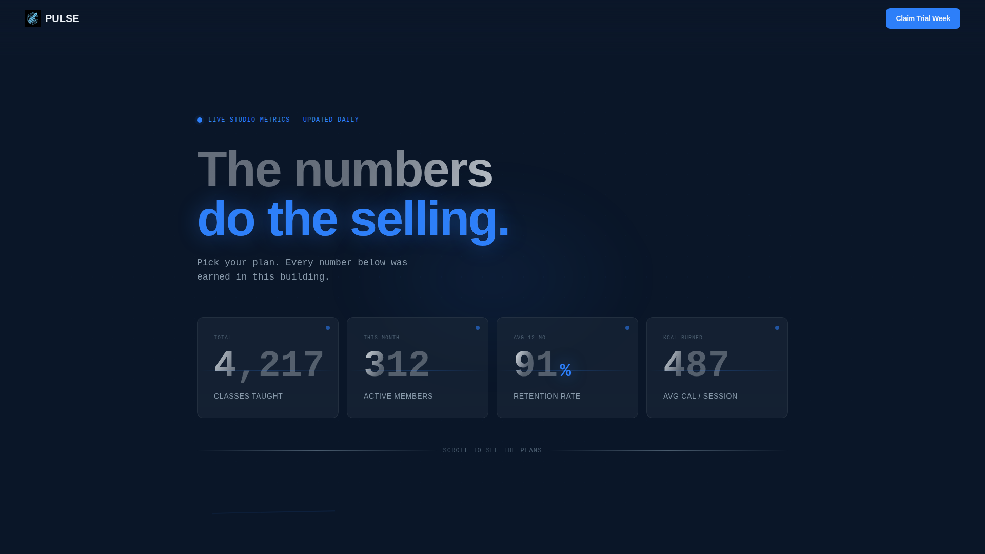
Animated Stats Header
The page opens as a dark cockpit displaying four key studio metrics in oversized monospace typography. Numbers count up on load like a stock ticker, making the studio's track record impossible to ignore before a single pricing tier is shown.
Progressive Scroll Reveal
Each pricing tier card enters the viewport one at a time as the visitor scrolls. The reveal sequence builds from individual plan detail to a full side-by-side tier comparison, creating natural momentum through the page.
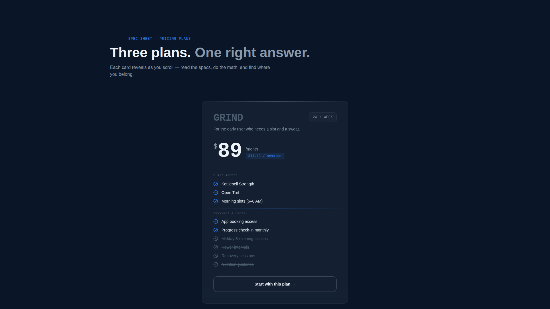
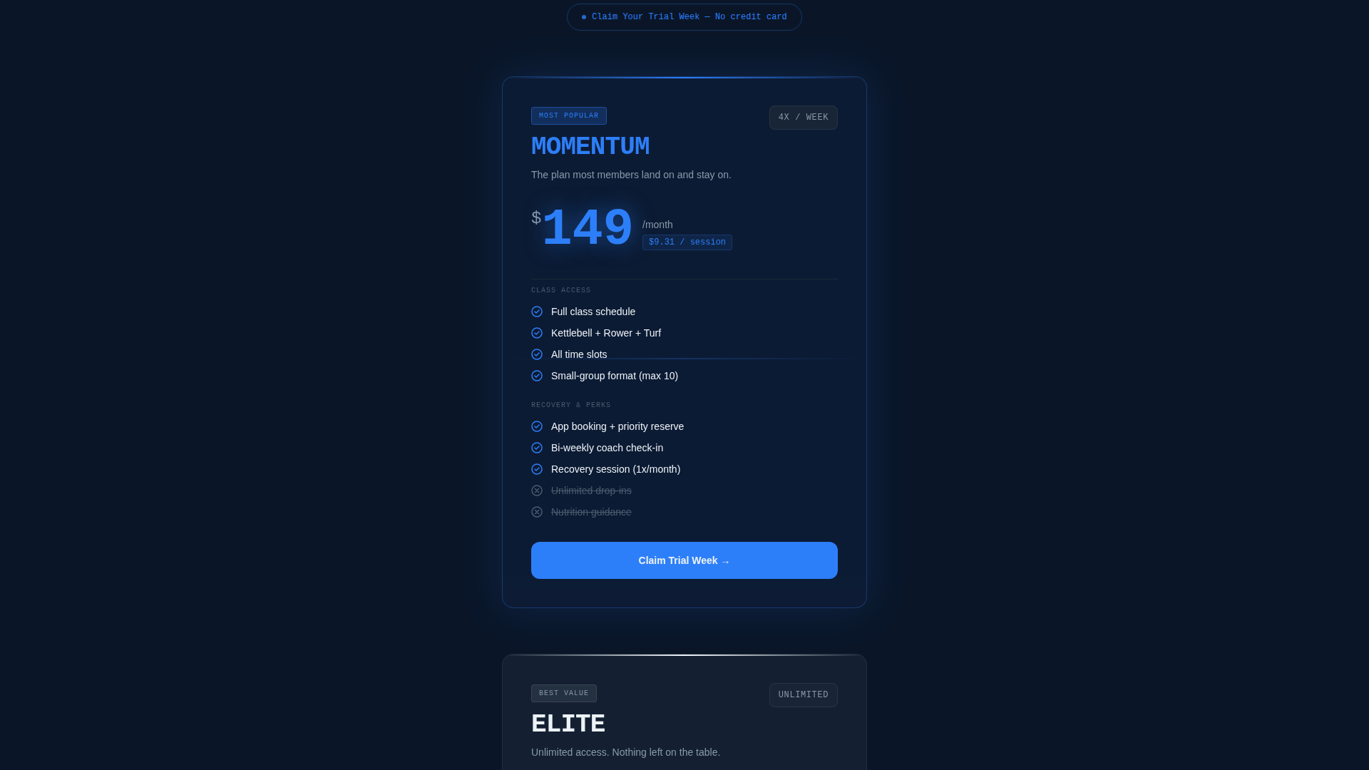
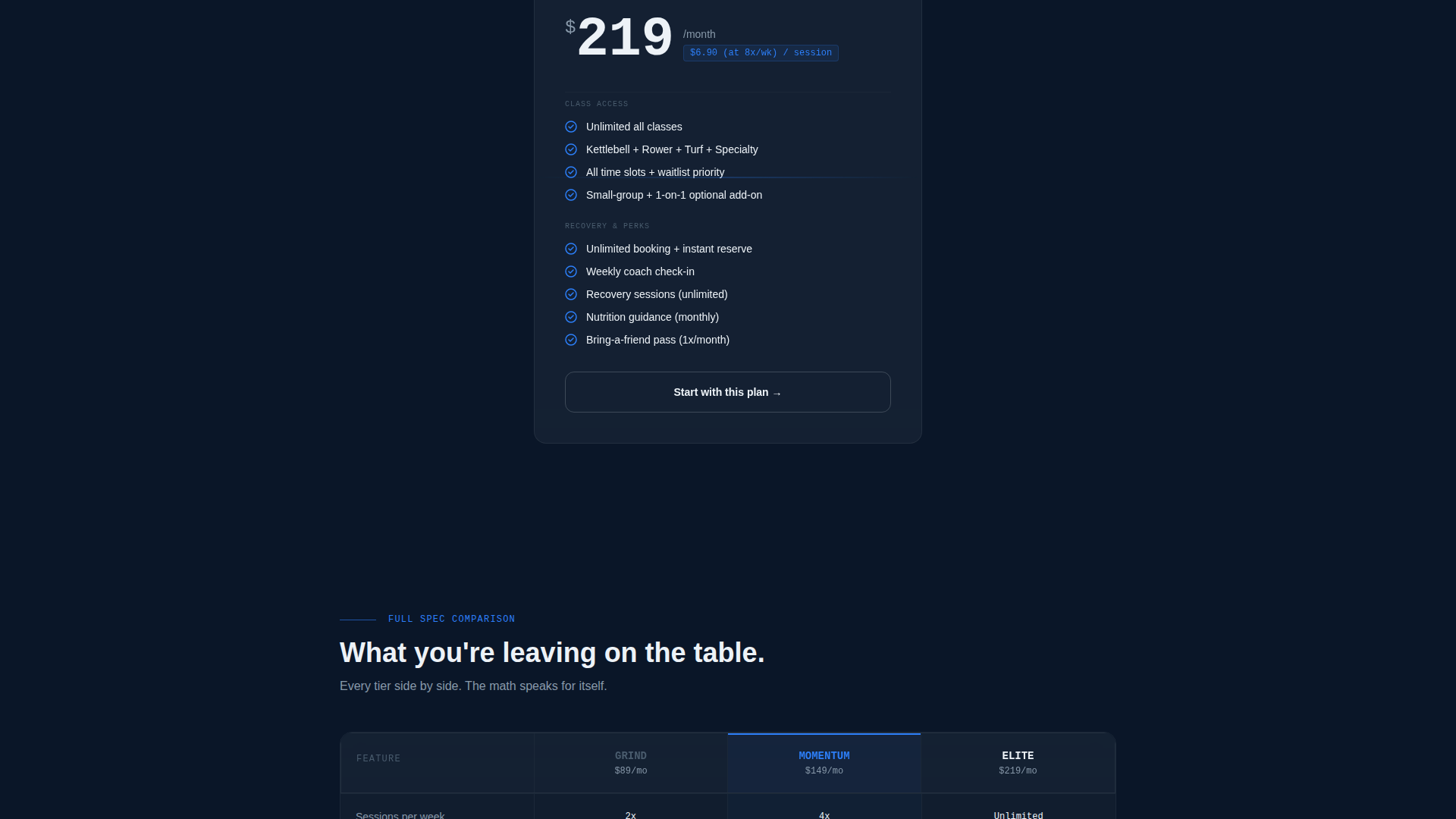
Pricing Tier Spec Cards
Each card presents plan name, sessions per week, class access matrix, recovery perks, and a cost-per-session breakdown. The math is displayed visibly so the value argument completes itself without additional copy.
Dual-Placement Call to Action
The "Claim Your Trial Week" call to action appears once after the first tier reveal and again as a sticky bar once all three tiers are visible. Placement is timed to catch both early-decision and comparison-stage visitors.
Low-Friction Lead Form
The intake form asks only for first name, preferred class time, and fitness goal. No credit card, no commitment language. The form is structured to reduce drop-off by keeping the ask proportional to the value already shown.
Side-by-Side Tier Comparison
After all three individual cards have been introduced, the layout shifts to a column-by-column tier comparison. This sequence ensures visitors understand each plan before the comparison creates pressure to upgrade.
Page sections overview
| Section | Purpose |
|---|---|
| Stats Metrics Header | Opens with live studio numbers counting up in monospace type to establish credibility immediately |
| First Tier Reveal | Introduces the entry-level plan with full spec detail and first call-to-action placement |
| Second Tier Reveal | Scrolls in the mid-tier card with expanded class access and recovery perks |
| Third Tier Reveal | Delivers the premium plan card and completes the individual introduction sequence |
| Side-by-Side Comparison | Presents all three tiers in columns to sharpen the upgrade decision |
| Sticky call to action Bar | Persists after all tiers are visible with the "Claim Your Trial Week" prompt |
| Lead Capture Form | Collects first name, preferred class time, and fitness goal with no credit card required |
Design & branding system
The visual identity follows a Startup Velocity theme built on a Midnight Blue color system. The palette is designed to feel like a performance dashboard glowing in a darkened room, clinical and driven.
- Deep terminal navy (#0A1628) anchors the background, steel-panel gray (#1B2838) surfaces each pricing card, and electric pulse blue (#2D7FF9) activates interactive elements and highlighted metrics
- Sharp signal white (#EDF2F7) handles all body and heading typography for high contrast against the dark layers
- Monospace type carries the stats wall and cost-per-session figures, reinforcing the data-first, dashboard aesthetic throughout
Mobile & speed optimization
The scroll-reveal structure is built to perform on smaller screens without losing the progressive sequence that drives the conversion logic. Each section stacks cleanly at mobile widths.
- Pricing tier cards reflow to single-column layout on mobile while preserving the individual reveal order before the comparison view
- The sticky call-to-action bar is sized for thumb interaction and remains visible without blocking primary content on small viewports
- The stats header retains its oversized number treatment at mobile scale, keeping the impact of the count-up animation intact on all screen sizes
How this template helps you convert
Pulse is structured so that every scroll earns more trust before asking for anything. The conversion sequence is deliberate and layered.
- The stats wall opens with proof before any plan is visible, so the visitor arrives at pricing already primed by real numbers rather than marketing claims.
- Progressive tier reveals give each plan room to justify itself individually, making the cost-per-session math land harder than a static comparison table ever could.
- The low-field lead form positioned after demonstrated value captures intent from visitors who are ready to act without overwhelming those who are still deciding.
Other information about this template
This template is categorized under fitness studio website templates and is specifically scoped to the fitness studio pricing page use case. It is built for studios that rely on small-group accountability and measurable results to retain members.
- The Scroll Reveal (Progressive) template style and Spec Sheet creative direction are matched specifically to this intersection of technology category and fitness studio niche
- The header concept replaces a traditional hero image with a Stats and Metrics wall, making it particularly effective for studios with strong retention rates and high class volume data to display
- The Midnight Blue color system and Startup Velocity theme position the brand closer to a performance technology product than a conventional gym, which aligns with audiences migrating from large commercial fitness chains to boutique training environments
Theme
Startup Velocity
Creative direction
Spec Sheet
Color system
Midnight Blue
Style
Scroll Reveal (Progressive)
Direction
Lead Generation
Page Sections
Animated Stats Metrics Header
Progressive Scroll Reveal Layout
Pricing Tier Spec Cards
Dual-placement Trial Call to Action
Low-friction Lead Capture Form
Related questions
Does this template require a hero image or photography?
How many pricing tiers does this template support?
What does the lead capture form ask for?
Can the studio statistics in the header be edited?
Is this template suitable for a studio with only one membership option?