Gen Z Finance Specialist Professional Website Template
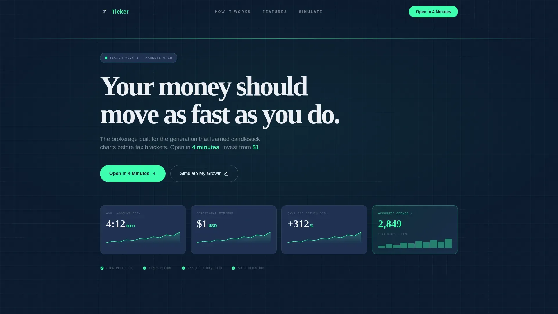
The Ticker Data Command Gen Z Investment Account Landing Page Template is a dark-mode, data-forward landing page built for young investors. It combines an animated stats wall, a zigzag comparison journey, and a two-step progressive form to turn first-time visitors into account sign-ups. Everything runs on a Navy Authority color system with volt green calls to action and a built-in growth simulator for email capture.
by Rocket studio
Quick summary
This template gives fintech brands a ready-to-deploy investment landing page designed around how Gen Z actually thinks about money and stocks. The layout opens with a live-styled data wall, moves through three alternating comparison sections, and closes with a growth calculator that captures email before revealing results. It is focused on conversions from the first pixel to the final form field.
Who this template is for
This template is built for fintech founders, brokerage startups, and financial product teams who want to reach younger investors. It works especially well when the offer centers on low fees, fractional investing, or fast account opening. Users who need to communicate transparency and speed will find the layout particularly useful.
- Early-stage fintech companies launching a Gen Z investment account or trading product
- Established brokerages redesigning their investment landing page for a younger channel
- Financial content creators or educators building a lead generation page around stocks and investments
What problem this template solves
Most investment landing pages feel designed for a 1990s compliance checklist, not a 22-year-old on a phone. They are cluttered, slow to load, and buried in industry jargon that younger buyers immediately tune out. This template flips that pattern by leading with data, not disclaimers, and letting the numbers do the persuading.
- Legacy brokerage pages use dense copy and hidden fee structures that erode trust before visitors can explore the offer
- Standard templates ignore the way Gen Z users navigate investments through social media and mobile-first channels
- Generic investment landing page designs fail to show real-time market momentum or interactive tracking tools that younger users expect
What you get with this template
You get a fully structured, single-page investment landing page with five distinct section blocks and a clear conversion path. Every layout decision is backed by the source brief, so there is no guesswork about what to build or how to arrange it. The template handles both the visual hierarchy and the interactive logic flow.
- An animated stats wall header with typewriter headline, count-up data points, and floating metrics covering account open time, fractional share minimum, and a live account counter
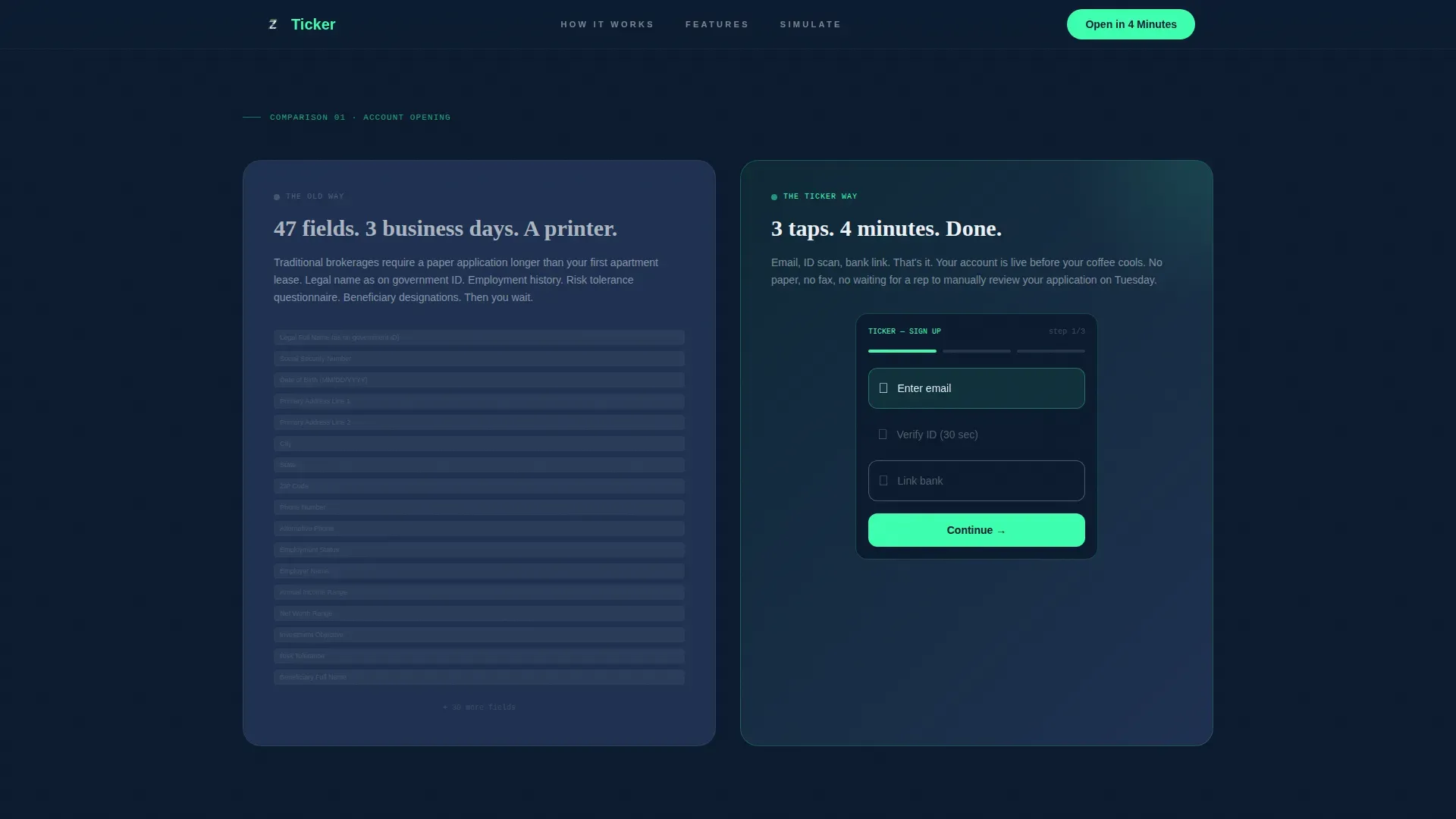
- Three zigzag comparison sections contrasting the old way versus the Ticker way, each with alternating left-right panel layout, muted tactical slate panels for legacy content, and volt green accents for modern solutions
- A two-step progressive form for email and age capture in step one, full name and phone in step two, plus a secondary growth simulator that reveals a projected five-year balance and collects email on result
Feature list
This investment landing page template includes purpose-built sections and interactive components. Each feature below maps directly to what the source brief specifies.
Animated Data Wall Header
The header opens with oversized data points fading in one by one against a deep terminal navy background. A typewriter-effect headline types itself across the screen while count-up numbers track metrics like average account opening time and the fractional share minimum of one dollar. This approach lets the data do the talking before any copy is read.
Zigzag Comparison Journey
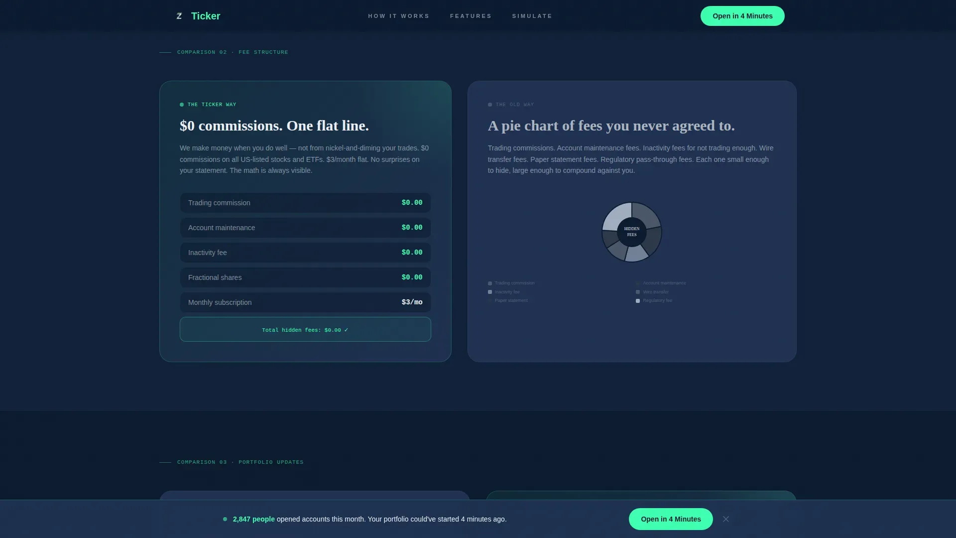
Three alternating sections place the old brokerage experience on one side and the modern investment experience on the other. Each pair of panels physically ping-pongs attention down the page, building a rhythm that accelerates toward the call to action. The contrast between muted slate panels and volt green animated micro-charts is visceral and intentional.
Two-Step Progressive Form
The sign-up form breaks the account opening process into two clear steps. Step one asks only for email and age to confirm eligibility. Step two expands to full name and phone with a toggle for a text download link. This approach reduces friction and acknowledges that younger users abandon long forms instantly.
Growth Simulator with Email Capture
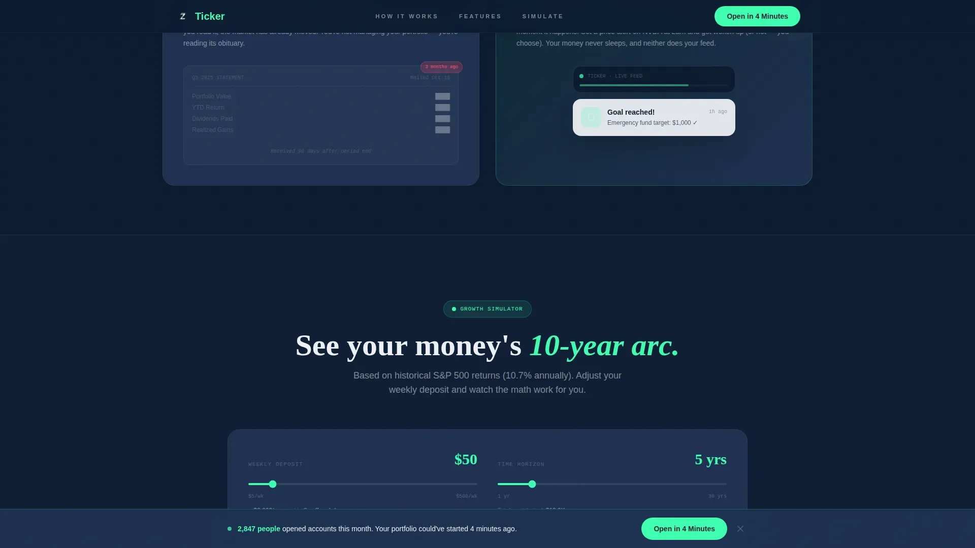
A lightweight calculator lets visitors type in a weekly deposit amount and explore a projected five-year balance based on historical market returns. The result is withheld until the visitor provides an email address, turning curiosity into a conversion. This tool turns passive browsers into trackable leads without aggressive pressure.
Sticky Call to Action Bar
After the second scroll section, a sticky bottom bar appears with the primary call to action. The bar stays visible as users continue to read and react to comparison content below. This persistent prompt keeps the conversion path accessible without interrupting the comparison journey flow.
Volt Green Visual Accent System
Every positive data point, active call to action button, and progress indicator uses volt green exclusively. This disciplined use of color trains the eye to associate green with action and growth. The result is a template where the design strategy itself reinforces the investment message.
Page sections overview
| Section | Purpose |
|---|---|
| Animated Stats Wall | Opens with live-styled data, typewriter headline, count-up metrics |
| Comparison One | 47-field paper application versus three-tap mobile signup |
| Comparison Two | Hidden fee pie chart versus zero-commission breakdown |
| Comparison Three | Quarterly mailed statement versus live push notification |
| Growth Simulator | Weekly deposit calculator with email capture on result reveal |
| Footer Row | Single linear row with navigation and legal links |
Design & branding system
The visual identity follows a Data Command theme that channels the precise, electric feel of a financial terminal. Every color choice is functional, not decorative. The palette makes it immediately clear what is active, what is legacy, and what the user should do next.
- Color system: deep terminal navy (#0B1A2E) as the dominant background, tactical slate (#1E3050) for card surfaces and alternating section breaks, signal white (#EDF0F5) for primary typography and data labels, and volt green (#3DFFB0) reserved for positive returns, active calls to action, and progress indicators
- Typography: Plus Jakarta Sans handles body copy and data labels for clean readability; Fraunces handles display headlines for editorial weight and contrast
- Animation style: typewriter effect on the headline, staggered count-up reveals on data points, scroll-triggered zigzag reveals on comparison sections, and animated micro-charts on the Ticker-side panels
Mobile & speed optimization
This template is built mobile-first because the target audience is phone-native. The layout and touch interactions are designed for small screens before being enhanced for desktop. Every interactive component is optimized for one-handed use and fast loading on a mobile device.
- Touch-friendly buttons and form fields sized for mobile interactions, with the sticky call to action bar positioned at the bottom of the screen where thumbs naturally reach
- Server Components handle static section rendering while Client Components manage animations, the growth calculator, and the progressive form, keeping the page load fast across every device type
- The zigzag layout stacks vertically on mobile so the comparison journey reads naturally from top to bottom without requiring horizontal scrolling
How this template helps you convert
This investment landing page is engineered around a single goal: turning a curious visitor into a captured lead or an active account opener. Every section earns the next click through transparent, data-led content before asking for a commitment.
- The animated stats wall establishes credibility instantly with real numbers. Visitors see the four-minute account open time, the one-dollar fractional minimum, and a live account counter before they read a single line of marketing copy. Trust is built through data, not claims.
- The comparison journey makes the value gap undeniable. Each zigzag section pairs a familiar frustration on the left with a clear solution on the right. By the time visitors reach the growth simulator, they already agree the old way is broken and the new way is better.
- The growth simulator converts intent into action. Visitors who explore a personalized five-year projection have a concrete reason to subscribe and open an account. The email capture is tied to a result they want, making it feel like an exchange rather than a demand.
Other information about this template
This template is part of the broader investment landing page category focused on Gen Z finance. It is designed to serve a new era of younger investors who are reshaping how the market thinks about financial products. The following details are useful for teams choosing this template and planning how to use it in their project.
- The template supports ideas drawn from the investment tracking tool space, where users expect dashboards that centralize real-time market data and help them monitor stocks and follow market shifts effectively
- Teams can use spreadsheet-style tracking logic as reference content inside the growth simulator section; for example, tools like Google Sheets support functions that update stock prices automatically, and Excel's STOCKHISTORY function retrieves historical data, which can inspire the simulator's methodology copy
- The page type is a single investment landing page, not a multi-page website, so all channel traffic should be directed to this URL to preserve conversion focus
- Users building out supporting content can explore vertical video as an additional asset type; a short explainer video placed near the comparison sections can reinforce the value proposition for visitors who prefer watching over reading
- The template is free to customize within the platform and does not require paid plugins or third-party subscriptions to deploy the core layout
- Teams should review privacy details carefully before launch, particularly around the email capture form and the age eligibility field, to ensure the page content and data collection practices meet applicable requirements
- The design system is shared across the Navy Authority color family, so teams can cancel or change accent colors while keeping the terminal aesthetic intact
- Building a strong investment landing page in this category means choosing a template that can react to Gen Z expectations: transparent fees, fast signup, and clear data without jargon
Theme
Data Command
Creative direction
Comparison Journey
Color system
Navy Authority
Style
Zigzag/Alternating
Direction
Lead Generation
Page Sections
Animated Data Wall Header
Zigzag Comparison Journey
Two-step Progressive Sign-up Form
Growth Simulator with Email Gate
Sticky Call to Action Bar
Volt Green Accent System
Related questions
Who is this investment landing page template designed for?
Can I customize this template without coding experience?
What sections are included in this landing page template?
How does the growth simulator support lead generation?
Is this template suitable for a mobile-first audience?



