DEI & Inclusion Professional Website Template
Mosaic is a single-column DEI analytics landing page template built for HR and inclusion leaders who need honest workforce data presented with warmth and clarity. The Stats-First Impact layout leads every section with an arresting number, then delivers context. An inline five-step Inclusion Readiness Score quiz converts visitors without redirecting them away from the page.
by Rocket studio
Quick summary
Mosaic is a single-column flow landing page template designed for diversity data analytics platforms. It pairs rigorous pay equity and promotion metrics with a Community Hearth visual identity that feels editorial and human. The hero opens on a candid team photo, a bold stat fades in at scale, and every scroll transition follows a silence-then-story rhythm that moves visitors from industry-wide problems toward platform-specific proof.
Who this template is for
This template is built for B2B SaaS teams in the HR and DEI space who serve professionals making high-stakes inclusion decisions. The layout and quiz flow are designed around the realities those buyers face every day.
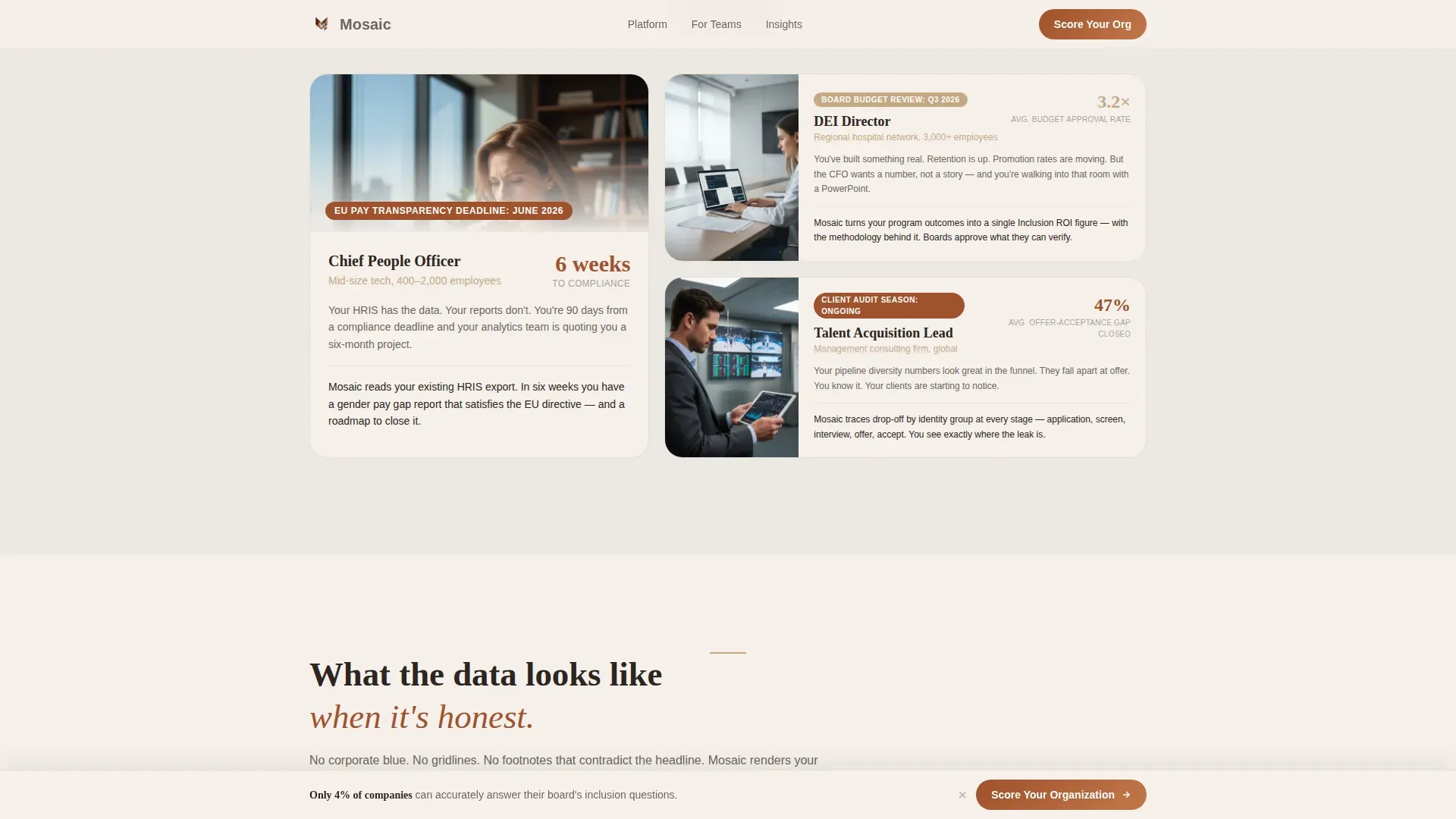
- Chief People Officers at mid-size tech companies facing EU pay transparency deadlines who need board-ready data fast
- DEI Directors at hospital networks defending programs and budgets to skeptical leadership members
- Talent Acquisition leads at consulting firms who must prove their pipeline reflects genuine diversity across race, sex, gender identity, sexual orientation, and disability categories
What problem this template solves
Most DEI dashboards bury the real numbers in footnotes. Leaders who are committed to honest inclusion progress cannot act on data they cannot clearly see or trust. This template solves the presentation problem: it surfaces uncomfortable truths first, then offers a structured path forward.
- Pay equity gaps, promotion velocity by identity group, and belonging scores are hidden inside dense HR reports that no senior leader has time to parse
- A company that cannot answer basic workforce questions accurately cannot build a credible plan for equity or meet growing regulatory expectations
- Static information pages fail to engage decision-makers; this template transforms data into a warm, story-led experience that builds trust and moves visitors toward action
What you get with this template
You get a fully structured single-column landing page with a clear visual hierarchy, an inline assessment, and a warm editorial design system. Every section is pre-built so your team can populate content and launch without starting from scratch.
- A cinematic hero section with a candid team photo, a large fade-in stat, and a compelling subhead that sets the emotional tone immediately
- A Stats Cascade section using the silence-then-story rhythm, an asymmetric persona bento block for three audience profiles, a platform preview section, and an inline five-step quiz with micro-responses
- A sticky "Score Your Organization" call-to-action that appears after the third stat block and stays gently pinned at the bottom of the viewport as visitors scroll
Feature list
This template's features reflect the prompt-defined scope. Each one is designed to serve DEI analytics platforms that strive to inform and convert senior HR decision-makers.
Cinematic Stats-First Hero
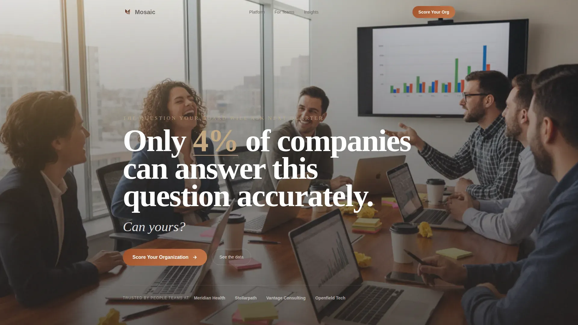
The hero section combines a full-bleed, candid team photo with an enormous fade-in stat: "Only 4% of companies can answer this question accurately." The subhead "Can yours?" follows. This structure leads with discomfort before offering any solution, matching the emotional journey your audience expects.
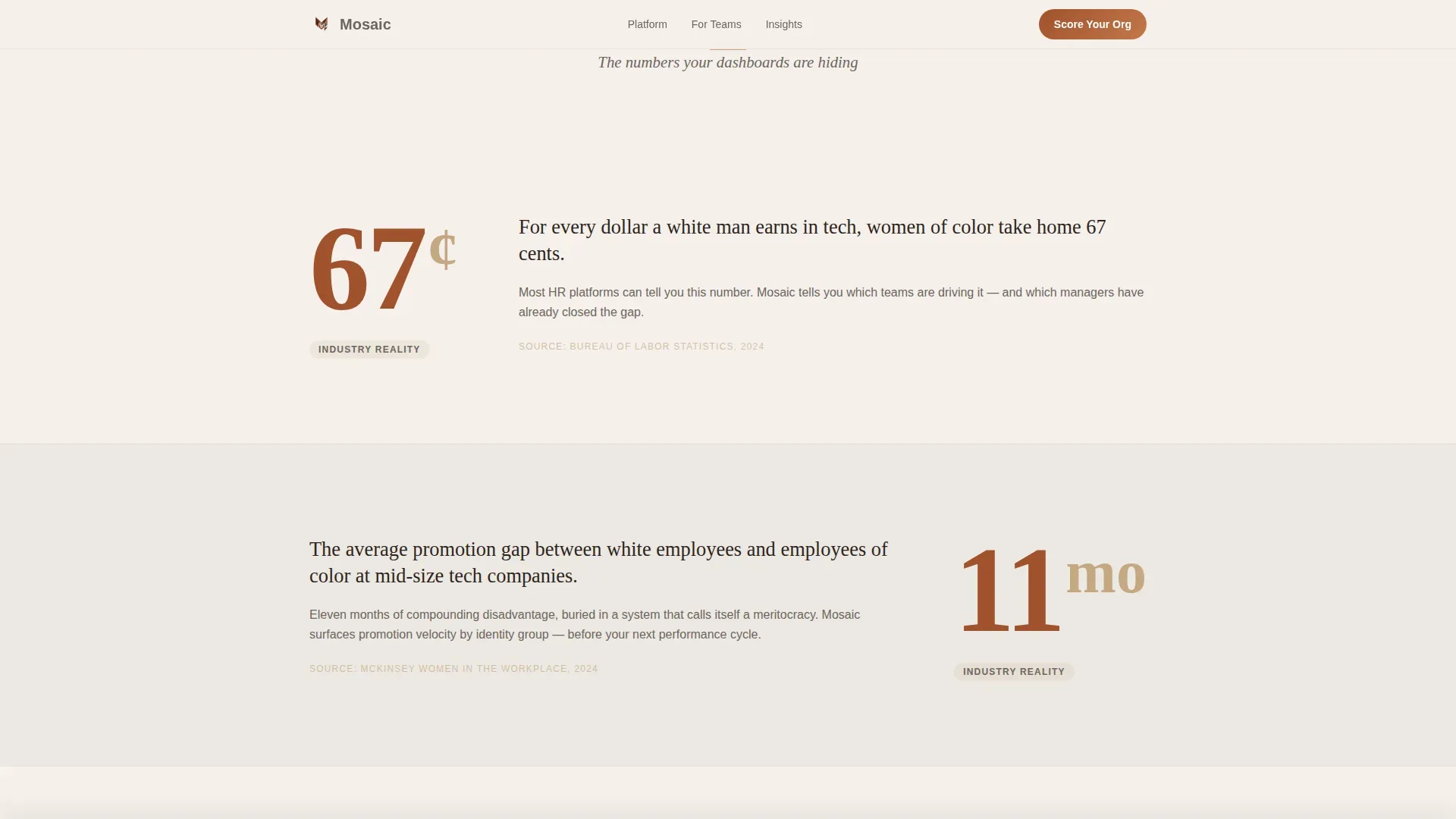
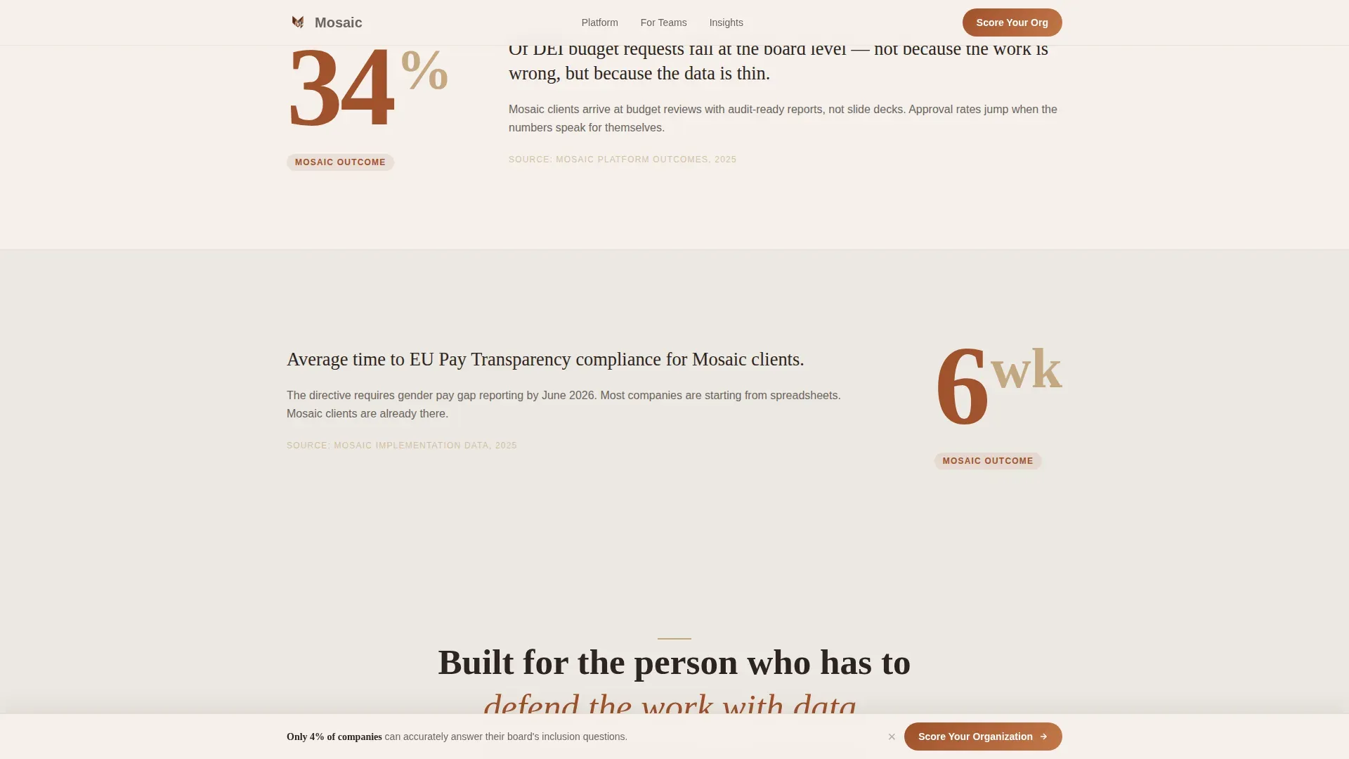
Silence-Then-Story Stats Cascade
Three stat blocks roll out in sequence: "67¢" lands alone before pay equity context appears; "11 months" lingers before the promotion gap explanation materializes. This rhythm holds each number in silence, then delivers the story. The arc shifts from industry-wide problems to platform-specific outcomes as the visitor scrolls deeper.
Inline Five-Step Inclusion Readiness Quiz
The quiz opens inside the page, not as a redirect. Five progressive questions cover company size, whether the organization tracks demographic data beyond standard filings, top inclusion priority, data confidence on an ember-colored slider, and work email last. Each answer triggers a single-sentence micro-response, keeping the interaction conversational and respectful.
Preliminary Inclusion Readiness Score Results Page
After completing the quiz, visitors receive a score with two fully unlocked insights and three blurred ones. A secondary call-to-action, "Unlock Full Report, Book a 20-Minute Walk-Through," drives the next conversion step without pressure.
Asymmetric Persona Bento Block
The "Who It's For" section uses an asymmetric bento layout to present three distinct audience profiles. Each panel speaks directly to one persona's specific challenge, so every visitor can quickly find their own situation reflected on the page.
Warm Hand-Drawn Data Visualizations
The platform preview section uses rounded bar charts rendered in gentle clay and deep ember tones. There are no gridlines and no corporate blue. The visual style feels editorial, like a research paper printed on handmade paper, making rigorous data feel approachable.
Page sections overview
| Section | Purpose |
|---|---|
| Hero stat fade | Opens with candid team photo and enormous fade-in stat to hook decision-makers immediately |
| Stats Cascade | Delivers three silence-then-story stat blocks that shift from industry problems to platform proof |
| Who It's For | Asymmetric bento presents three persona panels so each visitor recognizes their own situation |
| Platform Preview | Showcases warm, hand-drawn data visualizations in clay and ember tones |
| Inline Quiz | Five-step Inclusion Readiness Score assessment with micro-responses and a sticky call to action |
| Linear Footer | Single-row footer with contact links and essential service information |
Design & branding system
The template uses a four-color Soft Mist palette that feels like a wool blanket draped over a data dashboard. The combination of warm neutrals and a single ember accent keeps the visual environment disarming while the numbers remain rigorous.
- Linen white (#F5F0EB) and warm fog (#EDE8E2) alternate as section backgrounds to create breathing room; hearthstone gray (#6B6560) handles body text; gentle clay (#C4A882) marks section dividers and secondary accents
- Deep ember (#A0522D) is reserved exclusively for calls-to-action and stat callouts, so every action point stands out with quiet authority
- Fraunces handles display type and large stats; DM Sans handles body copy and user interface elements, creating a clear typographic structure that reflects an editorial, data-forward identity
Mobile & speed optimization
The template is desktop-first for its primary CPO and Director audience, and fully responsive across all screen sizes. Responsive layouts ensure equal opportunity for participation regardless of the device a visitor uses.
- The hero uses a static image layer so the page loads immediately; quiz logic is deferred and loads only when the visitor reaches the assessment section
- GSAP ScrollTrigger drives stat counters, blur reveals, and stagger animations that add engagement without blocking the initial render
- Mobile breakpoints reflow the asymmetric bento block and Stats Cascade into a clean single-column stack so every section remains readable on smaller screens
How this template helps you convert
The conversion structure is deliberate. Every layout decision supports a single goal: moving a skeptical senior leader from passive scrolling to active participation in the quiz.
- The Stats-First Impact creative direction creates an emotional arc from discomfort to hope, so visitors arrive at the quiz already invested in knowing their own score. The sticky call-to-action ensures the entry point is always visible once it appears.
- The inline quiz format removes redirect friction. Visitors answer five focused questions, receive immediate micro-responses, and see a preliminary score without leaving the page. The blurred insights on the results page make the follow-on booking feel like a natural next step, not a cold ask.
Other information about this template
This template sits within a broader ecosystem of inclusive landing page resources available on the platform. It draws on design principles and organizational values that communities and HR teams across the world recognize as foundational to respectful, effective inclusion work.
- Mosaic's values of integrity, respect, and collaboration form the bedrock of the platform's identity. Mosaic recognizes and values individual employees' similarities and differences, and the template design reflects that commitment visibly.
- Mosaic is committed to creating and sustaining a workplace environment defined by mutual respect, collaboration, and shared success. The template gives visual form to those values so every visitor feels that commitment before they read a single data point.
- The mosaic honest inclusion readiness landing page template is part of a family of community-focused designs that serve organizations spanning education, health services, and corporate DEI programs. Related templates in the ecosystem support communities ranging from local school networks, where staff, students, parents, children, and educators all contribute, to hospital networks focused on health equity.
- The MOSAIC eLibrary and early childhood education resources reflect how broadly the Mosaic name is trusted across sectors. Healthy eating guidelines, nutrition standards developed to inform early childhood service practice, and school-level programs like those at Bel Aire Elementary School, which aims to create a community with respect and dignity for all members, demonstrate the range of contexts where Mosaic-aligned resources operate.
- The template's photo direction, no-code configuration, and authentic imagery approach accept the standard that real images of real people, not stock photos of coworkers high-fiving, foster genuine belonging. Communications managers can curate content and adjust layouts without HTML skills.
- Organizations interested in sustaining long-term DEI progress will find that this template plan supports an honest assessment of current metrics, including areas that have not yet been achieved, while putting the focus on forward momentum.
Theme
Community Hearth
Creative direction
Stats-First Impact
Color system
Soft Mist
Style
Single Column Flow
Direction
Quiz/Assessment
Page Sections
Cinematic Stats-first Hero Section
Silence-then-story Stats Cascade
Inline Five-step Readiness Quiz
Preliminary Score with Blurred Insights
Asymmetric Persona Bento Block
Warm Hand-drawn Data Visualizations
Related questions
Who is this landing page template designed for?
Does the quiz redirect visitors to a separate page?
Can I customize the color palette and typography?
What sections are included in this template?
Is this template suitable for organizations outside the tech sector?


