Advanced Duplex & Multi-Family Real Estate Portfolio & Case Study Website Template
The Duplex Luxe Multi-Family Valuation Landing Page Template is built for boutique real estate agents who specialize in urban duplex and multi-family properties. It combines a moody split-screen hero, a gallery-walk sold property showcase, and a five-step seller assessment funnel, all wrapped in a Luxe Minimal dark emerald and antique gold design that speaks directly to sophisticated operators ready to sell.
by Rocket studio
Quick summary
This landing page template is purpose-built for a multi-family seller's agent operating in dense urban corridors. The design pairs high-contrast architectural photography with a progressive five-question assessment funnel. Every section is calibrated to qualify sellers, from accidental landlords to seasoned portfolio investors, and convert them into valuation consultation leads.
Who this template is for
This template is designed for a very specific audience. It speaks to sellers and agents who understand that multi-family transactions require a different conversation than single-family sales. A real estate landing page built at this level of sophistication serves operators, not casual browsers.
- Boutique real estate agents who specialize in duplex, fourplex, and mixed-use urban property sales
- Accidental landlords inheriting a two-flat, owner-occupants with house-hack equity, and seasoned investors rebalancing a portfolio
- Real estate professionals who need a high-performing landing page that qualifies sophisticated sellers before the first phone call
What problem this template solves
Multi-family sellers are not the same as home sellers. They think in cap rates, gross rent rolls, and Net Operating Income. A generic real estate landing page treats every visitor the same, and that approach loses the sophisticated operator before they reach the contact form. This template solves the qualification gap.
- Generic capture forms ask for a name and a zip code, while this funnel asks about unit count, occupancy status, approximate rent roll, reason for selling, and preferred timeline
- Standard real estate landing page designs bury deal metrics in paragraphs, while this template surfaces acquisition price, days on market, and cap rate at close as exhibition-quality data points
- Most landing page templates give sellers no reason to trust before they opt in, this template uses gallery-walk sold property narratives and full-panel testimonials as social proof before the ask
What you get with this template
This template delivers a complete, single-page seller funnel in a Luxe Minimal aesthetic. Every section is pre-built and ready to customize with your own sold properties, photography, and contact details. It is a well-crafted landing page that works as a digital sales assistant for the multi-family niche.
- A split-screen hero with a gold address search field, five progressive assessment steps with a gold progress bar, and a final valuation request form with name, email, and phone fields
- A gallery-walk section with paired photography and deal narrative panels, plus full emerald testimonial panels between each sold property frame
- A linear single-row footer and a persistent secondary call to action that lets visitors skip the quiz and call directly
Feature list
This landing page template includes a carefully considered set of built-in components. Each one is designed to generate leads from a specific audience segment and to keep potential sellers moving through the funnel without friction.
Split-Screen Hero with Gold Address Search
The hero opens on a 50/50 split viewport. The left side holds a full-bleed, high-contrast photograph of a classic multi-family facade at dusk, shot symmetrically with porch lights visible through divided-lite windows. The right side is deep emerald black with a single gold-ruled address field and the headline "What's Your Building Worth?" set in tracked-out alabaster serif. This is one of the clearest estate landing page examples of a hero that qualifies intent immediately, no dropdown menus, no filters, just the address and a gold arrow.
Five-Step Progressive Assessment Funnel
Once an address is entered, the page transitions into a five-question property assessment. Each question occupies a full split-screen step: unit count, current occupancy status, approximate gross rent roll, reason for selling, and preferred timeline. A gold progress bar tracks advancement across each step. This structure treats every potential seller as a sophisticated operator, not a generic lead, which is what makes it one of the more high converting landing pages available for the multi-family niche.
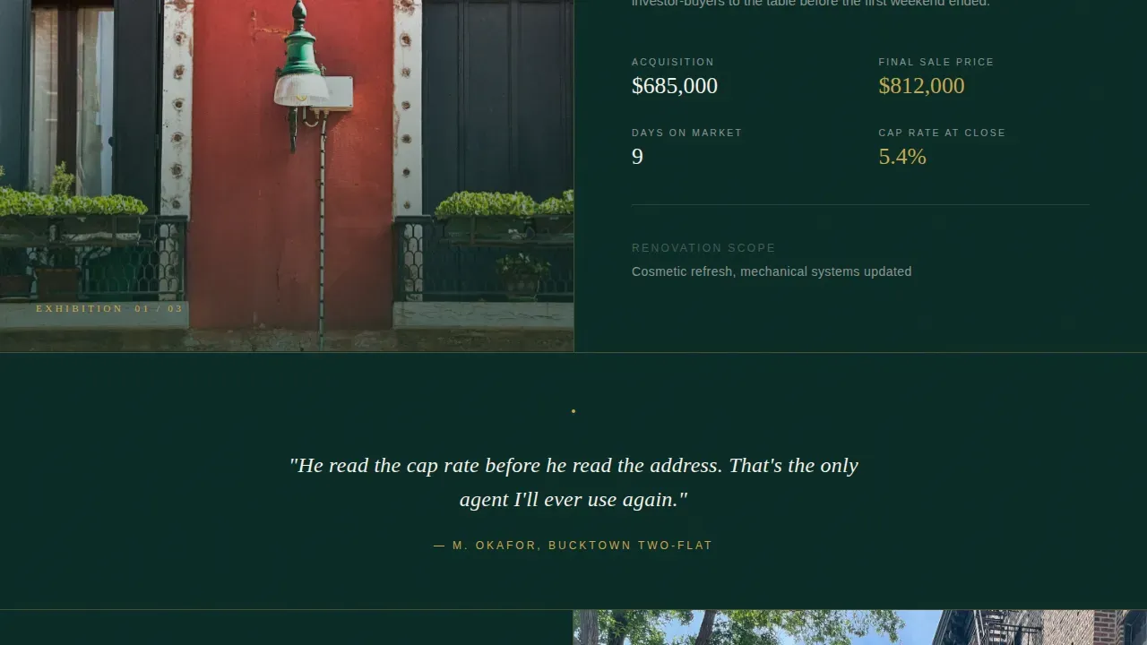
Gallery Walk Sold Property Showcase
The gallery section presents curated sold properties as exhibition pieces. Each split frame pairs a full-bleed exterior or interior photograph on one side with the deal narrative on the other, acquisition price, renovation scope, days on market, final sale price, and cap rate at close. The scroll moves like walking through a gallery of completed transactions. As a first example of how to surface financial credibility without a pitch, this section does more than property listings typically offer.
Full-Panel Testimonial Walls
Between each sold property frame, single-line seller testimonials appear centered on full emerald panels. These function like wall text beside a painting in a gallery, brief, authoritative, and placed where the reader is already paying attention. Client testimonials displayed in this format build credibility with high-net-worth visitors before they reach the lead capture form. Trust signals presented this way can raise conversion rates significantly for potential sellers who are evaluating multiple agents.
Final Valuation Request with Lead Capture Form
After the fifth assessment question, the primary call to action appears: "Get My Building's Valuation" in antique gold on deep emerald. The lead capture form requests only name, email, and phone number, the minimum key details needed to open a valuation conversation. Minimal fields in the capture form reduce friction for potential clients. A secondary call to action, rendered in small alabaster text, reads "Just want to talk? Call me directly" and is anchored to the bottom right of every section.
Persistent Secondary Call to Action
Every section of this landing page carries a low-friction exit ramp. The secondary call to action link stays anchored in the bottom right corner throughout the scroll, giving visitors who are ready to act immediately a way to reach out without completing the full quiz. This approach keeps potential buyers and sellers engaged without forcing a single path to conversion.
Page sections overview
| Section | Purpose |
|---|---|
| Split-Screen Hero | Address entry, immediate intent qualification |
| Gallery Walk | Sold property narratives with deal metrics |
| Testimonial Panels | Full-emerald social proof between gallery frames |
| Assessment Funnel | Five-step progressive seller qualification |
| Valuation Request | Lead capture form and primary call to action |
| Linear Footer | Contact info, navigation, branding close |
Design & branding system
The visual identity follows a Luxe Minimal theme that reads like a private equity prospectus printed on heavyweight cotton stock. Typography pairs Fraunces, a high-contrast serif display face, with DM Sans for all body and user interface text. The palette is restrained and intentional, every color serves a function.
- Deep emerald black (#0B2B26) dominates as the background across all sections; muted jade (#1A4D2E) is used for secondary panels and hover states; antique gold (#C9A84C) appears only on accent lines, progress bars, and call to action buttons; warm alabaster (#F5F0E8) is used for all body text and form fields
- Professional photos occupy full-bleed left panels throughout the gallery walk, with high-contrast dusk photography setting the tone in the hero section
- Typography stays minimal across all deal narrative panels, letting the numbers and photographs carry the argument, this is the high impact visuals approach applied to financial storytelling
Mobile & speed optimization
The template is built desktop-first, reflecting the reality that the investor and operator audience skews heavily toward desktop sessions. However, the design includes a solid mobile fallback to ensure the landing page remains usable and readable on smartphones. Mobile optimization matters even for a desktop-primary audience, since a meaningful portion of real estate searches begin on mobile devices.
- The split-screen layout adapts to a stacked single-column view on smaller screens, preserving the visual hierarchy of photograph above narrative and question above answer
- The five-step assessment funnel is isolated as a static-first component with client interactivity contained, so the page loads quickly before the quiz activates, this supports fast load performance that keeps mobile visitors from dropping off
- Mobile responsiveness across the testimonial panels and footer is built in, so the full-panel emerald quote sections stack cleanly without losing their gallery-wall character
How this template helps you convert
A well-crafted landing page earns trust before it asks for anything. This template is structured so that every scroll deepens the visitor's confidence in the agent's expertise and sharpens their understanding of what they own. The primary goal at every stage is to move a sophisticated operator one step closer to booking a valuation call.
- The address-entry hero filters out casual visitors immediately, only someone who owns or manages a multi-family property will type their building's address into a search field, which means the lead generation process starts with a self-qualified visitor before the first question is asked
- The gallery walk section uses real deal metrics, days on market, cap rate at close, final sale price, to demonstrate market knowledge and build credibility with potential sellers who evaluate agents the same way they evaluate assets
- The five-step assessment funnel earns the opt in by making the seller feel understood rather than processed, and the final lead capture form requests only name, email, and phone so that friction is minimal and conversion rates stay high
Other information about this template
This template sits within a broader context of real estate landing page templates designed for high-intent, niche-specific use cases. Understanding where it fits in the landscape helps agents and real estate developers make an informed decision about whether it is the right platform for their needs.
- The landing page is built around a unique value proposition: a hyper-specialized multi-family seller's agent who reads cap rates before open house signs go up, this is a value proposition that general real estate landing page templates cannot replicate without significant custom work
- The template can support campaigns driven by google ads targeting local multi-family sellers, making it a strong fit for real estate marketing efforts that need a landing page with a clear, single conversion goal rather than a full home page experience
- The design does not rely on countdown timers or urgency tactics; instead, it uses the gallery walk and deal narrative sequence to create a sense of gravity and expertise that drives conversions organically
- A new landing page built from this template can be dropped into any existing real estate business workflow as a standalone destination, it functions independently of a broader website and is a great example of a landing page that focuses entirely on one desired action
- The template is part of a template library designed for the real estate industry, specifically for agents and real estate developers who serve the multi-family and duplex segment in urban markets
- Video testimonials, virtual tours, and videos related to real estate can be incorporated into the gallery walk panels in place of or alongside still photography, the split-screen format accommodates rich media on either side
- The opendoor landing page model popularized instant home valuation as a concept; this template applies that same instant home valuation logic but frames it for multi-family operators who expect analytical depth alongside the data analytics that drive their decisions
- Using this template as your opendoor landing page alternative means your real estate leads arrive pre-qualified with unit count, occupancy, and rent roll data already captured, giving you key information before the first conversation
- The second example of a high-performing real estate landing page in this niche would typically address portfolio investors; this template serves both that audience and the accidental landlord segment simultaneously, making it a rare dual-purpose asset in the real estate industry
- For agents who want to create landing pages that feel as premium as the properties they sell, this template removes the need to build a custom design from scratch, it is a free resource you can adapt to your market, your photography, and your sold inventory


Theme
Luxe Minimal
Creative direction
Gallery Walk
Color system
Dark Emerald
Direction
Quiz/Assessment
Page Sections
Split-screen Hero with Address Search
Five-step Progressive Seller Assessment
Gallery Walk Deal Narrative Showcase
Full-panel Seller Testimonial Walls
Minimal Lead Capture Form with Dual Call to Action
Luxe Minimal Visual and Typography System
Related questions
Who is this landing page template designed for?
Can I customize the sold property gallery with my own deals?
Does the five-step quiz capture enough information to qualify a seller?
What if a visitor does not want to complete the quiz?
Is this template suitable for paid advertising campaigns?


