Gourmet Cardiac Snacks Landing Page Template
The Crunch artisan low sodium snack brand landing page template is a warm, modular card grid landing page built for small-batch food brands in the low-salt snack space. It combines a UGC photo wall header, sensory card grid, stats trust bar, community grid, and a tasting event registration form into one intentional, scroll-worthy design that earns every click before asking for one.
by Rocket studio
Quick summary
This landing page template gives artisan low-sodium snack brands a beautiful home to tell their story and drive real event sign-ups. The design blends warm Japanese Zen aesthetics with modular card sections that let honest ingredients, real community moments, and whole-food flavor speak for themselves. Every section builds trust so visitors feel ready to act before the call to action appears.
Who this template is for
This template is crafted for small-batch food brands that take salt seriously and sodium levels personally. If your products live on the better-for-you shelf and your customers read every label before dropping a bag in their cart, this design was made for you.
- Low-sodium snack brands hosting virtual tasting events and wanting pre-registered attendees
- Artisan food founders who sell direct-to-consumer and need pages that convert browsers into buyers
- Health-focused food entrepreneurs whose family of customers includes post-diagnosis snackers, new parents, and wellness regulars
What problem this template solves
Most food brand pages feel like a cluttered grocery store aisle. There is too much noise, too little warmth, and nothing that makes a visitor slow down and taste with their eyes first. This template solves the layout problem that keeps snack brands from turning curious scrollers into loyal customers.
- Visitors leave before the call to action because pages feel impersonal and loud
- Low-sodium products struggle to communicate flavor depth without a visual story backing them up
- Event registration pages often feel disconnected from the brand world they represent
What you get with this template
You get a complete, single-page landing page set up to showcase your snacks and fill your tasting event. Every section is thoughtfully ordered so the design earns trust before it asks for anything.
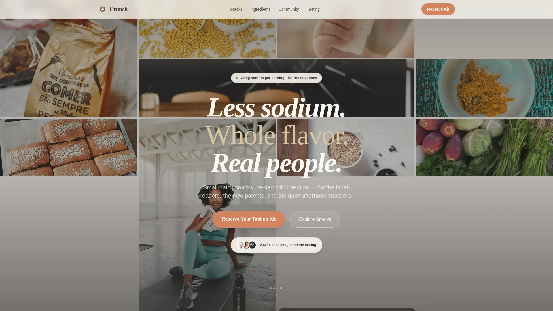
- A UGC photo wall hero with staggered tile fade-in and a handwritten-style headline overlay
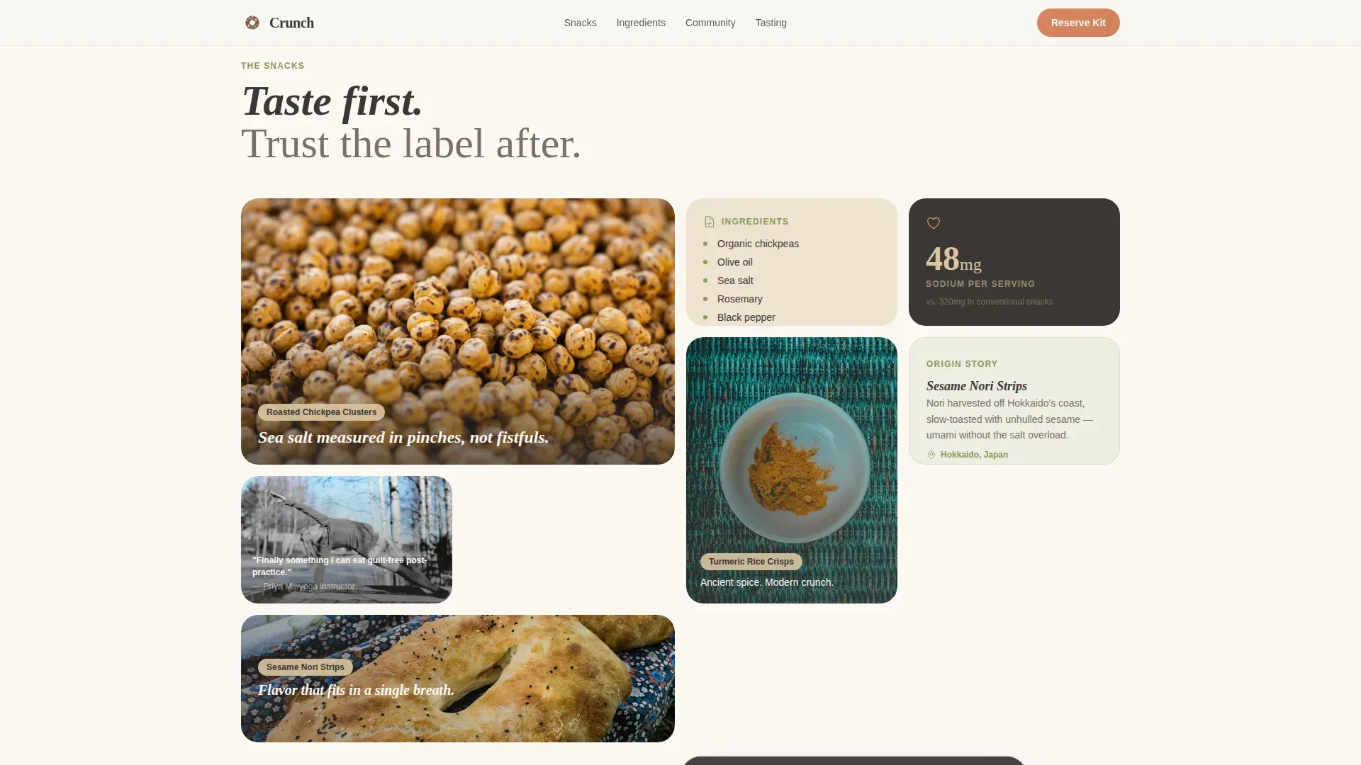
- A six-card modular grid where each card is a small sensory world of macro food photography, ingredient origin stories, and customer moments
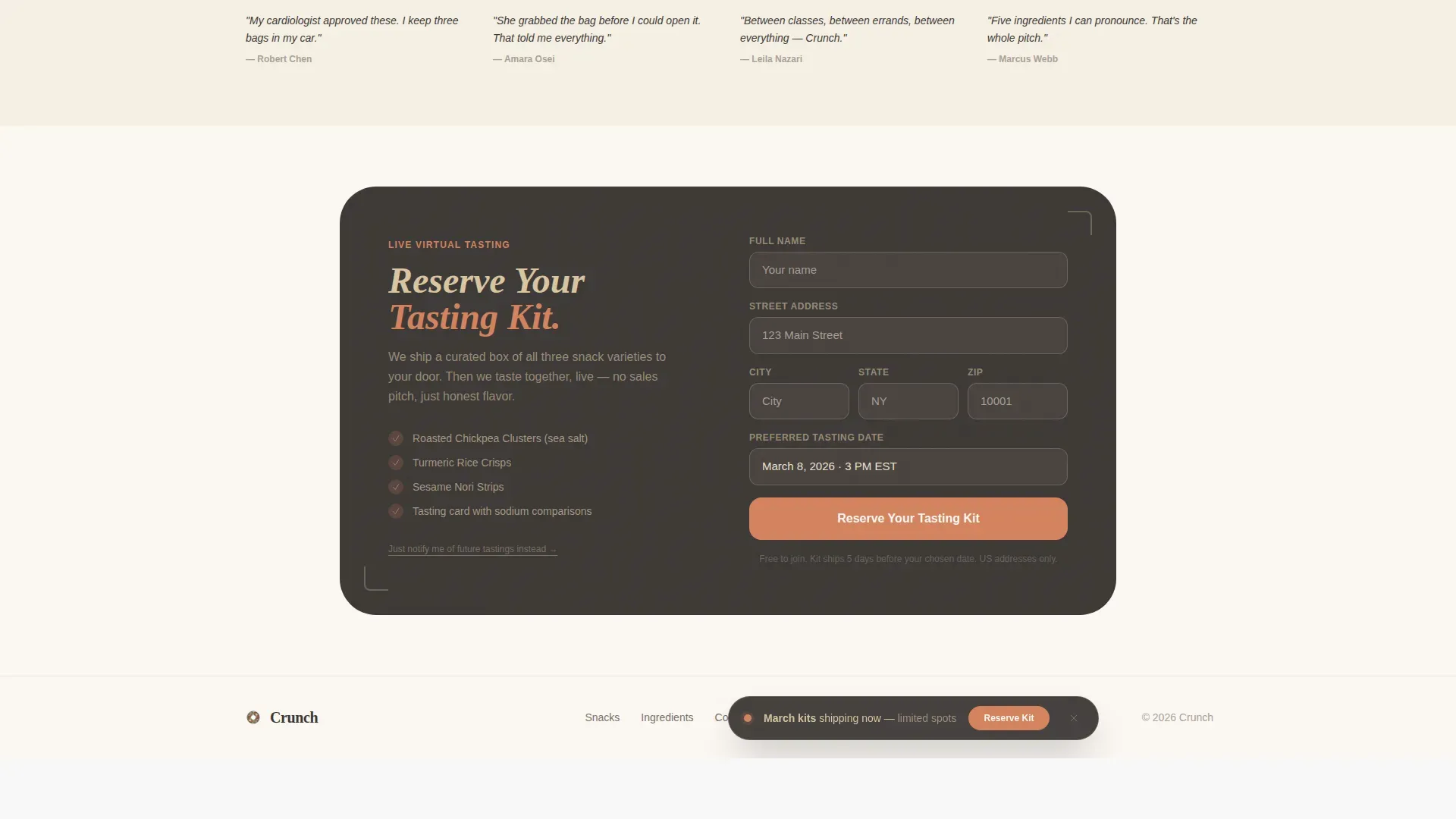
- A full-width tasting event registration card with a name field, shipping address input, and a date picker, plus a secondary email-only path for future-event notifications
Feature list
This template ships with a focused set of design and layout features. Each one is built around the needs of a health-conscious food brand selling snack products through experience and community trust.
UGC Photo Wall Header
The hero section opens as a living mosaic of real customer snapshots. Images fade in at staggered intervals before a handwritten-style headline settles over the center. The result feels pulled from someone's camera roll, not a studio shoot, which is exactly the kind of honest, family-feel social proof that builds trust fast.
Modular Sensory Card Grid
Six cards form the beating heart of this landing page. Each card becomes its own small world: one zooms into a macro shot of turmeric dusting a crisp, another shows sesame seeds in a warm pan, another presents an ingredient list so short it fits in a single breath. Cards alternate between snack photography, ingredient origin stories, and customer moments.
Stats Trust Bar
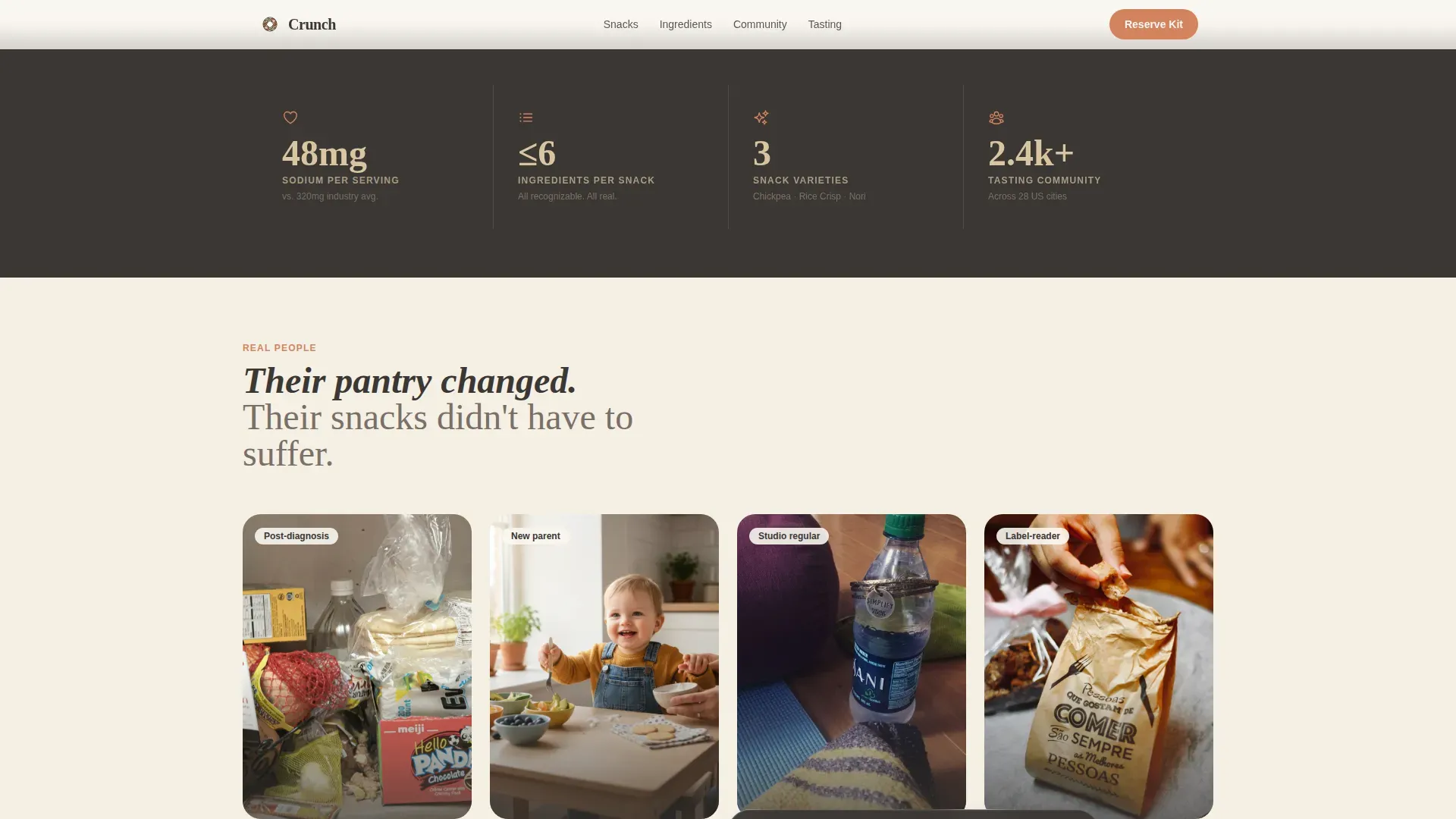
A dedicated section surfaces the numbers that matter most to label-checking customers. Sodium figures, ingredient counts, snack varieties, and community size all appear here in a clean format that lets the food products speak with clarity and confidence.
Floating and Full-Width calls to action
The primary call to action, "Reserve Your Tasting Kit," appears first as a floating bottom bar triggered after two scroll depths. It then returns as a full-width card near the bottom of the page. This two-stage approach means the design earns the click before it asks for it.
Community Photo Grid
A staggered grid of real-person moments with persona labels brings the audience to life. Customers who love these snacks at home, on a hiking trail, and at a desk all appear here, turning product pages into something that feels more like a curated market stall.
Event Registration Form
The tasting event section collects a name, a shipping address for the sample box, and a preferred date from a short calendar picker. A secondary path lets visitors enter their email alone to stay informed about future tastings, so no interested visitor leaves the site empty-handed.
Page sections overview
| Section | Purpose |
|---|---|
| UGC Photo Wall Hero | Opens with staggered customer snapshots and a headline |
| Modular Card Grid | Six sensory cards covering flavor, ingredients, and community |
| Stats Trust Bar | Displays sodium numbers, ingredient counts, and snack variety totals |
| Community Photo Grid | Staggered real-person moments with persona labels |
| Tasting Event Registration | Full-width form card plus secondary email notification path |
| Footer Linear Row | Single-row footer with essential brand links |
Design & branding system
The design follows a Warm Artisan theme rooted in Japanese Zen restraint. Every color choice and type pairing reflects the feeling of holding a handmade pottery bowl with a single perfect snack inside. Nothing crowds; everything breathes.
- Color palette: unglazed ceramic beige (#D9C5A0) as the base, roasted sesame charcoal (#3B3735) for text, matcha-dust green (#8A9A5B) for accents, and soft persimmon (#D4845F) for buttons and hover states
- Typography: Fraunces serif for headlines and DM Sans for body copy, a pairing that balances warmth with legibility
- Scroll-triggered card reveals and card hover zoom keep the design interactive without overwhelming visitors checking the page for the first time
Mobile & speed optimization
The template is built mobile-first, which matters because this brand's family of customers shops on phones at grocery stores and between meals. A fast loading experience is not optional when your audience is snacking and scrolling at the same time.
- Images use lazy loading so the initial page load stays light and does not punish visitors on slower connections
- CSS scroll behavior is native, reducing script weight and keeping animation smooth on mobile devices
- The floating call-to-action bar is sized and positioned for thumb-friendly tapping on small screens
How this template helps you convert
This landing page does not rush the sale. It builds a sensory case for the food products first, then presents the offer at the exact moment trust is highest. The result is a page that feels warm and intentional rather than pushy.
- The UGC photo wall and card grid use real customer moments and honest ingredients to build emotional credibility before any call to action appears, so visitors are already invested in the brand by the time they start checking the registration form.
- The floating call to action bar activates only after two scroll depths, meaning visitors have already explored the snack world and tasted it with their eyes, making the "Reserve Your Tasting Kit" prompt feel like a natural next step rather than an interruption.
- The secondary email path inside the registration section captures visitors who love the products but are not ready to commit to a date, turning passive browsers into a warm future audience and supporting longer-term sales without pressure.
Other information about this template
This template is a strong fit for brands that share the values seen across the artisan snack market today. Consumers are increasingly seeking healthier snack options made with natural ingredients, and the artisan snack industry continues to grow as people prioritize real flavor and honest food experiences. The design supports that story at every scroll depth.
- Trust badges for certifications such as "Non-GMO," "Organic," and "Low Sodium" can be added to the floating trust badge row in the hero, giving label-checking customers the quick visual confirmation they need when first landing on the site
- The card grid format naturally supports a "Build Your Own Bundle" style product narrative, letting you sequence your snack products and flavor descriptions in a way that encourages visitors to explore the full range
- Brands like Wild West Snack Co. demonstrate how a family-owned business built around handcrafted snacks and honest ingredients can use bold flavor storytelling to create an emotional connection with customers, and this template provides the design scaffolding to do exactly that on one focused page
- The brand story section within the card grid can reference artisan origins and traditional production methods, which helps position your products as higher quality in a crowded market and gives sharing-friendly content for posts on platforms like Facebook
- Leadfeeder is noted as a digital marketing best practice in 2026, and the registration form on this template generates a direct first-party list of interested customers, which pairs well with visitor identification tools used by food brands at that level
Theme
Warm Artisan
Creative direction
Immersive Visual
Color system
Japanese Zen
Style
Card Grid (Modular)
Direction
Event Registration
Page Sections
UGC Photo Wall with Staggered Fade-in
Six-card Modular Sensory Grid
Stats Trust Bar for Sodium and Ingredients
Scroll-triggered Floating Call to Action Bar
Two-path Event Registration Section
Community Photo Grid with Persona Labels
Related questions
Can I customize the snack product descriptions and card content?
Does the registration form support a secondary email sign-up path?
Is this template suitable for a small artisan snack brand with a limited product range?
Can I use my own customer photos in the UGC photo wall?
What call-to-action options does this template include?



