Snack Box Marketplace Landing Page Template
Munch is a masonry-grid landing page template built for snack box marketplaces. It pairs a Dopamine Pop color system with a Pinterest-style browsing layout, letting shoppers search, filter, and "Add to Crate" across curated, single-snack, and community-built boxes. The design feels like tearing into a mystery package, vivid, impulsive, and impossible to stop scrolling.
by Rocket studio
Quick summary
Munch is a single-page snack marketplace landing page template built around an oversize search bar, a masonry product grid, and a floating crate mechanic. It targets snack box sellers sourcing from sixty-plus countries. The Dopamine Pop palette keeps every card vivid and shopable, while three browsing tiers guide visitors from curated boxes to single snacks to community picks.
Who this template is for
This template is built for food founders and snack entrepreneurs who need a storefront that matches the energy of their product. It works especially well for sellers who want browsing to feel like discovery rather than shopping.
- Snack box brands curating international or themed assortments for subscription or one-time purchase
- Direct-to-consumer food sellers who want a multi-product grid with filtering and a cart-building mechanic
- Office culture or gifting brands replacing tired snack bowls with globally sourced, curated boxes
What problem this template solves
Most food e-commerce templates feel like a catalog. They show a product, list a price, and wait. Snack box selling is fundamentally different, the excitement is in the variety and the discovery. A flat grid with no hierarchy kills that excitement before the visitor scrolls twice.
- Visitors land on a generic storefront and feel no pull to keep exploring
- Sellers cannot surface curated picks, bestsellers, and new drops in the same visual space without it looking cluttered
- There is no low-commitment path between "browsing" and "buying," so potential customers leave before they build intent
What you get with this template
This template ships as a fully designed, single-page layout ready to adapt to your snack brand. Every section is built around the specific needs of a multi-product food marketplace.
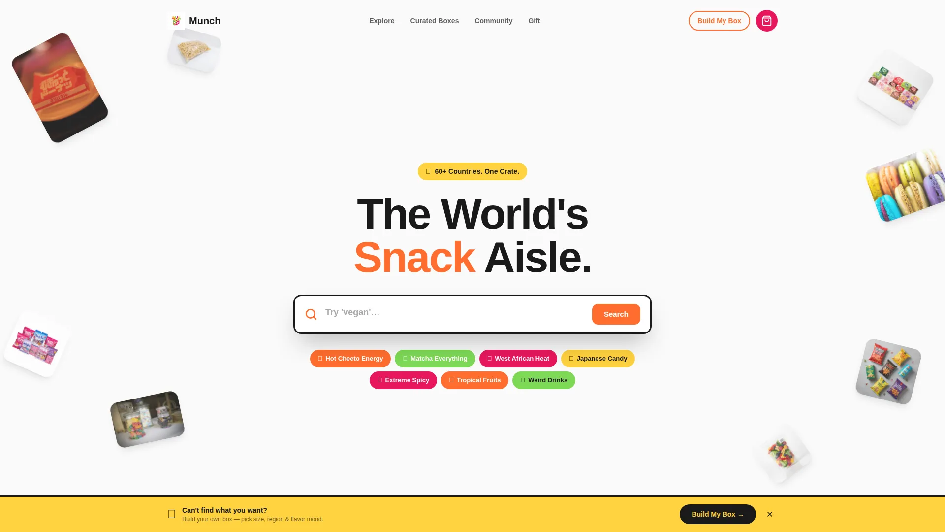
- An oversize, centered search bar with rotating ghost text that immediately invites exploration
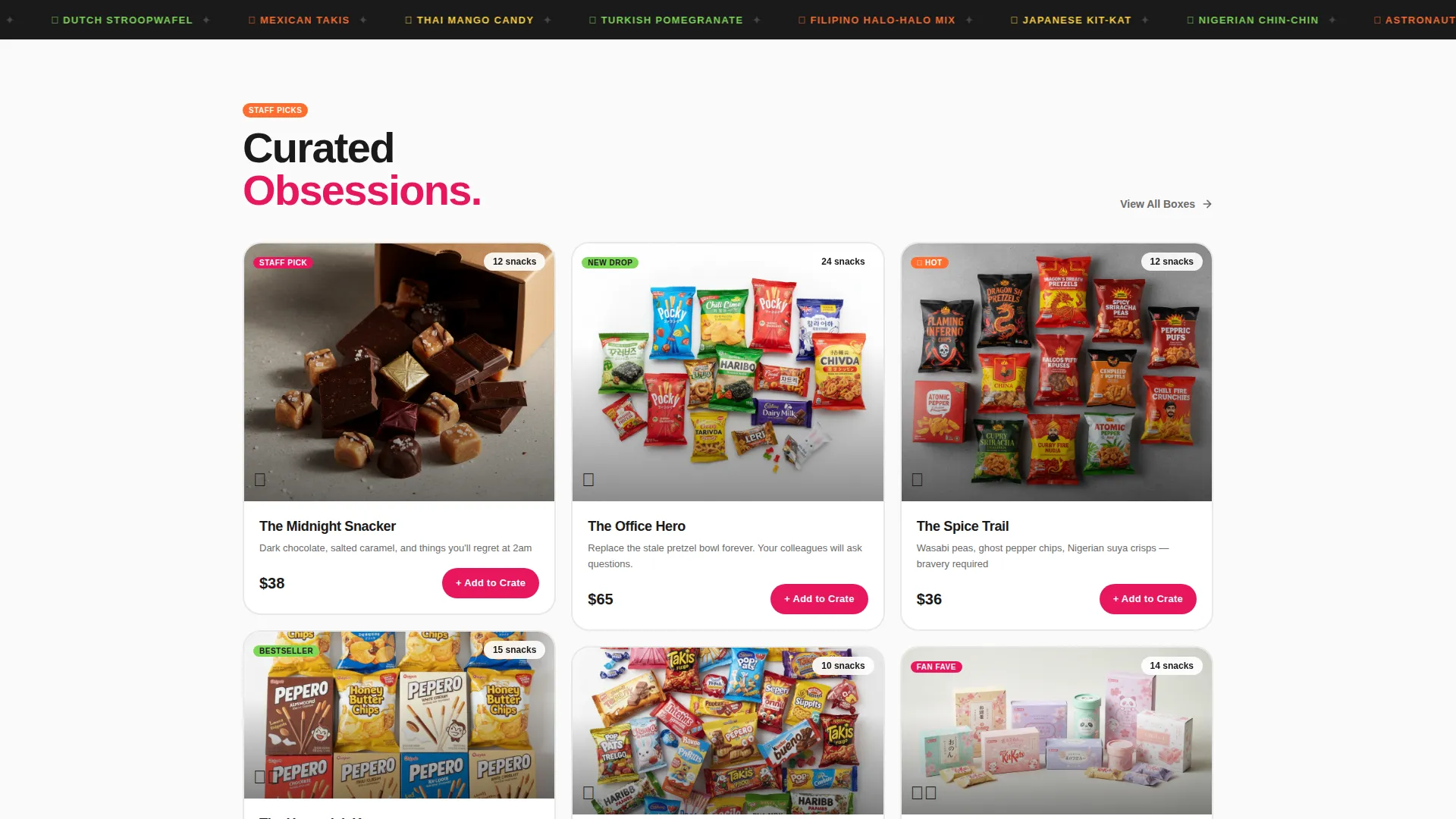
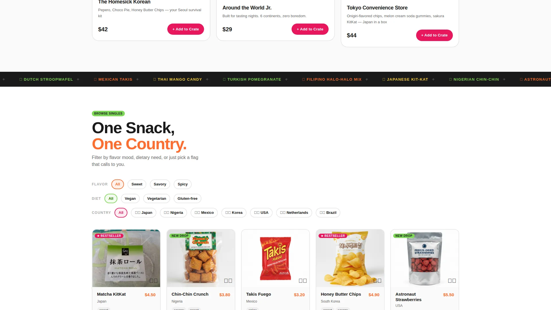
- A three-tier masonry grid covering staff picks, filterable single snacks, and community-curated boxes
- A floating crate icon, "Add to Crate" card actions, and a "Build Your Own Box" sticky banner with a step-by-step picker
Feature list
This template packs several purpose-built components that work together to turn browsing into buying.
Masonry Product Grid with Three Tiers
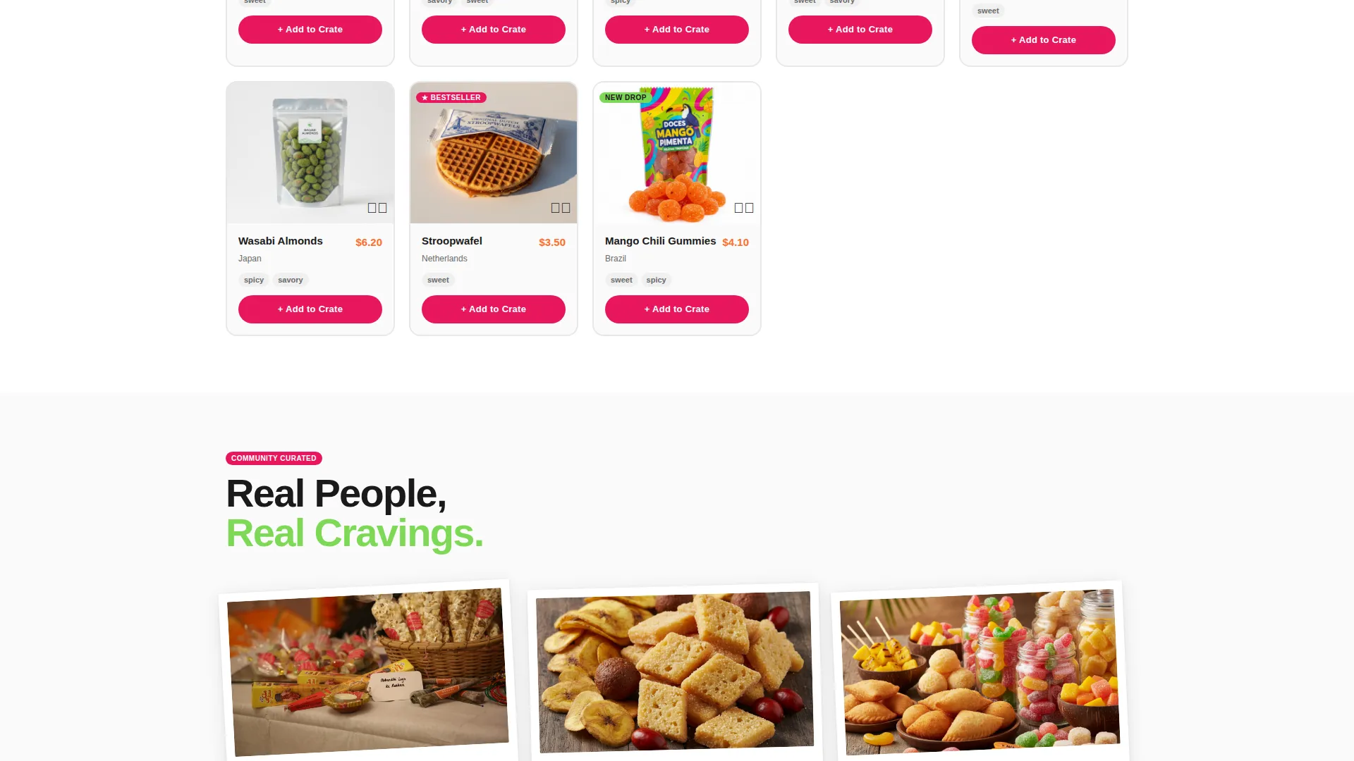
The layout uses an intentionally uneven masonry grid across three distinct browsing depths. The first tier shows themed staff-picked boxes at varied card heights. The second tier offers filterable single-snack cards. The third tier surfaces community-curated boxes with upvote counts and Polaroid-style taster reviews.
Oversize Search Bar with Rotating Ghost Text
The header leads with a large, rounded search field rather than a hero headline. Ghost text cycles through prompts like "Try 'mochi'... Try 'spicy'... Try 'Brazil'" to signal the breadth of inventory and invite immediate interaction.
Trending Pill Tags Below Search
A row of pill-shaped, clickable category tags sits directly below the search bar. Each pill uses a different Dopamine Pop accent color and carries an emoji label such as "West African Heat" or "Matcha Everything" for instant flavor-mood navigation.
Floating Crate with Live Item Count
A persistent floating crate icon lives in the bottom-right corner. Every "Add to Crate" action triggers a jiggle micro-animation and updates the item count, making the cart feel alive and encouraging continued collecting.
Build Your Own Box Sticky Banner
After three scroll-depths, a sticky banner slides up offering a "Build Your Own Box" path. The picker walks visitors through box size (6, 12, or 24 snacks), region selection, and flavor mood before checkout, converting browsers who want control.
Filter-Driven Single Snack Cards
The second browsing tier lets visitors filter by country flag, flavor profile, and dietary tag. Cards re-tile with each filter tap, keeping the grid fresh and helping niche seekers, from vegan snackers to heat lovers, find exactly what they want.
Page sections overview
| Section | Purpose |
|---|---|
| Search Header | Primary entry point with oversize search bar and rotating ghost text |
| Trending Pill Tags | Quick-access flavor and category navigation below search |
| Staff Picks Grid | Three-column masonry tier for curated themed boxes |
| Single Snack Browser | Filterable grid by country, flavor profile, and dietary tag |
| Community Boxes | Upvoted, review-pinned Polaroid-style community-curated picks |
| Floating Crate Icon | Persistent cart builder with live count and jiggle animation |
| Build Your Own Banner | Sticky step-by-step box picker sliding up after scroll depth |
Design & branding system
The visual identity runs on a Dopamine Pop color system built for maximum shelf impact. Every color has a specific functional role, keeping the grid energetic without becoming chaotic.
- Electric tangerine (#FF6D2E) and gummy-bear magenta (#E8175D) rotate as category accent tags and primary call-to-action colors; sour-apple green (#7ED957) marks bestsellers and new-drop badges
- Yolk yellow (#FFD23F) activates on hover states and add-to-cart micro-animations, creating a tactile sense of response
- A milk-carton white (#FAFAFA) background grounds the entire grid, letting product photography punch without visual noise
Mobile & speed optimization
The masonry grid is designed to reflow cleanly as viewport width changes, keeping the browsing experience intact on smaller screens.
- Card columns collapse gracefully on mobile so the uneven-height masonry effect reads well without horizontal scrolling
- Pill tags and the sticky "Build Your Own Box" banner remain thumb-accessible at the bottom of the viewport on mobile layouts
- The floating crate icon stays anchored to the bottom-right corner across all screen sizes for consistent cart access
How this template helps you convert
The template layers multiple conversion mechanics so that visitors move from casual browsing to active collecting without feeling pressured.
- The search bar and trending pill tags give instant direction, reducing the paralysis of an open-ended product catalog and pulling visitors deeper into the grid within seconds of landing.
- The "Add to Crate" mechanic on every card lowers commitment, visitors build a crate before they consciously decide to buy, turning passive browsing into active selection.
- The "Build Your Own Box" sticky banner captures visitors who want control by offering a structured picker that surfaces after enough scroll depth to indicate genuine interest.
Other information about this template
This template is a single-page layout optimized for the subscription box and direct-to-consumer food retail market. It is part of the Retail and E-Commerce category on the platform.
- The template is tagged under the Subscription Box and D2C subcategory, making it easy to find alongside complementary storefront layouts
- The Marketplace Grid theme and Dopamine Pop color system are designed as a cohesive visual package that can be recolored to match an existing brand identity
- Snack box sellers, food gifting brands, and international pantry curators will find the multi-tier browsing structure especially relevant to their catalog depth
- The controlled-explosion top-down photography style referenced in the brief works directly with the milk-carton white background to make every product image feel editorial
Theme
Soft Gradient
Creative direction
Seasonal/Moment
Color system
Ink & Paper
Style
Bento Grid
Direction
Quiz/Assessment
Page Sections
Masonry Grid with Three Browsing Tiers
Oversize Search Bar with Rotating Ghost Text
Trending Pill Tags for Quick Navigation
Floating Crate with Jiggle Animation
Build Your Own Box Sticky Banner
Filter-driven Single Snack Cards
Related questions
Can I use this template for a subscription box model as well as one-time purchases?
How many product tiers does the masonry grid include?
Can the Dopamine Pop color palette be changed to match my existing brand?
Is the masonry layout suitable for a large product catalog?
What is the 'Build Your Own Box' picker and how does it work?



