Snack Subscription Landing Page Template
Munch is a landing page template built for artisan snack subscription brands. It pairs a price-anchored header, a modular card grid discovery feed, and a five-step personalization quiz into one scroll-friendly layout. The warm lavender and deep plum color system makes every snack card feel like a market-stall find, while magenta countdown timers and bold call-to-action buttons push visitors toward checkout with real urgency.
by Rocket studio
Quick summary
Munch is a single-page landing page template designed for snack subscription boxes. It opens with oversized pricing tiers and a live flash-deal countdown, then flows into a browsable card grid where every snack tells its own origin story. A built-in five-question quiz helps visitors build a personalized box before they ever reach checkout.
Who this template is for
This template is built for founders and marketers running small-batch or artisan food subscription brands. It works especially well if your product has a story worth telling and a community worth building.
- Snack subscription brands selling direct-to-consumer, including gift-box operations and limited-edition drop models
- Food entrepreneurs who want a discovery-style layout that shows off product variety without overwhelming visitors
- Gift-focused sellers targeting remote workers, adventurous eaters, and buyers who want something more personal than a standard retail option
What problem this template solves
Generic e-commerce templates flatten the experience of discovering unusual, small-batch food products. A bag of black garlic cashews or a jar of miso caramel corn deserves more than a plain product photo and a price tag. Visitors need to feel the thrill of finding something rare before they commit to a subscription.
- Commodity-style layouts fail to communicate artisan provenance, flavor personality, or the scarcity that makes limited drops feel worth buying now
- Standard checkout flows skip personalization, leaving visitors unsure whether the box is right for their taste or dietary needs
- Flat, static pages cannot recreate the wandering, browsing energy that makes an open-air food market so compelling
What you get with this template
The template ships as a fully structured, modular landing page with every major section pre-built and ready for your content. Every visual element references the source brief, so you are customizing, not constructing from scratch.
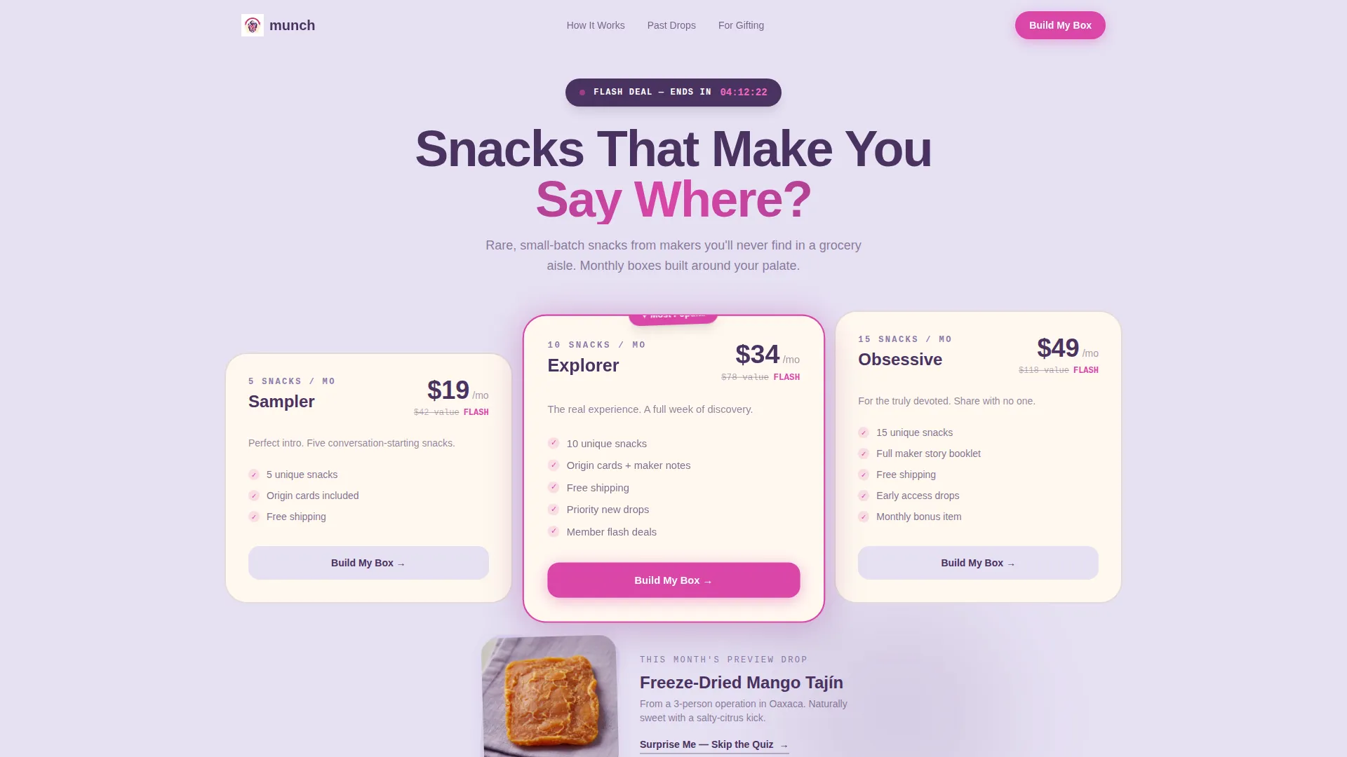
- A price-anchored header section with three subscription tier cards, a highlighted mid-tier badge, a live countdown timer, and a struck-through retail value comparison
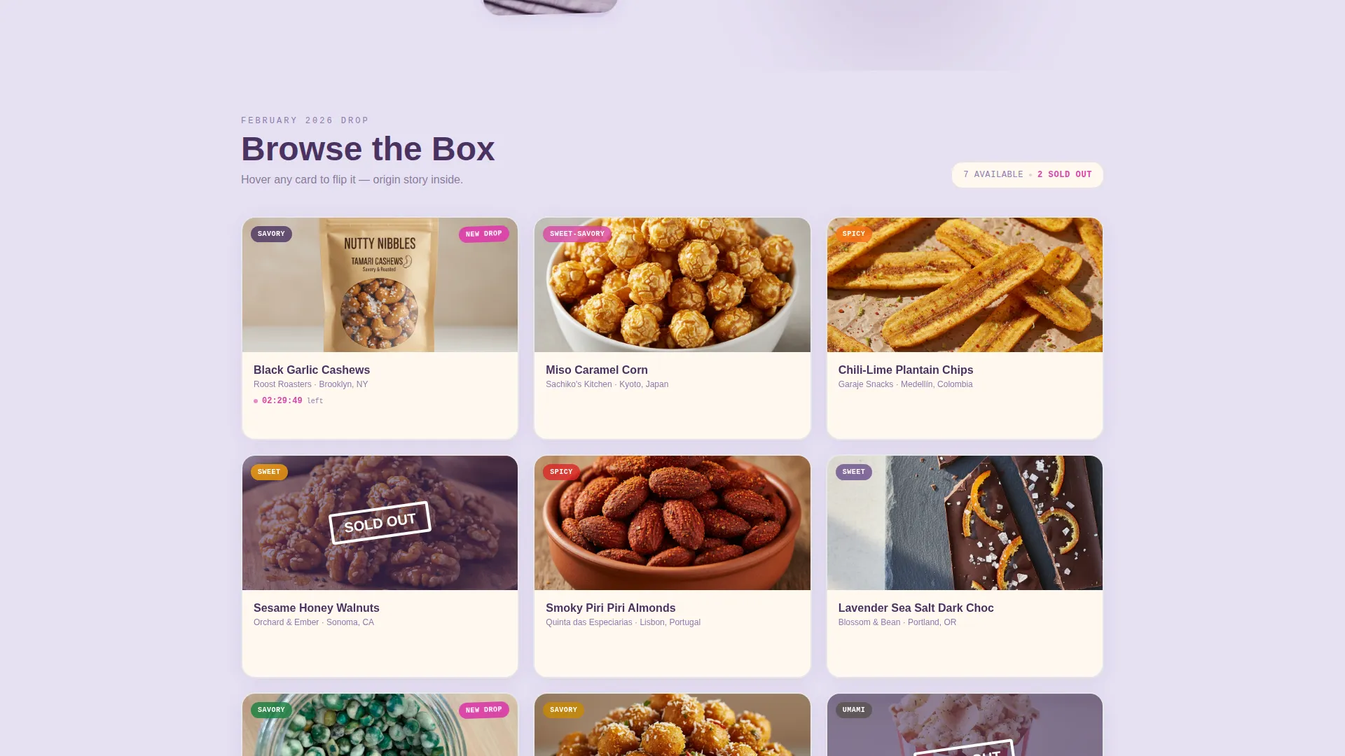
- A scrollable snack card grid with flip-on-hover cards, origin story copy, flavor profile text, heat-sweet-crunch rating meters, "Just Added" banners, and "Sold Out" scarcity badges
- A five-question snack profile quiz flow that generates a personalized box preview, plus a "Surprise Me" bypass path that routes visitors straight to a curated checkout
Feature list
This section describes the core built-in components that make Munch work as a high-converting snack subscription landing page.
Price-Anchored Tier Header
Three oversized subscription price cards sit at the top of the page. The middle tier is physically larger and carries a magenta "Most Popular" badge. A live countdown timer reading "Flash deal ends in 04:12:33" sits above the cards, while a struck-through retail value comparison ("$78 of snacks for $34") makes the deal math instantly clear.
Modular Snack Card Grid
The main scroll is a modular grid of snack cards. Each card flips on hover to reveal the snack's origin story, flavor profile, and a five-dot rating meter covering heat, sweetness, and crunch. The grid never feels static because timers pulse and scarcity badges update to reflect past drops.
"Just Added" Interrupt Banners
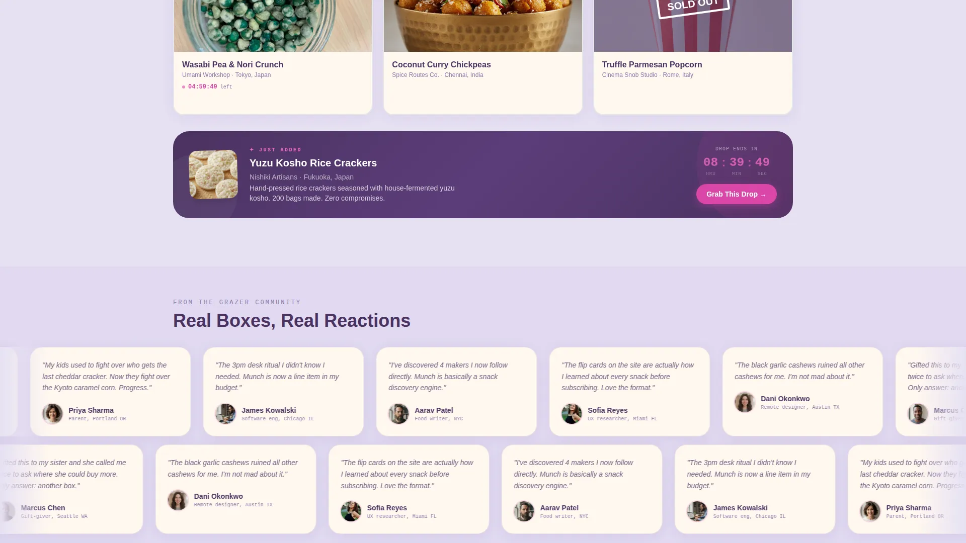
Every three rows of the card grid, a full-width "Just Added" banner breaks the scroll. It introduces a new limited-edition snack with its own micro-countdown, reinforcing that the catalogue is always moving and rewarding visitors who browse further.
Five-Question Personalization Quiz
The "Build My Box" call-to-action launches a guided quiz covering flavor lean, dietary filters, adventure level, box size, and whether the purchase is a gift or self-treat. Quiz results generate a personalized box preview with real product photos before requesting an email to lock in the flash deal price.
Sticky "Build My Box" Call-to-Action Bar
A persistent bottom bar keeps the primary call-to-action visible throughout the entire scroll. It means visitors never have to scroll back up to start building their box, reducing friction at every point in the browsing journey.
"Surprise Me" Express Checkout Path
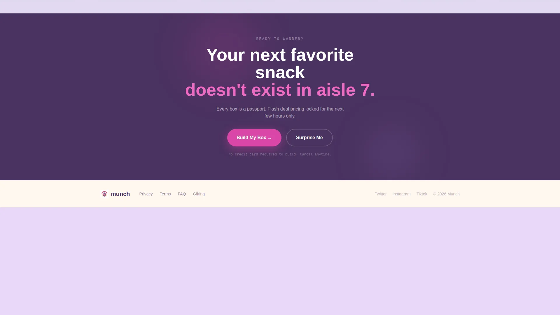
Visitors who prefer not to answer quiz questions can tap "Surprise Me" to skip directly to checkout with a pre-curated editor's pick box. This secondary path captures impulsive buyers and gift-givers who trust the brand's curation over their own selection.
Page sections overview
| Section | Purpose |
|---|---|
| Flash Deal Header | Anchors price comparison and urgency with countdown timer and tier cards |
| Pricing Tier Cards | Displays three subscription options with mid-tier highlighted as most popular |
| Sensory Snack Photo | Provides a product close-up that gives the pricing a tactile, real-world anchor |
| Snack Discovery Grid | Browses modular flip cards showing origin, flavor profile, and rating meters |
| Just Added Banners | Interrupts grid every three rows with limited-edition drops and micro-countdowns |
| Sold Out Badges | Signals real scarcity by marking past drops as unavailable within the grid |
| Build My Box Quiz | Guides visitors through five questions to generate a personalized box preview |
| Personalized Box Preview | Shows real product photos matched to quiz answers before email capture |
| Email Capture Gate | Locks in flash deal pricing after quiz completion with a single email field |
| Surprise Me Bypass | Routes non-quiz visitors directly to a curated editor's pick checkout |
| Sticky call to action Bar | Keeps the primary call-to-action visible at the bottom throughout the scroll |
Design & branding system
The visual identity follows a Directory and Discovery theme built around the Lavender Dream color system. Every color choice serves a purpose: soft tones create a welcoming browse experience, while the magenta accent cuts through as a clear action signal.
- Soft lavender mist (#E6E0F3) as the primary page background, deep plum (#4A3260) for headlines and card borders, and warm vanilla cream (#FFF8F0) for card face backgrounds
- Passionfruit magenta (#D946A8) reserved exclusively for countdown timers, call-to-action buttons, and the "Most Popular" badge, ensuring high visual contrast at every conversion moment
- The overall feel references tearing open a wax-paper bag of violet pastilles in a Parisian sweet shop: soft, a little indulgent, unexpected, and never childish
Mobile & speed optimization
The modular card grid is built to reflow cleanly on smaller screens. Flip interactions, countdown timers, and the sticky call-to-action bar are all designed with touch-first use in mind.
- Cards stack vertically on mobile so the flip interaction remains accessible via tap rather than requiring a hover gesture
- The sticky "Build My Box" bar and pulsing countdown timers retain their visual weight on smaller viewports, keeping urgency and action visible without cluttering the screen
- The quiz flow is structured as a single-column step sequence on mobile, reducing cognitive load and keeping the path to a personalized preview short and easy to complete
How this template helps you convert
Every structural decision in this template is aimed at moving a curious browser toward a committed subscriber. The layout earns trust through story, then applies urgency through scarcity, then removes friction through personalization.
- The price-anchored header does two jobs at once: it positions the deal value clearly and it creates immediate time pressure with the countdown timer, so visitors understand the offer before they scroll a single pixel.
- The discovery grid builds appetite through story. Flip cards showing a snack's city of origin and flavor rating turn passive scrolling into active exploration, making visitors feel they are finding something, not just shopping.
- The quiz-to-preview funnel earns the email address by delivering value first. Visitors receive a personalized box preview with real product photos before they are asked for anything, making the final step feel like a reward rather than a gate.
Other information about this template
This template sits within the Retail and E-Commerce category, specifically the Subscription Box and direct-to-consumer subcategory. It is designed for snack brands operating a drop model, a curated monthly cadence, or a gift-box offering.
- The template style is a modular card grid, which makes it straightforward to add, remove, or reorder snack cards as your catalogue grows or rotates with new drops
- The quiz component and the "Surprise Me" bypass path together serve two distinct buyer types in a single layout: the deliberate researcher and the impulsive gifter
- This landing page template is well suited for seasonal snack campaigns, limited-edition collaborations with small makers, and flash-sale events where urgency and discovery are equally important
Theme
Soft Gradient
Creative direction
Seasonal/Moment
Color system
Ink & Paper
Style
Bento Grid
Direction
Quiz/Assessment
Page Sections
Price-anchored Flash Deal Header
Flip-card Snack Discovery Grid
Just Added Interrupt Banners
Five-question Personalization Quiz
Sticky Call-to-action Bottom Bar
Surprise Me Express Checkout Path
Related questions
Can I edit the snack cards to match my own product catalogue?
Does the quiz actually generate a personalized box, or is it just a design element?
What if I do not want to use the countdown timer in my campaign?
Is this template suitable for a gift-box business rather than a self-subscription model?



