Snack Brand Landing Page Template, Bold Neighborhood Design
Munch is a bold, neighborhood-rooted snack brand landing page built around a flavor gallery and a click-through purchase flow. Real-neighborhood photography, a cinemagraph hero, and a sliding flavor detail panel put savory, crunchy snacks front and center. Every design choice, from cayenne-red calls to action to cumin-gold gallery frames, is built to make visitors reach for a bag.
by Rocket studio
Quick summary
The Munch bold neighborhood snack brand landing page template is a single-page, gallery-led experience for an indie snack brand with deep local roots. It pairs bold Neo-Retro design with a click-through structure built to move visitors toward purchase. Neighborhood photography, a cinemagraph hero, and a sliding flavor detail panel do the selling before a visitor ever reaches the button.
Who this template is for
This template is built for founders and designers working in the food and beverage space who need a page that feels as real as the snacks it represents. It suits a snack brand that started small, a garage, a bodega shelf, a barbershop counter, and is now ready to scale online.
- Independent snack business owners selling direct to consumers through an online shop
- Food and beverage designers creating pages for clients in the snack brand industry
- Emerging packaged food companies wanting to showcase bold flavors to an urban audience
What problem this template solves
Most snack brand pages feel clinical. They show a product on a white background and expect the food to speak for itself. That approach flattens personality and loses the audience before the page even loads.
- Visitors land without context, feel no connection to the brand, and leave without clicking
- Founders struggle to translate a rich neighborhood story into a page that converts
- Generic layouts fail to communicate what makes one snack brand different from its competitors
What you get with this template
You get a fully structured, single-page layout built around a flavor gallery and a clear click-through path. Every section is designed to build craving and trust before the call to action appears.
- A cinemagraph hero with a bold tagline, a neighborhood-context flavor gallery with click-open detail panels, and a sticky "Grab a Bag" call-to-action bar
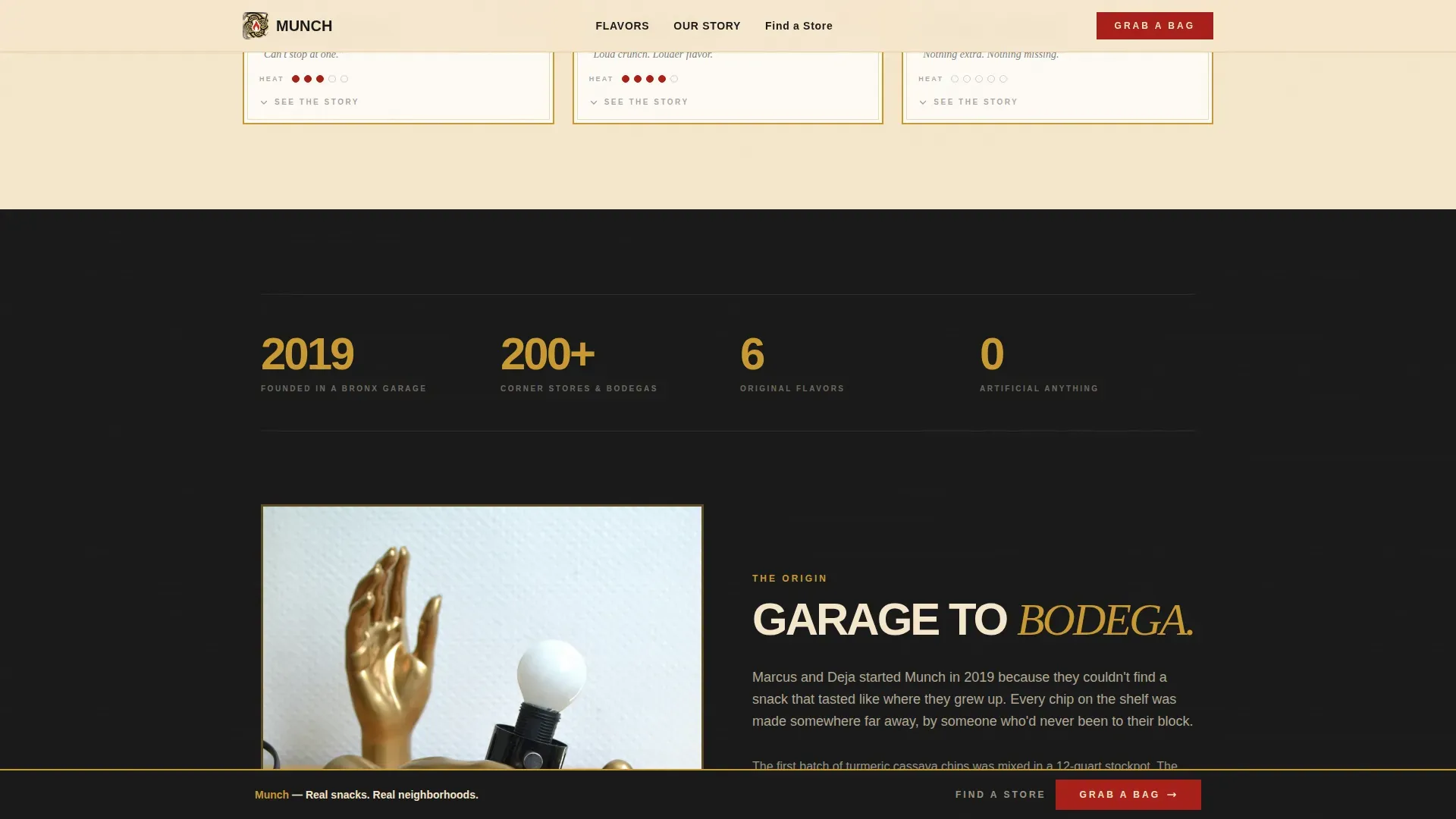
- A split-layout origin story section that carries the garage-to-bodega narrative with room for stats like retail location count
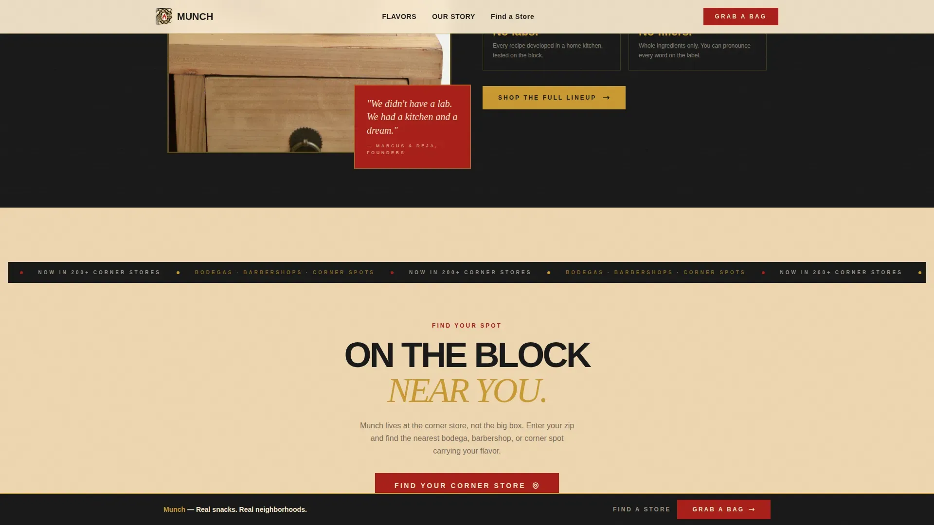
- A zip-code store finder modal so local customers can locate their nearest corner store
Feature list
The Munch landing page is built around several tightly integrated components. Each one serves the single goal of delivering a visitor from first impression to purchase with as little friction as possible.
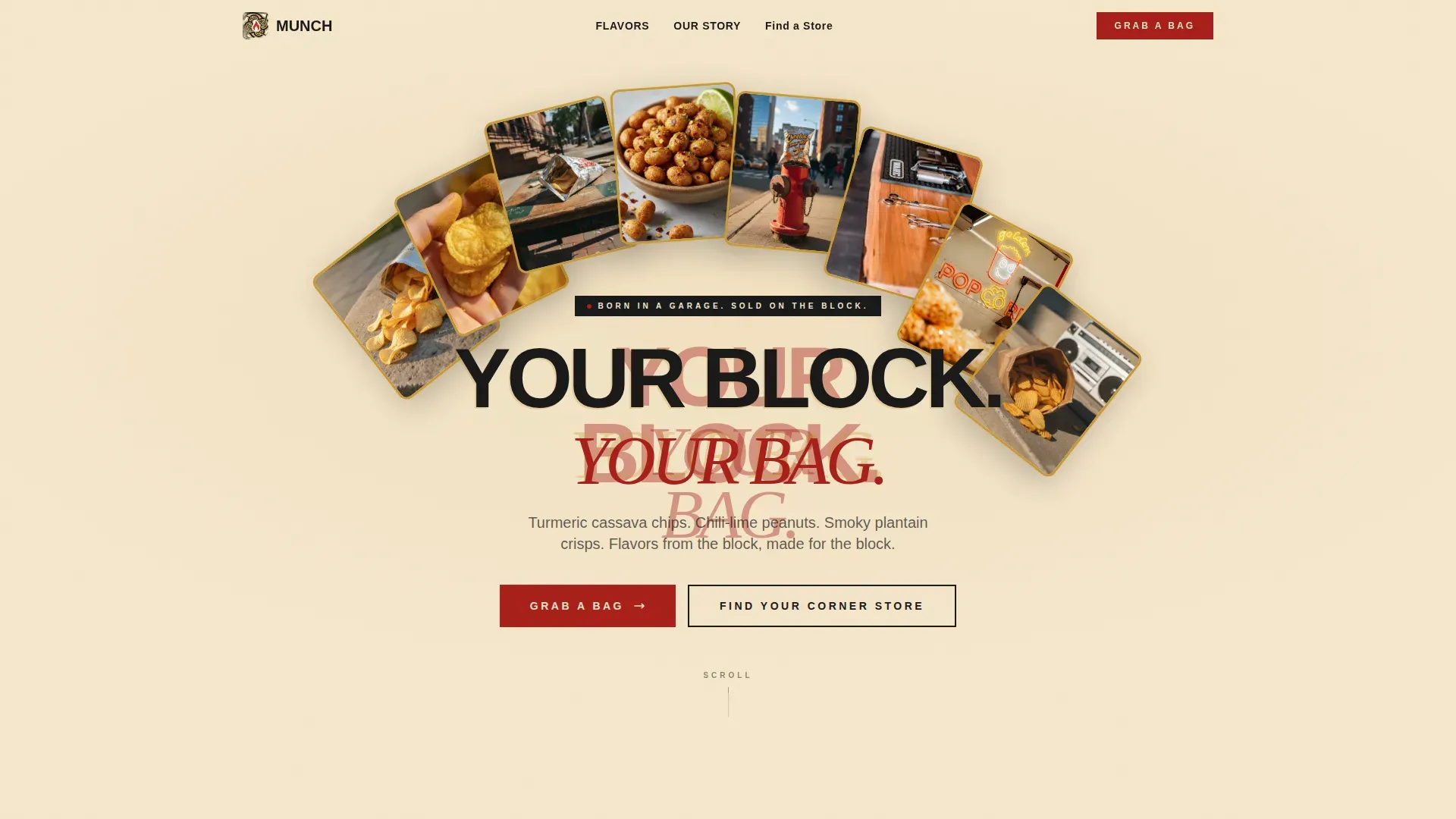
Cinemagraph Hero Section
The hero opens on a concrete stoop bathed in golden afternoon light. A bag of chips sits open, and one looping motion, a hand pulling a single chip, holds the viewer's attention. The bold tagline "Your Block. Your Bag." lands in slightly misregistered, blocky type. This still-meets-motion tension is one of the most effective tools for food and beverage marketing because it triggers a sensory response before a word is read.
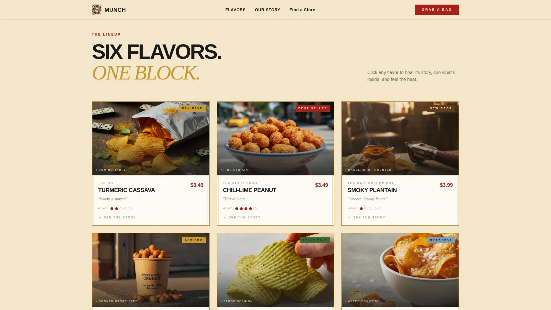
Neighborhood Flavor Gallery
Each gallery card features a different flavor photographed in a distinct neighborhood context: jalapeño lime chips on a domino table, smoky plantain chips beside a barber's clippers, honey-sriracha peanuts on a fire hydrant. Real-life, high-quality photos build authenticity and communicate the brand's personality far more effectively than generic stock images ever could. Using warm, vivid food photography aligns with proven color usage in branding, warm tones like red and gold are especially effective for food brands.
Sliding Flavor Detail Panel
Clicking any gallery card triggers a panel that slides open. Inside, users find the flavor story, a full ingredient list, and a heat-level meter rendered as a hand-drawn thermometer. This layout works to convert browsers into buyers by making each flavor feel personal and worth clicking through to the product page.
Sticky "Grab a Bag" Bar and Store Finder
After the third gallery card, a sticky bottom bar appears with the primary call to action in cayenne red. A secondary path, "Find Your Corner Store", opens a zip-code lookup modal so customers can locate neighborhood retailers. Both paths are large and tappable, following mobile-first design principles that are crucial for snack brand applications.
Origin Story Section
A split-layout section carries the garage-to-bodega narrative. It has room for social proof stats such as "now in 200+ corner stores." Bold visual storytelling here deepens trust and gives the brand a human face that competitors rarely match.
Page sections overview
| Section | Purpose |
|---|---|
| Cinemagraph Hero | Hook attention with looping motion and bold tagline |
| Flavor Gallery | Showcase neighborhood-context snack cards |
| Flavor Detail Panel | Slide open flavor story, ingredients, heat meter |
| Origin Story | Deliver garage-to-bodega brand narrative with stats |
| Sticky call to action Bar | Persist the "Grab a Bag" button after gallery scroll |
| Store Finder Modal | Let customers find nearby corner stores by zip code |
| Footer | Close with horizontal flow pattern and brand links |
Design & branding system
The visual identity follows a Neo-Retro Fire and Earth color system. Warm colors like deep cayenne red and toasted cumin gold lead the palette, an approach well supported by color usage in branding research showing that warm tones are especially effective for food marketing. Every color choice reinforces the brand's personality: sun-faded, punchy, and entirely neighborhood-made.
- Cayenne red (#A8201A) anchors calls to action and price callouts; cumin gold (#C89933) frames gallery cards; bodega-awning cream (#F5E6CC) covers the background; charred black (#1A1A1A) grounds all headlines
- Typography pairs Manrope for body text with Instrument Serif italic for display accents, fonts chosen to reflect the brand's bold, hand-pressed authority
- Illustrations and graphic shapes throughout the layout echo vintage packaging design: slightly worn edges, hand-drawn details, and a color palette that feels like a chip bag left on a sun-warmed dashboard
Mobile & speed optimization
Mobile-first design principles are central to this template. Around 80% of local searches occur on mobile devices, and 88% of those searches result in a visit or purchase action within a week. The layout is built to load fast and feel effortless on a phone screen.
- All buttons are large and tappable; the sticky call-to-action bar stays accessible throughout the scroll without blocking content
- Gallery cards, the sliding detail panel, and the zip-code modal are all optimized for touch interaction on smaller screens
- Animations use GPU-accelerated transforms only, keeping the experience smooth even on mid-range mobile hardware
How this template helps you convert
This template removes every moment of hesitation between "I'm interested" and "I'm buying." The gallery does the selling so that by the time a visitor reaches the call-to-action button, they are not deciding, they are just reaching.
- The cinemagraph hero and bold tagline create immediate sensory engagement, pulling visitors into the brand story before they have time to bounce
- Each gallery card builds craving with neighborhood-context photography and a flavor detail panel that delivers the full message, story, ingredients, and heat level, in one smooth interaction
- The sticky "Grab a Bag" bar and the "Find Your Corner Store" zip lookup give visitors two clear, frictionless paths to act, covering both direct online purchase and local retail discovery
Other information about this template
This template is a strong starting point for any snack business that wants its page to feel as distinctive as its packaging. Below are additional details that help you get the most from this layout.
- The Munch logo area in the header is designed to display the logo clearly at all sizes. Keeping the munch logo on a transparent background ensures it sits cleanly on the cream backdrop without clashing with the color system. If you use a logo maker to create or update your logo, export it in a vector format, ideally vector files in SVG or as a PNG format with a transparent version, so the munch logo stays crisp at every scale.
- A tagline is usually added near the logo as a short motto or catchphrase. "Your Block. Your Bag." is already set in the hero, but you can adapt memorable words to suit your own brand's personality and regional flavor story.
- Logo design is a crucial aspect of building a snack brand's identity. A well-designed logo can help a snack brand stand out on store shelves. Logo makers like Design.com allow users to customize colors, fonts, and graphics for their snack logos. Using a logo maker can simplify the process of creating a unique logo. Logos should communicate the essence of the snack brand and resonate with the target audience. Logos can be designed using three or fewer colors to keep the look clean and recognizable, and you should choose wisely to avoid logos similar to those of your competitors.
- The munch logo and all the files for the template are organized to give designers easy access without a complicated setup. Store all vector files in one folder and keep a transparent version of the munch logo alongside the PNG format version for flexible use across print layouts and digital channels.
- The template supports an engaging brand voice through the copy placeholders in the flavor detail panels and origin story section. An engaging brand voice will help you connect with potential customers through marketing efforts on social media or targeted ads.
- A talented community of designers using this template have noted that entering related keywords in your page metadata alongside related keywords for your neighborhood or city helps with local discoverability. Include your business name, store address, and phone number clearly on the site to boost local search performance, consistent NAP (Name, Address, Phone) information is a good place to start.
- The layout works equally well for gluten free snack lines. If your product range includes gluten free options, the ingredient list area inside the flavor detail panel is the right place to call that out clearly for health-conscious customers.
- Well-designed packaging should be unique, iconic, and visually delicious. This template echoes that same standard in its digital design experience, if your physical packaging design is strong, the gallery and detail panel will amplify it directly.
- Fans of the brand who find the site through local search or social media will find a page that feels like it belongs to the world they already know, not a corporate food company website.
Theme
Neo-Retro
Creative direction
Local & Neighborhood
Color system
Fire & Earth
Style
Gallery + Detail
Direction
Click-Through
Page Sections
Cinemagraph Hero with Bold Tagline
Neighborhood Flavor Gallery Cards
Sliding Flavor Detail Panel
Sticky Call-to-action Bar
Zip-code Store Finder Modal
Origin Story Split Layout
Related questions
Can I use this template without animation or coding experience?
How do I update the flavor gallery with my own snack photos?
Does the store finder section require a third-party mapping service?
Can I adapt the color palette to match my existing brand identity?
Is this template suited to a snack brand that sells multiple product lines?



