Military & Defense Professional Website Template
Muster is a modular card-grid landing page built for military family resource centers. It opens with a bold centered headline, moves through a credibility stats bar, and presents nine program cards arranged from urgent needs to community connection. Every card carries a clear call to action that routes visitors to the specific service they need, no forms, no friction.
by Rocket studio
Quick summary
Muster is a single-page, card-grid template designed for nonprofit military family resource centers. It guides visitors from a commanding hero headline through a stats bar and three rows of program cards. The layout moves deliberately from crisis support to stability services to community belonging, earning trust by showing the full scope of what the center already has ready.
Who this template is for
This template is built for organizations that serve military families in real, practical ways. If your center handles multiple programs and needs visitors to find the right one quickly, Muster fits your work.
- Military family resource centers running programs across housing, employment, and family support
- Nonprofit coordinators who need a clean, organized public-facing page without a complex build
- Outreach teams serving active-duty families, military spouses managing a permanent change of station (PCS), veterans navigating VA claims, and families facing financial strain
What problem this template solves
Military families often arrive at a resource center website with an urgent need and very little time. A cluttered or generic page makes them work harder to find help, and they may leave before they do.
- Visitors cannot quickly identify which specific program applies to their situation
- A page with too much text or too little structure fails the spouse on a phone at 7 a.m. who needs an answer now
- Generic nonprofit templates do not carry the quiet authority and focused calm that builds trust with a military audience
What you get with this template
You get a fully structured, single-page layout with every major section already planned and sequenced. The design does the organizing work so your team can focus on the content.
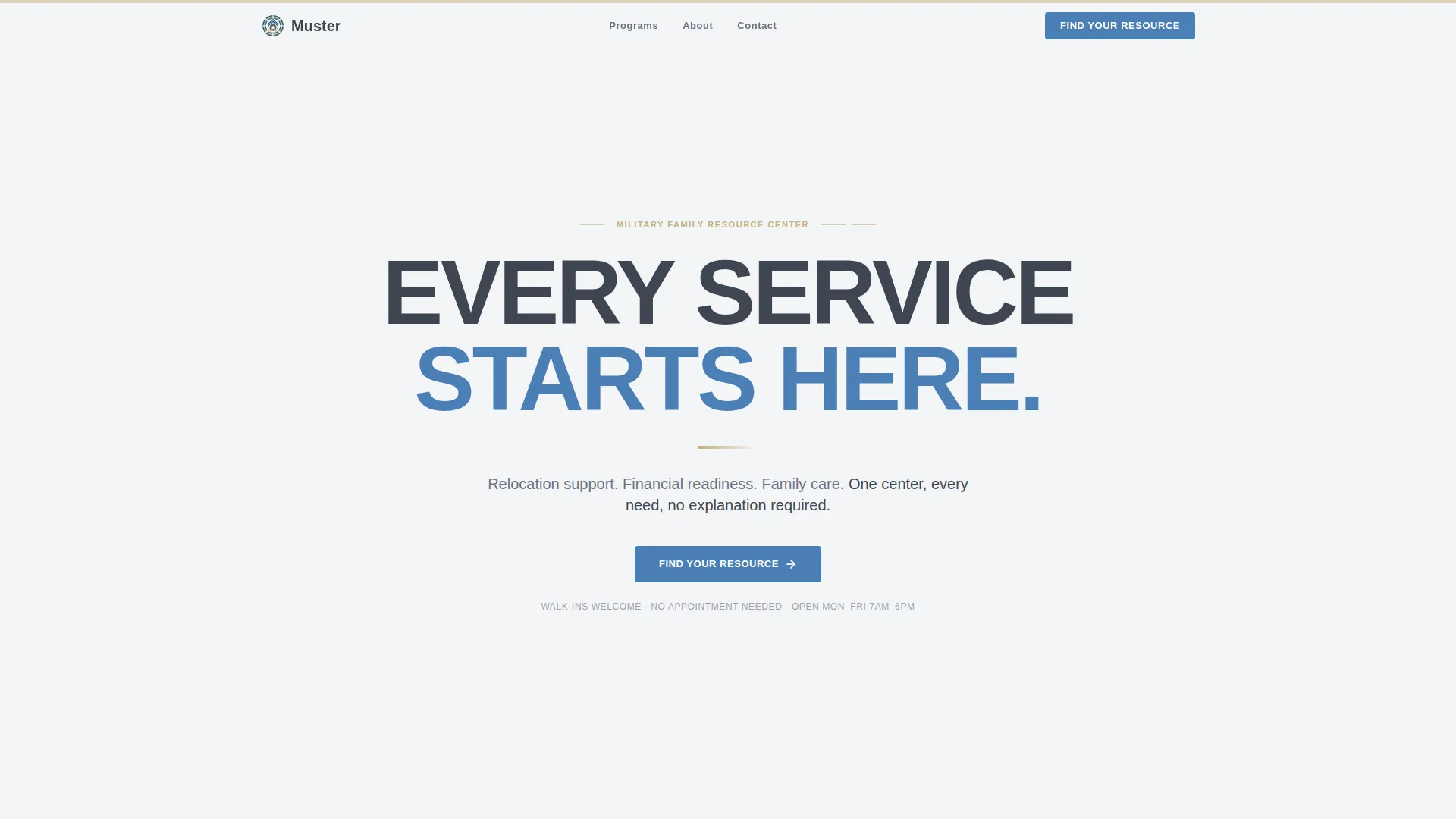
- A hero section with a massive centered headline and a signal-blue anchor button
- A stats bar for displaying families served, programs available, and years operating
- Nine modular program cards arranged across three thematic rows, each with its own call-to-action button
Feature list
This section covers the core capabilities built into the Muster template as described in the source brief.
Centered Hero with Anchor Navigation
The hero opens on a cloud-white field with a heavy, squared sans-serif headline reading "Every Service Starts Here." A single line of supporting text names the three pillars, relocation, financial readiness, and family support. The signal-blue "Find Your Resource" button anchors directly to the card grid below, keeping the path clear and uncluttered.
Stats Bar for Credibility
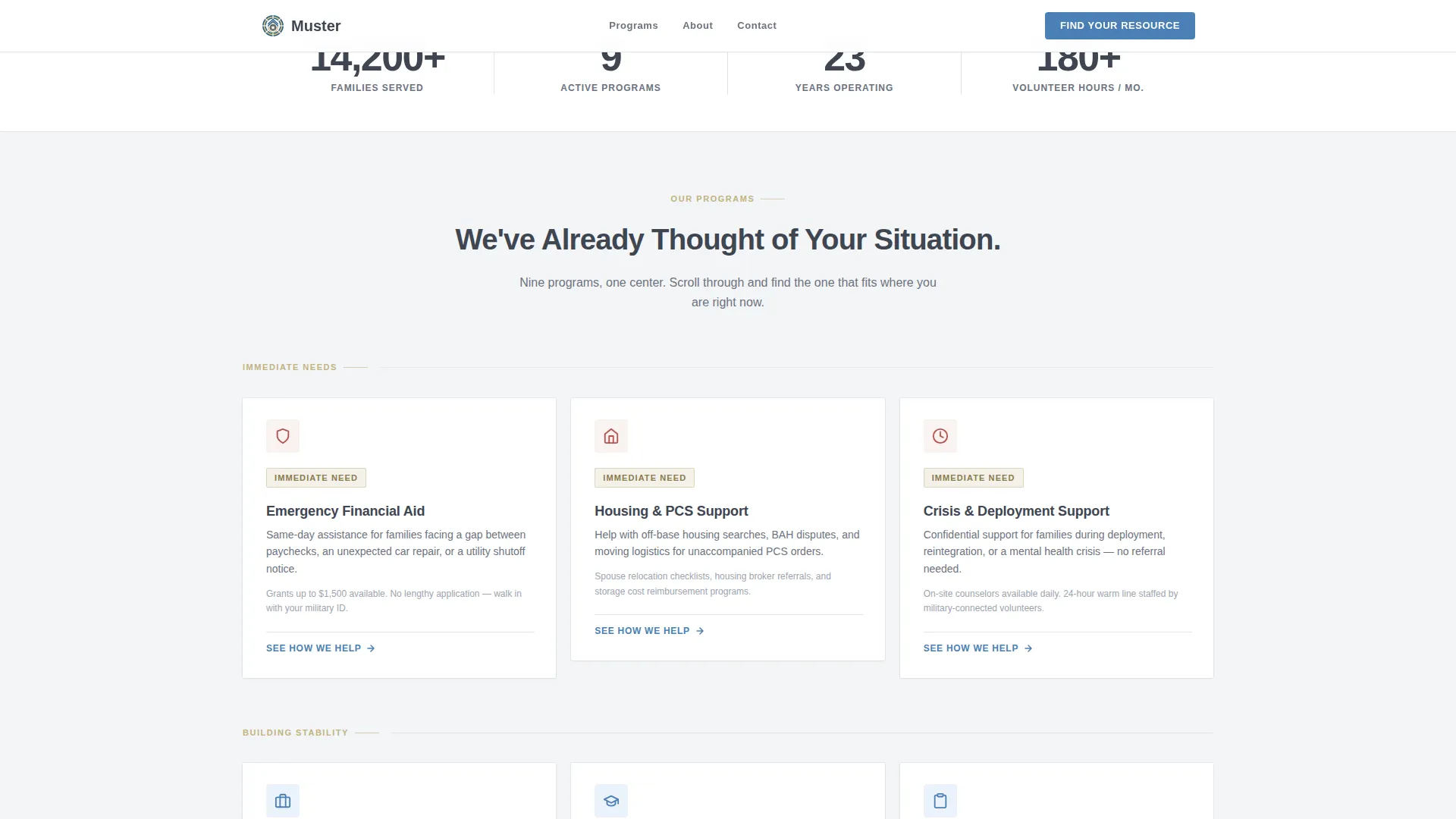
A horizontal stats bar sits between the hero and the card grid. It displays concrete numbers, families served, programs available, and years operating. This section gives first-time visitors a fast, factual reason to trust the center before they explore individual programs.
Modular Nine-Card Program Grid
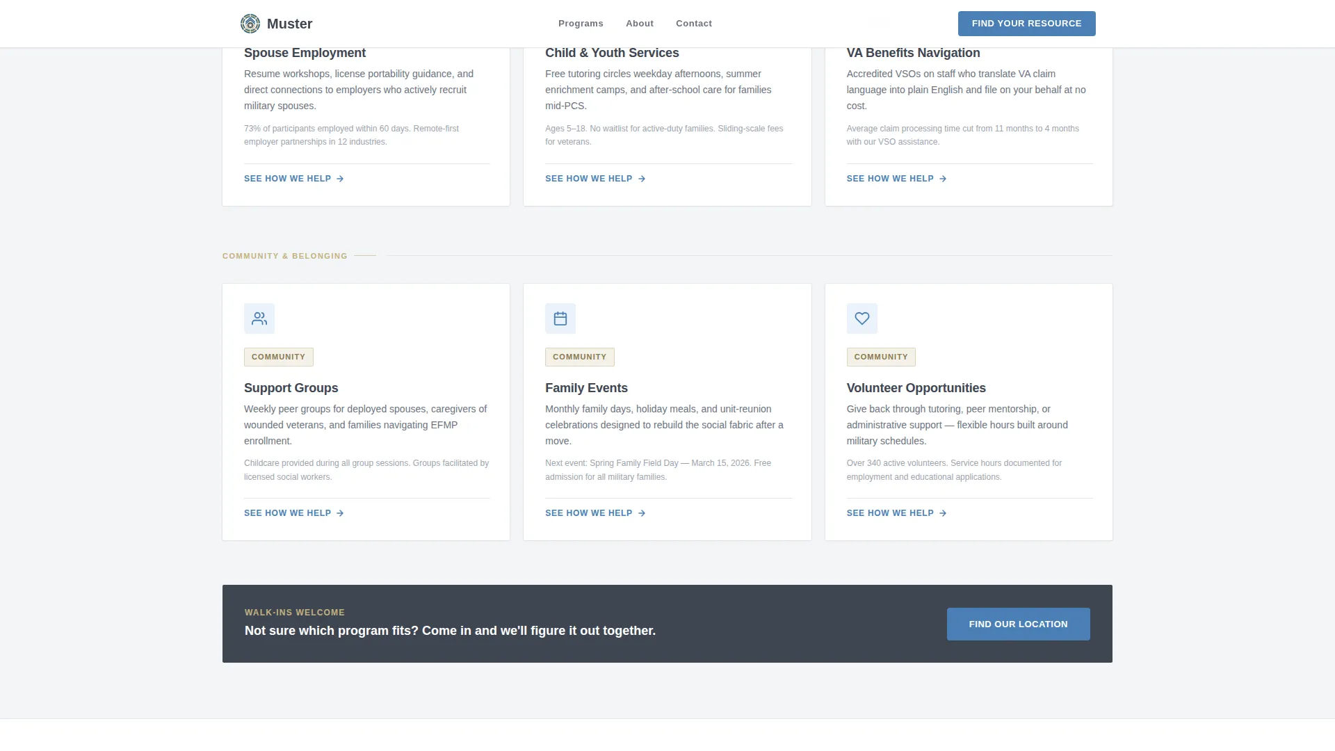
Three rows of three cards each present every major service the center offers. Row one covers immediate needs: emergency aid, housing assistance, and crisis support. Row two addresses stability: spouse employment, child and youth services, and benefits navigation. Row three builds community: support groups, family events, and volunteer opportunities.
Staggered Card Entry Animation
Cards enter the viewport with a subtle upward drift as the visitor scrolls. They arrive in sequence, one after another, reinforcing the sense that the center is ready and organized, like families checking in at the front desk, each one acknowledged in turn.
Per-Card Click-Through Action
Every card carries a "See How We Help" button that routes to a dedicated program page. There is no form on this landing page. The sole job of each card is to build enough clarity and trust that the visitor confidently clicks into the specific service they need.
Corporate Precision Visual System
The Cloud Canvas color system keeps the page clean and authoritative. Cloud white dominates backgrounds, field-uniform khaki warms card edges and section dividers, slate carries all body text, and signal blue appears only on buttons and active-state borders. Nothing competes for attention except the action the visitor should take next.
Page sections overview
| Section | Purpose |
|---|---|
| Hero Headline | Anchor visitors and introduce the center's three service pillars |
| Stats Bar | Display concrete credibility numbers before programs are shown |
| Card Row One | Present immediate-need programs: emergency aid, housing, crisis support |
| Card Row Two | Present stability programs: spouse employment, youth services, benefits navigation |
| Card Row Three | Present community programs: support groups, family events, volunteer opportunities |
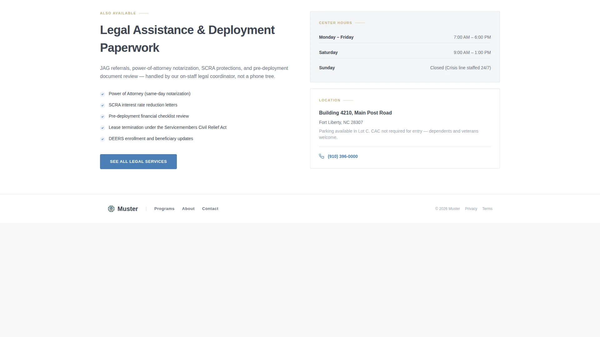
| Linear Footer | Close the page with a single-row footer pattern |
Design & branding system
The visual identity follows a Corporate Precision theme built around the Cloud Canvas color palette. The result feels like a clean intake folder on a well-organized desk, no flash, no noise.
- Colors: cloud white (#F4F5F7) for backgrounds, field-uniform khaki (#C2B280) for card edges and dividers, slate briefing-room gray (#3E4551) for all body text, and signal blue (#4A7FB5) reserved strictly for buttons and active-state borders
- Typography: Manrope in a heavy weight carries all headlines, producing a squared stencil-like authority that reads clearly at large sizes and on small screens
- Interactive states: cards include hover effects and the primary call-to-action button uses a magnetic interaction, making the clickable elements feel intentional and responsive
Mobile & speed optimization
The template is built with a mobile-first priority because military families often access resource pages on a phone, early in the morning, under real pressure.
- The card grid reflows cleanly for narrow screens so program cards remain tappable and legible on any device
- Server Components handle static content sections, keeping JavaScript to a minimum and the page feeling immediate
- Intersection Observer drives the staggered card animations, triggering entry effects only when a card enters the viewport rather than loading all animations at once
How this template helps you convert
Muster earns clicks by showing scope before asking for anything. The page never requests a form fill, it simply builds enough confidence that a visitor moves forward on their own.
- The hero establishes the full promise of the center in one headline and three named pillars, giving every visitor an immediate orientation before they scroll
- The stats bar converts abstract goodwill into specific, credible proof that the center has real capacity and experience
- The nine-card grid removes guesswork entirely, each card names one program, describes it plainly, and offers one clear next step, so the visitor never has to wonder whether the center handles their situation
Other information about this template
Muster fits within a broader ecosystem of purpose-driven templates built for government, public service, and cause-led organizations. A few additional details worth knowing before you build with it:
- The template style is Card Grid (Modular), making it straightforward to reorder, rename, or swap program cards as the center's services evolve
- The creative direction is Movement and Cause, the scroll progression from urgency to belonging is intentional and reflects the emotional journey of a family arriving at a resource center for the first time
- The footer uses a Pattern 1 Linear Single-Row layout, keeping the close of the page as clean and uncluttered as the rest
- This template sits in the Government and Public category under the Military and Defense subcategory, meaning its structure and tone are calibrated for public-trust audiences rather than commercial conversion funnels
- The page type is a click-through landing page, there is no lead capture form by design, and the primary conversion action is a confident click to a program-specific page
Theme
Corporate Precision
Creative direction
Movement & Cause
Color system
Cloud Canvas
Style
Card Grid (Modular)
Direction
Click-Through
Page Sections
Centered Hero with Anchor Button
Stats Bar for Social Proof
Modular Nine-card Program Grid
Staggered Scroll Animation
Click-through Card Actions
Cloud Canvas Color System
Related questions
Can I add or remove program cards from the grid?
Does this template include a contact form or intake form?
Is the scroll animation required, or can it be removed?
Who updates the numbers in the stats bar?
Is this template suitable for a center that serves both veterans and active-duty families?