Onigiri Shop Landing Page Template - Luxe Minimal
Musubi is a masonry-style landing page template built for artisan onigiri shops. It combines macro food photography, an origin-story grid layout, and a shoppable menu into one seamless page. The Parchment and Rust color system gives every section a warm, handcrafted feel that earns trust before the first order is placed.
by Rocket studio
Quick summary
Musubi is a single-page template designed for artisan onigiri counters. It opens with a tight macro shot of a rice ball and scrolls through an origin story grid before arriving at a shoppable menu. The Luxe Minimal aesthetic, warm Parchment and Rust palette, and pickled plum call-to-action buttons make this template feel as deliberate as the food it sells.
Who this template is for
This template is built for small food businesses that sell handcrafted Japanese rice balls and want a page that justifies both the craft and the price point. It suits founders who care as much about storytelling as about taking orders.
- Artisan onigiri shops and Japanese rice ball counters looking for a first online presence
- Food entrepreneurs who want a shoppable landing page without a heavy ecommerce build
- Japanese cuisine vendors at markets, pop-ups, or fixed counters serving lunch crowds and weekend shoppers
What problem this template solves
Most food shop pages look like generic menus. They list items and prices but never explain why the food is worth choosing. Customers who do not already know the shop scroll past without connecting.
- There is no visual hook that earns attention before showing the menu
- The origin and craft behind the product go untold, leaving price without context
- Order paths are unclear, especially for quick pickups or repeat customers
What you get with this template
You get a complete single-page layout that moves a visitor from first impression to placed order. Every section is purposeful, and the visual flow does the selling before any button is clicked.
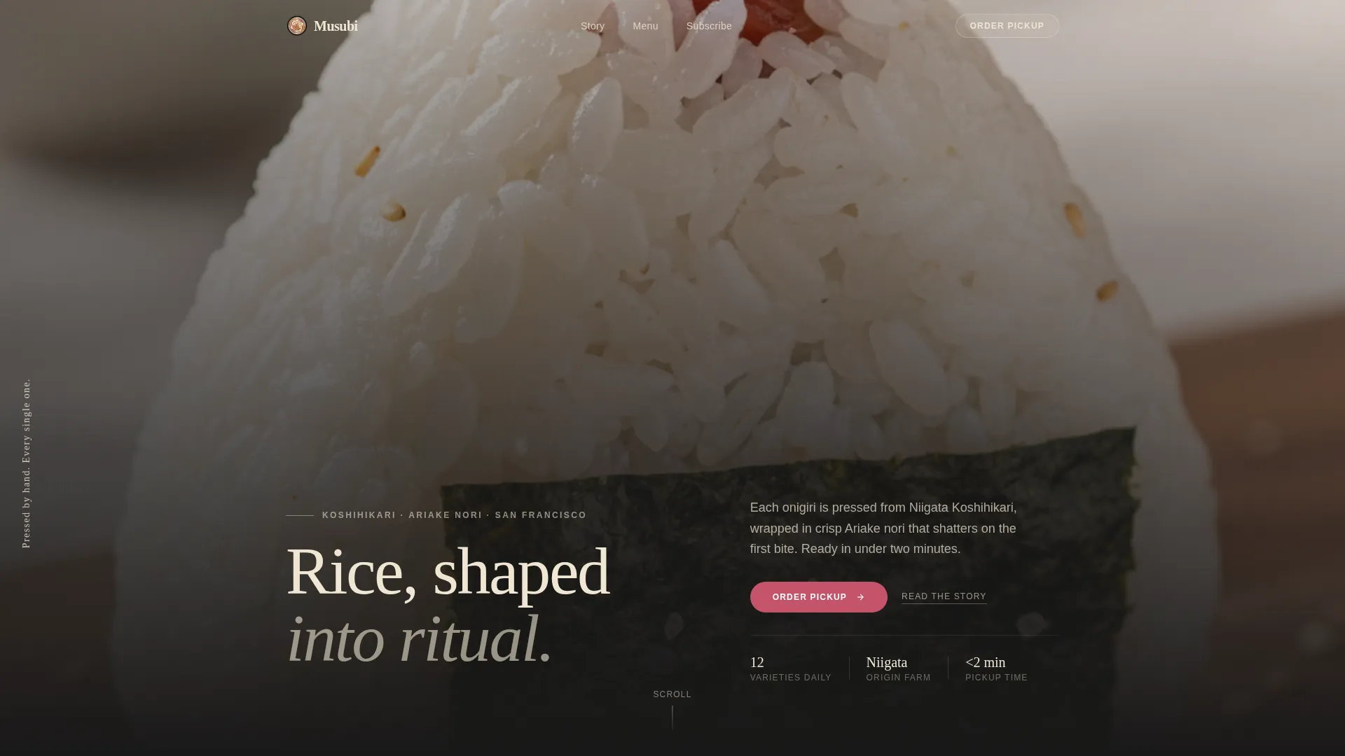
- A macro close-up hero header with a slim serif headline fading in along the left edge
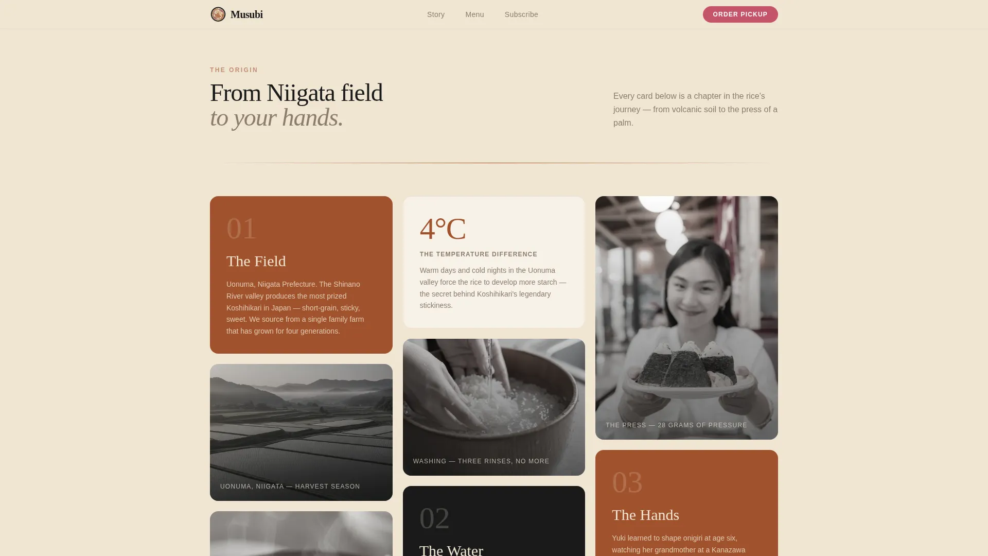
- A masonry origin-story grid that alternates food photography with sourcing and founder moments
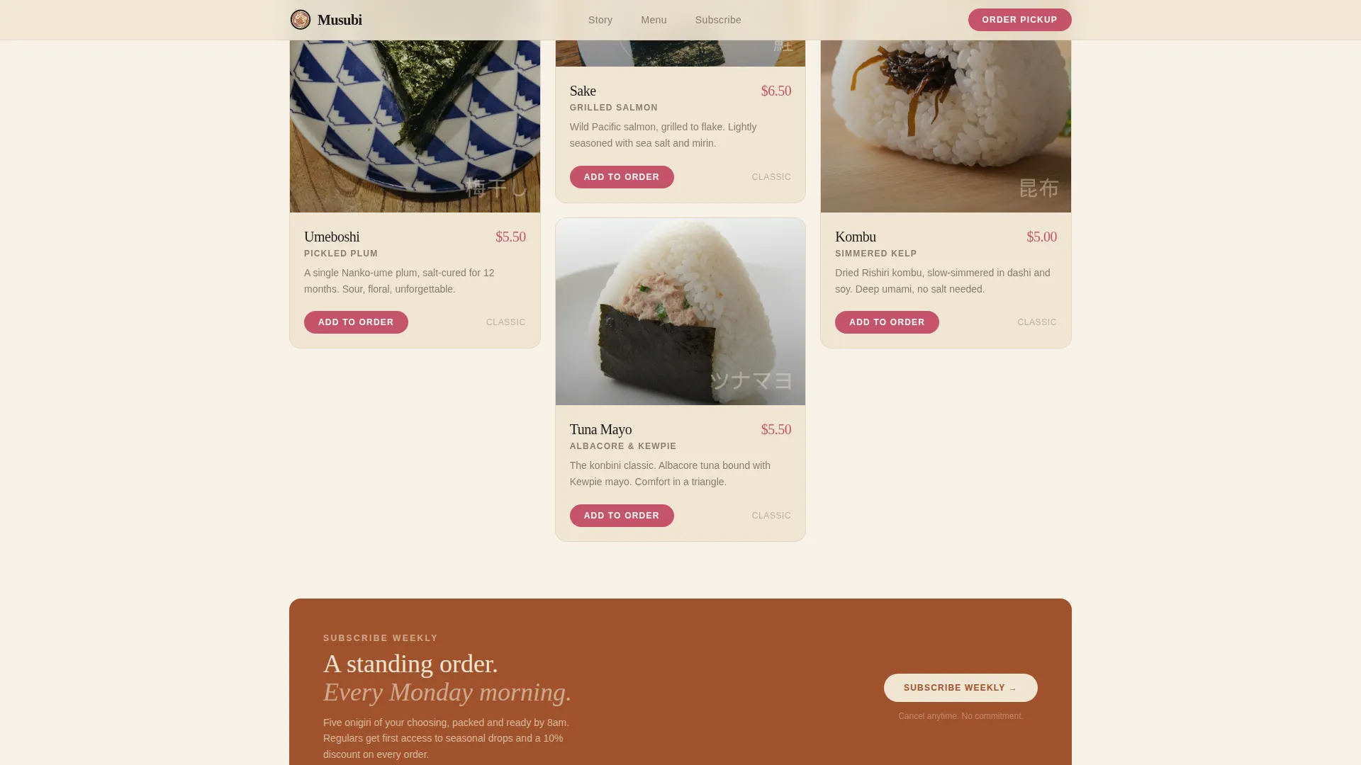
- A shoppable menu grid sorted by collection, a sticky bottom order bar, and a weekly subscription path
Feature list
This template packages storytelling, product display, and order flow into one cohesive page. Each feature below comes directly from the template layout described in the brief.
Macro Close-Up Hero Header
The page opens with a single onigiri photograph cropped tight enough to show individual rice grains and the seam of a pickled plum filling. Natural side lighting and shallow depth of field make the image feel immediate and tactile. A slim serif headline fades in on the left edge with the line "Pressed by hand. Every single one."
Masonry Origin Story Grid
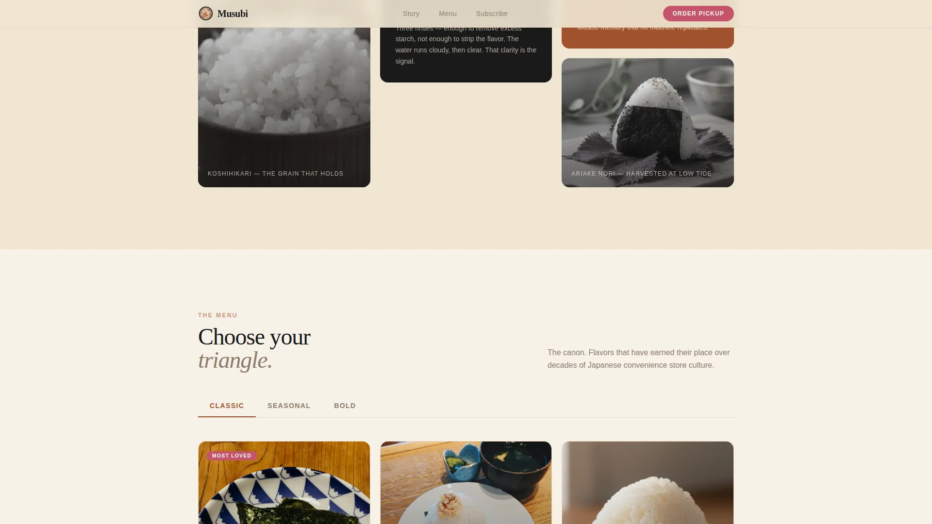
The scrolling grid tells the sourcing story in visual chapters. Cards alternate between full-color food photography and muted origin images, such as a Niigata rice field, a rice-washing video, and a founder portrait. This rhythm builds appetite and respect before the menu appears.
Shoppable Menu Cards
Each product card shows an onigiri variant name, a filling description, and an "Add to Order" button styled in pickled plum pink. Cards are grouped into three named collections: Classic, Seasonal, and Bold. The grid makes every item a small story before it becomes a transaction.
Sticky Pickup Order Bar
A fixed bottom bar tracks the running order total and displays a single "Place Pickup Order" call-to-action button. A built-in time-slot selector defaults to the next available fifteen-minute pickup window. This keeps the checkout path visible without interrupting browsing.
Weekly Subscription Path
Alongside the main order flow, a secondary link invites regular customers to subscribe for a standing five-pack delivered every Monday. This gives the template two conversion paths from one page, serving both first-time visitors and loyal regulars.
Luxe Minimal Color and Typography System
The template uses a four-color Parchment and Rust palette: unbleached washi cream for backgrounds, kiln-fired rust for headlines and dividers, charred nori black for photography frames, and pickled plum pink reserved for price tags and cart buttons. Slim serif type reinforces the handcrafted positioning throughout.
Page sections overview
| Section | Purpose |
|---|---|
| Hero Header | Anchors the page with a macro rice ball image and serif headline |
| Origin Story Grid | Builds brand context through alternating food and sourcing photography |
| Rice Field Card | Opens the origin chapter with a Niigata farm image |
| Rice Washing Video | Shows the care process through a short embedded clip |
| Founder Portrait | Humanizes the brand with a personal origin moment |
| Shoppable Menu Grid | Presents all onigiri variants sorted by collection |
| Classic Collection | Groups familiar, everyday onigiri fillings |
| Seasonal Collection | Highlights limited or time-specific offerings |
| Bold Collection | Features adventurous or signature filling options |
| Sticky Order Bar | Keeps pickup call to action and time selector always visible |
| Weekly Subscribe Link | Offers a repeat-order path for loyal customers |
Design & branding system
The visual identity follows a Luxe Minimal theme built on warmth and restraint. Every color in the palette has a specific role, and the typography reinforces the handcrafted nature of the product.
- Four-color palette: washi cream (#F0E6D3) for backgrounds, kiln-fired rust (#A0522D) for headlines, charred nori black (#1A1A1A) for photo frames, and pickled plum (#C4536A) for price tags and action buttons only
- Slim serif typeface used for the hero headline and section titles to echo the careful, artisan quality of the food
- Photography direction favors natural side light, shallow depth of field, and no surface styling, letting the food carry all visual weight
Mobile & speed optimization
The masonry grid and sticky bar are designed to function cleanly on smaller screens. The layout prioritizes thumb-friendly tap targets and a readable card size across devices.
- Masonry cards reflow into a single or double column on mobile without losing the alternating rhythm of food and origin images
- The sticky bottom order bar remains accessible at the bottom of the screen on mobile, keeping the pickup call-to-action reachable at any scroll depth
- The hero macro photograph is framed to remain impactful even when cropped to a portrait mobile viewport
How this template helps you convert
The page is structured so that every scroll step increases purchase intent before the visitor reaches the menu. Conversion is built into the layout, not bolted on afterward.
- The macro hero creates immediate sensory engagement, which earns the next scroll before any product is shown
- The origin story grid answers the unspoken question of why the rice balls cost what they do, reducing price hesitation at the menu
- The sticky pickup bar and time-slot selector reduce friction at the moment of decision, making it easy to commit to a specific order window
Other information about this template
This template is a strong fit for food businesses that operate with a short, curated menu and a strong sense of place. It is built around a single-page flow, so there are no multi-page navigation complexities to manage.
- The template style is Masonry and Pinterest-inspired, which suits image-heavy food brands that tell visual stories
- The landing page direction is Marketplace and Multi-product, supporting both one-time pickup orders and recurring subscription sign-ups
- The creative direction is Origin Story, meaning the layout is intentionally structured to build emotional context before presenting products
- The header concept is Macro Close-Up, a deliberate choice that makes the food itself the luxury signal rather than props or set dressing
- This template is categorized under Food and Beverage, specifically Japanese Cuisine and Dining, making it a focused fit for onigiri shops, Japanese rice ball counters, and similar artisan food concepts
Theme
Luxe Minimal
Creative direction
Origin Story
Color system
Parchment & Rust
Style
Masonry/Pinterest
Direction
Marketplace/Multi
Page Sections
Macro Close-up Hero Header
Masonry Origin Story Grid
Shoppable Menu Card Grid
Sticky Pickup Order Bar
Weekly Subscription Path
Parchment and Rust Color System
Related questions
Can I change the onigiri menu collections to match my own offerings?
Does the template support both pickup orders and subscriptions from the same page?
How many product cards can the shoppable menu grid hold?
Is the origin story grid easy to update with my own photos and brand story?



