Travel Consulting Booking Website Template
Navigate is a single-page landing page template built for executive travel consultancies. It combines a manifesto-style header, FAQ-driven zigzag sections, and a three-step booking flow to turn cold traffic into scheduled diagnostic calls. The design uses a Navy Authority color system to project authority, precision, and boardroom-level credibility from the first scroll.
by Rocket studio
Quick summary
Navigate is a premium landing page template designed for travel digital transformation consultants. It opens with a full-screen typographic manifesto, moves through alternating FAQ-led content sections, and closes with a structured scheduling flow. Every design decision reinforces one message: the consultant in this room knows exactly what to do next.
Who this template is for
This template is built for senior consultants and boutique firms advising travel industry operators on technology and process transformation. It speaks directly to the decision-makers those consultants are trying to reach.
- Travel technology consultants working with tour operators, regional airlines, and destination management companies (DMCs)
- Independent strategists and small consultancy practices offering digital transformation advisory to mid-market travel businesses
- Consulting leads who need a high-conversion booking page that matches their executive positioning
What problem this template solves
Travel consultants often sell a sophisticated service through a generic website. The gap between the caliber of the work and the first impression of the page costs them credibility and calls. Navigate closes that gap.
- Executives visiting the page cannot quickly see that this consultant understands their specific problems, so they leave before engaging
- There is no clear, low-friction path for a busy CEO or CTO to book time without filling out a long contact form
- Visitors who are not yet ready to call have no secondary option, so the page captures only one type of buyer intent
What you get with this template
Navigate delivers a complete, single-page layout with every section, interaction, and visual detail pre-built. You get a ready-to-deploy structure that projects authority and drives two distinct conversion actions.
- A full-screen manifesto header section, FAQ-driven zigzag content sections, and a three-step progressive scheduling form
- A secondary lead capture path using a downloadable Migration Readiness Scorecard, gated by a single work email field
- A consistent Navy Authority visual system across all sections, with decision-point gold reserved strictly for calls to action and key data points
Feature list
This template is built around specific structural and visual choices grounded in how travel executives actually make decisions.
Typographic Manifesto Header
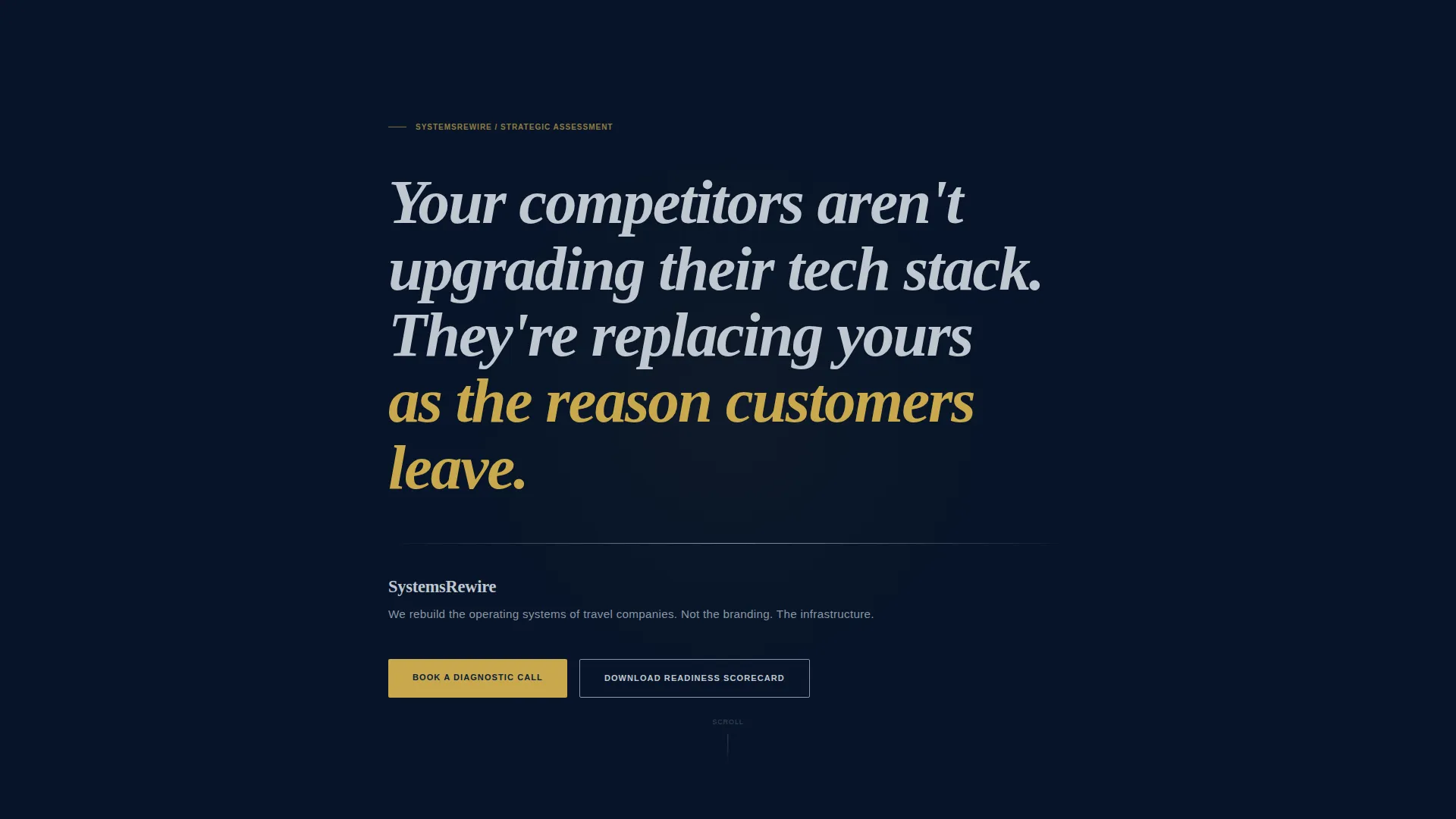
The opening section fills the screen with a single strategic statement set in a refined serif typeface at large scale against deep navy. The final clause renders in decision-point gold. No navigation appears until the visitor scrolls, ensuring the message lands before any other distraction.
FAQ-Driven Zigzag Sections
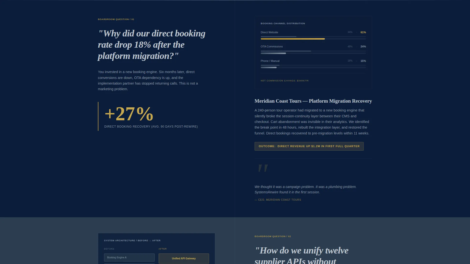
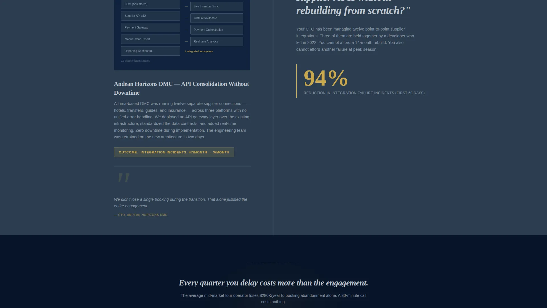
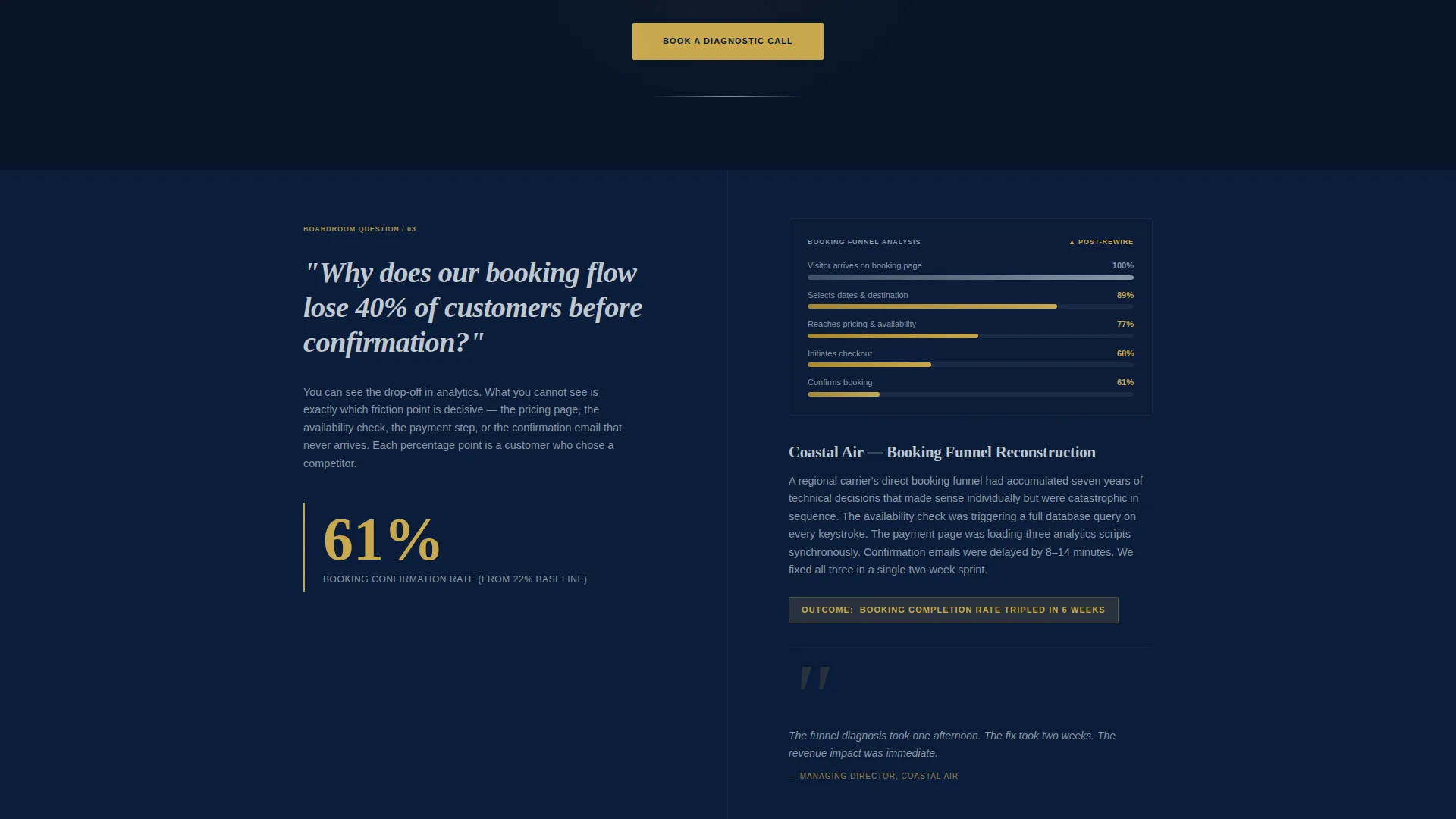
Each alternating section opens with a real boardroom question in large serif type on one panel. The opposing panel delivers a concise case narrative, a single metric highlighted in gold, and a supporting diagram or system architecture thumbnail. The scroll reads like a private consultation.
Three-Step Progressive Booking Form
The scheduling flow breaks into three clean steps: company type selection, primary pain point selection from a curated list, and a calendar embed showing 30-minute slots across two time zones. This reduces form friction for time-pressured executives.
Secondary Lead Capture Path
Visitors not ready to book a call can download the Migration Readiness Scorecard. The offer requires only a work email address, giving the page a second conversion lane without adding visual clutter or pressure.
Repeating Gold call to action Placement
"Book a Diagnostic Call" appears three times: beneath the manifesto, at the midpoint of the page, and in the final section. Repetition ensures the primary action is always one scroll away, regardless of where a visitor pauses.
Navy Authority Color System
The palette uses boardroom navy for backgrounds, polished charcoal for body text, executive silver for dividers and secondary type, and decision-point gold used sparingly for calls to action and key data. The restraint makes every gold element command immediate attention.
Page sections overview
| Section | Purpose |
|---|---|
| Manifesto Header | Opens with a full-screen typographic statement that earns attention before anything else loads |
| Primary call to action Block | Places "Book a Diagnostic Call" in gold immediately below the manifesto |
| FAQ Section One | Poses the first boardroom question and delivers a case narrative with a gold metric |
| FAQ Section Two | Alternates panel layout and addresses a second executive pain point with a supporting diagram |
| FAQ Section Three | Deepens the consultation feel with a more specific, uncomfortable question and answer |
| Midpoint call to action Block | Repeats the primary call to action at the scroll midpoint |
| Booking Form Flow | Hosts the three-step progressive scheduling form with calendar embed |
| Scorecard Capture | Offers the Migration Readiness Scorecard as a secondary conversion path |
| Closing call to action Section | Ends the page with a final "Book a Diagnostic Call" prompt in the full navy treatment |
Design & branding system
The visual identity follows an Executive Suite theme. Every color, typeface, and spacing decision is intentional, projecting the kind of confidence that mid-market travel executives recognize as peer-level authority.
- Color palette: boardroom navy (#0B1D3A) for backgrounds, polished charcoal (#2C3E50) for body text, executive silver (#C0C7D0) for dividers and secondary type, and decision-point gold (#C9A84C) exclusively for calls to action and key data points
- Typography: refined serif typeface at large scale for headings and the manifesto statement, with silver secondary type keeping body sections legible without competing with gold accents
- Layout rhythm: deep alternating navy bands separate zigzag sections, a single thin silver rule follows the manifesto, and gold appears sparingly enough that every instance demands the eye's obedience
Mobile & speed optimization
The template is structured to maintain its executive feel across screen sizes. The manifesto, zigzag sections, and booking form are all built to reflow cleanly without losing the visual hierarchy that makes the design work.
- The large-scale serif manifesto and alternating panel layout adapt to single-column stacking on smaller screens while preserving the typographic weight
- The three-step booking form is designed as a progressive flow, reducing the amount of visible input at any one time and keeping the mobile experience focused
How this template helps you convert
Navigate is built around two conversion goals. The page does not try to inform everyone equally. It moves decisive visitors to book and gives deliberating visitors a low-commitment alternative.
- The "Book a Diagnostic Call" call to action appears three times across the page in high-contrast gold on navy, removing any moment where the visitor has to search for the next step.
- The Migration Readiness Scorecard offer creates a second conversion path for buyers who need more time, capturing a work email without asking them to commit to a call before they are ready.
Other information about this template
Navigate is categorized under Professional Services and Travel Consulting, making it directly relevant to consultants positioning themselves within the travel technology advisory space.
- The template style follows an Editorial and Magazine layout approach, giving sections the weight and pacing of a well-produced thought leadership piece rather than a typical service page
- The creative direction applies a Stats-First Impact approach, pairing case narratives with single gold-highlighted metrics to make the consultant's results tangible at a glance
- The header concept draws on Data Storytelling principles, using the manifesto and FAQ structure to build a narrative that mirrors how a travel executive thinks through a problem
- The landing page direction is suited for content and resource-led positioning, supporting the scorecard download as a value-delivery mechanism alongside the booking flow
Theme
Educational Guide
Creative direction
Stats-First Impact
Color system
Navy Authority
Style
Editorial/Magazine
Direction
Content/Resource
Page Sections
Typographic Manifesto Header
Faq-driven Zigzag Layout
Three-step Progressive Booking Form
Secondary Scorecard Lead Capture
Repeating Gold Call to Action Placement
Navy Authority Color System
Related questions
Can I customize the FAQ questions in the zigzag sections?
What is the Migration Readiness Scorecard section?
How does the three-step booking form work?
Is this template suitable for a solo travel technology consultant?
Can the color system be adapted to a different brand palette?



