Executive Travel Consulting Landing Page Template
Navigate is a single-page landing page template built for independent executive travel consultants. It leads with a bold value statement, walks prospects through a three-column comparison table, and closes with case-study proof and a short audit-call intake form. The design uses a monochrome steel palette to project boardroom-level authority from the first scroll.
by Rocket studio
Quick summary
Navigate is a landing page template designed for solo travel consultants who serve mid-market companies. It pairs a commanding headline with a head-to-head comparison table, human-scaled case studies, and a deliberately short intake form. Every layout decision signals that the person behind this page already knows your expense reports better than you do.
Who this template is for
This template is built for one specific professional: an independent travel operations consultant who works directly with corporate clients. If you sit between a company's internal team and the complexity of supplier contracts, this page speaks your language.
- Operations directors at mid-market companies managing 200 to 500 trips per year
- Procurement leads comparing travel management company proposals without a clear framework
- Chief financial officers who have discovered runaway last-minute booking costs and need a structured fix
What problem this template solves
Most consulting landing pages look like a service menu. They list offerings without showing the gap between what a company currently has and what it could have. Prospects leave unconvinced because nothing on the page proves the consultant understands their specific pain.
- No head-to-head contrast means visitors cannot see where their current setup falls short
- Generic testimonials fail to land when the buyer is a senior executive who needs hard numbers
- Long intake forms filter out exactly the decision-makers you most want to reach
What you get with this template
The template delivers a complete, single-page layout structured to move a skeptical senior buyer from first impression to booked call. Every section has a clear role and a clear visual hierarchy.
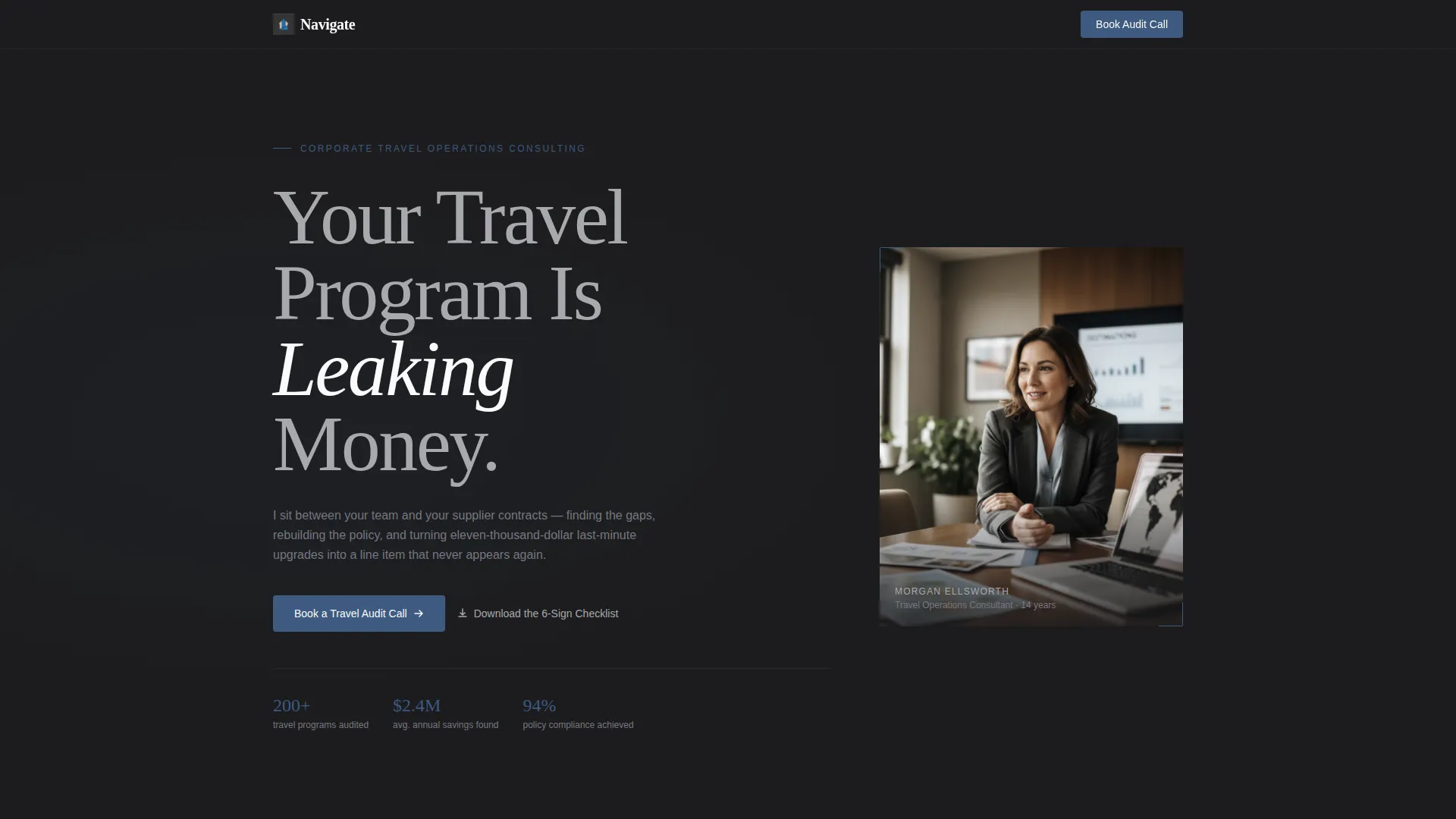
- A giant tracked-out headline section anchored left, paired with a consultant portrait shot across a conference table
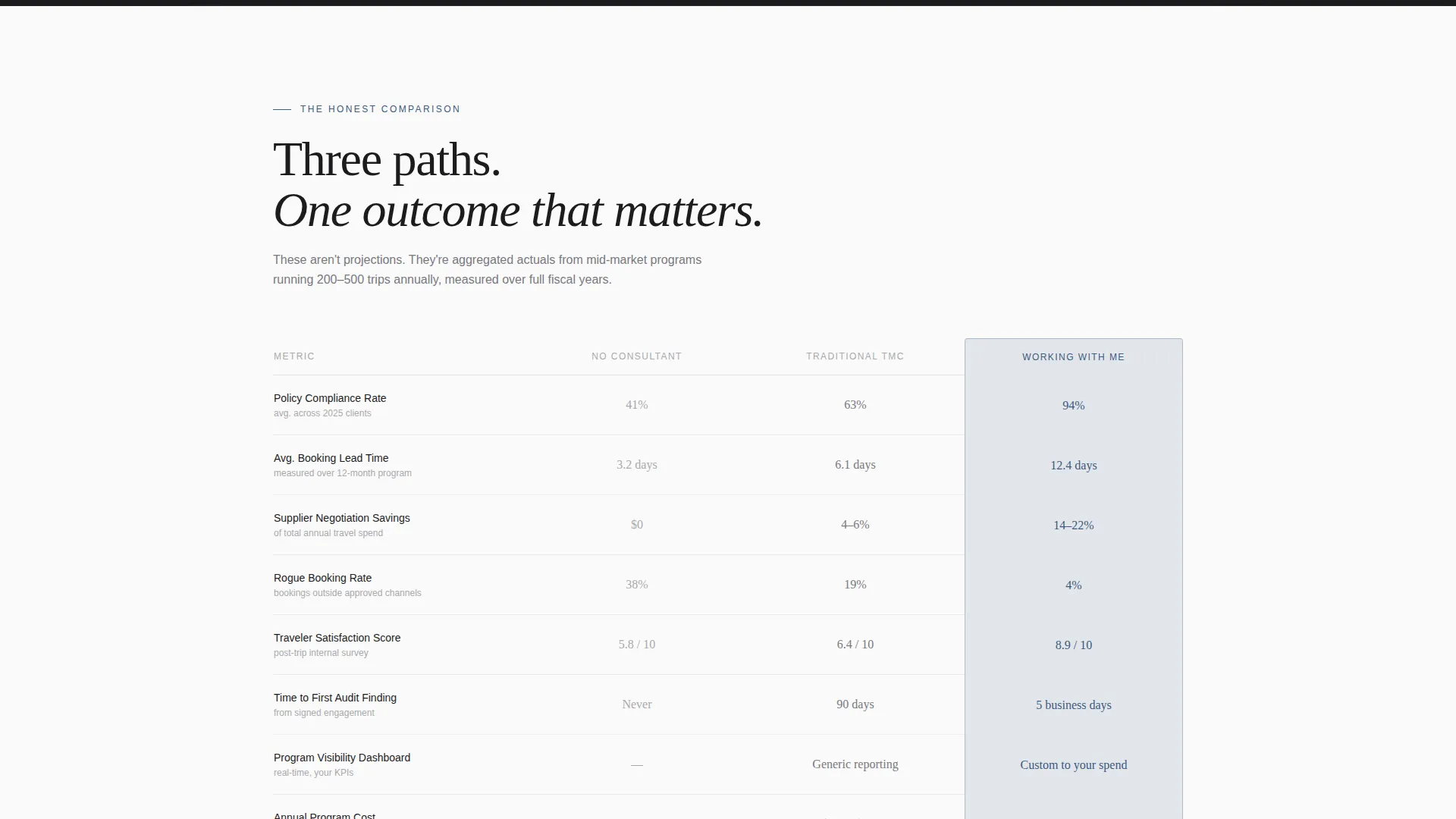
- A three-column comparison table contrasting no-consultant, traditional travel management company, and working with you directly
- Dual call-to-action placements: one below the comparison table and one as a sticky bar after the case studies
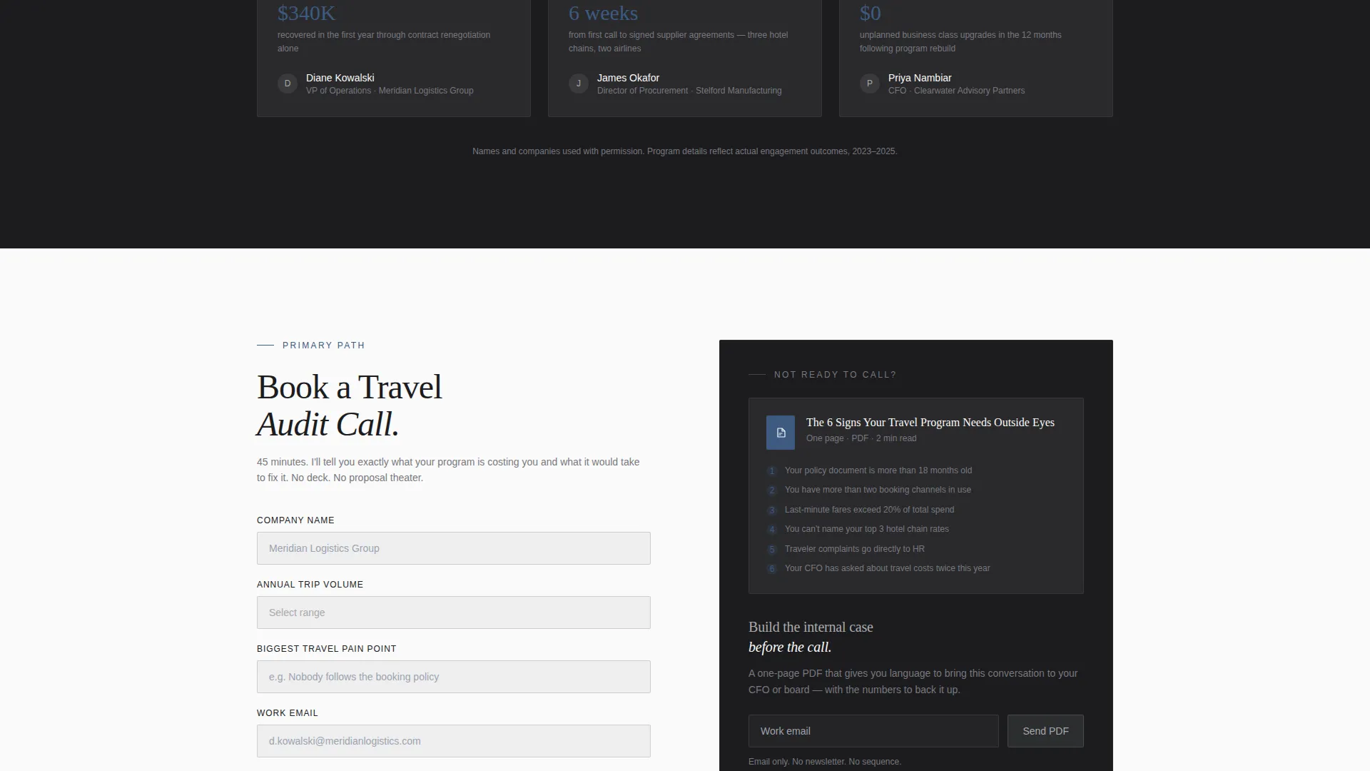
- A short intake form capturing company name, annual trip volume, biggest travel pain point, and work email
- A secondary lead-capture path offering a downloadable one-page PDF guide gated behind email only
Feature list
This section covers the core built-in components that make Navigate ready to use from day one.
Three-Column Comparison Table
The centerpiece of the page contrasts three scenarios side by side: no consultant, a traditional travel management company, and working directly with you. Line items include policy compliance rate, average booking lead time, supplier negotiation savings, and traveler satisfaction score. The authority blue accent highlights the winning column so the conclusion is impossible to miss.
Giant Headline Hero Section
The header uses enormous, tracked-out sans-serif typography anchored to the left two-thirds of the viewport. Set in brushed aluminum against boardroom charcoal, the headline "Your Travel Program Is Leaking Money" commands attention before a visitor reads a single detail. The right third holds a single sharp consultant portrait, shot at shoulder height across a conference table.
Case Study Portrait Blocks
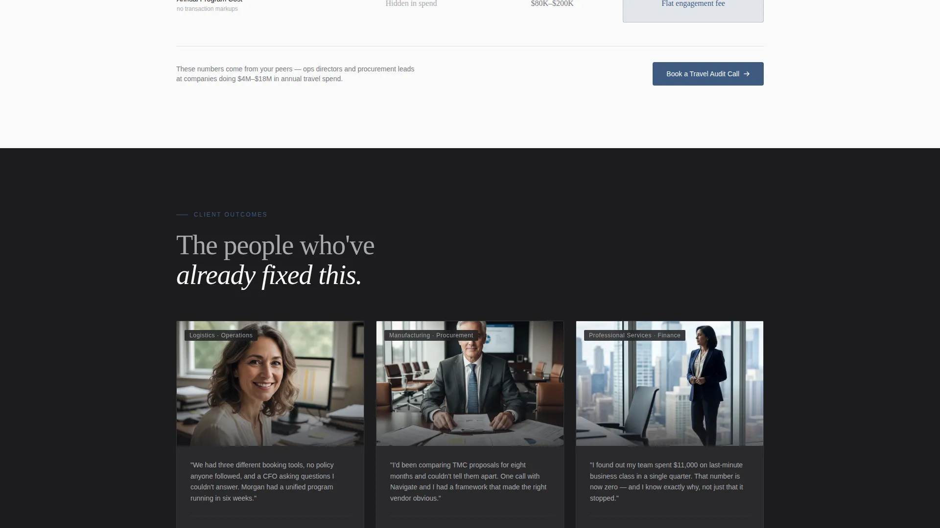
Below the comparison table, the page shifts into short proof sections. Each block pairs a quoted procurement lead or operations director with their own photograph and one hard number. Two sentences and one metric per story keep the section tight and credible.
Dual Call-to-Action Placement
The primary call to action, "Book a Travel Audit Call," appears first directly below the comparison table. It reappears as a sticky bar after the case study section. Both instances use authority blue to signal that this action carries weight.
Short Intake Form
The audit-call form asks for four fields only: company name, annual trip volume via dropdown, biggest travel pain point in free text, and work email. The brevity is intentional. Senior buyers will not complete a twelve-field form, and this one respects that reality.
PDF Lead Capture Path
A secondary conversion route offers a downloadable one-page guide titled "The 6 Signs Your Travel Program Needs Outside Eyes." It is gated behind email only, giving not-yet-ready visitors a low-commitment way to engage while still entering your funnel.
Page sections overview
| Section | Purpose |
|---|---|
| Hero Headline Block | Establishes the core problem and introduces the consultant with a portrait |
| Comparison Table Section | Shows measurable gaps between three travel program scenarios |
| Case Study Portraits | Builds trust through real client stories and specific outcome numbers |
| Primary call to action Block | Drives audit-call bookings directly below the proof section |
| PDF Lead Capture | Captures early-stage buyers not yet ready to book a call |
| Sticky call to action Bar | Keeps the audit-call action visible as visitors finish scrolling |
| Short Intake Form | Qualifies leads with four fields before the call |
Design & branding system
The visual identity is built on a Monochrome Steel palette that communicates precision and restraint. Every color choice has a structural role, and nothing is decorative for its own sake.
- Four-color system: boardroom charcoal (#1C1C1E), brushed aluminum (#A8A9AD), white-paper white (#FAFAFA), and authority blue (#3D5A80) reserved exclusively for calls to action and data highlights
- Backgrounds alternate between charcoal and white-paper sections; text uses aluminum gray on dark backgrounds and charcoal on light ones
- Typography is a large tracked-out sans-serif for headlines, keeping the page feeling engineered rather than styled
Mobile & speed optimization
The layout is structured to remain clear and navigable on smaller screens without losing the premium feel of the desktop experience.
- The comparison table is designed to scroll horizontally on mobile so no column is hidden or collapsed
- The sticky call-to-action bar remains anchored at the bottom of the viewport on all screen sizes
- Portrait images are cropped and sized to load cleanly without overwhelming narrow viewports
How this template helps you convert
The page is built around the psychology of a senior buyer who arrives skeptical and time-poor. Every structural decision shortens the path from doubt to decision.
- The comparison table removes the need for a visitor to imagine the difference your work makes. It shows the gap in plain numbers, with the blue accent column doing the persuasive work before you say a word.
- The case study portrait blocks place real faces and real outcomes between the table and the form. A CFO reading a two-sentence client story with a hard dollar figure is far more likely to book a call than one reading a list of service descriptions.
- The dual call-to-action placement and the PDF secondary path mean the page captures both the ready buyer and the one still building an internal case.
Other information about this template
Navigate is categorized under Professional Services and Travel Consulting. It suits a niche role often described as a travel compliance consultant or corporate travel program advisor. The editorial and magazine-style layout draws on a stats-first creative direction, using data storytelling to lead with credibility rather than biography. The template follows a content and resource landing-page direction, meaning it earns the conversion by educating the visitor first. The educational guide theme is reflected in the PDF lead magnet, which extends the page's value beyond the scroll.
- Suitable for independent consultants, boutique travel advisory firms, and fractional travel program directors
- The template style is editorial and data-led, not promotional or feature-list driven
- The header concept uses data storytelling to anchor the value proposition in a recognizable business problem rather than a service description
Theme
Educational Guide
Creative direction
Stats-First Impact
Color system
Navy Authority
Style
Editorial/Magazine
Direction
Content/Resource
Page Sections
Three-column Comparison Table
Giant Headline Hero Section
Case Study Portrait Blocks
Dual Call-to-action Placement
Short Four-field Intake Form
PDF Secondary Lead Capture
Related questions
Can I use this template if I offer more than one consulting service?
Is the PDF lead magnet section already built into the template?
How many fields does the intake form include by default?
Can I edit the metrics inside the comparison table?
Who is this landing page template designed for?



