Transparent Health Insurance Landing Page Template
Shield is a single-column health insurance landing page template built for mid-career brokerages. It uses a quiz-funnel structure to help professionals aged 35 to 55 spot plan gaps before sharing their contact details. The Data Command visual style, inline five-step assessment, and proof-stack section create a focused, high-trust experience that moves visitors from doubt to action.
by Rocket studio
Quick summary
Shield is a health insurance landing page template designed for mid-career brokerages. It walks visitors through a Problem-to-Solution flow: carrier logo marquee, diagnostic pain-point cards, an inline five-step quiz, a proof stack, and an email-capture results teaser. Every section earns the next click before asking for personal information.
Who this template is for
This template is built for health insurance brokerages serving professionals in the 35-to-55 age range. It suits any insurance business that wants to convert open-enrollment anxiety into booked consultations through a structured, quiz-led landing page.
- Directors, senior managers, and small business owners staring at open enrollment emails
- Dual-income couples managing a family plan with specialists and dependents
- Brokerages ready to create a lead-generation page that diagnoses needs before capturing contact details
What problem this template solves
Most people in mid-career are paying for a health insurance plan that made sense a decade ago. Life has changed: there is a mortgage, a specialist on retainer, a kid in braces, and possibly employees on a group plan. A cluttered, text-heavy page can overwhelm busy professionals seeking clarity. This template removes that friction immediately by presenting a clean, focused landing page that answers the two most urgent questions: what is wrong with my current plan, and what should I do next?
- Mid-career professionals may face high deductibles, specialized care needs, and job changes that make old plans expensive
- Most insurance landing pages lead with pricing tables; this page leads with the visitor's own situation
- The quiz surfaces over-coverage and under-coverage before asking for a name or email, which builds trust first
What you get with this template
This health insurance landing page template ships as a fully designed, single-column flow. Every section is pre-built and ready to customize. You get a structured page that can guide visitors from recognition to action without overwhelming visitors at any step.
- Carrier logo marquee header, three numbered diagnostic data cards, and an inline five-step quiz
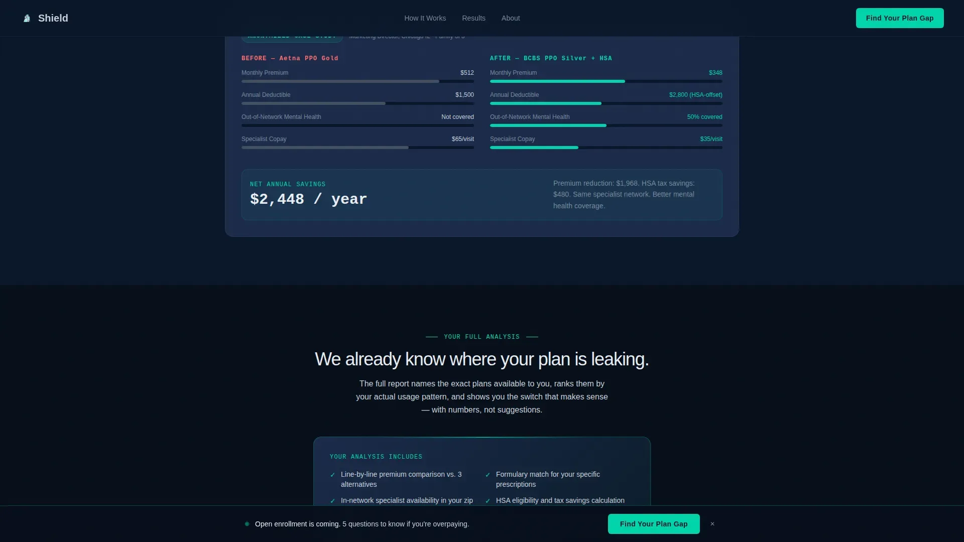
- A proof stack section with a savings counter, assessment count, and an anonymized before-and-after plan comparison
- A personalized results teaser with a secondary call-to-action form that captures name and email to deliver the full analysis
Feature list
This template includes purpose-built features that make each health insurance landing page section work together as a single conversion path.
Carrier Logo Marquee Header
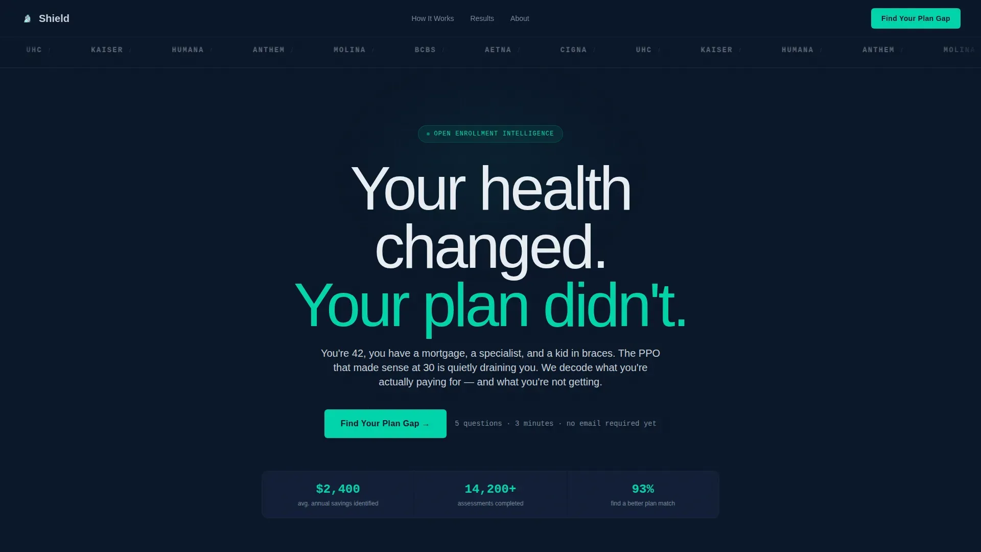
A slow-scrolling infinite loop of major carrier logos rendered in monochrome silver on deep navy. No hero image, no stock photography. The catchy headline "Your health changed. Your plan didn't." sits directly below, communicating the value proposition to every visitor immediately.
Inline Five-Step Quiz Funnel
The quiz opens on the same page without a redirect. Visitors select coverage type, drag a premium slider, choose top-used benefits via checkboxes, pick a current carrier from a dropdown, and enter a zip code. Each answer fills a teal progress ring, keeping users engaged through all five steps.
Diagnostic Pain-Point Data Cards
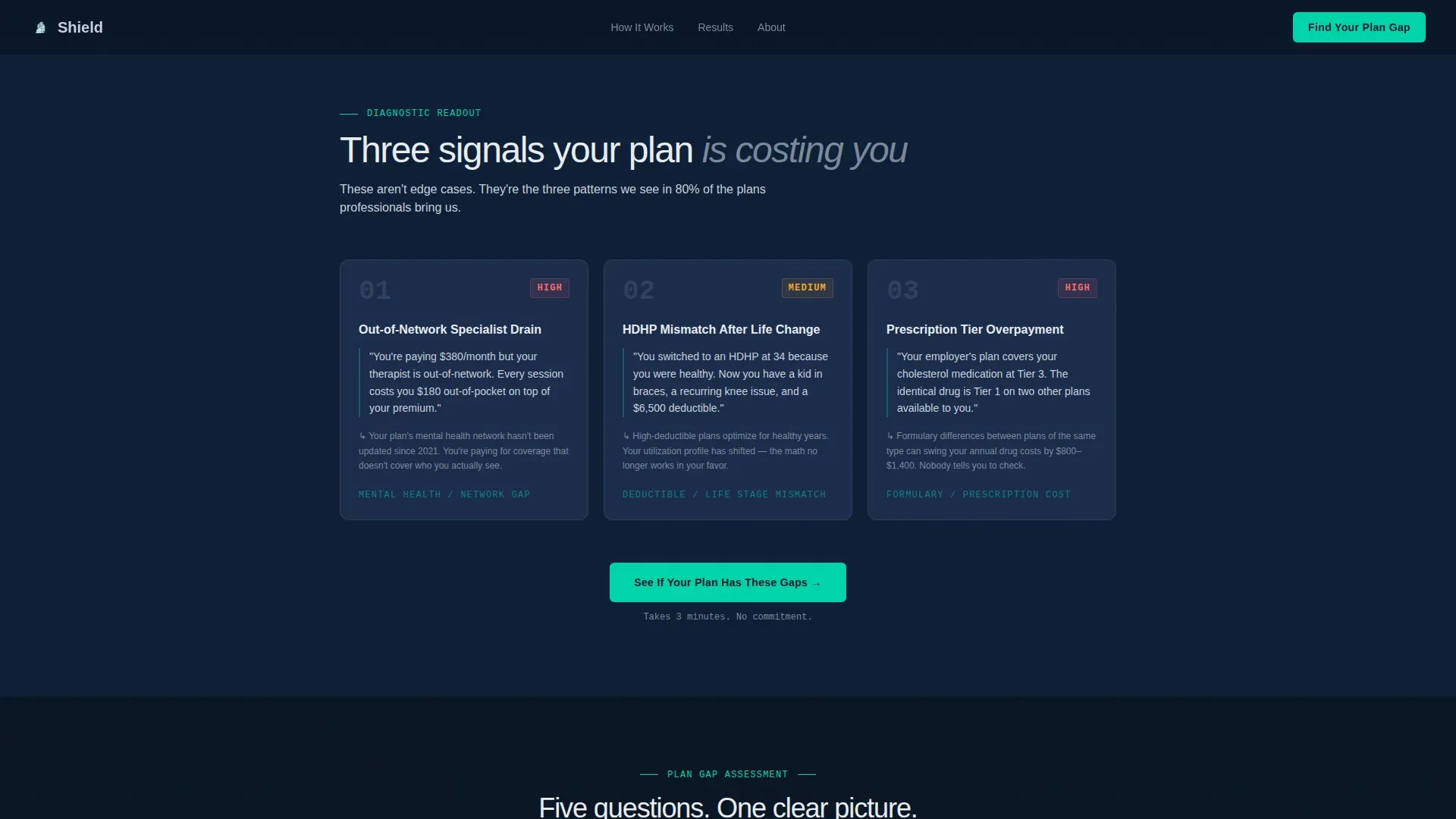
Three numbered cards present real health insurance scenarios as diagnostic readouts. Each card names a specific cost problem, such as paying a high monthly premium while a therapist sits out-of-network. This section makes the case for change before the quiz ever appears and helps build trust with the visitor.
Personalized Results Teaser and Email Capture
On quiz completion, a single sentence summarizes the visitor's likely coverage gap. A secondary call-to-action, "Get My Full Analysis," then collects name and email to deliver the detailed report. The page earns the sign-up by showing it already understands the problem. Multi-step forms like this reduce friction and improve conversion rate by dividing the process into smaller parts.
Proof Stack with Live Counters
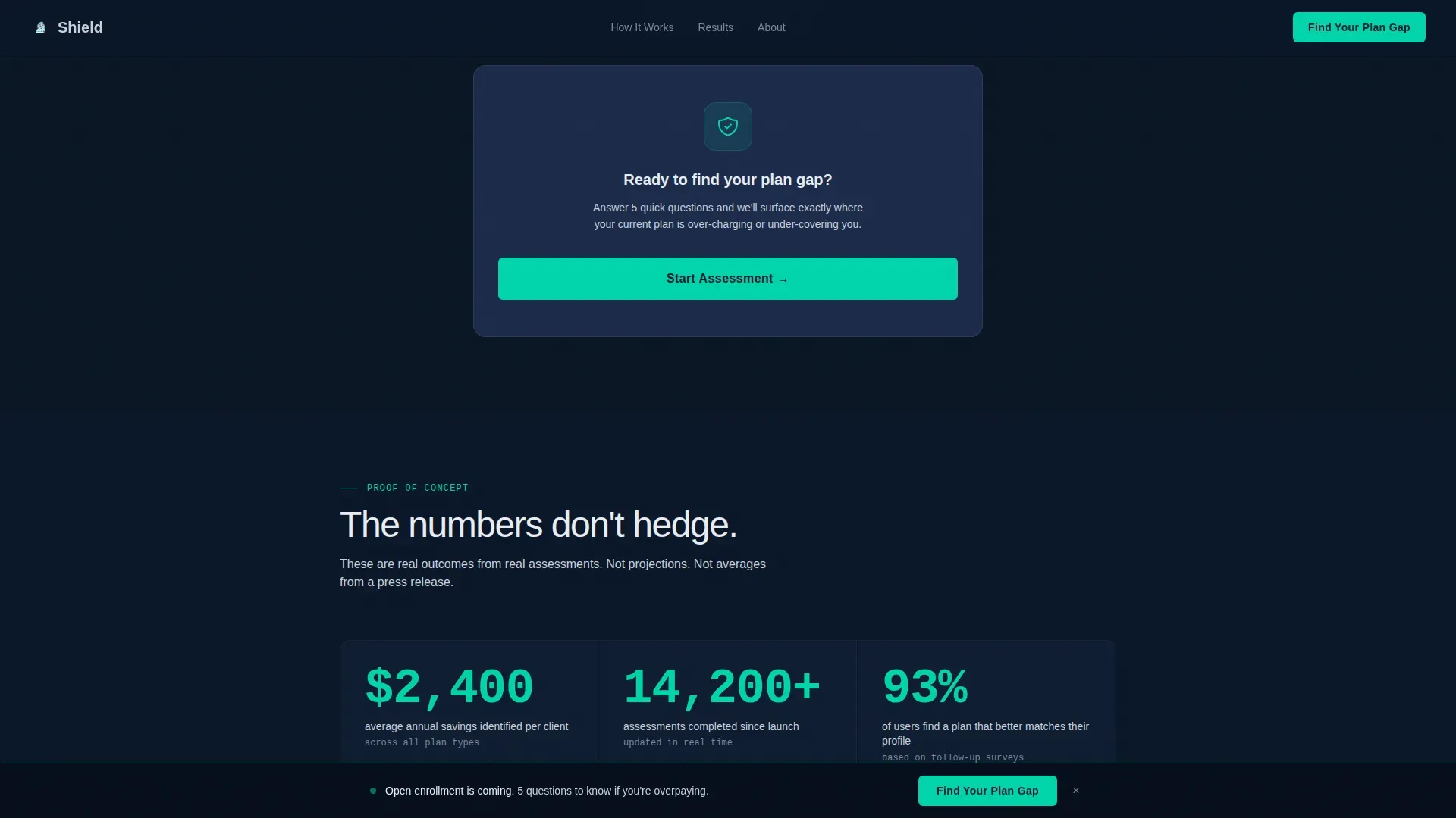
Below the quiz, the proof stack section displays average savings figures, a live counter of assessments completed, and an anonymized before-and-after breakdown showing a real plan switch result. Social proof displayed this way helps build credibility for mid-career individuals who need trust signals before sharing personal data.
Sticky Bottom Call-to-Action Bar
After a visitor scrolls past 40 percent of the page, a sticky bottom bar appears with the primary "Find Your Plan Gap" button in pulse-bright teal. This persistent element keeps the primary action visible without interrupting the reading flow and contributes to a stronger conversion rate throughout the page.
Page sections overview
| Section | Purpose |
|---|---|
| Carrier Logo Marquee | Display major carrier logos and anchor the headline |
| Pain Point Cards | Name three specific cost problems as diagnostic data |
| Quiz Funnel Entry | Introduce the inline five-step assessment |
| Proof Stack | Show savings data and anonymized plan comparison |
| Results Teaser | Deliver a personalized gap summary and capture email |
| Sticky call to action Bar | Keep the primary action button visible after scroll |
| Footer | Single-row linear footer with essential links |
Design & branding system
The visual style follows a Data Command theme. The palette feels like the glow of a financial terminal at early morning: authoritative, data-dense, and quietly urgent. White space is used deliberately, ensuring no section overwhelms the eye.
- Background layers: deep terminal navy (#0A1628) as the primary background, steel-blue midtone (#1B2A4A) for card surfaces and section dividers that darken progressively as the visitor scrolls
- Body text in cool silver (#C9D1D9) for readability; pulse-bright teal (#00D4AA) reserved exclusively for interactive elements, progress bars, and call-to-action buttons
- Typography uses Manrope for headings and body copy, with JetBrains Mono for data values and numbers to reinforce the terminal aesthetic
Mobile & speed optimization
The page is designed desktop-first to match the Bloomberg terminal aesthetic of the target audience, and it is fully responsive across all screen sizes. The layout can automatically adjust for mobile with responsive column stacking.
- The landing page loads fast on mobile and desktop, keeping all interactive elements accessible without layout breakage
- The inline quiz, drag slider, and sticky call-to-action bar are all touch-friendly and functional on smaller screens
- GSAP-powered scroll reveals, progress ring animations, and the marquee loop are scoped to client components, keeping static sections light and quick to render
How this template helps you convert
Every element on this insurance landing page works toward one goal: moving a skeptical mid-career professional from recognition to a completed form. The page earns the lead before it asks for it.
- The pain-point cards qualify the visitor in the first scroll, creating immediate relevance and reducing bounce before the quiz entry point appears.
- The five-step quiz gathers coverage context progressively, using multi-step forms to reduce friction, so each small commitment feels manageable rather than invasive.
- The proof stack and results teaser close the loop with concrete data, giving the visitor a reason to fill in their name and email to access the full analysis.
Other information about this template
This template is built specifically for the mid-career health insurance niche, where insurance options are plentiful but confusing. It is a great example of high converting landing pages that protect attention by focusing on a single action at a time.
- Mid-career professionals should check if their trusted doctors are in-network before finalizing a new plan; this page can support that discovery through the quiz coverage questions
- Health Savings Accounts (HSAs) offer tax-free savings for medical gaps and should be prioritized with a High Deductible Health Plan (HDHP); the template's quiz checkboxes can surface this insurance option naturally
- Health Insurance Marketplace plans qualify for a Special Enrollment Period of 60 days after losing job-based coverage, a fact relevant to the job-change scenarios this page addresses
- Short-term health insurance is often cheaper but excludes pre-existing conditions and is not compliant with the Affordable Care Act (ACA); a brokerage using this page can clarify these insurance products in the results teaser
- Using a licensed insurance broker to compare insurance options costs nothing; this template is designed to make that free consultation feel like the obvious next step
- The shield find your plan gap mid career health insurance landing page template is available for preview in the marketplace and can support marketing campaigns across the mid-career insurance business niche
- Trust signals can include relevant accreditations and industry awards that highlight an insurance company's credibility; the proof stack section is the recommended placement for those elements
- Unlike a travel insurance or auto insurance page that focuses on a single product type, this template manages the complexity of comparing multiple health insurance plan types within one focused flow
- Companies using landing pages generate 55 percent more leads than those without dedicated landing pages, making this template a practical starting point for any insurance company ready to grow
Theme
Data Command
Creative direction
Problem→Solution Arc
Color system
Midnight Blue
Style
Single Column Flow
Direction
Quiz/Assessment
Page Sections
Carrier Logo Marquee and Headline Block
Inline Five-step Quiz Funnel
Diagnostic Pain-point Data Cards
Proof Stack with Savings Counter
Personalized Results Teaser and Email Capture
Sticky Bottom Call-to-action Bar
Related questions
Who is this landing page template designed for?
Can I customize the quiz questions and insurance options shown?
Does the page work as a standalone health insurance landing page?
What makes this template different from a generic insurance landing page?
Is this template relevant for group health plans and small business owners?



