CKD Booking Landing Page Template for Health Apps
Nephra is a sidebar companion landing page built for a chronic kidney disease digital therapy app. It uses a warm three-step intake form, a Problem-to-Solution scroll arc, and a persistent booking sidebar to guide newly diagnosed patients and their caregivers from diagnosis overwhelm toward a calm, scheduled conversation with a renal health coach.
by Rocket studio
Quick summary
Nephra is a single-page booking experience for a kidney disease digital therapy app. It opens with a gentle three-step intake form, moves through a Problem-to-Solution content arc, and keeps a sticky sidebar visible at all times. Every section earns the visitor's trust before asking them to book a free renal check-in call.
Who this template is for
This template is designed for digital health teams building a patient-first booking experience around chronic kidney disease (CKD) management. It speaks directly to people who are scared, newly diagnosed, and searching for calm guidance rather than a sales pitch.
- Stage 3 and Stage 4 CKD patients who have just received a diagnosis and do not yet know what to eat or drink
- Caregiving spouses and family members researching dietary guidance on behalf of a patient
- Dialysis-adjacent patients who want to delay progression and need a structured starting point
What problem this template solves
A CKD diagnosis typically comes with a dense printout and very little time to ask follow-up questions. Patients go home and open Google at 2 a.m., find contradicting information, and feel worse than before. This template replaces that spiral with a structured, calm first experience.
- It names the real fears patients carry: fluid confusion, phosphorus limits, medication timing, and emotional overwhelm
- It matches each fear to a specific app feature, so visitors understand exactly how the app helps before they commit to anything
- It removes the hard sell entirely and replaces it with a low-stakes 15-minute call booking, which feels safe for a vulnerable audience
What you get with this template
You get a fully structured single-page layout with a sidebar companion design, a three-step intake form, a sequenced content arc, and multiple booking touchpoints. The layout is built to feel like a warm consultation room, not a software product page.
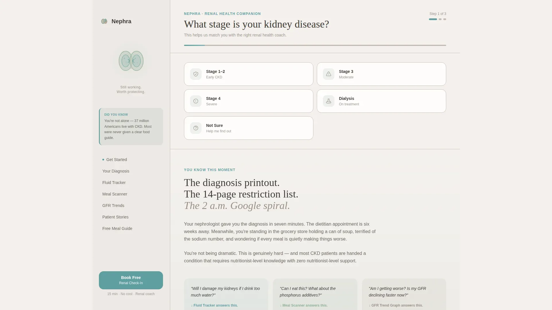
- A three-step header form that collects CKD stage, current challenge, and preferred call time, then surfaces a personalized booking calendar
- A persistent sidebar that displays a soft animated kidney illustration, contextual scroll-triggered micro-tips, and a sticky "Book Your Free Renal Check-In" button
- A secondary email capture for visitors who are not yet ready to speak with a coach, offering a CKD Meal Guide download as a lower-commitment entry point
Feature list
This template includes purpose-built components designed specifically for a health coaching booking flow. Each one serves the emotional and practical needs of a CKD patient or caregiver.
Three-Step Intake Form
The header form walks visitors through three gentle questions: their CKD stage, their biggest current challenge, and their preferred call time. On completion, a personalized calendar widget loads with the next three available 15-minute onboarding slots. Form step transitions are animated to feel smooth and unhurried.
Persistent Sidebar Companion
The sidebar stays fixed as the visitor scrolls. It holds a soft illustration of kidneys with a small animated pulse, contextual micro-tips that update based on scroll position, and a sticky booking button. It makes the layout itself feel like a preview of the app experience.
Problem-to-Solution Scroll Arc
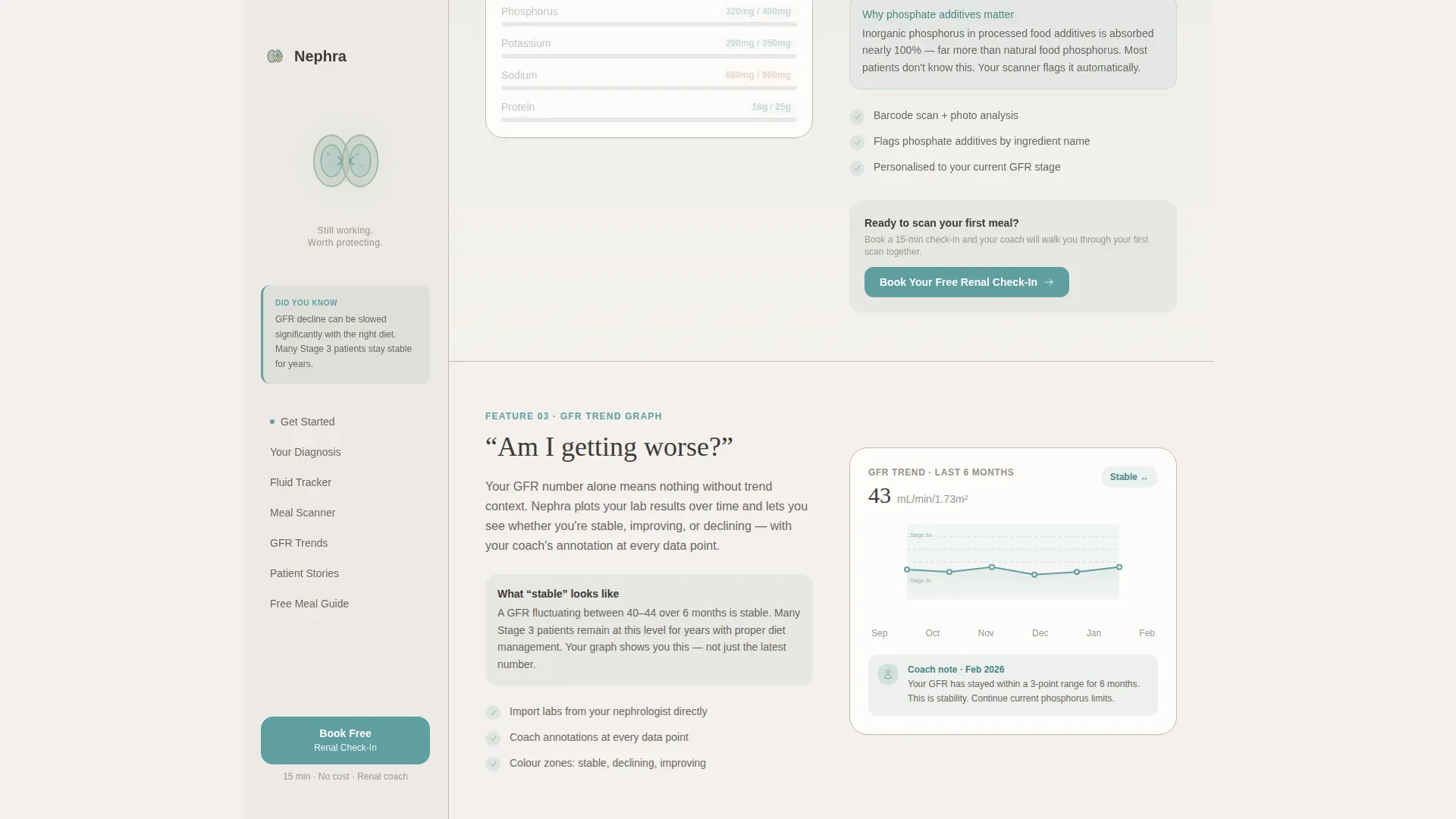
Each content section beneath the header resolves one specific patient fear. The fluid tracker section addresses hydration anxiety. The meal scanner section answers "Can I eat this?" The GFR trend graph section reassures patients who fear silent progression. The arc moves visitors from panic to comprehension to a sense of control.
Dual Call-to-Action System
The primary call to action, "Book Your Free Renal Check-In," appears at form completion, mid-page after the meal scanner section, and as a persistent sidebar button. The secondary path is a "Send Me the CKD Meal Guide" email capture for visitors who need more time before speaking with a human.
Scroll-Triggered Contextual Tips
As visitors scroll through each feature resolution section, the sidebar updates with short, relevant micro-tips tied to the content in view. This mirrors the in-app experience and builds trust in the product before any commitment is made.
Patient Testimonials Section
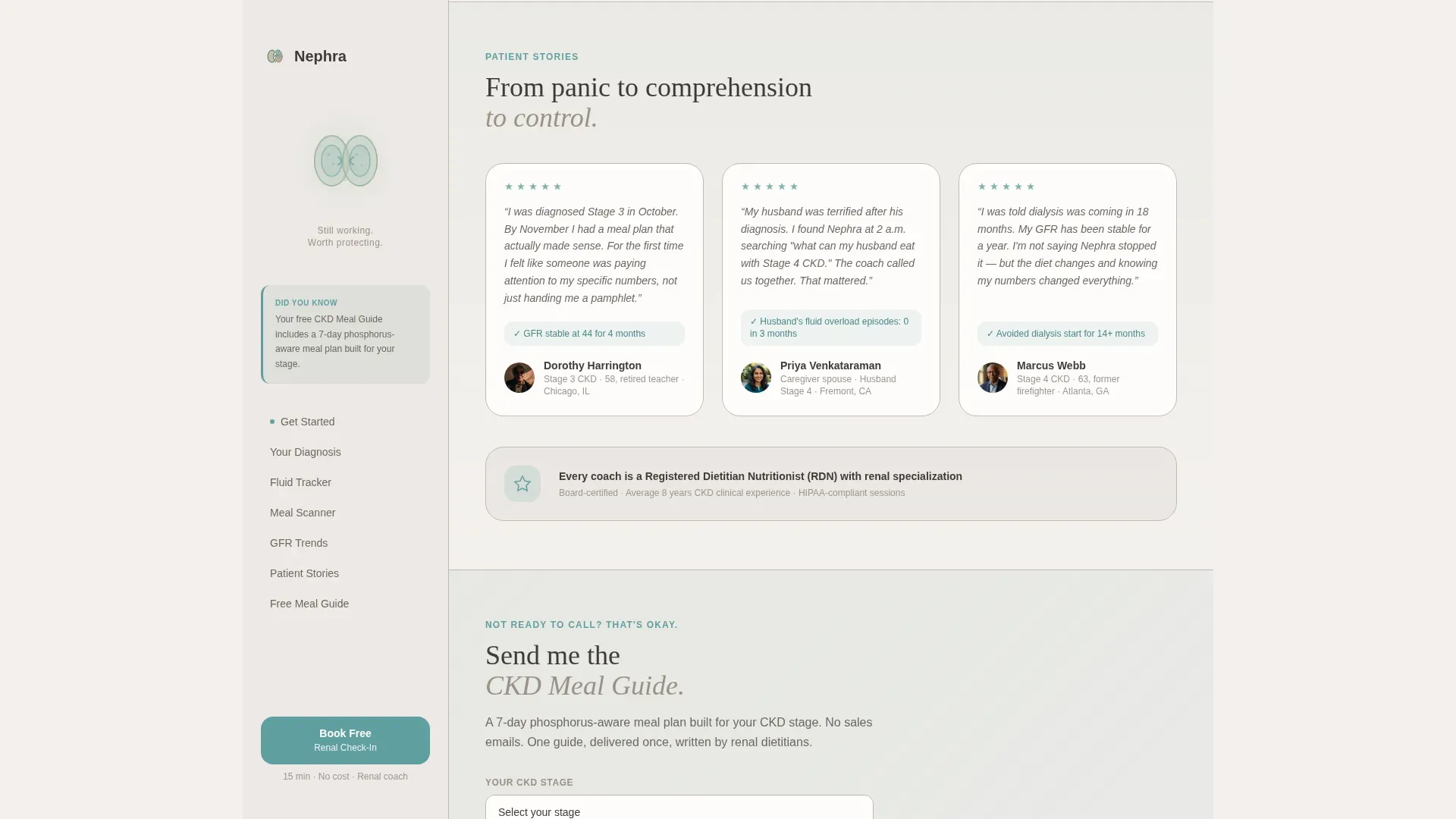
A dedicated testimonials block surfaces real patient voices with specific outcomes and CKD stage context. Dietitian credentials are also presented here, establishing clinical authority in a way that feels personal rather than institutional.
Page sections overview
| Section | Purpose |
|---|---|
| Three-Step Intake Form | Collects CKD stage, challenge, and booking preference; opens calendar |
| Sidebar Kidney Illustration | Displays animated pulse and contextual micro-tips while visitor scrolls |
| Problem Arc Section | Names diagnosis overwhelm and real patient fears by name |
| Fluid Tracker Resolution | Resolves hydration anxiety with the fluid tracking feature |
| Meal Scanner Resolution | Answers "Can I eat this?" with the in-app meal scanner demo |
| GFR Trend Resolution | Addresses fear of silent progression with the GFR trend graph |
| Patient Testimonials | Shares specific outcomes and dietitian credentials for social proof |
| CKD Meal Guide Capture | Email opt-in for visitors not ready to book a call yet |
| Footer | Horizontal flow layout with navigation and supporting links |
Design & branding system
The visual identity follows a Healing Space theme. Every design decision reduces clinical anxiety and replaces it with warmth and calm. The color system is called Soft Mist, inspired by the first quiet hour after rain in a Japanese healing garden.
- Colors: morning fog white (#F4F1ED) for backgrounds, washed sage (#B5C5B8) for section washes, quiet stone (#9A8F85) for the persistent sidebar, reassuring teal (#5F9EA0) for buttons and progress indicators, and warm charcoal (#3E3A36) for body text
- Typography: DM Sans for body text (clean and legible at small sizes) and Fraunces for headings (a warm serif that feels personal and editorial, not clinical)
- Animations: scroll-triggered reveals, sidebar micro-tip transitions, three-step form transitions, and a kidney pulse SVG in the sidebar set to a medium animation intensity
Mobile & speed optimization
This template is built mobile-first. CKD patients often check information from a phone in a clinic waiting room or a grocery store aisle. Every component is designed to serve that context.
- The three-step form uses large, tappable stage-selection cards that work comfortably on small screens with no pinch-zoom required
- The sidebar companion adapts to mobile by collapsing into a bottom-anchored sticky bar, keeping the booking button and micro-tips accessible without obscuring content
- Static sections use server-rendered components for fast initial load; the interactive form and sidebar run as client components to keep interactivity smooth without slowing the first paint
How this template helps you convert
This template earns conversions by building trust incrementally rather than pushing a single hard ask. Every structural choice reduces the emotional barrier for a medically vulnerable audience.
- The three-step intake form creates immediate personalization. By answering two questions about their own situation, visitors feel seen before they see any product features.
- The Problem-to-Solution arc sequences content so that each scroll resolves a named fear. Visitors arrive at the booking call to action already feeling calmer and more informed.
- The dual call-to-action system captures visitors at two different levels of readiness. Those ready to talk book a call; those who need more time leave an email address and receive the CKD Meal Guide, keeping them in the funnel.
Other information about this template
This template is part of a broader digital health design system built for B2C wellness software-as-a-service (SaaS) products. It is especially suited to apps that combine self-tracking tools with human coaching, where the booking of a first consultation is the key conversion event.
- The footer follows a horizontal flow layout pattern, keeping navigation clean and uncluttered at the bottom of the page
- Localization is set for English (USA) with imperial measurements and USD pricing contexts, making it ready for a North American patient audience without modification
- The sidebar companion layout can support any health coaching product where a persistent contextual guide adds trust, not just CKD-specific use cases

Theme
Healing Space
Creative direction
Problem→Solution Arc
Color system
Soft Mist
Style
Sidebar Companion
Direction
Booking/Scheduling
Page Sections
Three-step Booking Intake Form
Persistent Sidebar Companion
Problem-to-solution Content Arc
Dual Call-to-action System
Patient Testimonials Block
Healing Space Visual System
Related questions
Who is this landing page template designed for?
Can I adapt the three-step intake form for a different health condition?
Does the sidebar companion work on mobile devices?
What is the secondary conversion path included in this template?
Is this template suitable for caregiver audiences as well as patients?



