Nephrologist Booking Website Template
Nephron is a hub-and-spoke landing page template built for kidney care practices. It gives chronic kidney disease patients and their caregivers a clear digital front door to track lab trends, schedule dialysis, and message their care team. The design uses a calming Forest Trust color system with animated counters and a testimonial-led hero to build trust fast.
by Rocket studio
Quick summary
Nephron is a single-page patient portal landing page for nephrology practices. It opens with a floating testimonial card, moves through animated outcome stats, and walks visitors through secure messaging, lab tracking, appointment scheduling, and care team access. The page closes with a lead generation form that converts both patients and caregivers.
Who this template is for
This template is built for kidney care practices and nephrologists who need a clear, trustworthy digital front door. It speaks directly to patients and the people who support them every day.
- Stage 3 and 4 chronic kidney disease (CKD) patients managing creatinine levels alongside diabetes medications
- Kidney transplant recipients coordinating immunosuppressant schedules
- Adult children remotely coordinating a parent's peritoneal dialysis care
What problem this template solves
Patients with CKD often wait weeks between appointments before learning their kidney function has shifted. Phone hold times, scattered lab results, and no easy way to reach their nephrologist make a stressful condition even harder to manage. This template solves those gaps with a structured, evidence-first landing page that shows patients what the portal actually delivers.
- Patients catch declining glomerular filtration rate (GFR) trends weeks before their next scheduled visit
- Caregivers coordinating care from a distance get a clear path to request remote access
- The page replaces vague portal marketing with concrete outcome stats and a real patient story
What you get with this template
This template delivers a fully structured, single-page layout with every section pre-built and ready to customize. The design and interaction pattern are defined from the first pixel to the final form submit button.
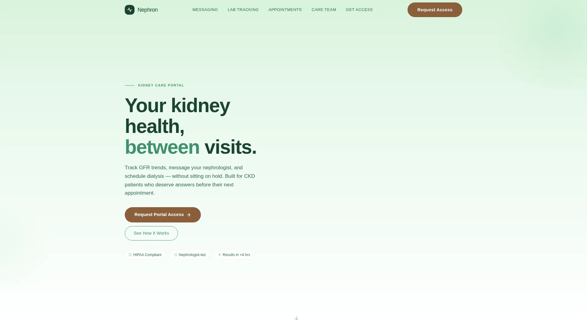
- A hero section with a floating testimonial card, animated eGFR sparkline, and a birch-to-white soft gradient background
- Five anchor-linked content spokes covering messaging, lab tracking, scheduling, care team access, and portal access request
- A lead generation form with a patient or caregiver radio toggle, secondary content download path, and a mobile sticky call-to-action bar
Feature list
This template includes a focused set of built-in components. Each one is designed to move a first-time visitor from curiosity to confidence.
Animated Testimonial Hero Card
The header opens with a single oversized card floating on a birch-to-white gradient. It displays a real patient quote, first name, diagnosis stage, and care duration alongside a small animated sparkline that draws eGFR trends stabilizing over twelve months. No stock photography is used.
Stats-First Impact Section
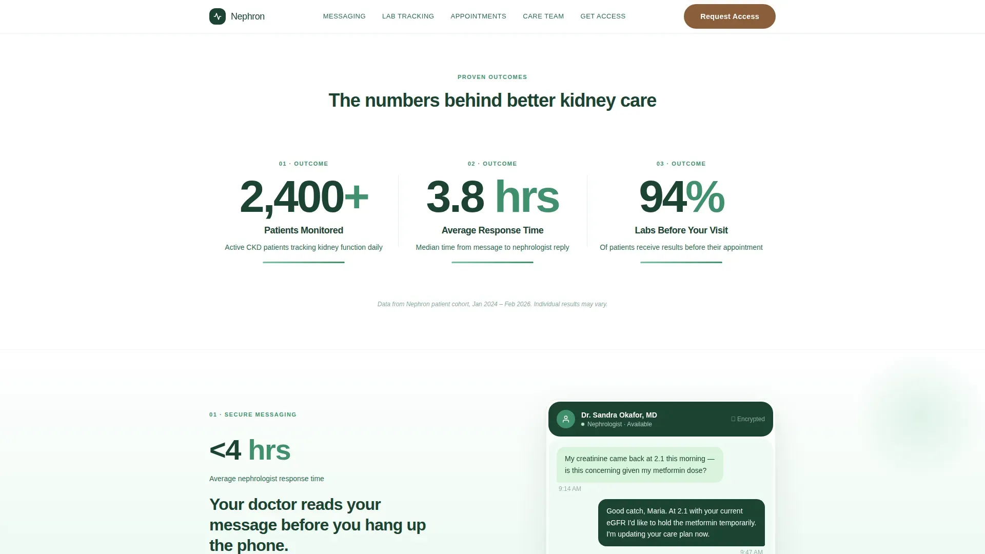
Three large animated counters appear immediately below the testimonial. They count upward on scroll to show patients monitored, average response time in hours, and lab results delivered before the next office visit. Each counter anchors the visitor in proof before they read a single feature description.
Secure Messaging and Lab Tracking Split
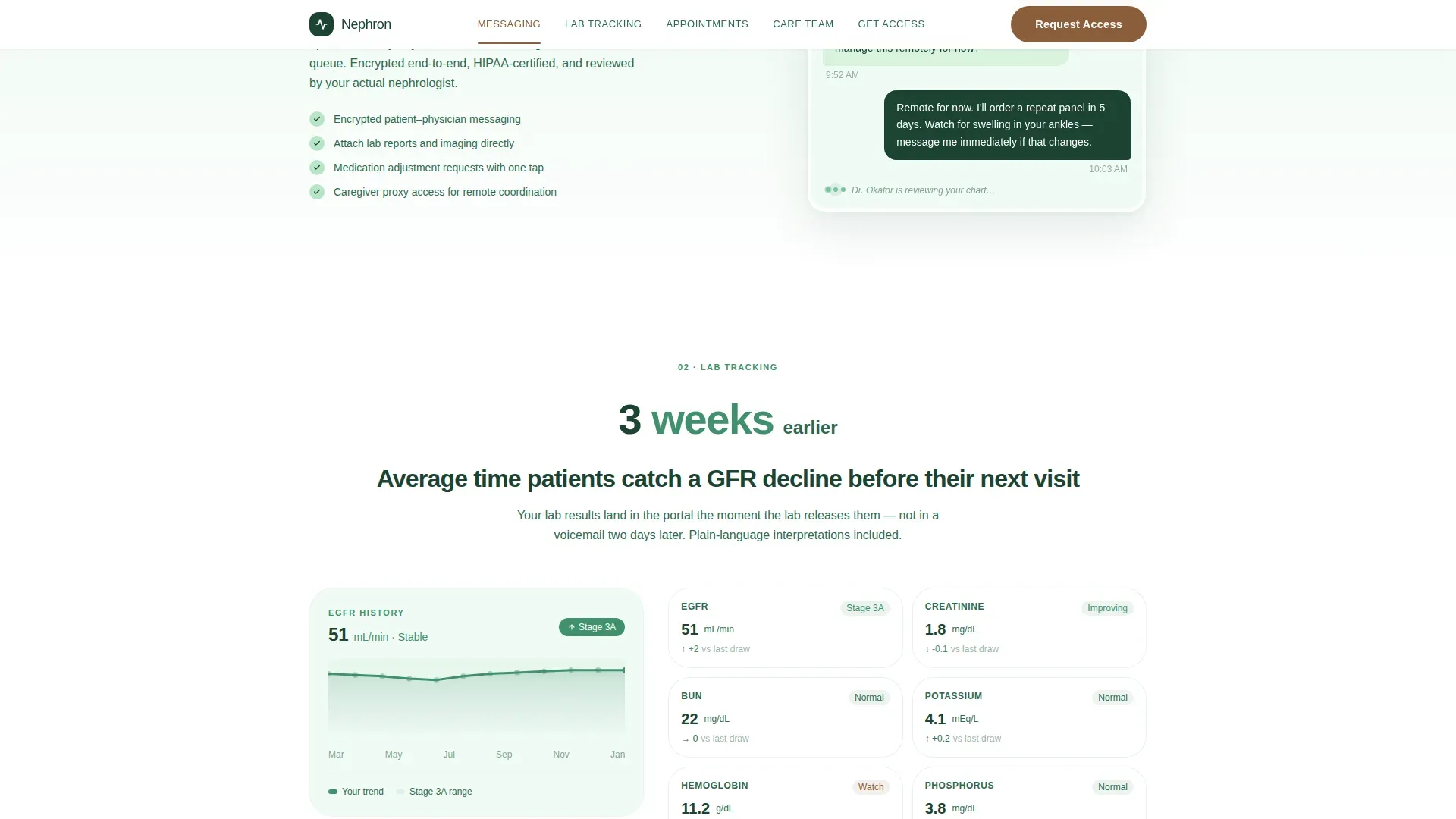
An asymmetric twelve-column layout pairs a message thread visual on one side with a GFR trend chart on the other. Each sub-section opens with its own headline stat before explaining the feature, so evidence always leads the story.
Care Team Access Bento Block
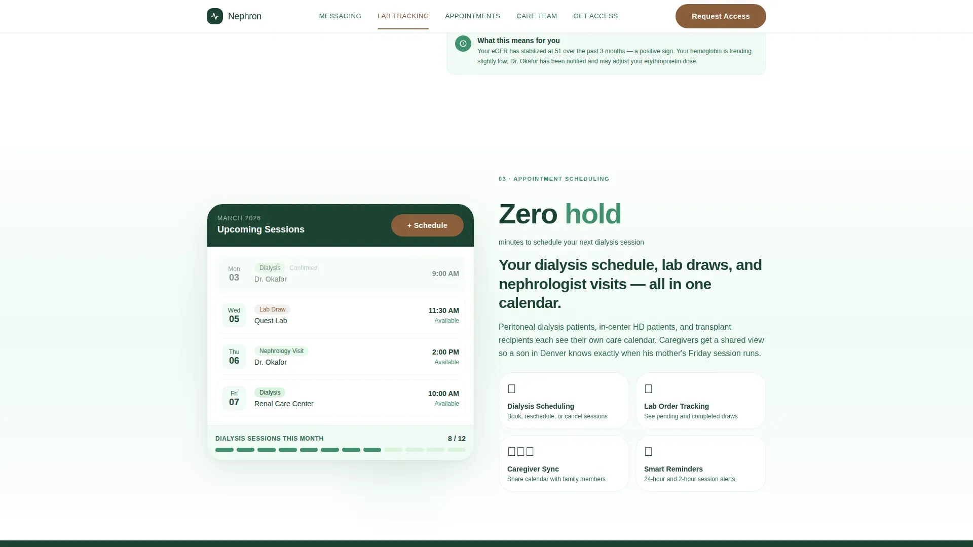
A bento-style grid section covers dialysis session scheduling, caregiver coordination tools, and transplant immunosuppressant tracking in one compact view. Each tile opens with a number before its narrative.
Dual-Path Lead Generation Form
The final spoke is a portal access request form. Visitors choose patient or caregiver status first via a radio toggle, then enter their name, referring nephrologist or clinic, and preferred contact method. A secondary call-to-action offers a downloadable CKD self-tracking guide for visitors who are not yet ready to request access.
Sticky Mobile Call-to-Action Bar
On mobile devices, a persistent bottom bar keeps the primary "Request Portal Access" action visible at all times. This supports caregivers who coordinate care on a phone while away from home.
Page sections overview
| Section | Purpose |
|---|---|
| Hero Testimonial Card | Opens with patient proof and animated eGFR sparkline |
| Stats Impact Row | Three animated counters establish outcome credibility |
| Secure Messaging Spoke | Explains direct nephrologist communication with a stat lead |
| Lab Tracking Spoke | Shows GFR trend visualization and early-alert value |
| Appointment Scheduling Spoke | Covers dialysis session booking and visit management |
| Care Team Access Bento | Groups caregiver, transplant, and dialysis tools in one grid |
| Portal Access Form | Converts visitors with a patient or caregiver toggle form |
| Footer Row | Single-row linear footer with practice and contact links |
Design & branding system
The visual identity follows a Soft Gradient theme built around the Forest Trust color system. The palette is grounding and unhurried, like a walking trail through old-growth forest at early morning light.
- Deep evergreen (#1B4332) carries all primary text, deep evergreen fern (#40916C) fills section dividers and icon elements, morning birch (#D8F3DC) anchors background gradients, and warm bark (#8B5E3C) is reserved for buttons and active anchor nav states
- Backgrounds transition in soft vertical gradients from birch down to white, giving the page a quiet, oxygenated feel as visitors scroll
- Typography uses Plus Jakarta Sans for all headings and DM Sans for body copy, keeping the hierarchy clear and readable at every size
Mobile & speed optimization
The template is designed desktop-first with strong mobile optimization built in, because caregivers frequently coordinate care from a phone while away from home.
- Scroll reveals, staggered entrance animations, and counter animations are implemented as client components, keeping static content fast to render
- The sticky bottom call-to-action bar on mobile ensures the portal access request is never more than one tap away
- The anchor navigation locks to the top on scroll and updates its active state as the visitor moves between spokes, working cleanly across screen sizes
How this template helps you convert
The page is structured to build a case through accumulated evidence. By the time a visitor reaches the form, they have already absorbed multiple proof points.
- The testimonial card at the top creates immediate emotional trust. A real name, a real diagnosis stage, and a visible GFR trend tell the story before a word of feature copy is read.
- The stats section hits visitors with three concrete outcome numbers early in the scroll. Proof arrives before process, which lowers the skepticism a first-time visitor naturally brings to a healthcare portal page.
- The dual-path form removes the all-or-nothing barrier. Visitors who are not ready to request access can still download the CKD self-tracking guide, staying connected to the practice while they decide.
Other information about this template
This template sits at the intersection of healthcare software as a service (SaaS) patient portal design and nephrologist website best practices. It is localized for United States audiences, using English copy, MM/DD/YYYY date formatting, and US phone number formatting throughout.
- The animation level is set to medium: counter animations, sparkline draw-on-scroll, scroll reveals, and staggered entrance effects are all included
- The form toggle interaction distinguishes between a patient filling out their own request and a caregiver acting on behalf of a family member, which matters for intake routing
- The page style is Hub and Spoke with Anchor Navigation, meaning the sticky nav links jump to each spoke section directly, reducing friction for returning visitors who know what they need
Theme
Soft Gradient
Creative direction
Stats-First Impact
Color system
Forest Trust
Style
Hub & Spoke (Anchor Nav)
Direction
Lead Generation
Page Sections
Animated Testimonial Hero Card
Stats-first Impact Counters
Secure Messaging and Lab Tracking Layout
Care Team Access Bento Grid
Dual-path Lead Generation Form
Sticky Mobile Call-to-action Bar
Related questions
Who is this landing page template designed for?
Can caregivers use this template to coordinate a parent's dialysis care?
What makes the hero section different from a standard testimonial block?
Does the template include a secondary conversion path?
Is the page optimized for mobile use?



