Nephrology Support Community Landing Page Template
Nephron is a healing-space landing page template built for kidney patient support communities. It opens with an oversized testimonial card, then walks visitors through three FAQ-anchored comparison tables that replace fear with clarity. The design uses Arctic White, Saline Blue, and soft Mauve tones to feel both clinically trustworthy and genuinely warm.
by Rocket studio
Quick summary
Nephron is a single-page, click-through landing page template for a nephrology peer support community. It leads with one powerful patient testimonial, then moves through three FAQ-driven comparison tables that answer the questions chronic kidney disease patients actually search for. Every section earns trust before asking for anything.
Who this template is for
This template is built for organizations, advocates, or community managers running a peer support group for kidney patients and their caregivers. It speaks directly to people in one of the most anxious, information-hungry moments of their lives.
- Chronic kidney disease communities serving patients at stage 3 through stage 5
- Peritoneal dialysis and hemodialysis caregiver support networks
- Post-transplant patient communities helping members navigate immunosuppressant management and recovery
What problem this template solves
Kidney patients spend late nights searching for answers that medical websites rarely give in human terms. They feel isolated, overwhelmed, and unsure who to trust. A generic landing page does nothing for someone who just got a glomerular filtration rate result they cannot interpret.
- It replaces clinical distance with human warmth through real patient voices and plain-language comparison tables
- It addresses the three most common fear-driven search queries before asking the visitor to do anything
- It removes the pressure of immediate sign-up by offering a secondary path to a free downloadable guide
What you get with this template
You get a fully structured, section-led landing page that converts anxious visitors into community members by answering their real questions first. Every component is mapped to a specific emotional or informational need.
- A floating hero testimonial card, three FAQ comparison table sections, a social proof block, and a linear single-row footer
- Two call-to-action placements: a primary "Join the Conversation" button after the first FAQ table and a persistent bottom bar after the third
- A secondary conversion path offering a downloadable new diagnosis guide for visitors not yet ready to join
Feature list
This template is built around one core idea: earn the click before you ask for it. Each feature below serves that goal directly.
Oversized Floating Testimonial Card
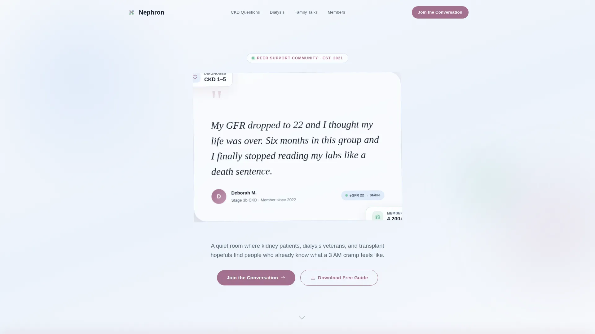
The hero section features a single large testimonial card with handwritten-style typography. It presents one real patient quote, a name, a diagnosis stage, and a small avatar circle. No stock photography. No medical clip art. Just one human voice given enough space to land.
FAQ-Anchored Comparison Tables
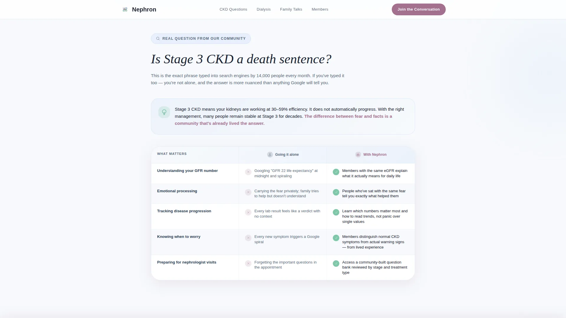
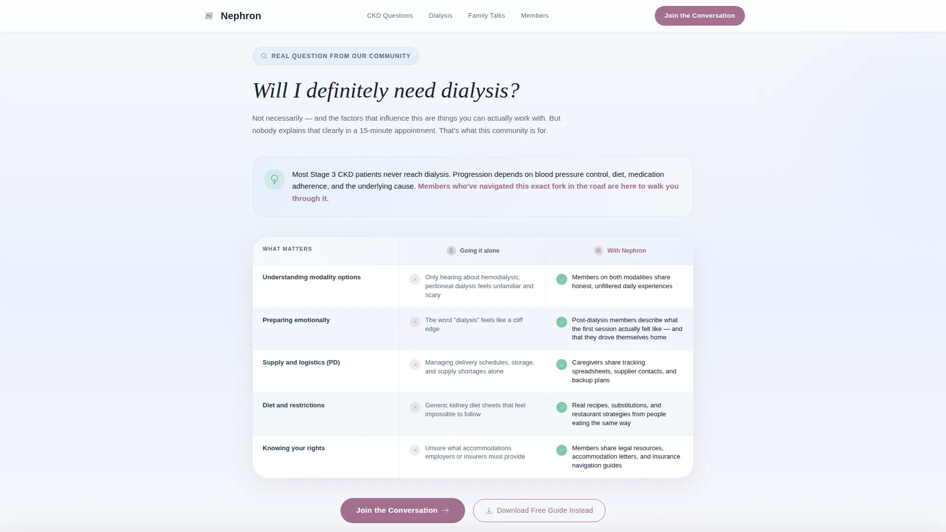
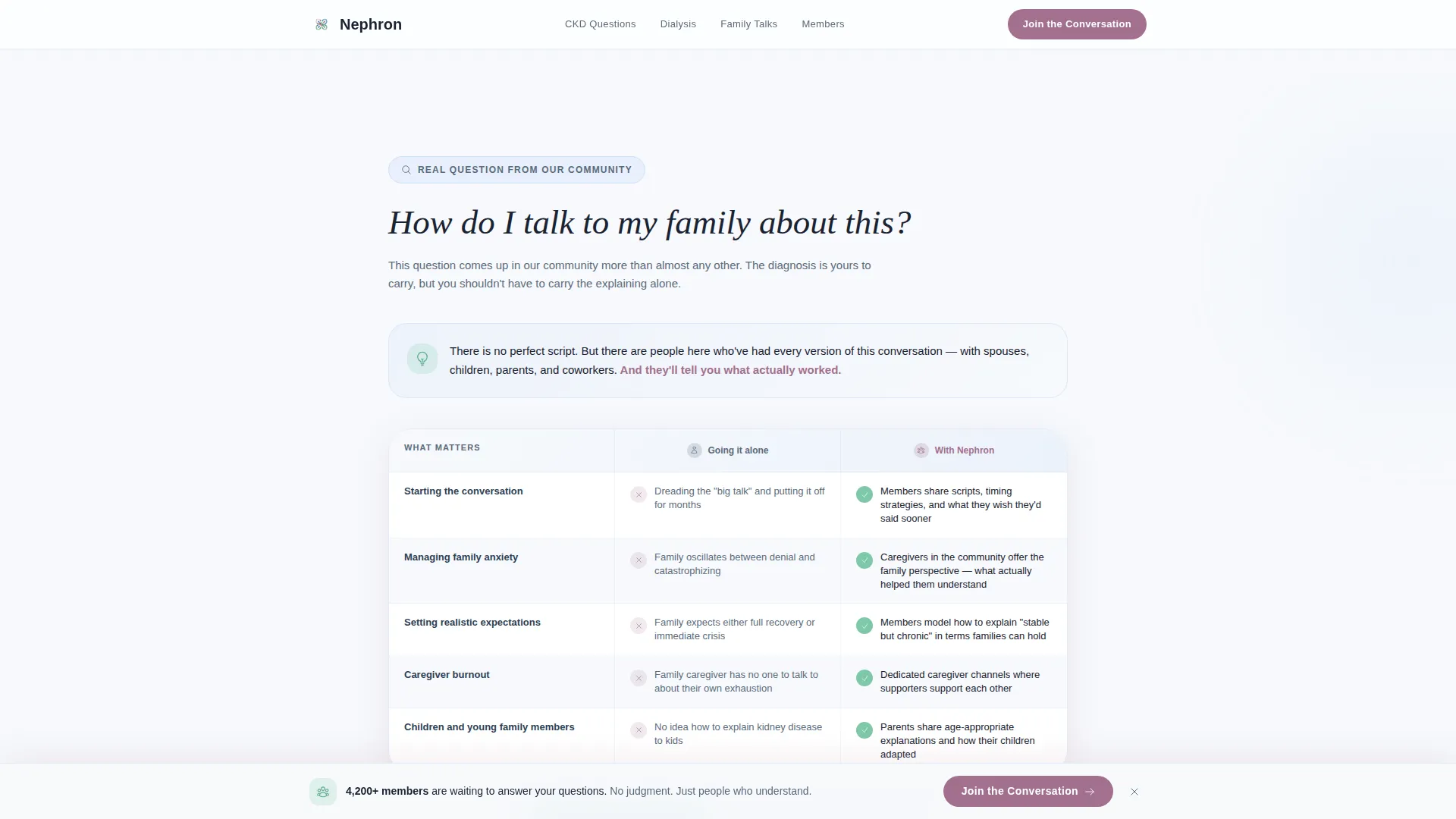
Three full comparison tables are each introduced by a real patient search question. Each table contrasts the community experience against going it alone, covering emotional outcomes, information access, and practical caregiving knowledge. The scroll dismantles anxiety row by row.
Dual Call-to-Action System
The primary call to action, "Join the Conversation," appears after the first FAQ table and again as a persistent bottom bar after the third. A secondary path offers the downloadable new diagnosis guide. Both paths are click-through only; no form is present on this page.
Social Proof Block with Diagnosis Stage Badges
Below the third FAQ table, a social proof section displays member testimonial cards in a rotated layout alongside member count metrics and diagnosis stage badges. This section shows the community's breadth and gives late-stage visitors proof they belong here.
Scroll-Triggered Animation System
The template uses clip-in reveals and scroll-triggered fade-ups to introduce each section gently. The floating hero card has ambient motion. Comparison table rows use spotlight hover states. The animations are medium intensity, never distracting.
Healing Space Color and Typography System
DM Sans headings pair with Crimson Text for testimonial quotes, creating a clear distinction between clinical clarity and human warmth. The Arctic White color system keeps the page trustworthy without feeling cold.
Page sections overview
| Section | Purpose |
|---|---|
| Hero Testimonial Card | Opens with a single oversized patient quote to give visitors immediate emotional permission to stay |
| FAQ Comparison Table 1 | Answers "Is stage 3 CKD a death sentence?" with a side-by-side community versus. alone comparison |
| FAQ Comparison Table 2 | Answers "Will I definitely need dialysis?" and introduces the first primary call to action |
| FAQ Comparison Table 3 | Answers "How do I talk to my family about this?" and triggers the persistent bottom call-to-action bar |
| Social Proof Block | Displays member voices, diagnosis stage badges, and member count metrics with a secondary guide download offer |
| Linear Footer | Single-row footer pattern with essential links |
Design & branding system
The visual identity follows a Healing Space theme built on the Arctic White color system. The goal is a palette that feels sterile enough to be trusted and warm enough to encourage someone to stay.
- Four core colors: clinical calm white (#F7F9FC), soft Saline Blue (#D0E1F9), muted kidney-bean Mauve (#A2708E), and vitals-monitor green (#7FC8A9) for interactive elements and progress indicators
- Typography uses DM Sans for all headings and interface text, paired with Crimson Text exclusively for testimonial quotes to separate data-clear communication from human narrative
- Interactive states use vitals green on comparison table hover and the persistent bottom call-to-action bar, keeping action moments visually distinct from passive reading
Mobile & speed optimization
This template is built mobile-first because kidney patients are most likely searching on their phones at midnight, not at a desktop. Every layout decision starts at the smallest screen.
- The floating testimonial card, comparison tables, and social proof block all reflow cleanly for narrow viewports without losing hierarchy
- Server Components handle all static content rendering, while Client Components manage animations and interactive states, keeping the page lightweight where it counts
- The persistent bottom call-to-action bar is designed to stay accessible on mobile without obscuring content during scroll
How this template helps you convert
This template converts by building trust through information first. It never asks for commitment before delivering value.
- The oversized testimonial card at the top gives a scared visitor an immediate emotional reason to keep reading, reducing bounce before a single product claim is made.
- Each FAQ comparison table answers a real search query in structured, scannable format, so the visitor feels informed and understood by the time they reach the call to action.
- The dual call-to-action system lets visitors choose their own pace: join the community directly or download the free guide first, reducing friction for the undecided visitor.
Other information about this template
Nephron is designed specifically for the nephrology support group and peer community niche within the broader health and wellness space. A few additional details worth noting:
- The template supports English-language content with United States date format and USD currency conventions built into the layout
- The page type is a click-through landing page; there is no embedded form, keeping the registration experience on a dedicated membership page
- The FAQ accordion component and comparison table hover states are included as interactive elements alongside the persistent bottom call-to-action bar
- This template sits in the Health and Medical category under the Nephrology Medicine subcategory, making it purpose-built rather than adapted from a generic health template
- The Comparison Table template style means all three FAQ sections use structured side-by-side layouts rather than prose blocks, which makes complex information easy to scan quickly
Theme
Healing Space
Creative direction
FAQ-Driven
Color system
Arctic White
Style
Comparison Table
Direction
Click-Through
Page Sections
Oversized Floating Testimonial Hero
Faq-anchored Comparison Tables
Dual Call-to-action System
Social Proof with Diagnosis Badges
Scroll-triggered Animation System
Healing Space Typography Pairing
Related questions
What kind of community is this template designed for?
Does this landing page include a sign-up form?
How many call-to-action placements are included?
Can this template serve caregivers as well as patients?
What makes the FAQ comparison table format effective here?



