Kidney Disease Care Booking Website Template
Nephron is a kidney disease telehealth landing page built for specialist practices that need to convert anxious, newly diagnosed patients into booked appointments. It pairs a portrait-centered hero with a side-by-side comparison table, a three-step patient journey, and a chronic kidney disease stage explainer, all styled in a calm Slate and Sky palette that balances clinical trust with human warmth.
by Rocket studio
Quick summary
Nephron is a single-page, click-through landing page for a telehealth nephrology practice. It guides worried patients from first impression to a booked appointment through a comparison table, an expandable step-by-step walkthrough, and a chronic kidney disease stage chart. The design is educational, mobile-first, and built around plain-language explanations that help patients feel informed before they act.
Who this template is for
This template suits telehealth practices that specialize in kidney care and need to reach patients before the traditional referral system does. It is especially useful when the audience arrives anxious and under-informed rather than ready to book.
- Telehealth nephrology practices converting newly diagnosed chronic kidney disease patients
- Kidney care teams serving caregivers managing a parent's dialysis transition
- Specialist practices targeting diabetics who are monitoring their albumin-to-creatinine ratio between quarterly primary care visits
What problem this template solves
Patients who receive abnormal creatinine or glomerular filtration rate results often face a six-week wait for a specialist and no clear explanation of what the numbers mean. This template addresses that gap directly by placing education and access side by side.
- Removes the perceived barrier of a long referral wait by making same-week access visible and central
- Replaces confusing lab jargon with stage-by-stage explanations that help patients locate themselves in their own care journey
- Captures both ready-to-book visitors and earlier-stage visitors who need more information before committing
What you get with this template
The template delivers a fully structured, single-page layout with every section a nephrology telehealth practice needs to earn trust and drive bookings. All sections are pre-built and editable without restructuring the page.
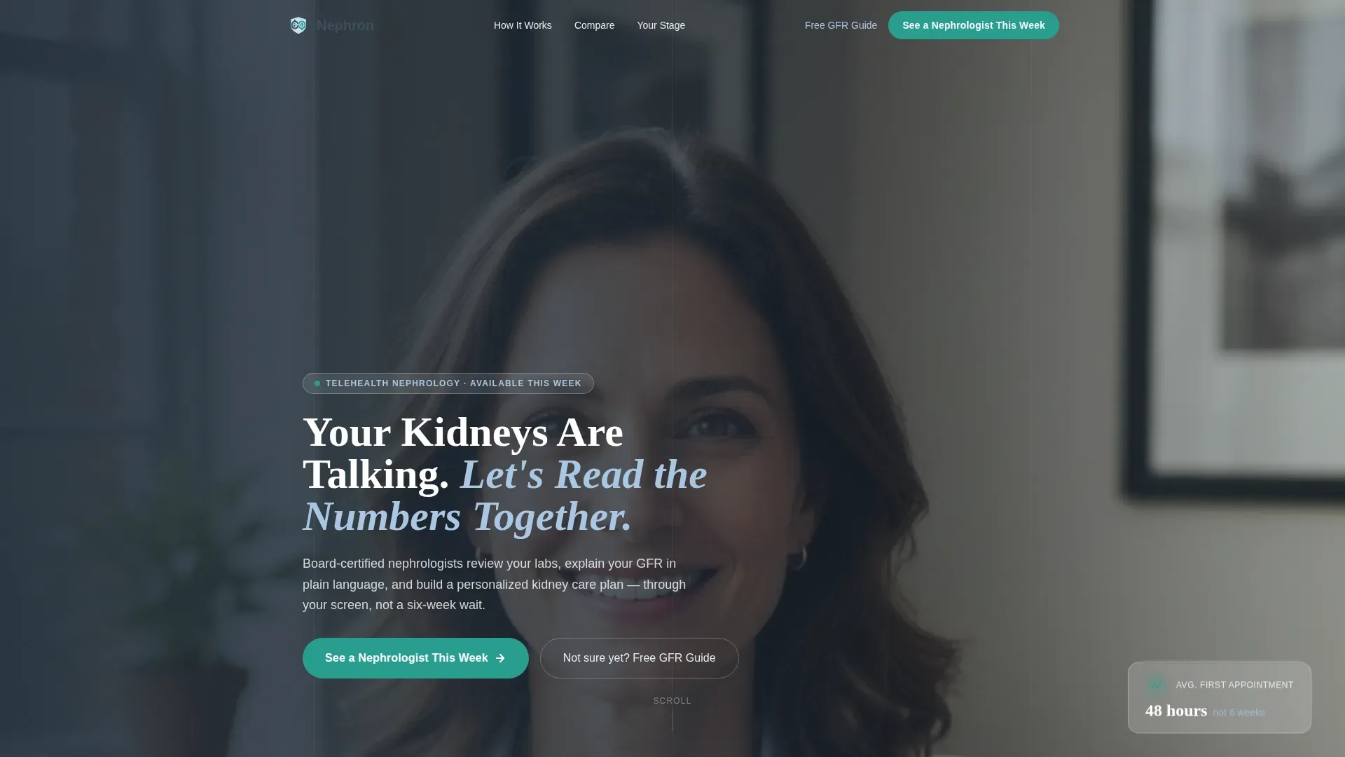
- A portrait-centered hero with a trust bar showing board certifications, licensed states, and average wait time in hours
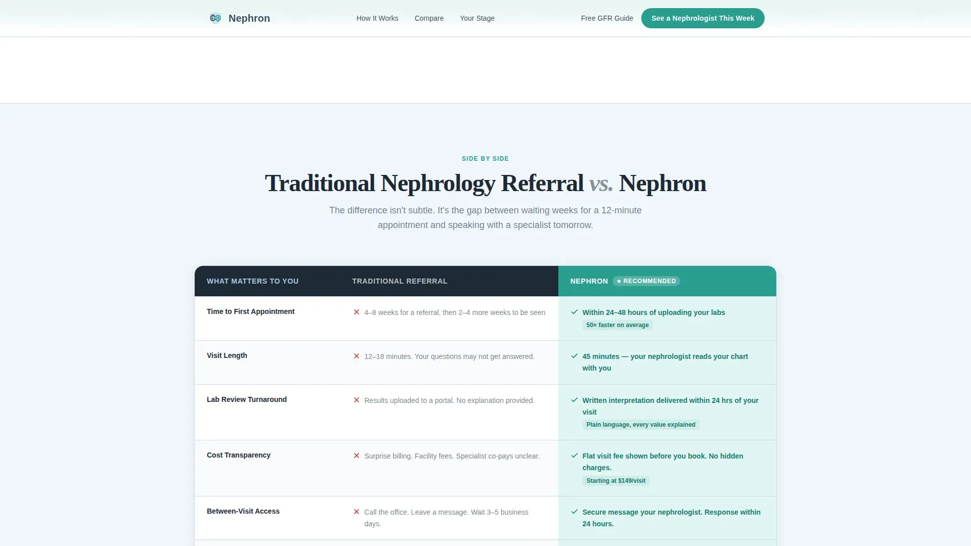
- A comparison table contrasting traditional nephrology referrals with the practice's telehealth model, with teal-highlighted advantage cells
- A three-step expandable patient journey, a chronic kidney disease stage explainer, a social proof section, and a sticky mobile call-to-action bar
Feature list
This landing page is built around five core functional and design features drawn directly from the project brief.
Portrait-Centered Hero with Trust Bar
The header opens with a warm, shoulders-up photograph of a nephrologist in a soft-collared shirt, set against a desaturated home-office background. Below the portrait, a compact trust bar displays board certifications, licensed states, and average wait time in hours rather than weeks, giving first-time visitors immediate credibility signals before they scroll.
Side-by-Side Comparison Table
A structured table sets traditional nephrology referrals against the telehealth practice across five rows: wait time, visit length, lab review turnaround, cost transparency, and follow-up access. Teal accent highlighting draws the eye to every advantage cell, making the value case scannable without requiring a single line of persuasion copy.
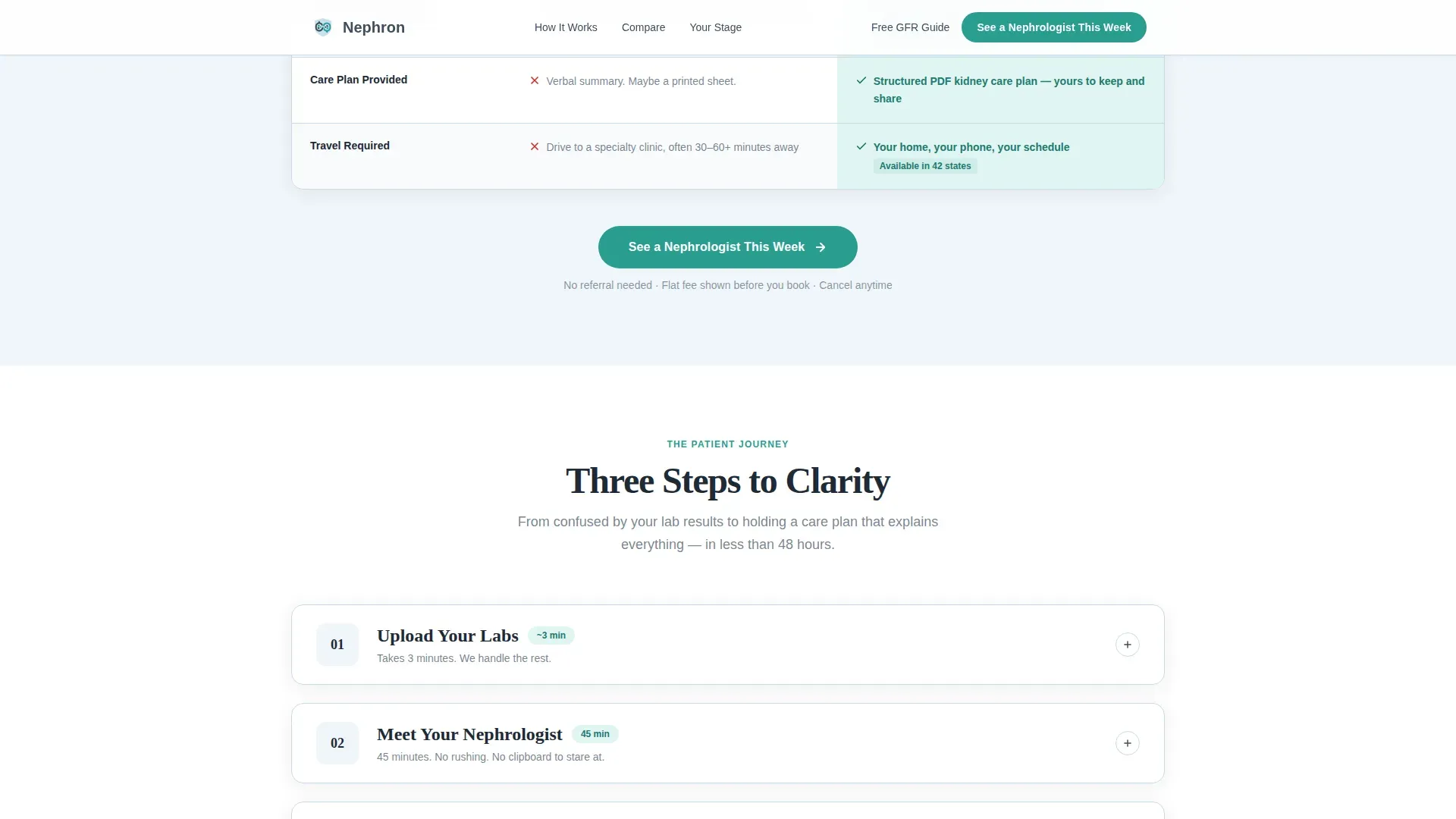
Expandable Three-Step Patient Journey
The three steps, uploading labs, meeting a nephrologist, and receiving a kidney care plan, are presented as interactive cards that expand on click. Each expanded card explains in plain language exactly what happens during that phase and uses small anatomical diagrams to teach without alarming a newly diagnosed reader.
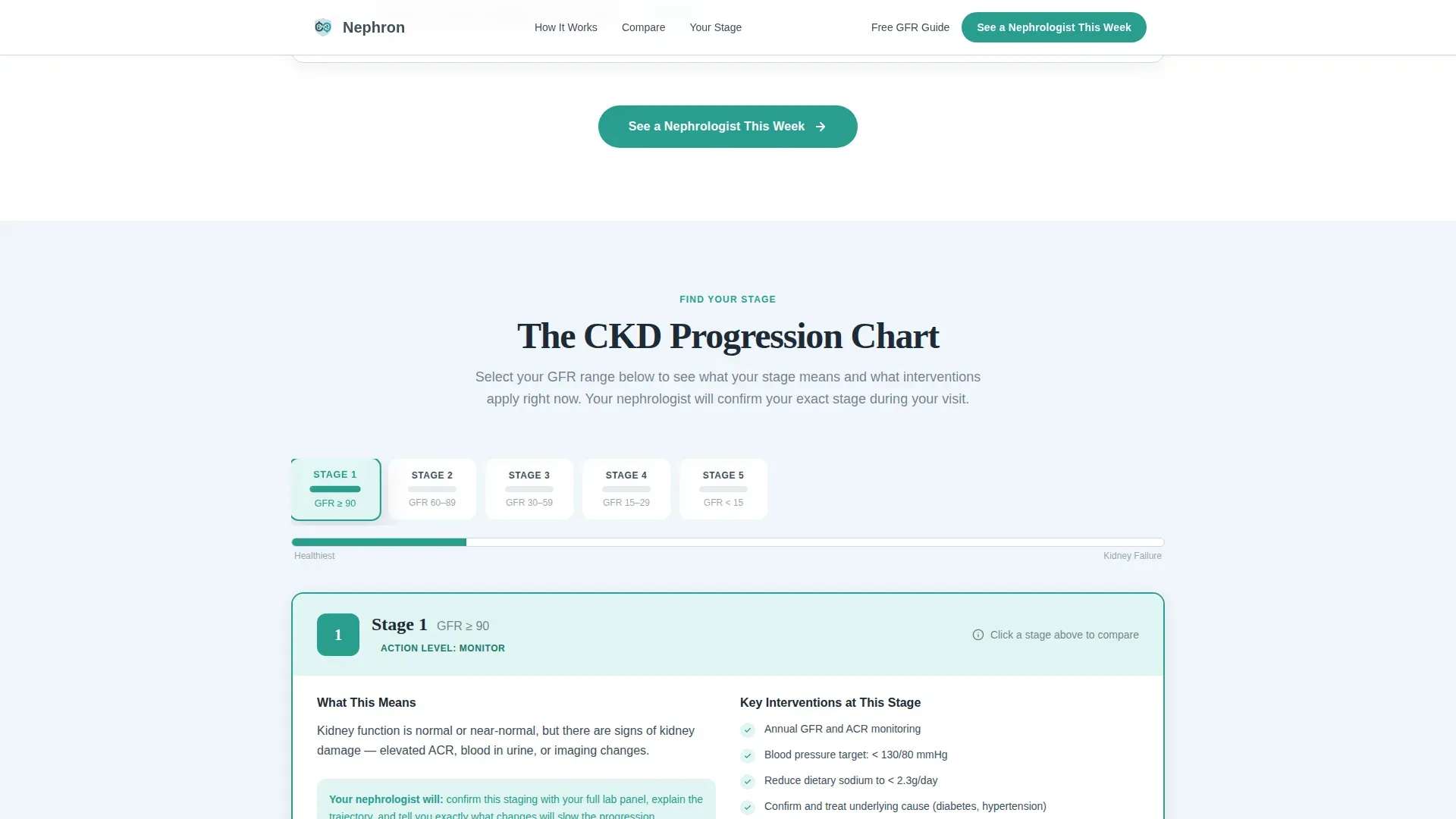
Chronic Kidney Disease Stage Explainer
A horizontal progression chart runs from stage one through stage five of chronic kidney disease. Visitors can locate their own stage and see which interventions apply at that point in their condition. The chart is interactive and designed to reduce fear by turning an abstract diagnosis into a clear, actionable picture.
Repeating Click-Through Call to Action
The primary call-to-action button, labeled "See a Nephrologist This Week," appears after the comparison table, after the three-step walkthrough, and as a sticky bar at the bottom of the screen on mobile. A secondary text link offering a free glomerular filtration rate guide captures visitors who are not yet ready to book but are willing to exchange an email address.
Page sections overview
| Section | Purpose |
|---|---|
| Portrait hero header | Establish specialist credibility and human warmth immediately |
| Compact trust bar | Display board certifications, licensed states, and wait time |
| Comparison table | Contrast traditional referral model with telehealth access |
| Primary call to action | Direct visitors to the booking intake after the table |
| Three-step journey | Walk patients through the upload, consult, and plan phases |
| Second call to action | Repeat the booking prompt after the walkthrough |
| CKD stage chart | Help visitors locate their stage and see relevant next steps |
| Social proof section | Build trust with patient testimonials by name, state, and stage |
| Final call to action | Close the page with the primary booking prompt |
| Sticky mobile bar | Keep the booking button visible on small screens throughout scroll |
| Secondary text link | Capture earlier-stage visitors with a free guide download |
Design & branding system
The visual identity follows an Educational Guide theme. The palette is called Slate and Sky, chosen to feel institutional enough to signal medical authority while remaining open and approachable for a patient who may be reading their first specialist page.
- Deep charcoal (#1E2A36) for all headlines and table headers, clinical slate (#3D4F5F) for body text and section dividers, and soft sky (#A8C7E2) as the primary background wash
- Reassuring teal (#2A9D8F) applied to buttons, progress indicators, and highlighted comparison table cells to draw attention without visual aggression
- DM Sans used for body text and interface elements, paired with Fraunces as the display serif for headlines, balancing clinical clarity with human warmth
Mobile & speed optimization
The template is designed mobile-first, reflecting the reality that most patients search for specialist help on a phone shortly after receiving a worrying lab result. Every interactive element is sized and sequenced for a small screen first.
- Expandable step cards and the chronic kidney disease stage selector are built as client-side interactive components so static sections load quickly
- The sticky call-to-action bar appears at the bottom of the screen throughout the mobile scroll, keeping the booking action reachable at every point in the journey
- Scroll-reveal animations are set to medium intensity, providing visual feedback on progress without slowing the reading experience
How this template helps you convert
Every section is sequenced to answer the next question a worried patient would ask before they feel ready to act. The page earns the click through clarity, not pressure.
- The comparison table makes the access gap tangible in seconds, so visitors understand the value before reading a single word of persuasive copy.
- The three-step patient journey removes procedural uncertainty by explaining exactly what happens after a visitor clicks, reducing the booking action from a vague medical commitment to a clear, predictable next step.
- The repeating primary call to action, paired with the lower-commitment secondary guide offer, captures both high-intent and research-phase visitors in the same scroll.
Other information about this template
This template is built specifically for the United States market. All date formatting follows MM/DD/YYYY convention, currency references use USD, and content is written in American English. The footer follows a linear single-row pattern. Social proof blocks display patient testimonials with name, state, and chronic kidney disease stage for added specificity. Scroll-reveal animations and the stage chart interaction are powered by client components, while all static sections use server components for faster initial rendering. The template does not include an intake form on the page itself; the primary call-to-action button links to a dedicated scheduling page.
- Localization: United States, USD, English, MM/DD/YYYY date format
- Footer style: linear single-row pattern
- Social proof format: testimonial cards with patient name, state, and chronic kidney disease stage
- Scheduling: call-to-action button links to a separate booking intake page, no on-page form
Theme
Educational Guide
Creative direction
Step-by-Step Guide
Color system
Slate & Sky
Style
Comparison Table
Direction
Click-Through
Page Sections
Portrait-centered Hero with Trust Bar
Side-by-side Comparison Table
Expandable Three-step Patient Journey
Chronic Kidney Disease Stage Chart
Repeating Click-through Call to Action
Related questions
Who is this landing page template designed for?
Does this template include an appointment booking form?
Can this template serve patients at different kidney disease stages?
What does the secondary call to action offer visitors?
Is this template optimized for mobile users?



