Nephrologist Booking Website Template
Nephron is a nephrologist new patient welcome landing page built for kidney care clinics. It combines a stats-driven hero, a four-step transparent process section, and an interactive five-question kidney health screener. The calm Slate and Sky color system, zigzag layout, and plain-language framing turn lab-report anxiety into a scheduled first appointment.
by Rocket studio
Quick summary
Nephron is a single-page nephrologist welcome template designed for healthcare B2C practices. It guides newly referred patients from confusion to commitment using staggered stats, a transparent step-by-step process, and a five-question interactive health screener. The result-driven layout replaces clinical dread with calm clarity and ends every user path with a simple appointment form.
Who this template is for
This template is built for kidney care clinics and nephrologist practices that want to convert anxious new patient referrals into booked appointments. It works equally well for practices serving dialysis candidates and transplant recipients navigating long-term follow-up care.
- Nephrologist offices onboarding newly referred adults who cannot decode their lab results
- Dialysis and transplant care practices that need to present complex treatment options clearly
- Healthcare marketing teams who want a patient-first digital experience that earns trust before asking for commitment
What problem this template solves
Patients referred to a nephrologist often arrive holding a lab report full of numbers like creatinine and GFR (glomerular filtration rate) that mean nothing to them. That gap between clinical data and personal understanding creates fear, hesitation, and delayed care. This template closes that gap.
- It translates kidney function numbers into plain, reassuring language patients can actually follow
- It removes the fear of the unknown by showing each step of the patient journey before it happens
- It earns the appointment click by giving patients a useful health screener result before asking for their contact details
What you get with this template
You get a complete, ready-to-customize nephrologist landing page with every section planned and structured. The layout follows a zigzag alternating flow that keeps the scroll engaging without feeling clinical or overwhelming.
- A stats hero section, four-step process section, interactive quiz, testimonial cards, a contact form, and a single-row footer
- A five-question interactive kidney health screener with a teal progress bar and three result paths, each ending at the appointment form
- Trust badges for board-certified status and patient data privacy, plus three patient testimonial cards covering newly referred, dialysis, and transplant personas
Feature list
This template is built around a small set of high-impact components, each serving a specific purpose in the patient conversion journey.
Staggered Stats Hero Section
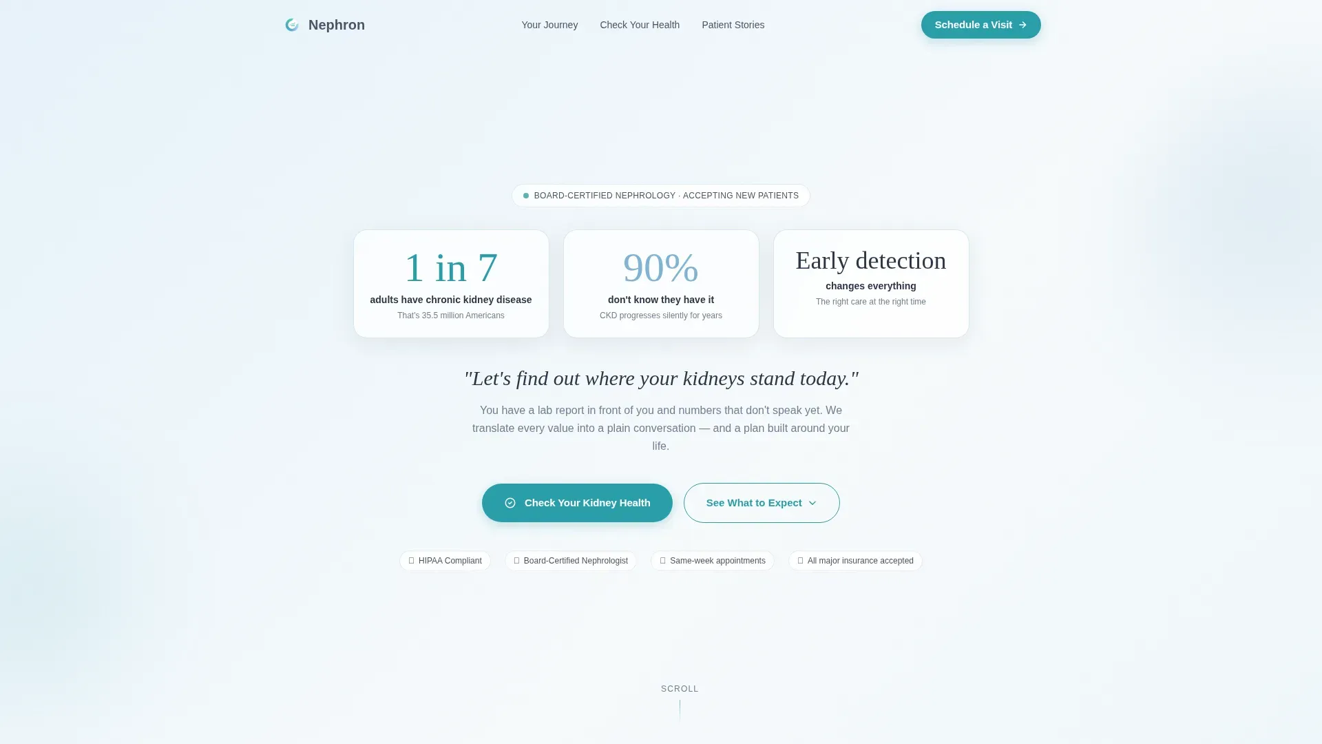
Three oversized kidney health statistics fade in one at a time against a soft sky-to-white gradient. The unhurried reveal mirrors the pace of a doctor reading results aloud, setting a calm and trustworthy tone before the patient scrolls further.
Four-Step Zigzag Process Layout
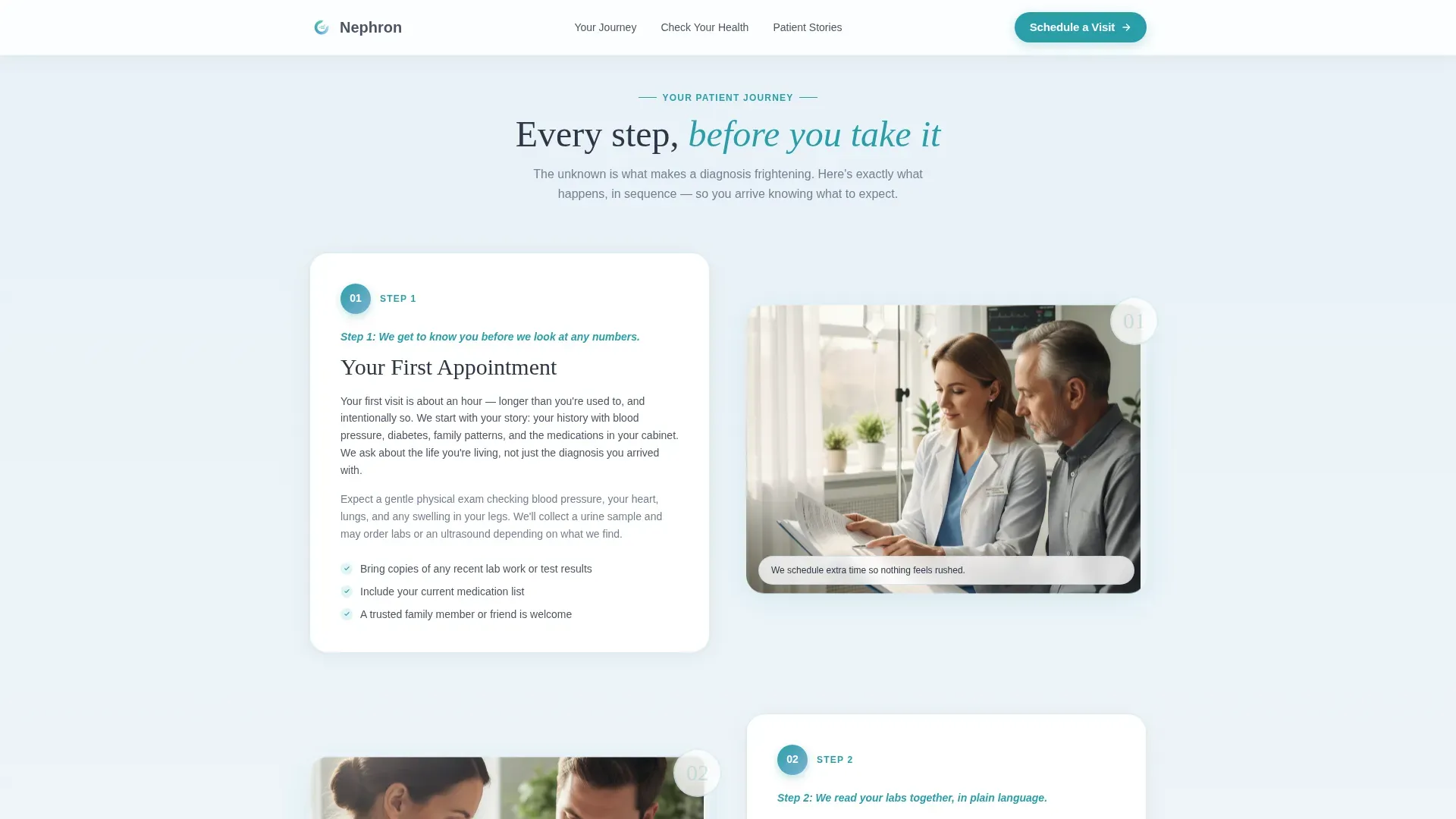
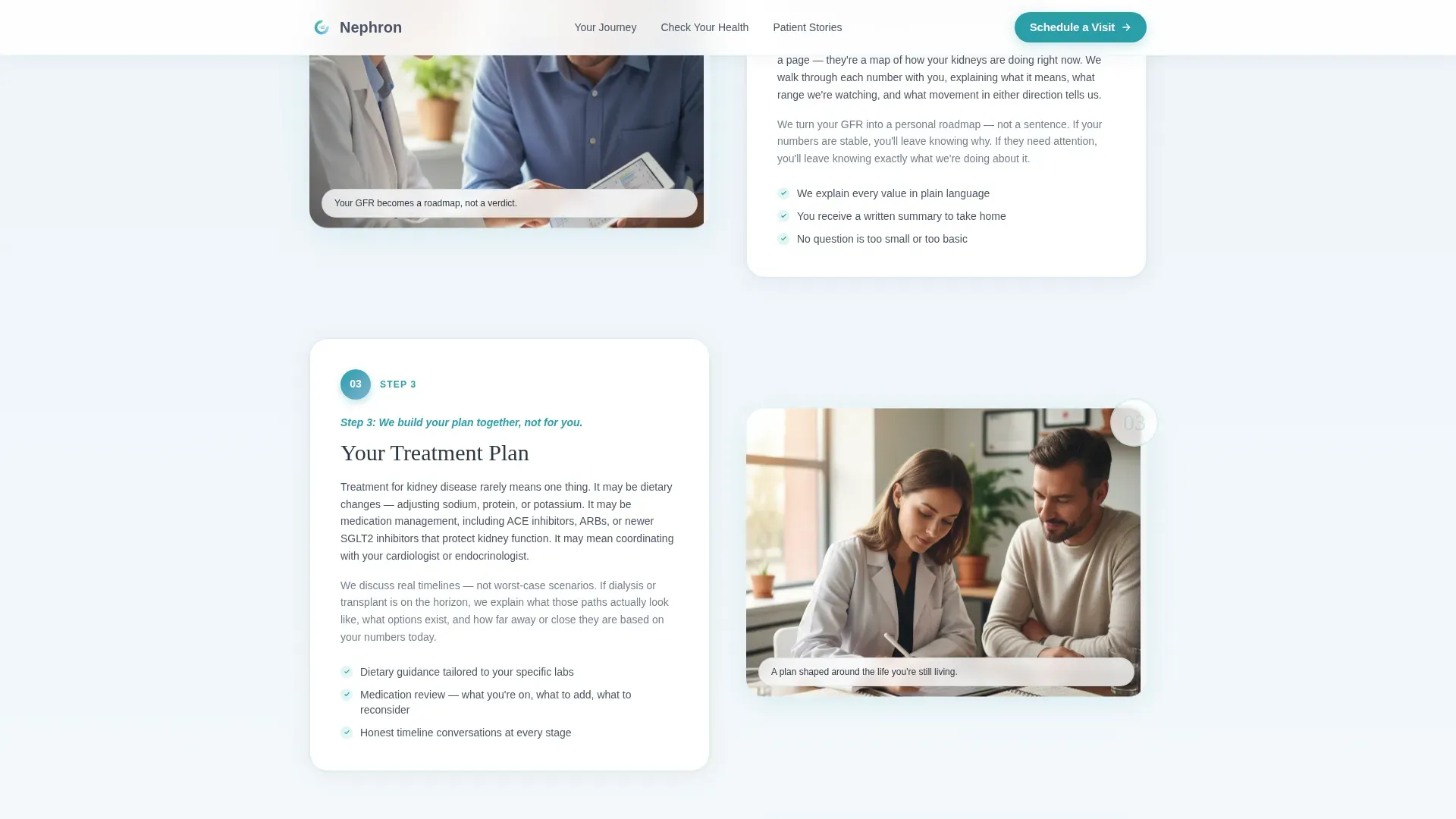
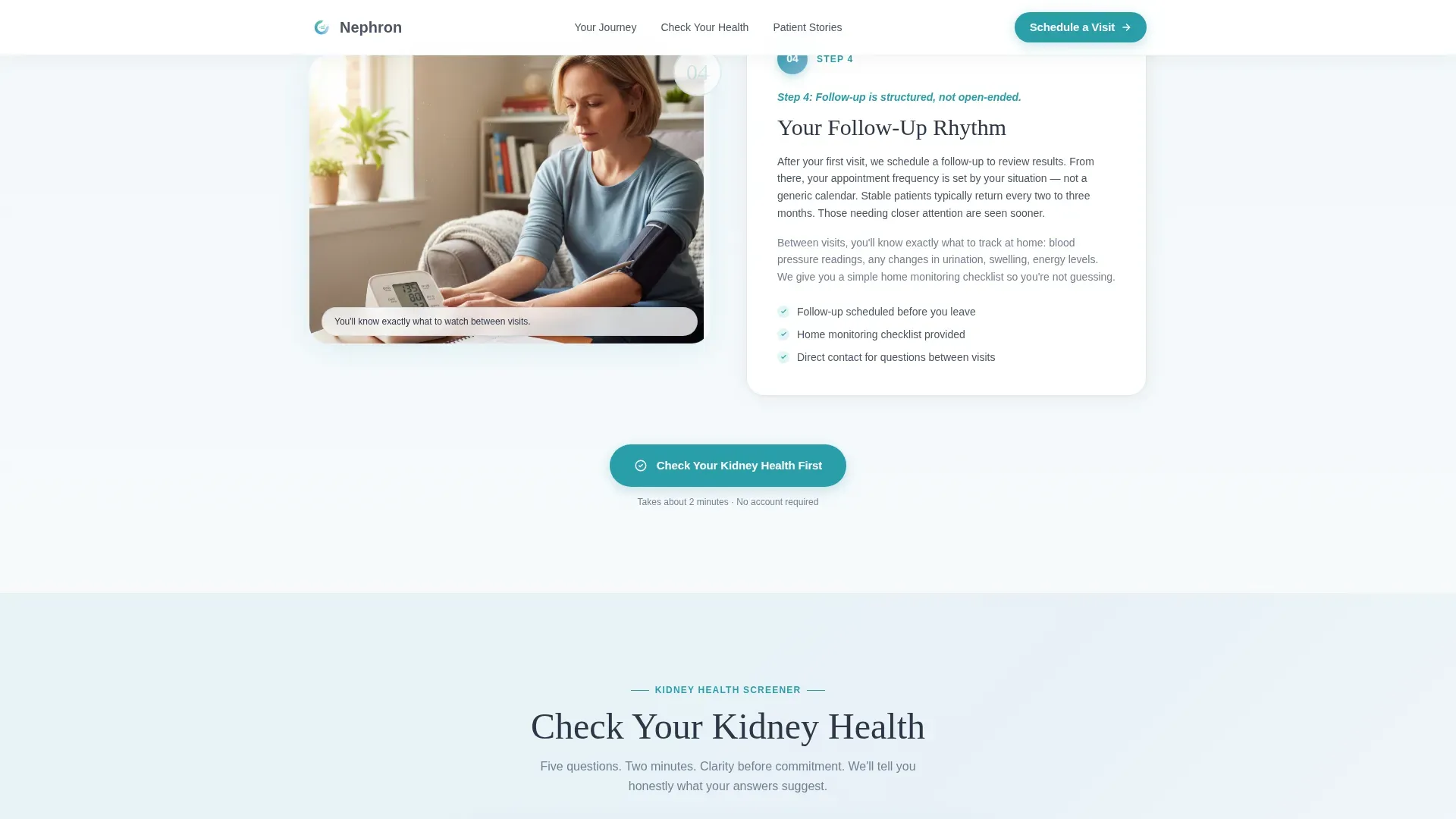
Alternating left-right content blocks walk patients through the full clinic journey: first appointment, reading labs together, building a treatment plan, and setting up home follow-up. Each block opens with a numbered step and a one-sentence promise to keep the experience transparent and approachable.
Interactive Five-Question Health Screener
A quiz-style assessment presents one question at a time on its own soft gradient card. A teal progress bar fills overhead as patients answer. Results sort into low, moderate, or elevated concern, and every outcome path leads to the appointment scheduling form.
Result-Routed Appointment Form
Every screener result path connects to a simple name, phone, and insurance intake form. The form appears after the patient has already received useful clarity, making the request for commitment feel natural rather than premature.
Patient Testimonial Cards
Three distinct patient voices represent the core audience segments: a newly referred adult, a dialysis candidate, and a transplant recipient. The cards provide social proof grounded in real patient situations rather than generic praise.
Scroll-Triggered Fade and Blur Animations
Section content reveals with staggered fade-blur transitions as the user scrolls. The animation pace is medium and unhurried, reinforcing the calm clinical tone without distracting from the page content.
Page sections overview
| Section | Purpose |
|---|---|
| Hero Stats Display | Opens with three kidney health statistics and the primary "Check Your Kidney Health" call to action |
| Step One Block | Describes what happens at the patient's first appointment |
| Step Two Block | Explains how labs are read together with the patient |
| Step Three Block | Outlines what treatment options look like with real timelines |
| Step Four Block | Covers home follow-up and what patients track between visits |
| Health Quiz Section | Presents the five-question interactive screener with progress bar and result routing |
| Testimonial Cards | Shows three patient stories across the newly referred, dialysis, and transplant personas |
| Contact Form Section | Delivers the "Schedule Your First Visit" form with name, phone, and insurance fields |
| Single-Row Footer | Provides compact clinic links and trust badges in a linear layout |
Design & branding system
The visual identity uses a Soft Gradient theme built on a Slate and Sky color system. Every color choice reinforces the calm, clinical tone the patient experience requires.
- Clinical slate (#4A5568) anchors headlines and body text; morning sky blue (#7FB3D3) washes across section backgrounds in gentle horizontal gradients; cloud white (#F7FAFC) creates breathing room between blocks; reassuring teal (#2B9EAA) lights up buttons and the quiz progress bar
- Fraunces serif handles headlines for warmth and authority, while DM Sans covers body copy for clean readability
- Generous whitespace, rounded typography, and soft gradients combine to create the feeling of calm clarity the patient needs on first visit
Mobile & speed optimization
This template is built mobile-first, recognizing that patients often open their clinic link on a phone right after receiving lab results. The layout adapts cleanly to smaller screens without losing the zigzag flow or quiz interactivity.
- Static page sections are structured as server components for efficient rendering, while the interactive quiz runs as a client component to handle state transitions smoothly
- Scroll-triggered animations are designed to fire cleanly on mobile without jank, keeping the experience fluid on mid-range devices
- The single-page structure keeps navigation simple for patients who are not tech-savvy and may be accessing the page while stressed or distracted
How this template helps you convert
The conversion strategy is built around giving patients value before asking for anything in return. Every section moves the visitor one step closer to booking, without pressure.
- The stats hero immediately validates that kidney disease is common and often undetected, prompting the visitor to take the screener rather than leave the page
- The transparent process section dissolves the fear of the unknown by showing each clinic step before it happens, turning hesitation into readiness
- The screener earns the appointment form click by delivering a personalized result first, so patients feel informed and respected rather than sold to
Other information about this template
This template covers the full scope of a nephrologist patient onboarding experience in a single-page format. It is designed for English-language, United States-based practices using standard date and currency formats.
- The layout follows a zigzag alternating pattern throughout the process section, keeping the scroll visually engaging across all four patient journey steps
- Trust badges for board-certified status and patient data privacy (Health Insurance Portability and Accountability Act compliance display) are included as built-in social proof elements
- The template is designed for healthcare B2C contexts where the patient, not a referrer, is the primary decision-maker on the page
Theme
Soft Gradient
Creative direction
Transparent Process
Color system
Slate & Sky
Style
Zigzag/Alternating
Direction
Quiz/Assessment
Page Sections
Staggered Stats Hero with Call to Action
Four-step Zigzag Process Section
Interactive Five-question Health Screener
Result-routed Appointment Form
Patient Testimonial Cards
Scroll-triggered Fade and Blur Reveals
Related questions
Who is the primary audience for this landing page template?
Does the quiz actually collect patient health data?
Can I customize the four-step process section for my clinic's workflow?
What form fields are included in the appointment section?
Is this template suitable for a multi-specialty kidney care practice?



