Nephrology Medicine Booking Website Template
Nephron is a single-page nephrology private practice landing page built around radical transparency. It opens with three quietly animated trust metrics, moves into a side-by-side comparison table that makes the practice's approach undeniable, then guides patients through a visual process timeline before presenting a focused booking form. The design feels calm, clinical, and unmistakably human.
by Rocket studio
Quick summary
Nephron is a comparison table landing page for a nephrology private practice. It leads with animated credentialing metrics, walks patients through a transparent care process, and closes with a low-barrier booking form. Every section is designed to replace anxiety with clarity, so that a recently diagnosed kidney patient feels ready to book rather than afraid to ask.
Who this template is for
This template is built for nephrology practices that want to stand out by being genuinely transparent with patients. It speaks directly to people who feel lost inside standard care systems and are searching for a physician who actually explains things.
- Nephrologists and kidney specialists running independent or small-group private practices
- Practices targeting newly diagnosed chronic kidney disease patients, dialysis management cases, or transplant evaluation referrals
- Clinics ready to convert late-night, anxious online searches into real booked appointments
What problem this template solves
Most nephrology practice pages look identical. They list credentials, post a phone number, and ask patients to call. That approach fails the patient who received a glomerular filtration rate (GFR) number at 2 a.m. and has no idea what it means.
- Patients leave generic practice pages more confused than when they arrived, because nothing addresses their specific fear or situation
- Standard pages never show the process, so patients do not know what to expect, which makes booking feel risky
- There is no visible reason to choose one practice over another, so patients default to whoever is closest or covered by insurance
What you get with this template
This template delivers a fully structured, single-page layout that guides the patient from anxiety to action. Every section has a clear job, and each one builds on the last.
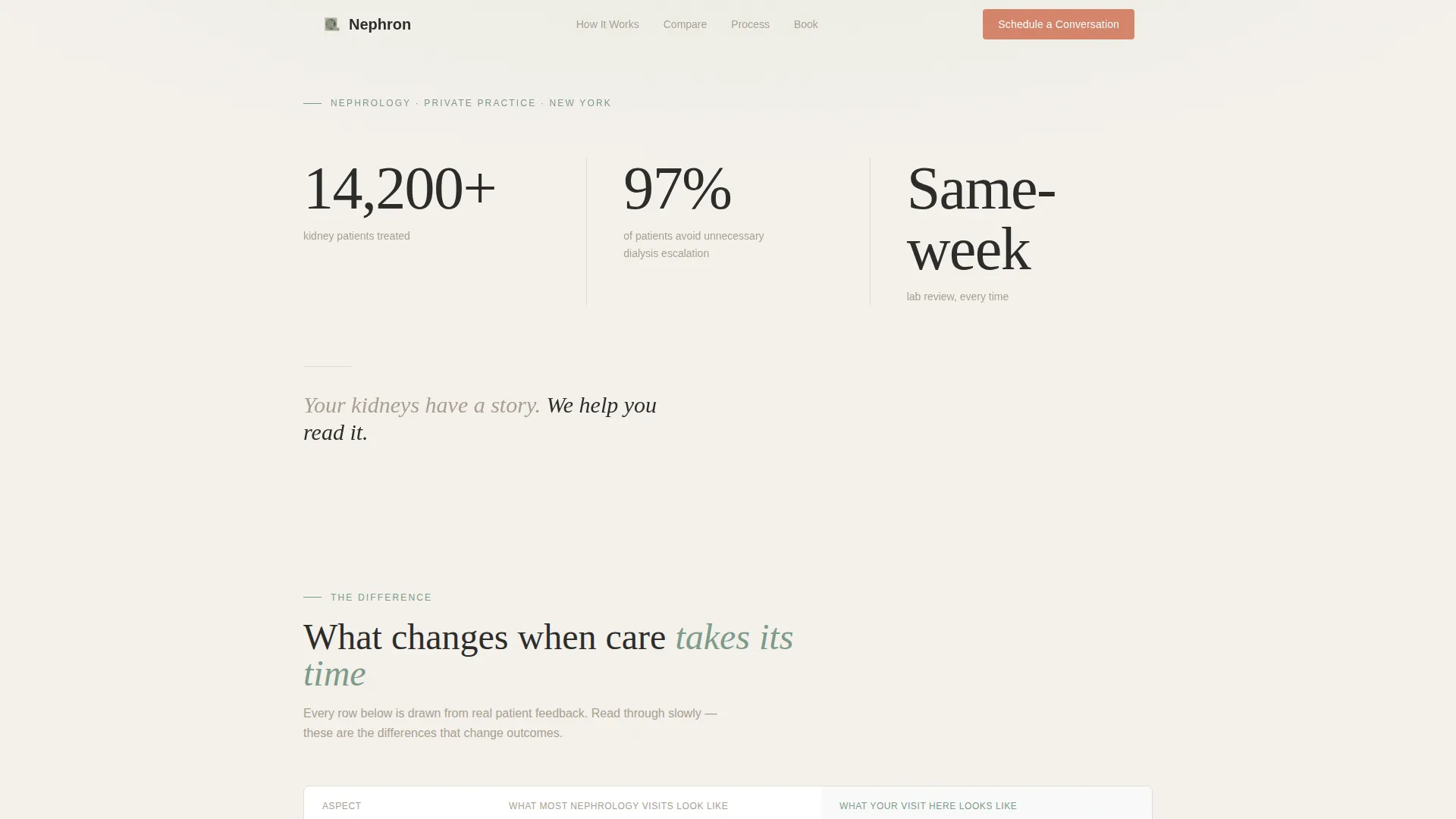
- A hero section with three animated metrics and a grounding tagline that does the credentialing without stock photography
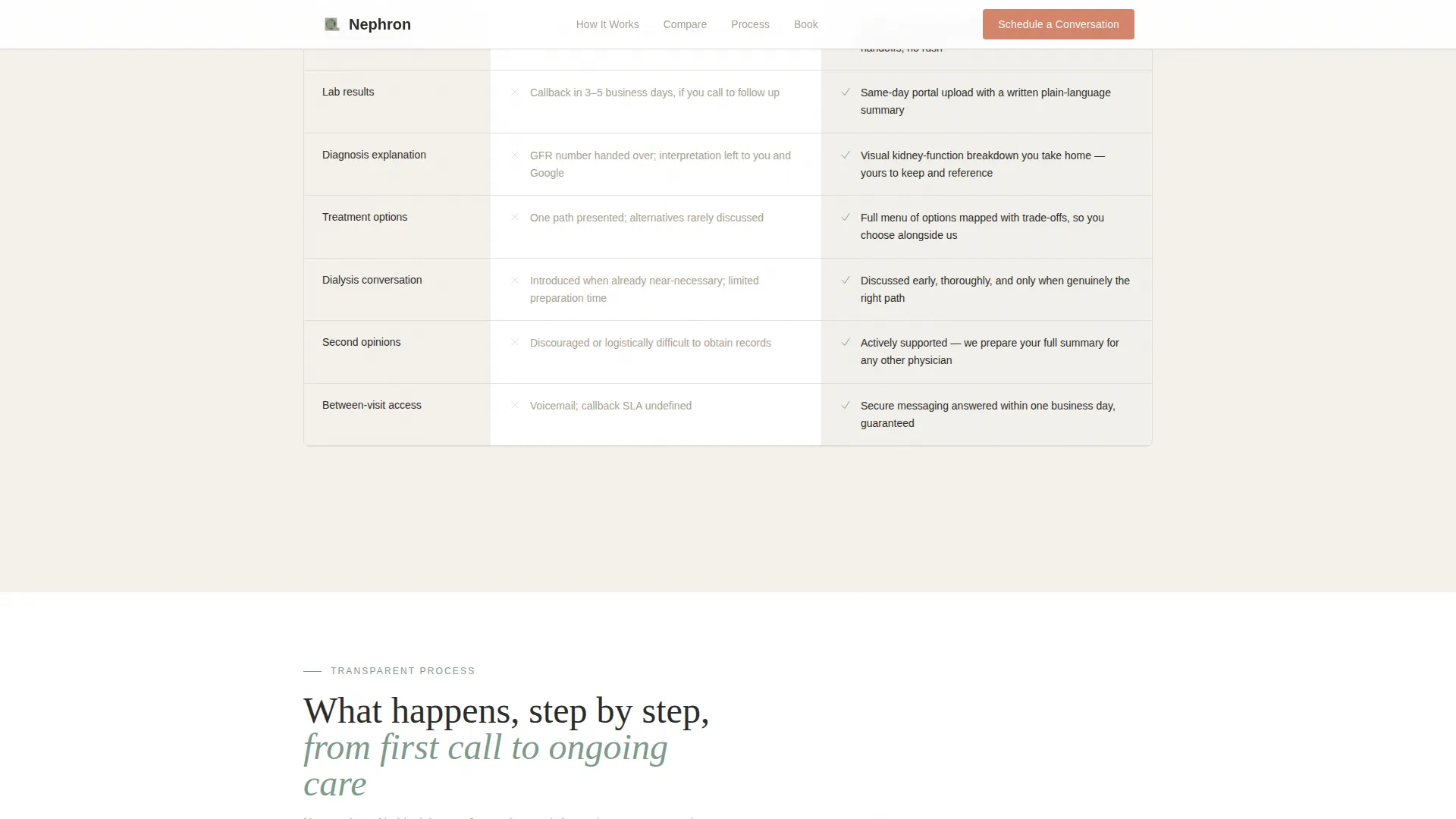
- A comparison table contrasting typical nephrology visits with what the practice actually offers, row by row
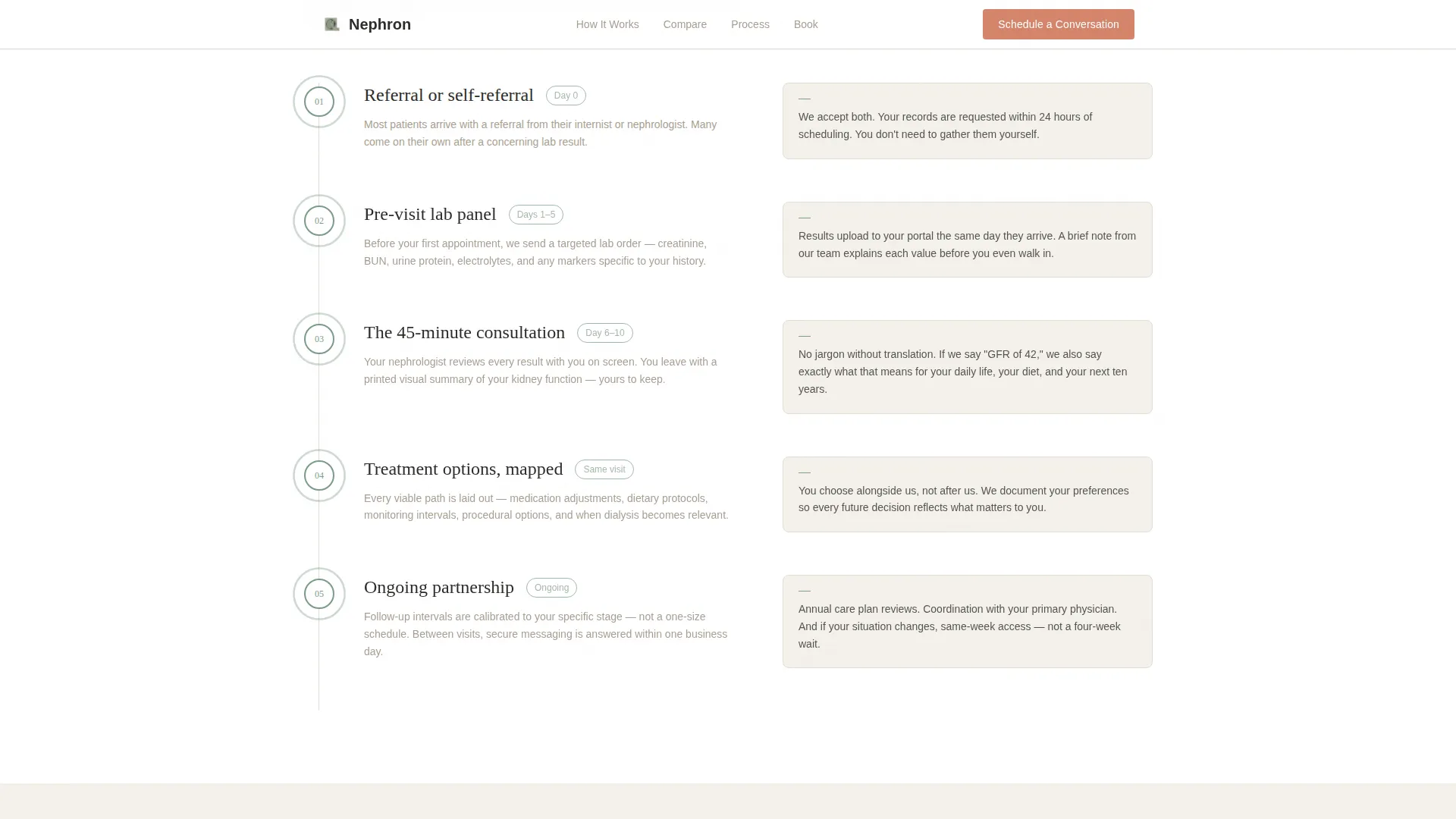
- A transparent process timeline covering referral through treatment, with sage milestone markers and scroll-reveal pacing
- A booking form asking only three things: insurance carrier, reason for visit, and preferred appointment window
- A secondary conversion path inviting patients to send their latest labs for a free five-minute review
- A patient testimonials section featuring specific, concrete outcomes rather than generic praise
Feature list
This section covers what the template is built to do, based directly on its design brief and section structure.
Animated Metrics Hero
Three large numbers fade in against a soft fog-white background using counter animations. The metrics read "14,200+ kidney patients treated," "97% of patients avoid unnecessary dialysis escalation," and "Same-week lab review, every time." No stock imagery is used. A single warm-stone tagline anchors the section below the numbers.
Side-by-Side Comparison Table
The comparison table contrasts "What most nephrology visits look like" with "What your visit here looks like" across multiple rows. Rows cover visit length, lab result turnaround, and how diagnoses are communicated. Each row functions as a small, concrete revelation. Hover states are built into the table for desktop interaction.
Transparent Process Timeline
A four-stage visual timeline maps the patient journey from referral through labs, consultation, and treatment options. Sage-colored milestone markers pulse on scroll reveal. The layout is designed to remove ambiguity at every stage so the patient can picture exactly what happens next.
Dual-Path Booking Form
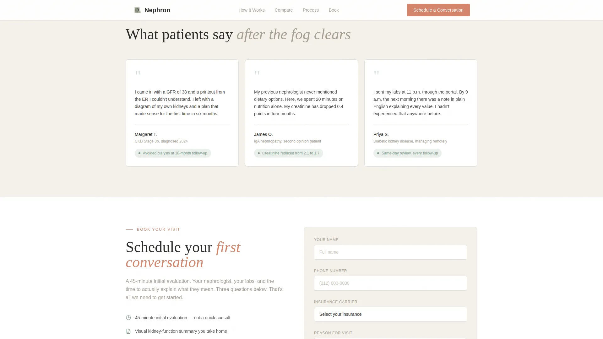
The primary call to action reads "Schedule Your First Conversation" and collects three inputs: insurance carrier via dropdown, reason for visit via selection, and preferred appointment window. A secondary path below the form offers a lower-commitment option: sending in recent lab results for a free five-minute review, capturing patients who are not yet ready to book.
Persistent Mobile Call-to-Action Bar
On mobile, a sticky bottom bar keeps the primary booking call to action visible throughout the entire scroll. This supports the mobile-first priority for patients searching late at night on a phone, ensuring the path to booking is never more than one tap away.
Patient Testimonials Section
A dedicated section presents patient voice quotes with specific, concrete outcomes rather than generic praise. Each quote is designed to reflect a recognizable patient situation, giving prospective patients a way to see themselves in the stories being told.
Page sections overview
| Section | Purpose |
|---|---|
| Hero Stats | Establish credibility with three animated trust metrics and a grounding tagline |
| Comparison Table | Show the practice's difference row by row against typical nephrology visits |
| Process Timeline | Walk patients through referral, labs, consultation, and treatment step by step |
| Booking Form | Convert intent to action with a focused three-field scheduling form |
| Secondary Lab Path | Capture lower-commitment visitors with a free lab review offer |
| Patient Testimonials | Build trust through specific, outcome-focused patient quotes |
| Footer | Provide navigation and practice identity with a split logo-and-links layout |
Design & branding system
The visual identity follows a Healing Space theme. The palette reads like linen curtains filtering morning light into a room with warm wood floors: clinical enough to trust, soft enough to exhale in.
- Colors: fog white (#F4F1EB) for backgrounds, warm stone (#A89F91) for body text and dividers, muted sage (#7D9B8A) for section accents and trust indicators, and coral (#D4856B) reserved exclusively for calls to action and urgent callouts
- Typography: Fraunces serif for headlines, set thin and wide-spaced for a generous, breathing feel; DM Sans for body copy and interface elements for clean readability
- Animation: counter animations on metrics, fade-in hero elements, scroll-reveal sections, and pulsing milestone markers on the timeline
Mobile & speed optimization
The template is built mobile-first, prioritizing the patient experience on a phone at 2 a.m. when anxiety is highest and the need for clarity is most urgent.
- Server Components handle all static content sections to keep the initial page load lean; Client Components are scoped to animations and the booking form only
- The persistent sticky call-to-action bar on mobile keeps the booking option visible at every scroll position without disrupting the reading experience
How this template helps you convert
Every section of this template is sequenced to reduce hesitation and build enough trust that clicking "Schedule Your First Conversation" feels like the obvious next step.
- The animated metrics open with undeniable social proof before a single word of copy is read, establishing credibility in the first three seconds
- The comparison table makes the practice's difference concrete and personal, so the patient understands exactly what they are choosing before the call to action ever appears
- The dual-path conversion structure catches two distinct patient mindsets: those ready to book immediately and those who need one smaller step first, such as the free lab review option
Other information about this template
This template was designed for the nephrology private practice niche within the broader Health and Medical category. It is purpose-built for patient acquisition in a B2C medical context.
- The footer uses a split layout with the practice logo and tagline on the left and navigation links on the right
- All form fields include validation to reduce submission errors on mobile
- The template is scoped to a single-page landing structure, not a multi-page website build
- Section animations use a medium intensity level: present and meaningful without feeling distracting or clinical-feeling
- The page is designed entirely in US English with US healthcare terminology throughout
Theme
Healing Space
Creative direction
Transparent Process
Color system
Cloud Canvas
Style
Comparison Table
Direction
Booking/Scheduling
Page Sections
Animated Metrics Hero Section
Row-by-row Comparison Table
Transparent Process Timeline
Dual-path Booking Conversion
Persistent Mobile Sticky Bar
Patient Testimonials Section
Related questions
What kind of practice is this template designed for?
Can I update the metrics shown in the hero section?
Does the template include both a booking form and a secondary conversion path?
How does the comparison table work?
Is this a single-page template or a multi-page website?



