Nephrologist Complete Booking Website Template
Nephron is a nephrologist virtual consultation landing page built for kidney specialists who see patients remotely. The 50/50 split-screen layout pairs a bold typographic hero with a sticky five-stage process timeline that walks anxious patients through every step before asking them to book. It converts late-night research into scheduled consultations.
by Rocket studio
Quick summary
Nephron is a single-page virtual consultation template designed for kidney specialists. It uses a 50/50 split-screen layout, a scroll-linked process timeline, and a plain-language approach to turn confused, anxious patients into booked appointments. Every design choice, from the typographic hero to the insurance-first booking form, is built to earn trust before asking for commitment.
Who this template is for
This template is built for nephrologists and kidney specialty practices that offer remote consultations. It speaks directly to patients who are overwhelmed by lab results and to the clinicians who want to convert that uncertainty into a scheduled visit.
- Nephrology practices launching or expanding a telehealth consultation service
- Kidney specialists who want patients to arrive informed rather than frightened
- Primary care physicians who refer patients and need a credible destination page to share
What problem this template solves
Most kidney patients delay care because the process feels opaque and intimidating. They receive a printout, see unfamiliar abbreviations like GFR (glomerular filtration rate) or creatinine, and freeze. This template removes that barrier by showing the entire consultation process before asking for a single click.
- Patients leave the page understanding what a nephrology visit involves, step by step
- The sticky process timeline replaces vague promises with a clear, visual sequence of events
- The booking form reduces friction by collecting insurance and appointment preference upfront
What you get with this template
You get a fully structured, single-page layout that handles every stage of the patient conversion journey. The template covers the hero moment, the educational scroll, social proof, the physician profile, and the booking form in one cohesive flow.
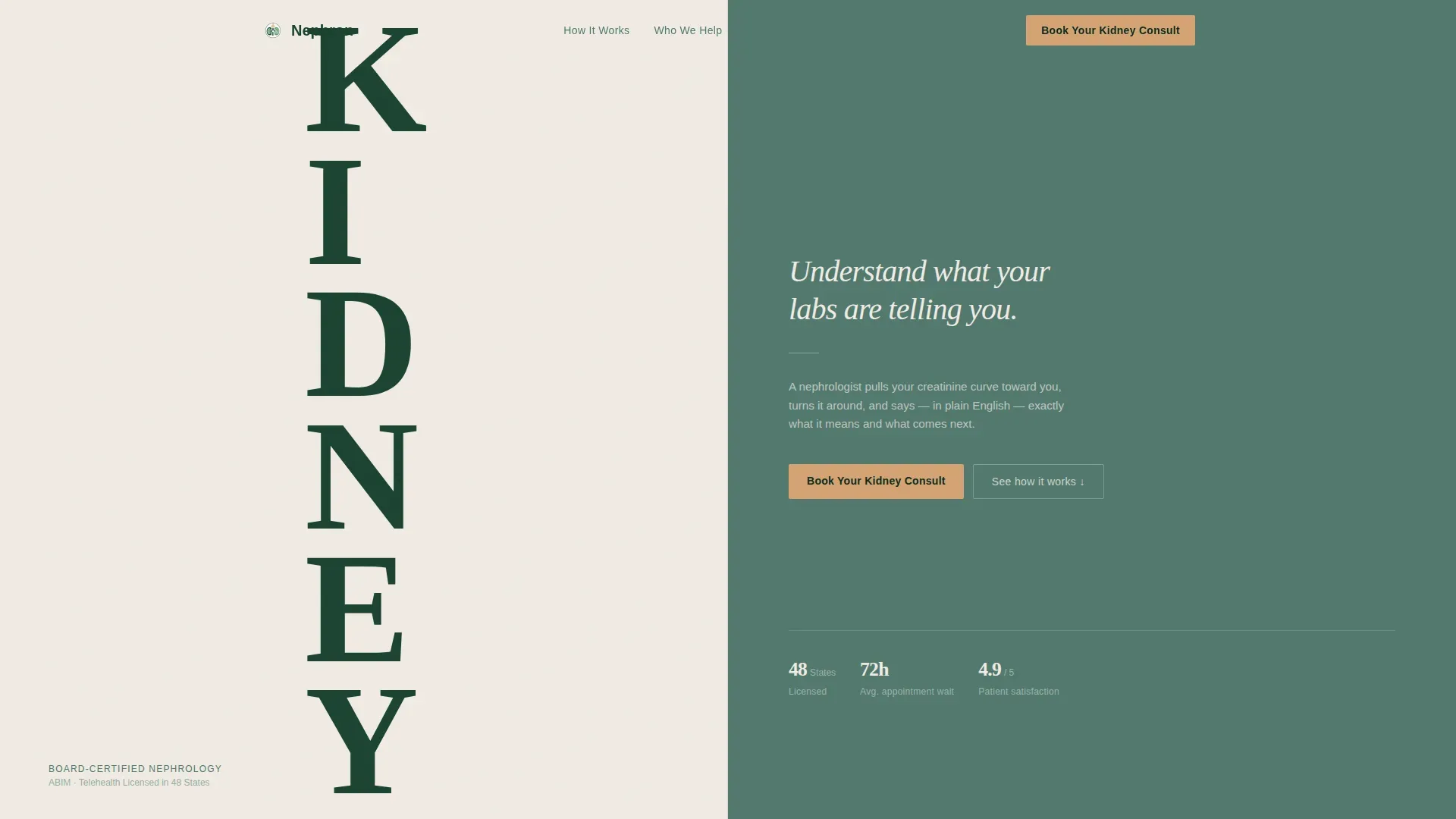
- A 50/50 split-screen hero with a stacked typographic KIDNEY tower and a plain-language headline on the right
- A five-stage sticky process timeline with scrolling right-panel explanations, annotated GFR chart sections, and short captioned physician videos
- Three patient archetype cards in an asymmetric bento layout, a physician profile section, and a booking form with an insurance dropdown and a secondary lab-upload path
Feature list
A paragraph overview of this template's built-in capabilities follows, with each major feature described in detail below.
Stacked Type Tower Hero
The hero splits the viewport evenly. The word KIDNEY stacks vertically in large evergreen letterforms on the left. The right panel holds a single clarifying headline in birch white on soft fern. No images or icons are used. Typography alone establishes authority and sets the tone for the entire page.
Sticky Five-Stage Process Timeline
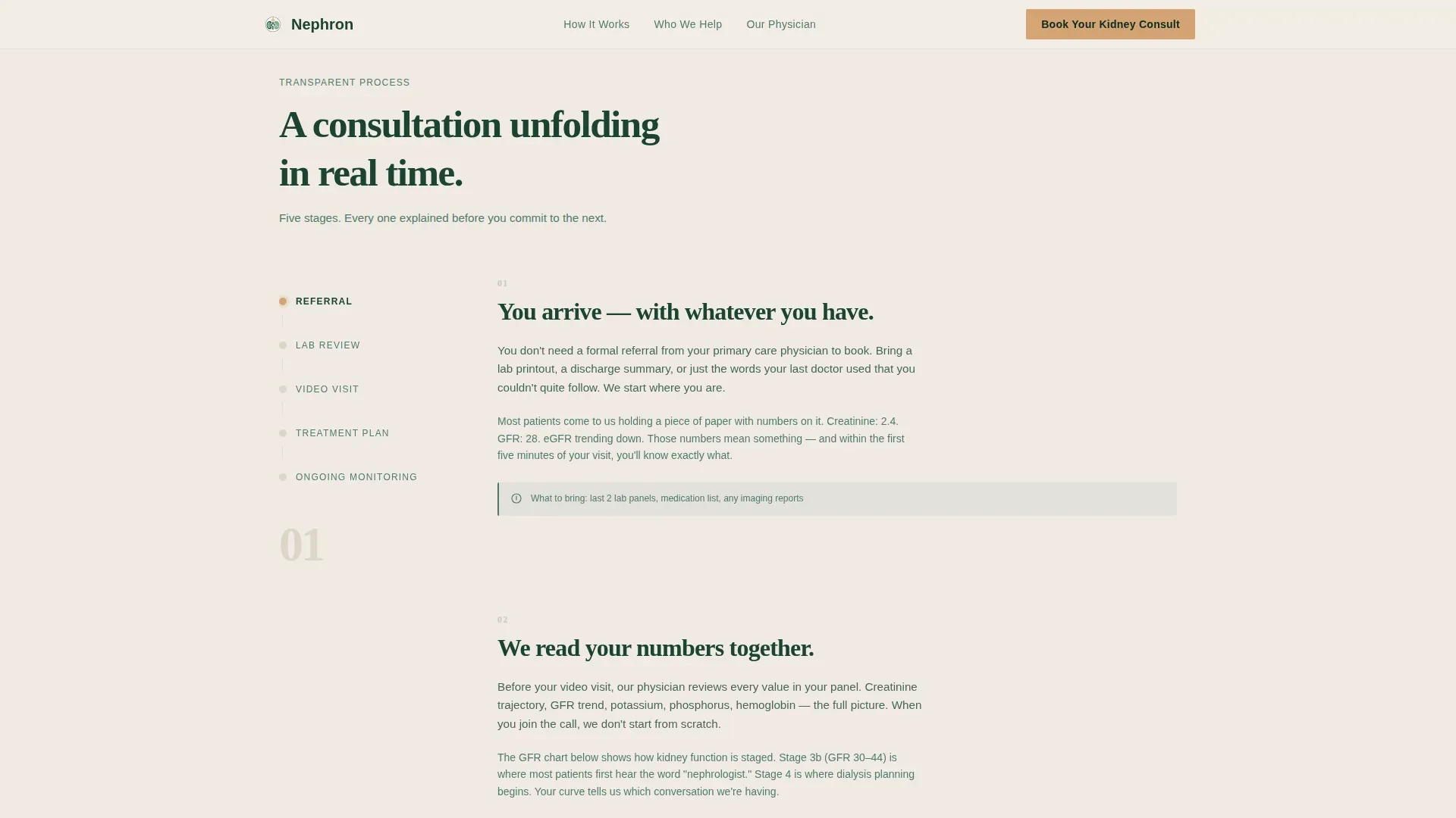
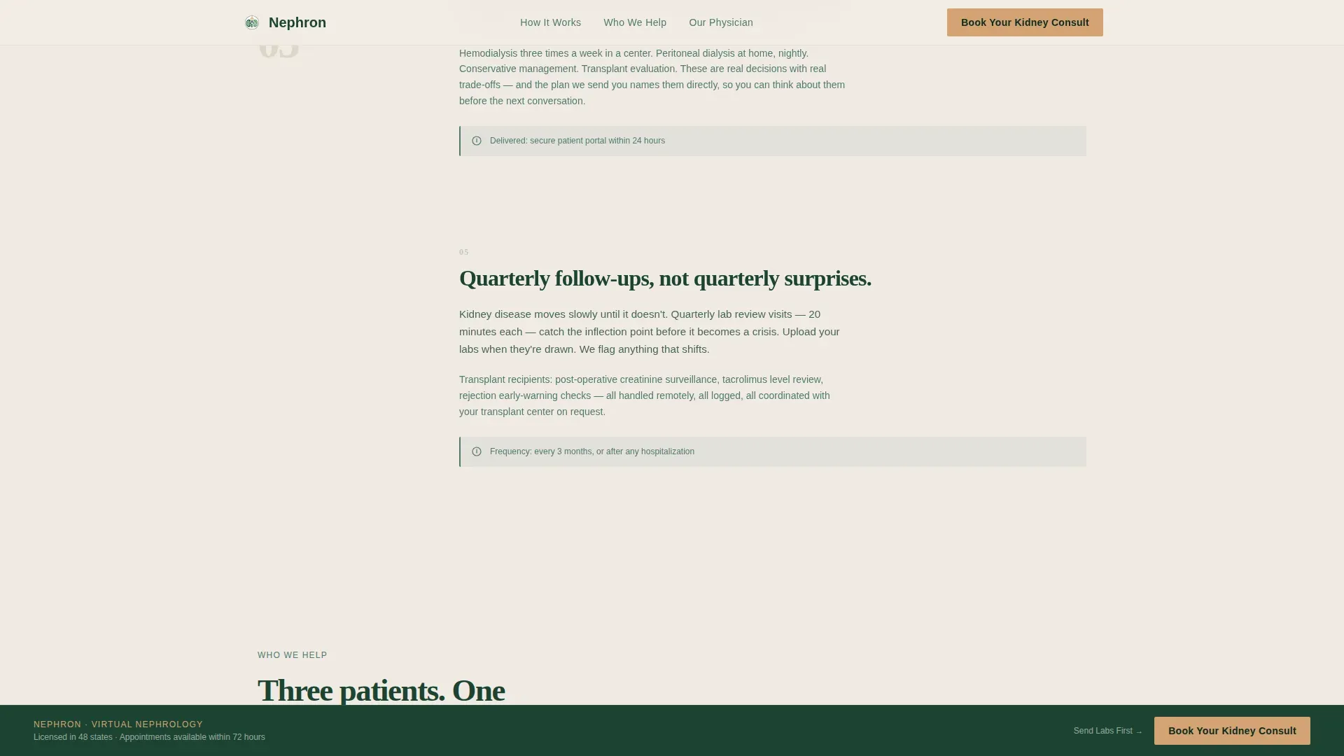
A persistent left rail lists five consultation stages: Referral, Lab Review, Video Visit, Treatment Plan, and Ongoing Monitoring. As the visitor scrolls, the right panel moves through each stage with plain-language explanations and supporting visual content. The layout makes the consultation feel real and knowable before any commitment is made.
Annotated GFR Chart Sections
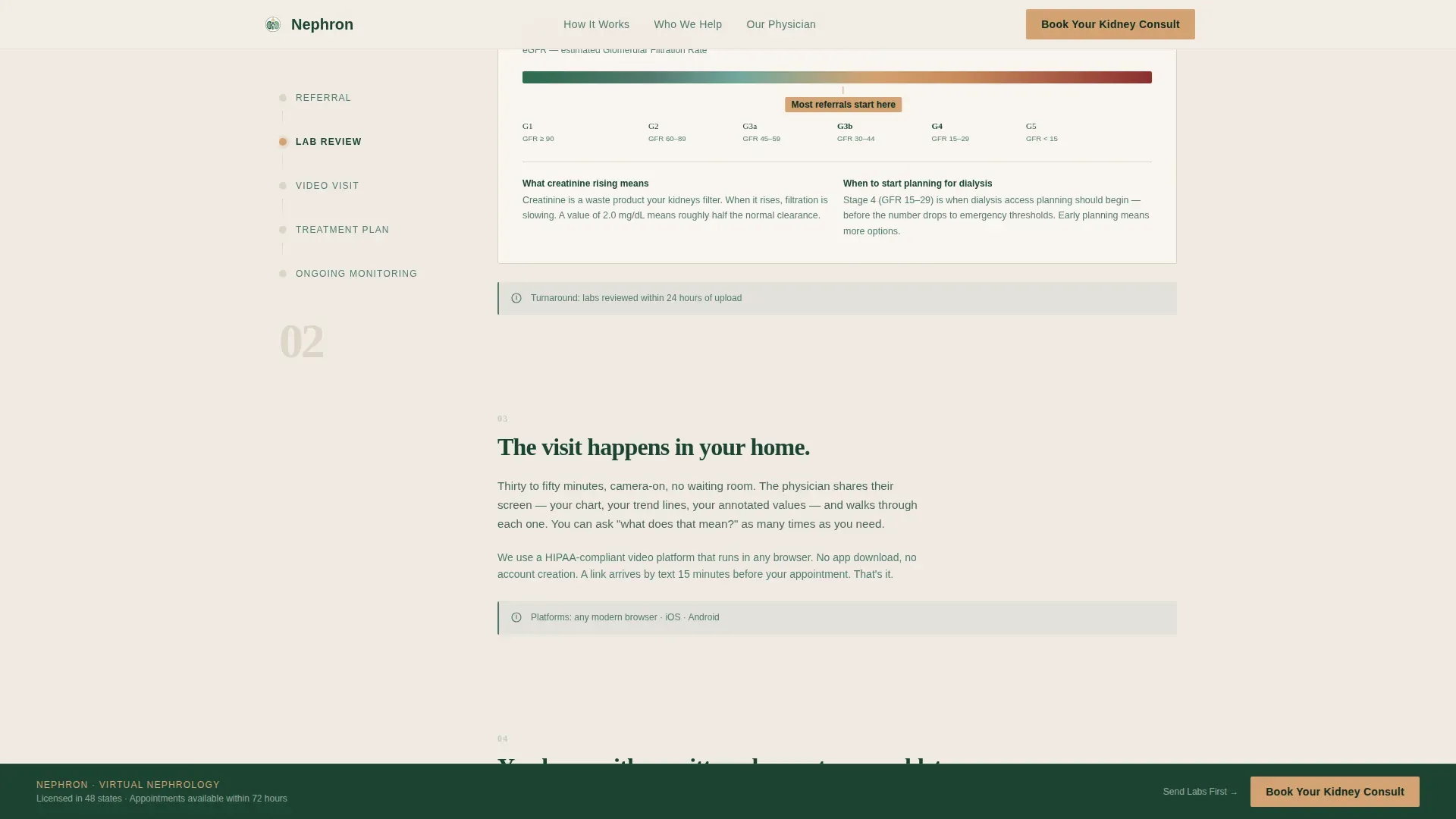
Each relevant process stage includes a sample GFR chart with annotated thresholds. Jargon is translated on screen. Visitors who arrive confused about creatinine curves or kidney function numbers leave with a working understanding of what their results mean.
Insurance-First Booking Form
The primary booking form opens with an insurance carrier dropdown that includes a self-pay option. It then asks for the patient's current nephrologist status, followed by a preferred appointment window. This order reduces drop-off by addressing the most common barrier, cost and coverage, before anything else.
Lab Upload Secondary Path
A secondary call to action reads "Send Us Your Labs" and provides a secure upload field. Patients who are not ready to book a full visit can submit their lab panel for a review first. This path captures leads who need one more step before committing.
Patient Archetype Cards
Three cards present specific patient situations in an asymmetric bento layout. Each card describes a recognizable patient type: a dialysis candidate weighing options, a primary care referral with unread printouts, and a transplant recipient managing quarterly follow-ups. Specificity builds trust faster than generic messaging.
Page sections overview
| Section | Purpose |
|---|---|
| Hero Type Tower | Establish authority with stacked KIDNEY typography and a plain headline |
| Process Timeline Rail | Walk visitors through five consultation stages with sticky left navigation |
| GFR Chart Panels | Translate lab values into plain language using annotated chart segments |
| Physician Videos | Short captioned clips showing the doctor explaining each process stage |
| Patient Archetype Cards | Help visitors self-identify with three specific kidney patient profiles |
| Physician Profile | Build credibility through credentials and an editorial quote layout |
| Booking Form | Capture consultations with an insurance-first, low-friction intake form |
| Lab Upload Path | Offer a low-commitment entry point via secure lab file submission |
| Single-Row Footer | Close the page cleanly with essential practice links and contact info |
Design & branding system
The visual identity follows an Educational Guide theme using a Forest Trust color system. The palette feels authoritative without being clinical, drawing on natural, grounded tones rather than sterile hospital whites and blues.
- Deep evergreen (#1B4332) for primary text and structural elements, soft fern (#52796F) for secondary surfaces and supporting type, birch white (#F0EBE3) for the background, and warm amber (#D4A373) reserved for buttons and highlighted lab values
- Fraunces serif handles display and headline type; DM Sans handles all body copy, creating an editorial pairing that reads like a trusted medical reference
- Animation is intentionally minimal: the hero is fully static, the process timeline uses scroll-linked reveals, and all motion is subtle to support a late-night, focused reading experience
Mobile & speed optimization
The template is designed desktop-first to match the primary use case of patients researching kidney care late at night on a laptop. A mobile fallback ensures the experience holds up on smaller screens without losing the core layout logic.
- The sticky timeline collapses gracefully on smaller viewports so the process flow remains readable without the split-screen constraint
- Static sections use server-rendered components; the sticky scroll behavior and booking form are handled client-side for responsive interactivity
- Low animation overhead keeps the page feeling fast and focused, removing distractions that could interrupt a visitor working through a difficult medical decision
How this template helps you convert
The template is built around a single conversion principle: show the patient exactly what will happen before asking them to act. Every scroll adds information that removes a reason not to book.
- The process timeline earns trust incrementally. Each stage resolves a specific fear, starting with the referral process and ending with ongoing monitoring, so by the time the booking form appears, the visitor already feels like a patient.
- The amber "Book Your Kidney Consult" button appears after the Lab Review stage and stays pinned to the bottom of the viewport from that point forward. The patient never has to scroll back up to act.
- The lab upload path removes the all-or-nothing pressure of committing to a full visit. It gives hesitant visitors a smaller first step, which keeps them in the funnel rather than closing the tab.
Other information about this template
This template is categorized under Health and Medical, with a specific focus on the nephrologist virtual consultation page niche. It is built for United States-based practices, with localization set for USD, MM/DD/YYYY date formatting, and Eastern Standard Time (EST) appointment windows.
- The booking form supports a "self-pay" option alongside insurance carriers, making it accessible to patients outside traditional insurance networks
- The template style is Split Screen (50/50), a layout choice that enforces visual balance and prevents either the educational content or the conversion elements from dominating prematurely
- The footer follows a Linear Single-Row pattern, keeping the page close cleanly without introducing new navigation that could pull the visitor away from booking
Theme
Educational Guide
Creative direction
Transparent Process
Color system
Forest Trust
Style
Split Screen (50/50)
Direction
Booking/Scheduling
Page Sections
Stacked Type Tower Hero
Sticky Five-stage Process Timeline
Annotated GFR Chart Panels
Insurance-first Booking Form
Lab Upload Secondary Path
Patient Archetype Cards
Related questions
Who is this template designed for?
Can I customize the booking form fields?
Does the template include physician video content?
How does the lab upload path work?
Is this a single page or a multi-page template?



