Reliable Child Care Services Landing Page Template
Nurture is a split-screen daycare landing page template built for Facebook ad traffic. It follows a case study narrative flow, guiding parents from enrollment anxiety to a gated checklist download. The Arctic White color system, marigold call-to-action buttons, and candid photography direction create a warm, trustworthy first impression that moves busy parents toward action.
by Rocket studio
Quick summary
Nurture is a single-page, split-screen landing page template designed for daycare centers running Facebook ad campaigns. It uses a case study narrative structure to build trust with parents, then guides them to download a gated kindergarten readiness checklist. The layout is clean, warm, and purpose-built to convert anxious parents into booked tours.
Who this template is for
This template is built for daycare owners and early childhood education marketers who need a high-converting landing page that works with paid social traffic. It suits both established centers and new ones looking to fill enrollment slots quickly.
- Daycare centers running Facebook or Instagram ad campaigns targeting local parents
- Early childhood education programs promoting kindergarten readiness outcomes
- Enrollment coordinators who need a professional page ready to capture leads fast
What problem this template solves
Most daycare websites bury the value. Parents arriving from a Facebook ad are anxious, time-pressed, and skeptical. A generic homepage does not answer their real questions. This template solves that by giving parents a focused, story-driven page that speaks directly to their concerns and earns their trust before asking for anything.
- Parents leave pages that feel corporate or vague, especially at midnight after a waitlist rejection
- Generic contact forms feel risky to new families who have not yet seen proof of care quality
- Centers lose high-intent visitors because no clear next step is offered after the first scroll
What you get with this template
You get a fully structured landing page layout that follows a proven content-to-conversion flow. Every section has a defined role, from the headline that stops the scroll to the gated checklist form that captures the lead.
- A split-screen hero with a bold, data-led headline and candid caregiver photography direction
- A case study narrative scroll with four structured story sections per family arc
- Two strategically placed marigold download buttons and a secondary tour scheduling text link
Feature list
This template includes purposefully designed components that support the full parent journey from first impression to lead capture.
Split-Screen Hero Layout
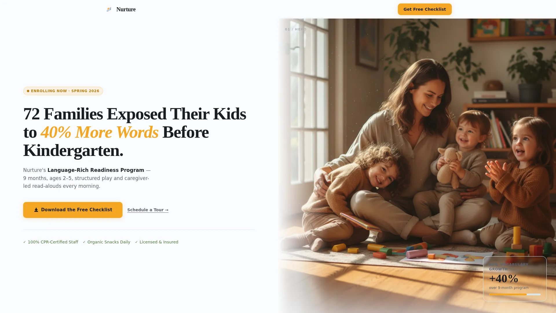
The header divides the viewport into two equal halves. The left side holds a large, rounded sans-serif headline with a specific program result and a supporting subline. The right side frames a candid, naturally lit photograph of a caregiver at child eye level during circle time. The pairing creates immediate emotional credibility.
Case Study Narrative Scroll
The page is structured around real family stories. Each arc covers four sections: the parents and their concern, the assessment process, the daily routine, and the measurable outcome. Subsequent scrolls introduce new families and new challenges, compounding stakes and deepening relevance for the reader.
Gated Checklist Lead Capture Form
The primary call to action is a two-field form gated behind a downloadable kindergarten readiness checklist. The form asks only for a parent's first name and email address. This low-friction approach earns the click through demonstrated expertise rather than pressure.
Dual Call-to-Action Placement
The marigold download button appears twice: once mid-page after the first case study and once at the bottom after the final outcome data. A secondary "Schedule a Tour" text link sits beneath the form for high-intent visitors ready to move faster.
Arctic White Color System
The layout uses a four-color palette built for clarity and warmth. Arctic white backgrounds keep the page open and readable. Glacier blue surfaces the section dividers and card areas. Warm mitten gray carries all body text. Marigold is reserved exclusively for buttons, badges, and trust indicators.
Assessment Split-Screen Panel
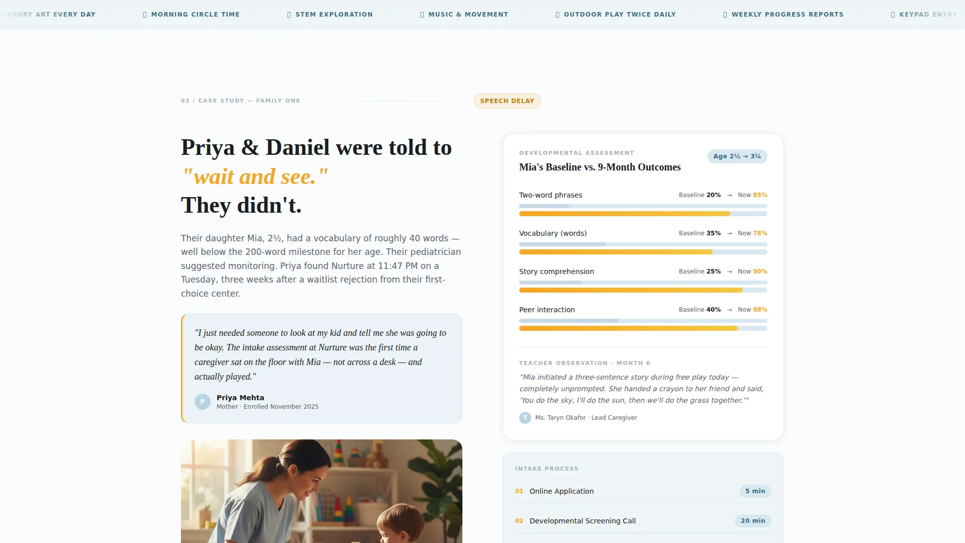
Section two of each family arc pairs the intake form visual on the left with a developmental milestone chart on the right. This side-by-side layout communicates a rigorous, caring process without requiring dense explanation.
Page sections overview
| Section | Purpose |
|---|---|
| Split-Screen Hero | Headline, subline, and caregiver photo establish immediate trust |
| Family Introduction | Introduces the parent concern and sets the emotional stakes |
| Assessment Process | Pairs intake form with developmental milestone chart |
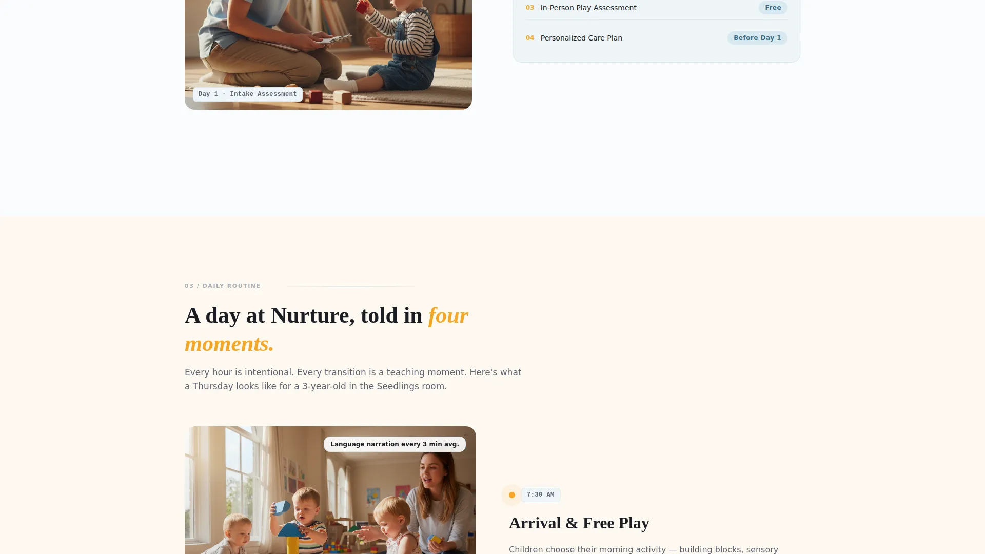
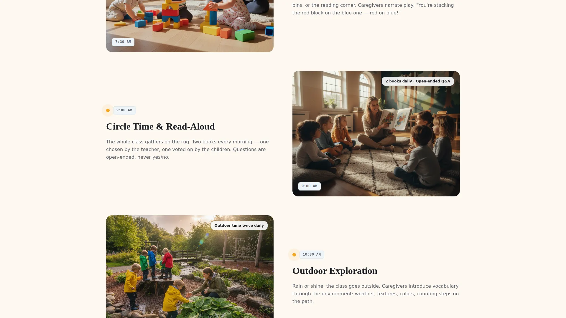
| Daily Routine Snapshots | Timestamped visuals walk through the child's day |
| Outcome Data Panel | Vocabulary growth, teacher observations, and parent quote |
| Mid-Page call to action Form | Gated checklist download after the first case study arc |
| Second Family Arc | New challenge, new story, compounding trust and relevance |
| Final Outcome Section | Closes the narrative with measurable results |
| Bottom call to action Form | Second checklist download and tour scheduling text link |
Design & branding system
The visual identity follows a Service Utility theme. The palette is intentional and restrained, using four colors with strict role assignments. Typography leans on a friendly rounded sans-serif for headlines and clean body text for readability at all scroll depths.
- Arctic white (#FAFBFC) for open page backgrounds, glacier blue (#D6E8F0) for card surfaces and section dividers, warm mitten gray (#5C6370) for all body copy
- Marigold (#F5A623) used exclusively for buttons, badges, and trust indicators to maintain visual hierarchy
- Candid photography direction with natural morning light, imperfect framing, and real caregiver-child moments to avoid stock photography sheen
Mobile & speed optimization
The split-screen layout is designed to restack gracefully for smaller screens. Each 50/50 panel shifts to a single-column flow so the narrative reads clearly on a phone held during a lunch break or late-night scroll.
- Full-width stacking for the hero and case study panels on mobile viewports
- Two-field form kept minimal so it loads and submits cleanly on any device
- Marigold call to action buttons remain prominently visible at both mobile breakpoints where they appear
How this template helps you convert
The page earns conversions through trust before it asks for anything. The narrative structure does the persuasion work so the form feels like a natural next step rather than a cold demand.
- The case study scroll builds proof progressively, showing real outcomes like vocabulary growth percentages and teacher observations before the checklist form appears
- The gated checklist positions the daycare center as a genuine educational resource, which lowers resistance and increases form completion from parents who are still in research mode
- The secondary "Schedule a Tour" link gives high-intent visitors an immediate path forward without forcing them through the checklist funnel
Other information about this template
This template is a strong fit for daycare center Facebook ads landing page campaigns where a single focused page outperforms a full website for paid traffic. It is also well suited to daycare center marketing strategies that prioritize content-led lead generation over direct booking pressure.
- The template style is Split Screen (50/50), making it visually distinct and effective for both desktop and mobile ad traffic
- The creative direction is Case Study Narrative, which is proven to build emotional connection with parents evaluating care options
- The header concept is Giant Headline Left, designed to stop the scroll and communicate a specific, credible result within the first two seconds of page load
- The landing page direction is Content and Resource, meaning the primary conversion mechanism is a valuable downloadable asset rather than a direct appointment request
- This template falls within the Professional Services category, specifically the Daycare Center Marketing subcategory, and is optimized for the daycare center Facebook ads landing page niche
Theme
Service Utility
Creative direction
Case Study Narrative
Color system
Arctic White
Style
Split Screen (50/50)
Direction
Content/Resource
Page Sections
Split-screen Hero with Data-led Headline
Case Study Narrative Page Flow
Gated Kindergarten Readiness Checklist Form
Dual Marigold Call to Action Button Placement
Assessment Process Split Panel
Secondary Tour Scheduling Link
Related questions
Can I customize the headline and case study content for my specific daycare?
What does the gated checklist form collect from parents?
Is this template suitable for a daycare just starting to run Facebook ads?
Can the secondary tour link point to an external booking page?
Does the template include the actual kindergarten readiness checklist document?



