Low Income Finance Professional Website Template
Nest is a single-column flow landing page template built for micro-savings and retirement planning platforms targeting hourly workers, gig drivers, and freelancers. It combines a Problem→Solution Arc with an animated income projection counter, an interactive savings slider, and a freemium sign-up flow. The Arctic White and Momentum Green design system keeps the experience clean, calm, and focused on one goal: getting skeptical visitors to open a free account.
by Rocket studio
Quick summary
Nest is a single-column landing page template designed for fintech platforms that help low-income workers begin retirement planning with spare dollars. The template uses a Problem→Solution Arc to dissolve barriers one scroll at a time. It opens with a logo bar and animated counter, moves through tension-release barrier panels, and closes with an emotional call-to-action. Every design choice supports one conversion goal: turning doubt into a first step.
Who this template is for
This template is built for founders, product teams, and designers launching or refreshing a micro-savings or retirement planning platform aimed at workers who have never had access to an employer-sponsored plan. If your product helps people start investing on a modest income, Nest gives you a ready-made narrative structure and visual system to match.
- Fintech startups building retirement savings products for gig workers, hourly employees, and freelancers who lack employer-sponsored retirement benefits
- Platform teams that want a freemium sign-up flow with an interactive projection tool and zero credit-card friction at the first touchpoint
- Designers and developers who need a fully structured, mobile-first single-column layout with high-animation, scroll-driven storytelling built into the wireframe
What problem this template solves
Most retirement planning interfaces are designed for people who already feel financially confident. They assume users have stable income sources, an existing retirement budget, and familiarity with terms like Roth versus Traditional individual retirement account. For hourly workers and gig drivers, those assumptions create an immediate wall. The result is a high bounce rate and low account creation, even when the product itself is genuinely accessible.
- Visitors with irregular income assume retirement saving requires a minimum deposit, a certified financial planner on retainer, or an employer who cares. This template's copy and structure directly dismantle each of those assumptions, section by section.
- The sign-up flow asks only for age and income range at first contact. No Social Security number, no credit card, no employer name. That low-friction entry point reduces hesitation and makes the process feel safe before any commitment is made.
- Without a visual proof of growth, abstract claims about compound interest feel hollow. The animated counter and savings projection slider show actual numbers, making retirement goals feel reachable instead of theoretical.
What you get with this template
You get a complete single-column landing page layout built around a clear narrative arc. The template includes every section needed to take a skeptical first-time visitor from "this isn't for me" to "I should try this." The visual system, typography choices, interactive components, and copy framework are all defined and ready to adapt to your specific platform.
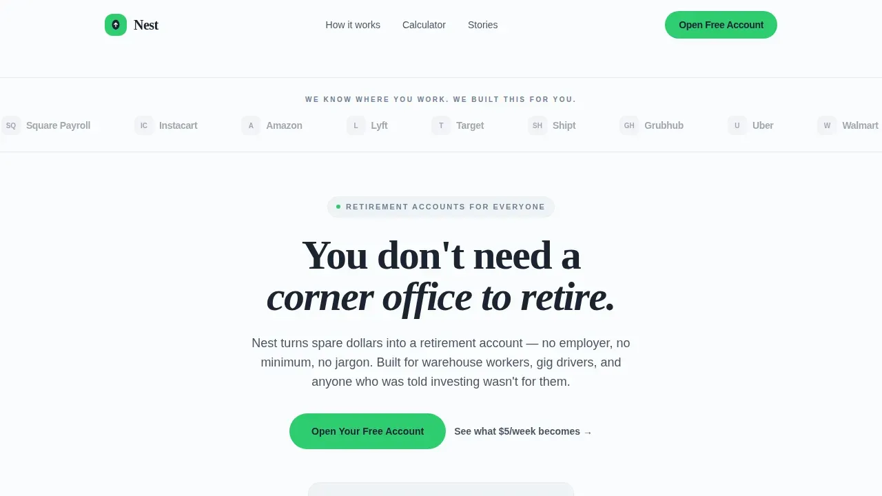
- A hero section with a logo bar marquee, a bold headline, and an animated counter that shows how $11 per week becomes $47,000 over 30 years, giving visitors a concrete retirement income projection the moment they arrive
- Three Problem→Solution barrier panels that name specific objections in plain language, a projection tool section with a live savings slider, a social proof section with worker-archetype testimonials, and a final emotional call-to-action section with footer
- A freemium sign-up path built around an income slider and age input that generates a personalized retirement projection before asking for an email, plus a secondary no-form path for hesitant visitors who want to explore projections first
Feature list
This template ships with a set of purposefully designed components. Each one addresses a real friction point in the retirement planning sign-up process for low-income and gig-economy users.
Animated Retirement Income Counter
The hero section opens with a counter that ticks upward in real time, showing how $11 per week compounds into $47,000 over 30 years. This single visual does more work than a paragraph of copy. It makes retirement savings feel immediate, tangible, and personally achievable. Interactive tools like this demonstrate how small amounts can grow over time, and they help simplify the user experience for people who distrust financial projections they cannot verify themselves.
Problem→Solution Barrier Panels
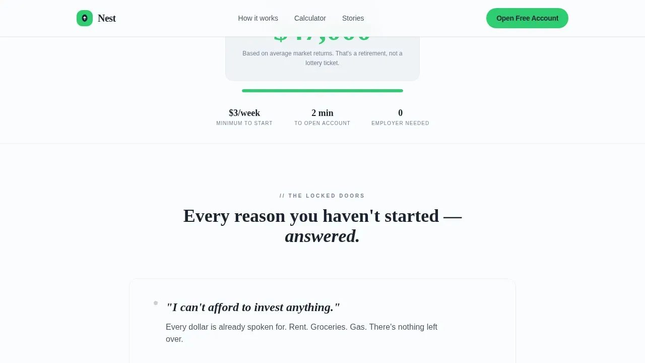
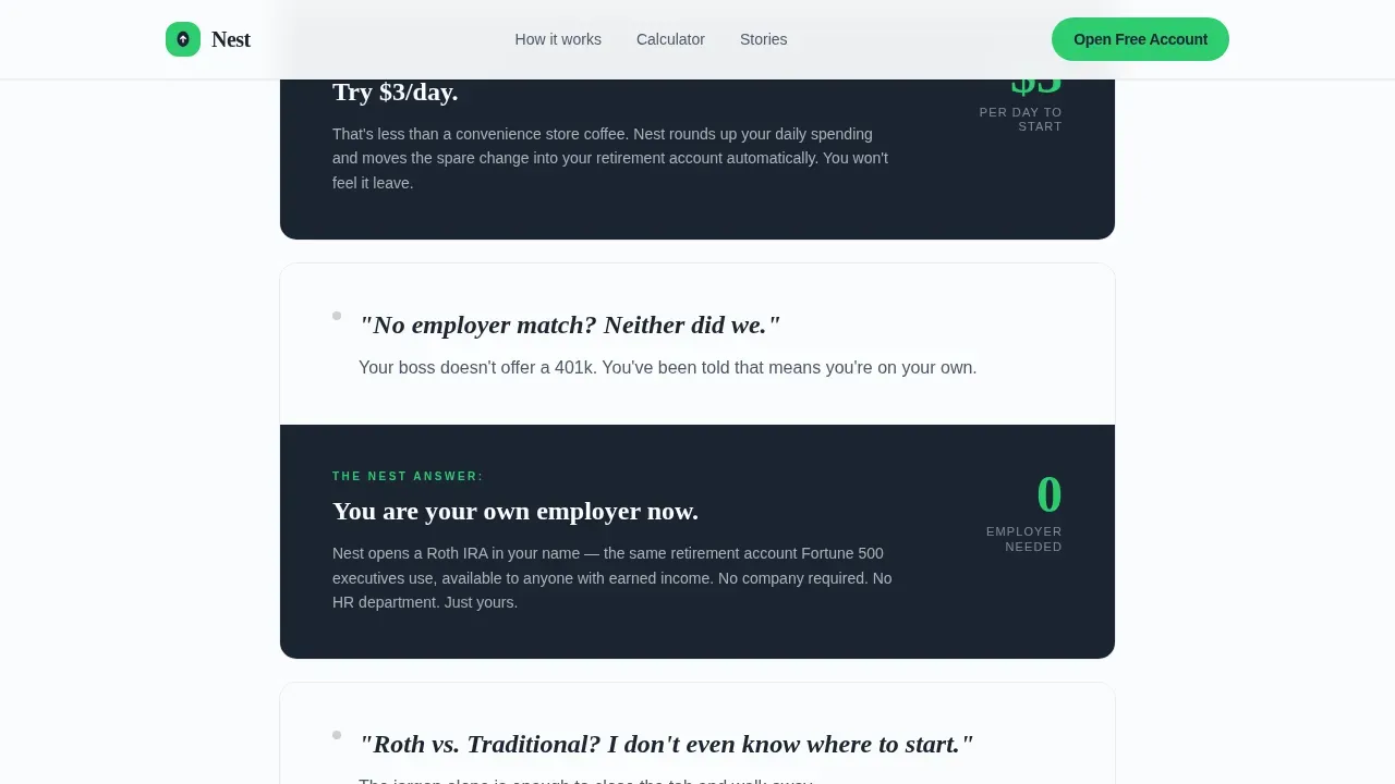
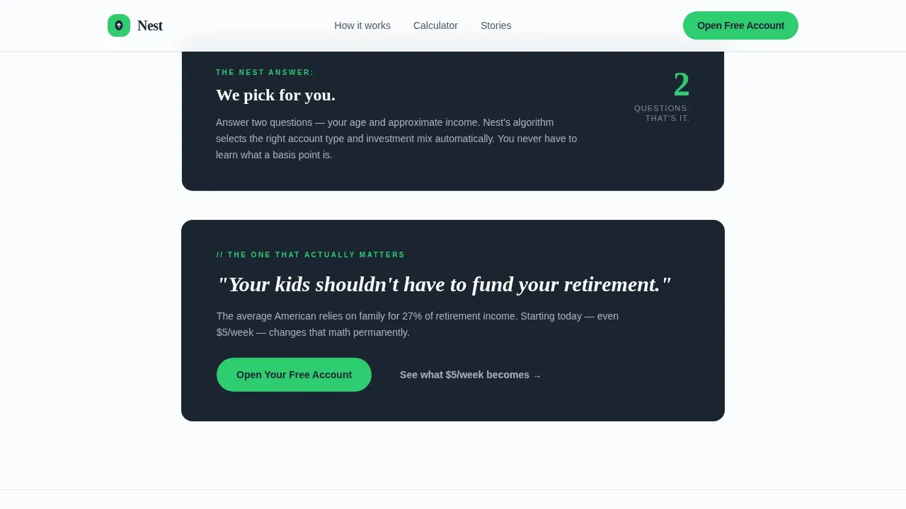
Three dedicated barrier panels move through the most common objections: no employer match, no large monthly contribution, and confusion about account types. Each panel opens with stark charcoal text naming the problem in the visitor's own language, then resolves into a green-accented solution panel. The rhythm creates a tension-release pattern that builds emotional momentum toward sign-up. Outcome-led copy keeps the focus on the benefits of starting a retirement plan rather than on technical features.
Interactive Savings Projection Slider
A full section is dedicated to a live projection tool. Visitors drag a weekly contribution slider and watch their estimated retirement budget update in real time. A micro-investment calculator that lets users input small amounts to see decades of growth makes long-term retirement goals feel concrete. Basic projection tools provide a useful estimate of retirement income and expenses without pretending to offer precise predictions, which keeps trust high with a skeptical audience.
Freemium Sign-Up Flow
The primary call-to-action flow asks only for annual income via a slider and age before generating a personalized projection. No credit card, no Social Security number, no employer name is required at the first step. A secondary path, labeled "See What $5/Week Becomes," lets hesitant visitors run projections with no form at all. This two-path structure respects different levels of readiness and keeps investors of every confidence level moving forward at their own pace.
Social Proof Testimonial Stack
A dedicated section displays stacked testimonial cards from worker archetypes: a warehouse associate, a gig driver, and a home health aide. Each card includes a job title and a specific dollar amount saved, grounding the proof in recognizable circumstances. Trust signals like these are critical for any platform asking users to connect financial accounts. Testimonials should be prominently displayed to reduce hesitation and build the confidence needed for account creation.
Logo Bar Marquee
The header opens with a slow-scrolling horizontal marquee of logos from recognizable gig platforms, retail chains, and payroll providers. These logos are not presented as partners. They function as signals that the platform was built with full awareness of where its users actually work. This design choice immediately communicates relevance to hourly workers and gig drivers who may have never seen a retirement planning product acknowledge their employer or platform by name.
Page sections overview
| Section | Purpose |
|---|---|
| Logo Bar Hero | Opens with brand-signal marquee, bold headline, and animated $47k counter |
| Barrier Panel One | Names the no-employer-match problem and resolves it with a solution panel |
| Barrier Panel Two | Addresses small contribution fears with the $3/day framing |
| Barrier Panel Three | Dissolves account-type confusion with an automatic selection message |
| Projection Tool | Live savings slider generates a personalized retirement income estimate |
| Social Proof Stack | Worker-archetype testimonials with job titles and saved dollar amounts |
| Final Call-to-Action | Emotional stakes copy and primary "Open Your Free Account" button |
| Single-Row Footer | Linear footer with minimal links and legal copy |
Design & branding system
The visual identity follows a Startup Velocity theme built on an Arctic White color system. The palette was chosen to feel like a freshly cleared surface on payday morning: bright, uncluttered, and free of visual noise that might trigger financial anxiety. Calm aesthetic design elements like gentle motion and stable colors help reduce anxiety related to financial decisions, which matters deeply when your audience includes people who have historically avoided finance products.
- Color system: clean snow white (#FAFBFC) as the dominant background, soft frost gray (#E8ECF1) for section dividers and card surfaces, deep charcoal (#1B2432) for all body and headline text, and Momentum Green (#2ECC71) reserved exclusively for calls-to-action, progress indicators, and dollar amounts. Green never decorates; it only appears where money grows.
- Typography: Fraunces serif display font for headlines paired with DM Sans for all body copy. This pairing balances warmth and legibility, which supports readability across a wide range of screen sizes and literacy comfort levels.
- Animation direction: high-motion scroll reveals using slideInBlur transitions, counter tick-up on load, scroll parallax between sections, and barrier dissolve animations as solution panels appear. The motion is purposeful and quiet, never distracting.
Mobile & speed optimization
The target demographic for this template uses smartphones as their primary device. A mobile-first design approach is reflected in every layout decision, from the single-column flow to the slider-based form inputs that replace text fields. A mobile-friendly design is crucial for this type of landing page, ensuring fast loading times and simple navigation for users accessing via phone.
- The single-column layout eliminates multi-column reflow issues and keeps the scroll path linear and uninterrupted on any screen width. The income input uses a slider rather than a keyboard field to reduce friction on mobile devices.
- Animations use CSS scroll-behavior native implementation, which keeps the motion smooth without requiring heavy JavaScript libraries that could slow load times on mid-range Android devices common among the target audience.
- The freemium sign-up form is designed for a two-thumb interaction model, with large tap targets, clearly labeled inputs, and a visible green call-to-action button that stays accessible throughout the scroll experience.
How this template helps you convert
This template was structured around one outcome: turning a skeptical visitor into an account opener. Every section either removes a barrier, builds trust, or creates forward momentum toward the primary call-to-action. The freemium model means visitors can generate real value before they commit, which dramatically lowers the psychological cost of signing up.
- The animated counter and live savings slider make retirement savings feel real and personal immediately, before any form appears. Visitors see their own numbers first, which shifts the mental frame from "this is for other people" to "this could actually work for me." Compelling headlines and visual proof of growth are consistently more persuasive than feature lists for skeptical audiences.
- The Problem→Solution Arc mirrors the visitor's internal objections in sequence, naming each barrier plainly before dissolving it. This structure creates a sense of being understood, which is the primary driver of trust for users who have historically been excluded from financial planning tools and have never received guidance from a certified financial planner or similar resource.
- The two-path sign-up structure, one for ready visitors and one for hesitant explorers, keeps every visitor moving. No one hits a dead end. The secondary "See What $5/Week Becomes" path converts curious browsers into engaged users who are far more likely to complete account creation after seeing a personalized projection based on their own income and retirement age.
Other information about this template
This template sits at the intersection of personal finance product design and social impact fintech. It is built for a use case that has historically been underserved by standard retirement planning interfaces. The sections below cover additional context that may be useful as you plan, customize, and deploy this template for your platform.
- Retirement planning tools across the personal finance space vary widely in complexity. Tools like those offered by providers such as Vanguard, Fidelity, and Charles Schwab are designed for users with existing assets and financial literacy. The Nest template is explicitly designed for users who are starting from zero and may never have used any retirement planning tool before. The retirement spreadsheet concept embedded in the projection section draws on the same logic used by tools like Microsoft Excel-based retirement models, but presents it through a slider rather than a grid, removing the data-entry burden entirely.
- The projection tool in this template is designed as a retirement spreadsheet equivalent for non-spreadsheet users. It captures the core function of a retirement spreadsheet, estimating future retirement income from current savings behavior, without requiring the user to understand formulas or financial terminology. Users should regularly review and adjust their retirement calculations as circumstances change, and the template includes copy prompts that encourage return visits and ongoing engagement.
- Advanced retirement calculators often use monte carlo simulations to model the probability of outliving savings under different market conditions. The Nest template does not claim to replicate that level of modeling. Instead, it presents straightforward compound growth projections that give users an honest, accessible starting point. Different retirement calculators may yield varying results due to differences in assumptions, and the template copy is written to acknowledge that these projections are estimates, not guarantees.
- The social proof section is designed to surface real circumstances: actual spending levels, actual income constraints, and retirement goals that reflect the lives of hourly and gig workers rather than idealized savers. Tracking actual spending and understanding total expenses is a foundational step in any retirement budget, and the testimonial section reinforces this by grounding each story in specific numbers rather than vague outcomes.
- The template accounts for the fact that circumstances change. Workers change jobs, pick up extra shifts, lose hours, and face unexpected healthcare costs. The projection tool is designed to be revisited as income sources shift, so users can recalculate their retirement budget and update their retirement goals without starting over. This positions the platform as a long-term companion rather than a one-time sign-up event.
- Healthcare costs are a significant factor in long-term retirement planning. Retirees often face fixed incomes while healthcare expenses rise with age. The template copy touches on healthcare as part of the emotional stakes section, acknowledging that retirement is not just about leisure but about protecting family members from financial burden in later life. A health savings account is one tool that can complement a retirement plan, and the template's copy framework leaves room for platforms to introduce supplemental products like healthcare coverage or insurance options as they expand.
- Social security benefits are a meaningful income source for low-income workers, but they are rarely sufficient on their own. The template's narrative treats social security as a known quantity that visitors likely factor into their thinking, while positioning the platform's micro-savings product as the piece that fills the gap. Identifying potential gaps between projected retirement income and actual retirement expenses is one of the core functions of any sound retirement plan, and the projection tool makes those gaps visible in plain numbers.
- Property taxes, medical expenses, and other fixed costs in retirement are often overlooked in early retirement planning conversations. The template's barrier panels and emotional stakes section create space to name these costs honestly, helping visitors understand that the plan is built for real life, not a simplified model. Inflation is also acknowledged in the projection methodology, with copy noting that expense projections typically account for a two to three percent annual increase.
- The nest spare dollars retirement landing page template is designed to be a one-page retirement plan in visual form. It condenses the retirement planning process into a single scroll, helping users visualize their retirement strategy, identify potential gaps, and take a first action, all before leaving the page. This aligns with the principle that a one-page retirement plan is a concise and effective tool for streamlining the retirement planning process for people who find multi-step financial planning overwhelming.
- The freemium path supports a savings rate conversation without requiring users to commit to a fixed contribution. Visitors can explore what a modest savings rate, even just $3 per day, would produce over 30 years. This is consistent with guidance that users should be encouraged to start saving with no minimum investment required, using automated savings options to make the process consistent without demanding large upfront cash commitments.
- Cash flow variability is real for gig workers and hourly employees. The template does not pretend otherwise. The income slider uses annual income ranges rather than fixed salary fields, which accommodates irregular earners and avoids the alienating experience of a form that assumes a steady paycheck. This design choice reflects a genuine understanding of the financial circumstances of the target audience.
- Net worth, financial independence, and the ability to retire early are aspirational outcomes that motivate many investors. The template uses these ideas at the emotional stakes level without overpromising. The copy frames financial independence as a direction, not a guarantee, which keeps the tone honest and builds long-term trust with an audience that has good reason to be skeptical of financial products.
- For teams using this template as a starting point, it is worth noting that a certified financial planner can help users develop a comprehensive retirement strategy beyond what any projection tool can provide. The template is designed to start the conversation, not replace professional financial planning advice. Platforms that include a referral path to a certified financial planner as an upsell or partnership feature will find the template's tone and structure naturally supportive of that positioning.
Theme
Startup Velocity
Creative direction
Problem→Solution Arc
Color system
Arctic White
Style
Single Column Flow
Direction
Freemium/Trial
Page Sections
Animated Retirement Income Counter
Problem→solution Barrier Panels
Live Savings Projection Slider
Freemium Two-path Sign-up Flow
Worker-archetype Testimonial Stack
Logo Bar Marquee Header
Related questions
Who is this landing page template designed for?
What interactive components are included in the template?
How does the freemium sign-up flow work in this template?
Can the copy structure be adapted without rebuilding the template?
Is this template suitable for a mobile-first audience?



