Expert Virtual Neurology Landing Page Template
Synapse is a single-page virtual neurology consultation landing page template built for neurologists who need to turn worried patients into booked appointments. It combines a commanding serif headline, a Problem-to-Solution zigzag layout, and a stripped-down three-field booking form to deliver clinical authority with genuine human warmth, moving patients from anxiety to action in one clear scroll.
by Rocket studio
Quick summary
Synapse is a professionally designed landing page template built for virtual neurology practices. It guides patients through a calm, educational scroll that validates their symptoms and leads them to a single clear action: book a consultation. The layout alternates symptom panels with clinical context, building trust section by section until the appointment form feels like the obvious next step.
Who this template is for
This template serves neurologists, neurology group practices, and telehealth clinics that want a polished, conversion-focused landing page without building one from scratch. It is especially useful for physicians who treat outpatient neurological conditions through video consultation and need a page that speaks directly to worried patients rather than clinical peers.
- Solo or group neurologists launching or expanding a virtual consultation service
- Telehealth platforms and clinic networks adding neurology to their care offerings
- Healthcare providers who want a professional lead generation page tailored to patient concerns like migraines, memory changes, tremors, and unexplained numbness
What problem this template solves
Most neurology practices rely on generic clinic websites that list services without connecting emotionally with the people who need them most. Patients experiencing scary or confusing symptoms do not need a feature list, they need to feel understood before they can act. Standard templates force patients through long intake forms, busy navigation menus, and walls of medical jargon that drive anxiety rather than resolve it.
- Patients abandon pages when forms are too long or language feels cold and clinical
- Physicians lose potential appointments because their pages fail to explain what a virtual visit actually involves
- Families supporting a loved one with neurological symptoms cannot find enough information to feel confident booking remotely
What you get with this template
Synapse delivers a complete, ready-to-customize landing page with every section a neurology virtual practice needs to convert first-time visitors into booked patients. Each component has been designed around the specific communication needs of neurological healthcare, where trust, clarity, and calm are non-negotiable.
- A full zigzag symptom-to-solution layout covering migraines, memory changes, tremors, and numbness or tingling, each paired with a plain-language clinical explanation
- A minimal three-field booking form designed for speed: one dropdown for primary symptom, one for symptom duration, one for preferred consultation window
- A secondary conversion path offering a downloadable Symptom Journal PDF in exchange for an email, capturing patients who are not ready to book tonight but want to do something useful
Feature list
This section covers the core built-in features of the Synapse template. Every item listed below is grounded in the template brief and reflects what is included in the design.
Commanding Serif Hero Section
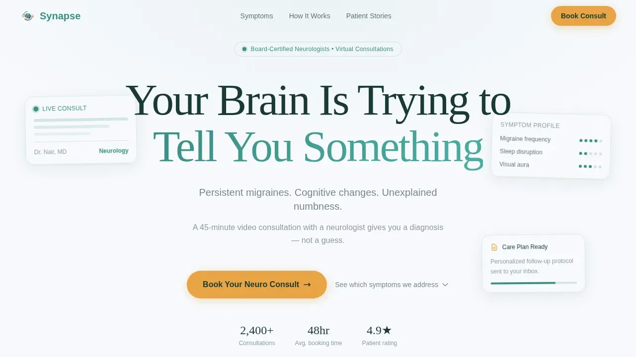
The hero opens with a single large headline set in Fraunces, a refined serif typeface, centered on a clean summit white field. No competing imagery distracts from the words. A single subline in deep pine identifies the three most common booking reasons: persistent migraines, cognitive changes, and unexplained numbness. This restraint communicates authority. In a world of busy sliders and hero videos, the stillness and directness of this header function as an immediate trust signal for patients who are already anxious.
Zigzag Problem-to-Solution Arc
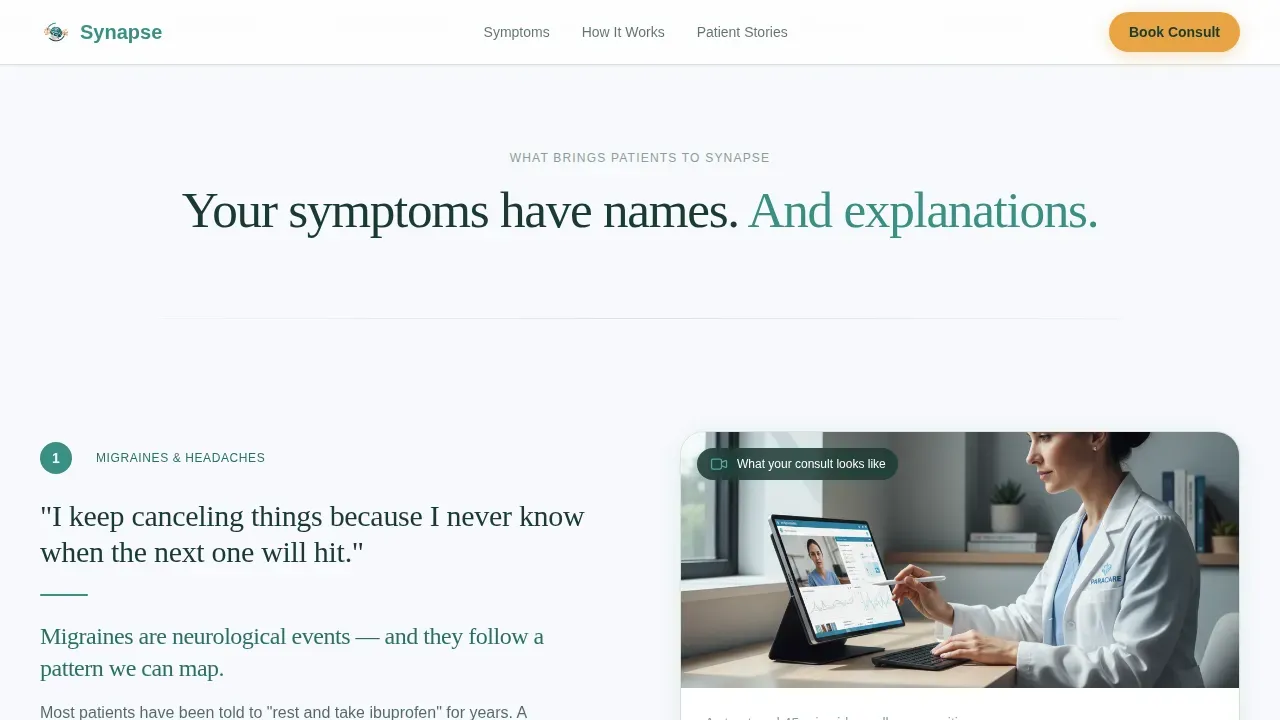
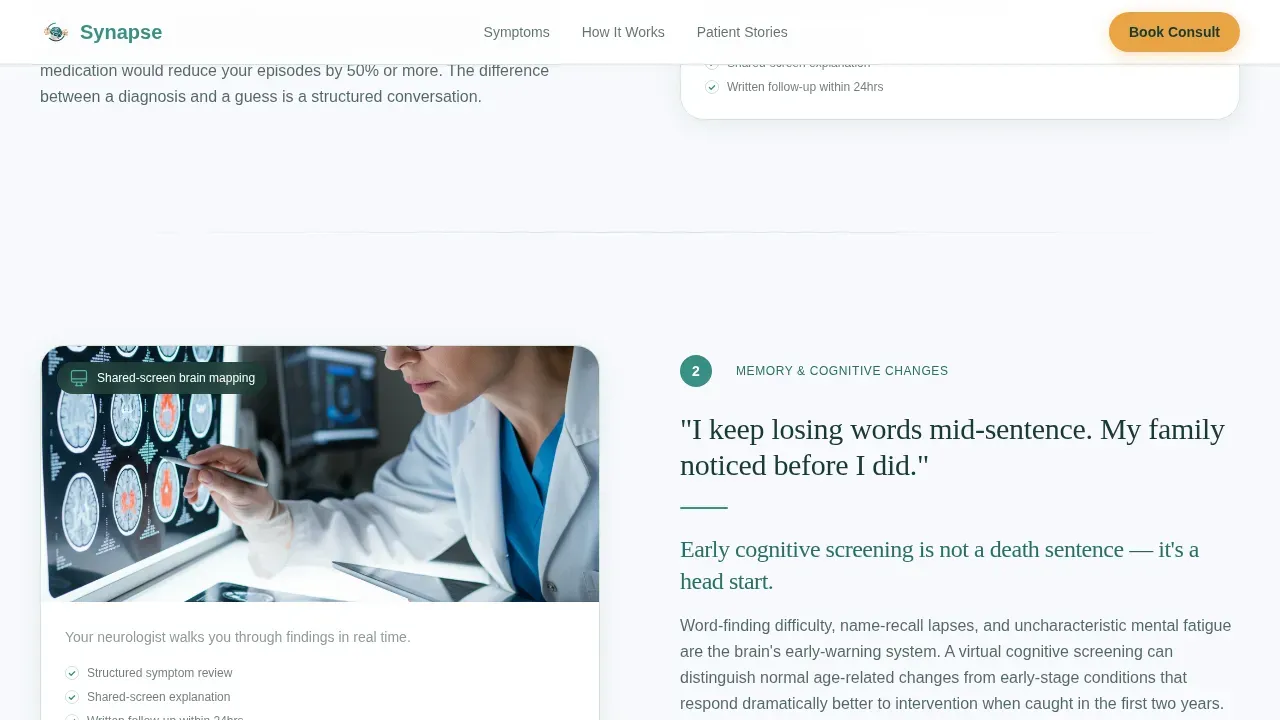
Four alternating content sections present each symptom category the way a good doctor would: in the patient's own language first, then the clinical reality. Migraines, memory and cognitive changes, tremors, and numbness or seizures each receive a dedicated panel. The left-right alternation creates visual rhythm and keeps the scroll moving. Scroll-triggered entrance animations and staggered reveals give each section a sense of arrival rather than static presentation. The tone never alarms, it educates, so patients feel informed rather than frightened.
Minimal Three-Field Booking Form
The primary appointment booking form contains exactly three fields: a symptom dropdown, a symptom duration selector, and a preferred consultation time window. No insurance questions, no medical history walls. A person in distress can complete this form in under fifteen seconds. The form appears first beneath the hero and repeats after every second zigzag block, so patients always have an immediate path to book regardless of where they are on the page.
Symptom Journal Secondary call to action
Patients who are not ready to book a consultation are offered a free downloadable Symptom Journal PDF. This secondary conversion path captures an email address in exchange for a practical resource that helps patients document their neurological symptoms before their first visit. It serves the practice by building a warm contact list and serves patients by giving them something productive to do tonight. This is a thoughtful addition for families supporting aging parents or young adults still processing a first episode.
Alpine Fresh Color and Typography System
The visual identity uses summit white (#F7F9FC) for primary backgrounds, glacial teal (#3A8F85) for headings and interactive elements, deep pine (#1B3A33) for body text, and alpine wildflower (#E8A444) exclusively for calls to action and urgent callouts. Typography pairs Fraunces (serif, headings) with DM Sans (body), creating a medical editorial feel that is authoritative without being sterile. White space is generous throughout, giving the page a clean, unhurried character that supports patient confidence.
Social Proof Footer with Testimonials and Credentials
A linear single-row social proof footer closes the page with patient testimonials that reference specific outcomes, board-certification badges, and trust signals that reinforce professional credibility. Detailed physician profiles with qualifications and areas of expertise are part of the design framework, helping to humanize the digital service. Logos of recognized medical associations can be displayed here to further establish authority. This section is essential for patients who need reassurance that the clinicians they are about to contact are board-certified and experienced.
Page sections overview
| Section | Purpose |
|---|---|
| Hero Headline Block | Anchor attention with a dominant serif headline and subline listing primary symptom reasons to book |
| Primary Booking Form | Capture appointment intent early with a three-field symptom, duration, and time-window form |
| Migraines Zigzag Block | Pair patient language about headaches with a calm clinical explanation of what screening involves |
| Memory Changes Zigzag | Address cognitive concern in plain language and explain what a virtual cognitive assessment looks like |
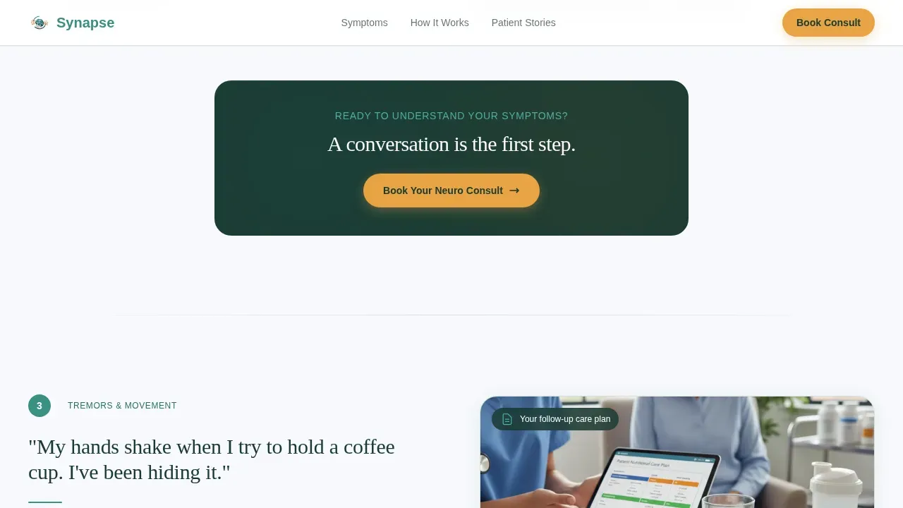
| Tremors Zigzag Block | Translate movement symptoms into understandable neurology context and next steps |
| Numbness and Seizures | Cover the most alarming symptoms with educational calm and a clear path to professional evaluation |
| Repeat call to action Block | Re-surface the booking form in alpine wildflower after every second content section |
| Social Proof Footer | Display testimonials, board-certification badges, and association logos in a linear row |
Design & branding system
Synapse uses an Alpine Fresh color system that feels like standing on a mountain trail at dawn, the light clean, the air clarifying, and every edge sharp. The palette was chosen deliberately for a healthcare context where clinical precision and human warmth need to coexist. White space is used almost medically, creating breathing room that makes each section feel considered rather than crowded.
- Color roles: summit white (#F7F9FC) backgrounds, glacial teal (#3A8F85) headings and key interactive elements, deep pine (#1B3A33) body text and grounding sections, alpine wildflower (#E8A444) reserved strictly for calls to action
- Typography: Fraunces serif for all headings at large display scales, DM Sans for body copy, a pairing that delivers editorial authority with strong readability
- Visual tone: Educational Guide theme with generous white space, minimal ornamentation, and a calm unhurried rhythm that supports patient trust rather than urgency or alarm
Mobile & speed optimization
Patients who are worried about a symptom are often researching late at night on a phone. The Synapse template is built desktop-first but carries full mobile responsiveness throughout every section. The zigzag layout reflows cleanly into a single-column stack on smaller screens, and the three-field booking form remains accessible and easy to complete without pinching or horizontal scrolling.
- The booking form is thumb-friendly on mobile: large tap targets, dropdown fields, and no keyboard-intensive free-text inputs
- Scroll-triggered animations and staggered reveals are implemented as client-side components, while static sections use server-rendered markup for leaner initial page loads
- Images and physician profile photos are designed for high-quality display across screen densities, supporting the visual trust that patients need when choosing a healthcare provider remotely
How this template helps you convert
The Synapse landing page is built around a single conversion goal: the booked neurology appointment. Every design decision flows from that goal, including the header that speaks to symptoms before it mentions services, the minimal booking form that removes friction, and the repeated wildflower call to action that appears at every logical decision point in the scroll.
- The hero call to action appears immediately beneath the headline, giving patients who already know they need help a direct path to book without scrolling, reducing the time between anxiety and appointment contact
- The zigzag arc builds enough information and trust through the scroll that patients who were hesitant at the top feel informed and confident by the time the next call to action appears, improving booking rates among the undecided majority
Other information about this template
The Synapse template draws inspiration from real developments in virtual neurology care. Telemedicine in neurology has proven effective at improving patient access to specialists, particularly in rural and underserved areas where geography creates significant barriers to clinic visits. Research has shown that virtual neurology visits can alleviate the physical, emotional, and financial burden of traveling for specialist care, and AI-powered telemedicine platforms are now helping clinicians respond faster, with some hospital workflows reporting dramatically reduced stroke response times through better integration with imaging tools and communication systems.
The template's focus on patient data safety is reflected in its design guidance, which recommends displaying trust indicators prominently. Clinicians working in digital health are advised to ensure that patients feel their private health data is protected. This means communicating compliance standards clearly and displaying security indicators so that patients feel informed before they book. The platform design also reflects broader science around reducing patient anxiety: short forms, plain language, and educational resource access all contribute to better outcomes by lowering the psychological barrier to seeking care.
This template is well-suited for practices that want to serve families supporting loved ones with cognitive changes, as well as young adults navigating a first neurological episode. It is equally useful for mid-career professionals who have been delaying care and need a professional, trustworthy first contact point. Clinicians at university-affiliated practices or those developing independent virtual clinic models will find the design system adaptable to their branding. The landing page structure also acknowledges the role of counseling and mental health support in holistic neurological care, with the Symptom Journal secondary path providing a low-stakes entry point for patients not yet ready to book.
Notably, the Synapse Integrated Therapy Center in Virginia Beach, Virginia, stands as a real-world example of interdisciplinary outpatient neurological care done right. As the first such center dedicated to the military community in Virginia, it provides evidence-based treatment across physical therapy, mental health therapy, and speech-language pathology. The broader Synapse name is associated with meaningful developments in virtual neurology, including AI-driven triage platforms that help hospitals connect to vascular neurologists rapidly, reducing stroke intervention delays. The template reflects this ethos: rapid access, clear communication, and patient-centered design that lets neurologists focus on care rather than friction.
More than half of adults in America use social media to obtain health care information, and nearly 70% use at least one platform regularly. This makes a strong landing page an essential professional asset for any neurology practice. Among physicians, the majority use social media personally, and a significant portion use it professionally, meaning patients will often find a practice through social channels before reaching the landing page. A well-designed page that is shareable, visually trustworthy, and clinically authoritative reinforces the credibility that clinicians build across every channel. This template supports that full-funnel confidence by presenting a page that physicians can be proud to share and patients can trust on arrival.
- The Symptom Journal download supports families and friends of patients who want to help document symptoms before a first appointment
- The tailored three-field form reduces procedural anxiety and mirrors the kind of intake that a doctor would conduct in an unhurried clinic setting
- Predictive analytics and AI-driven triage tools in virtual neurology are enabling clinicians to distinguish emergent from non-emergent cases, and this template is designed to serve practices that are developing those capabilities alongside their patient-facing presence
- Training materials, onboarding guides, and internal resources are not part of this template, but the Symptom Journal PDF serves as a patient-facing educational resource that adds real value at the moment of first contact
- The inpatient-to-outpatient transition is a common challenge in neurology, and this landing page model is specifically designed to support outpatient and virtual care models rather than hospital inpatient referral flows
- This template does not claim surgery scheduling or inpatient procedure booking, it is built entirely around the virtual consultation appointment and the patient's journey toward a first conversation with a neurologist
Theme
Educational Guide
Creative direction
Problem→Solution Arc
Color system
Alpine Fresh
Style
Zigzag/Alternating
Direction
Lead Generation
Page Sections
Zigzag Symptom-to-solution Layout
Dominant Serif Hero Section
Minimal Three-field Booking Form
Symptom Journal Download Path
Alpine Fresh Visual Identity
Social Proof Footer with Trust Signals
Related questions
What neurological conditions does this template address?
Can I customize the booking form fields?
Is this template suitable for a solo neurologist or only for group practices?
How does the Symptom Journal secondary conversion path work?
What makes this different from a general medical website template?



