Financial Advisor Fee Tiers & Pricing Comparison Website Template
Ledger is a single-page financial advisor pricing landing page built on a Bold Brutalist design system. It uses a dark, data-forward layout to present fee tiers, a comparison grid, and an interactive calculator with total transparency. Built for advisors ready to win clients by showing every number, every cost, and every advantage in plain sight.
by Rocket studio
Quick summary
Ledger is a financial advisor pricing landing page designed for radical fee transparency. It presents AUM versus flat-fee versus hourly costs across portfolio sizes, breaks down service tiers in a checklist matrix, and features a live Fee Erosion Calculator. The entire layout runs on a void black and electric indigo design system that reads like a live trading terminal.
Who this template is for
This template is built for independent financial advisors and registered investment advisory firms who want to compete on transparency rather than reputation alone. It speaks directly to mid-career professionals managing between $500,000 and $5 million in investable assets who have lost trust in opaque fee structures.
- Fee-transparent advisors who want to show costs before a prospect ever books a call
- Independent RIA (registered investment advisory) firms ready to differentiate with data-first positioning
- Financial planners targeting high-earning professionals burned by vague AUM percentage billing
What problem this template solves
Most advisory pricing pages hide the real cost behind vague language, percentage ranges, and delayed disclosure. Prospects leave without understanding what they will pay, and that uncertainty drives them elsewhere. This template replaces vague language with visible numbers.
- Opaque fee structures that erode client trust before the first meeting
- The inability to show a clear cost comparison against industry averages
- Losing prospects who want data before they commit to a discovery call
What you get with this template
You get a single-page pricing layout structured like an industry research document. Every scroll reveals another layer of evidence. The page is built to make the fee conversation happen on your terms, before a prospect ever sits across from you.
- A full-bleed dark header with animated data cards showing live-style fee comparisons
- A brutalist fee comparison grid spanning five portfolio sizes and three billing models
- A service tier checklist matrix covering tax-loss harvesting, estate coordination, and insurance auditing
- A Fee Erosion Calculator section with an interactive bar chart projecting 10, 20, and 30-year savings
- Three strategically placed calls to action and a secondary PDF capture link
Feature list
The following core components are built into the Ledger template. Each one is grounded in the page structure described in the brief.
Animated Header Data Cards
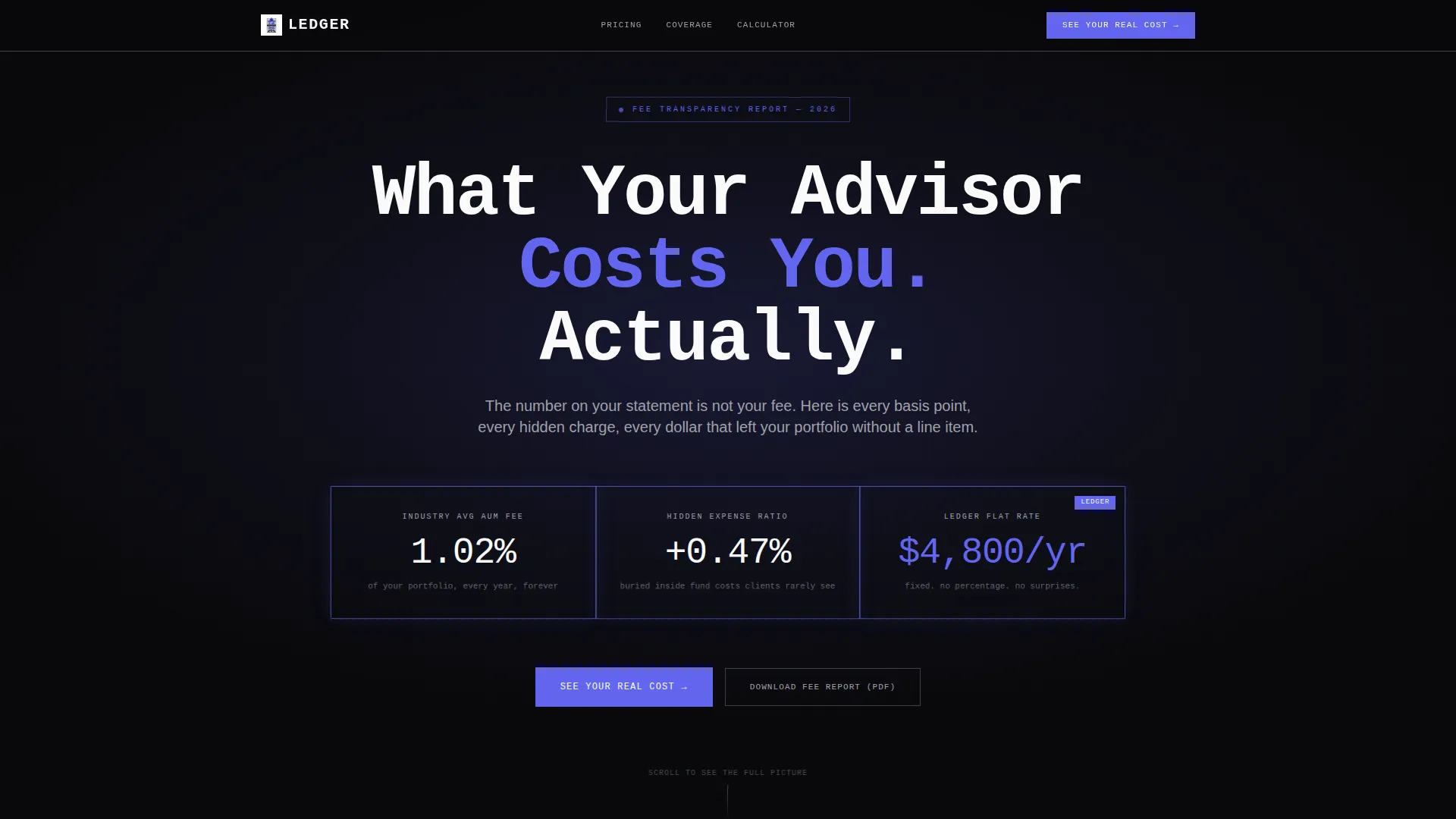
The full-bleed header opens with three glowing data cards that animate upward like live tickers. Each card shows a key number: the industry average AUM fee, the hidden expense ratio, and this firm's flat-rate alternative. The effect creates immediate contrast and urgency without a single word of sales copy.
Brutalist Fee Comparison Grid
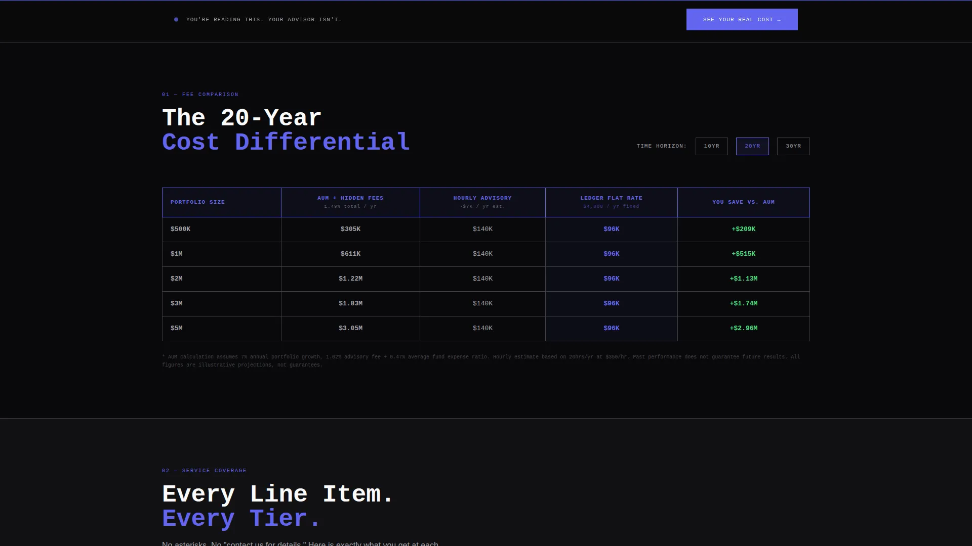
A thick-bordered table compares AUM, flat-fee, and hourly billing models across five portfolio size tiers. The cumulative 20-year cost difference is highlighted in electric indigo, making the financial impact impossible to ignore. No softened language, no footnotes, just the math.
Service Tier Checklist Matrix
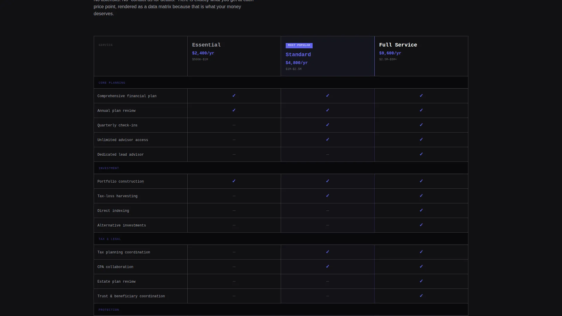
Section two renders each advisory tier as a structured checklist. Services like tax-loss harvesting, estate coordination, and insurance auditing are mapped to each tier so prospects can see exactly what they are and are not paying for. This removes ambiguity from the value conversation entirely.
Fee Erosion Calculator
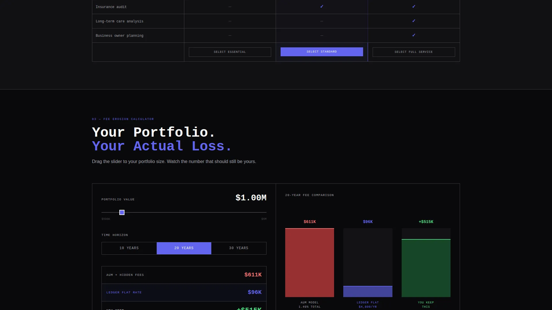
Visitors input their portfolio size and a live bar chart renders projected savings over 10, 20, and 30-year horizons. This interactive section transforms an abstract fee percentage into a concrete dollar figure. It is the moment the old billing model stops looking defensible.
Persistent Click-Through call to action System
The primary call to action, "See Your Real Cost," appears three times: inside the header cluster, as a persistent bottom bar after the first scroll, and as a full-width brutalist block after the calculator. No form is required on this page. The click is the only commitment asked.
PDF Lead Capture Link
A secondary text link, "Download the Full Fee Report (PDF)," is placed for visitors who want the data but are not yet ready to click through. It captures email intent from a different segment of the audience without interrupting the primary conversion path.
Page sections overview
| Section | Purpose |
|---|---|
| Dark Header Block | Opens with full-bleed black, radial indigo glow, headline, and three animated fee data cards |
| Fee Comparison Grid | Brutalist table comparing AUM, flat-fee, and hourly costs across five portfolio sizes |
| Service Tier Matrix | Checklist layout mapping included services to each advisory tier |
| Fee Erosion Calculator | Interactive bar chart projecting 10, 20, and 30-year savings by portfolio input |
| Full-Width call to action Block | Final brutalist call-to-action block placed directly after the calculator section |
Design & branding system
The visual identity is Bold Brutalist with an Electric Indigo color system. Every design decision reinforces legibility, urgency, and data authority. There are no rounded corners, no gradients, and no decorative softness anywhere on the page.
- Void black (#09090B) as the dominant background, electric indigo (#6366F1) as the primary accent for borders and data highlights, cold zinc (#A1A1AA) for secondary text and grid lines, and phosphor white (#FAFAFA) for headline type
- Monospaced brutalist typography stacked in rigid columns, referencing terminal and trading-desk aesthetics
- All visual emphasis achieved through color contrast and sharp borders rather than illustration or photography
Mobile & speed optimization
The template is structured for fast rendering on mobile screens without sacrificing the density of the data grid layout. The brutalist grid collapses predictably at smaller breakpoints while preserving the hierarchy and readability of each section.
- Data cards in the header restack vertically on smaller screens to maintain legibility
- The fee comparison table and checklist matrix scale with the viewport without losing column alignment
- The persistent bottom call to action bar remains fixed across all screen sizes for uninterrupted access
How this template helps you convert
Ledger is built as a conversion machine disguised as a transparency document. Every section is sequenced to build frustration with the status quo and then offer a clear exit. The page earns the click rather than asking for it.
- The animated header data cards immediately surface the cost gap between industry norms and your flat-rate model, creating emotional contrast within the first three seconds of a visit.
- The Fee Erosion Calculator personalizes the impact. Once a visitor enters their own portfolio number, the savings projection becomes real and specific, which moves them past skepticism toward action.
- Three call to action placements mean the prompt to act arrives exactly when intent is highest, not on a fixed schedule that ignores how visitors actually scroll.
Other information about this template
Ledger is part of a Financial Advisor Website Templates collection focused on high-trust, data-led design for the advisory niche. It is designed as a standalone pricing landing page and does not require additional pages to function as a conversion asset.
- Template style: Dashboard and Data Grid, built for information-dense financial services content
- Theme: Bold Brutalist with Electric Indigo, a pairing suited to financial advisor pricing page use cases
- Creative direction follows the Industry Report model, where each scroll adds evidence rather than decoration
- The page is designed for the Financial Advisor Pricing Page niche and sits within the broader Technology and Financial Advisor Website Templates category
- No photography, no stock imagery, and no lifestyle visuals are included or needed by design
Theme
Bold Brutalist
Creative direction
Industry Report
Color system
Electric Indigo
Style
Dashboard/Data Grid
Direction
Click-Through
Page Sections
Animated Header Data Cards
Brutalist Fee Comparison Grid
Service Tier Checklist Matrix
Fee Erosion Calculator
Persistent Click-through Call to Action System
Secondary PDF Lead Capture
Related questions
Does this template require a form on the pricing page?
Can I update the fee numbers and tier details to match my own pricing?
Is this template suitable for a solo financial advisor or only for larger firms?
What kind of visitor does this page target?
Does the Fee Erosion Calculator need a third-party platform to work?



