Hamster & Guinea Pig Professional Website Template
Nibble is a playful geometric masonry landing page template built for small-batch pocket-pet supplement brands. It pairs a warm Parchment and Rust color system with a curiosity-shop masonry grid, flip cards, ingredient spotlights, and a sticky "See What's Inside" call-to-action bar. The result is a frictionless click-through landing page that earns trust before asking for a purchase.
by Rocket studio
Quick summary
Nibble is a single-page masonry landing page template designed for pet supplement brands serving devoted hamster and guinea pig parents. The layout uses a Parchment and Rust color system, playful geometric tile patterns, and a Surprise and Delight creative direction. Every scroll surfaces something new: flip cards, ingredient spotlights, a DVM pull-quote, and a sticky rust-colored call-to-action bar that reappears after the third masonry row.
Who this template is for
This template is made for founders and creators who love their pets as much as their customers do. If you are building a direct-to-consumer store for pocket-pet health products, this landing page fits your brand from day one. It works especially well for small-batch supplement makers who want to stand out in a crowded world of generic pet food products.
- Small-batch pet supplement founders launching a direct-to-consumer store for hamsters, guinea pigs, or other pocket pets
- Pet brand designers and freelancers who want a production-ready landing page with built-in trust signals and high interactivity
- Exotic-vet-backed brands or artisan pet food makers hoping to communicate quality before a buyer ever clicks "buy"
What problem this template solves
Most pet supplement landing pages feel cold, clinical, or built for dogs and cats. Pocket-pet parents are a different family of buyer. They are research-driven, emotionally invested, and quick to lose trust in a brand that looks mass-produced. They are the kind of person who checks ingredient lists the way a father checks a car seat before a road trip, or a mother reads a school lunch menu every single week. A generic template simply cannot carry that emotional weight.
- Pocket-pet parents distrust supplement brands that look mass-market, so a handcrafted, artisan visual identity builds instant credibility
- Standard landing page layouts bury ingredient details and trust signals, causing buyers to leave before they ever reach the call-to-action
- No-code founders often struggle to show product quality through design alone, making it hard to compete with larger brands that have bigger budgets
What you get with this template
You get a fully designed, interactive masonry landing page built specifically for the pocket-pet supplement niche. Every section is mapped to a conversion goal: the hero earns curiosity, the masonry rows build trust, and the sticky bar closes the moment a buyer is ready. There is no form friction. The primary call-to-action leads directly to a product detail view and one-click purchase.
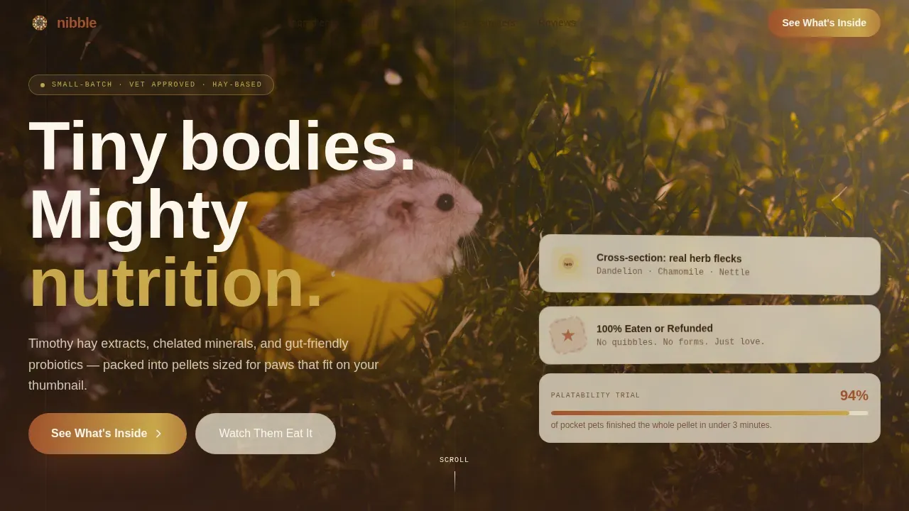
- A cinematic tabletop hero section with a translucent "See What's Inside" button layered over natural lifestyle photography
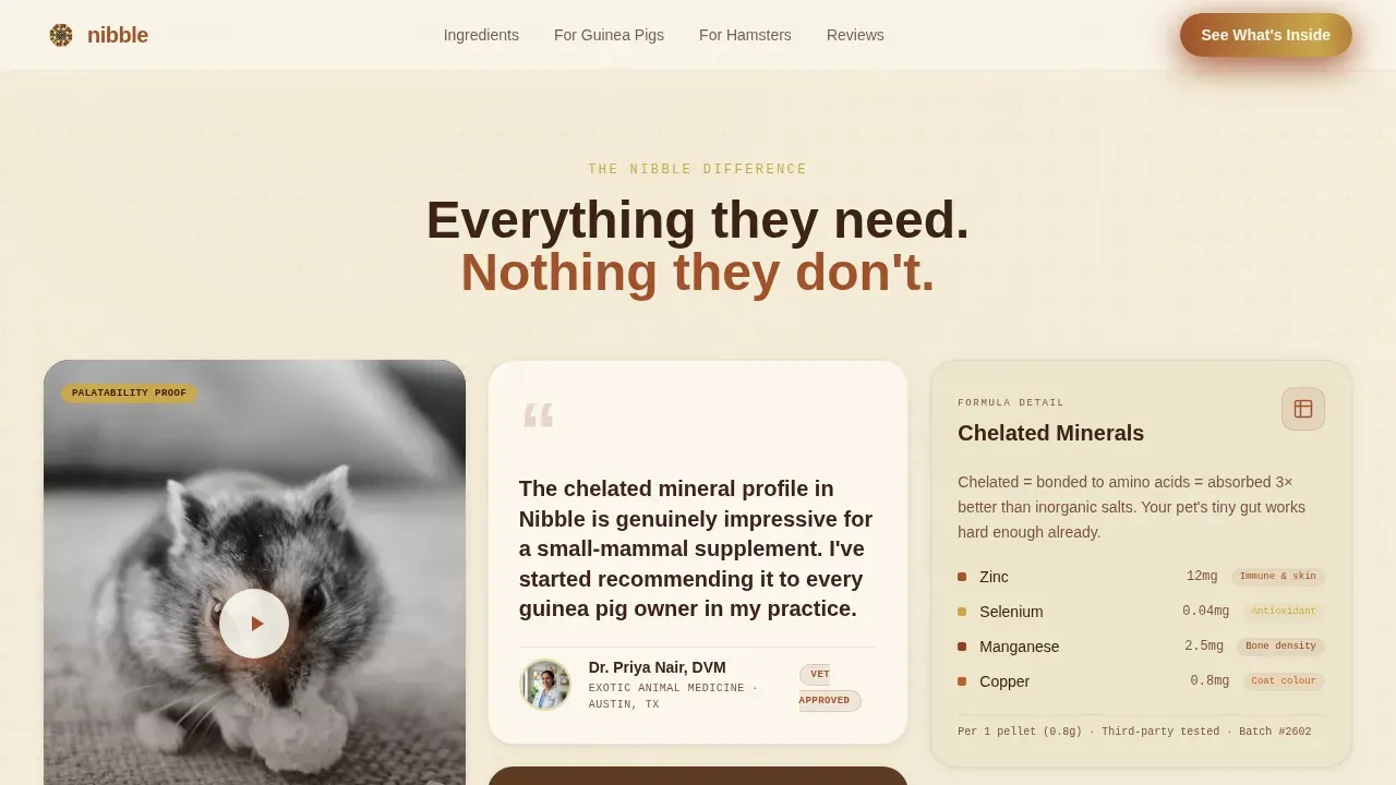
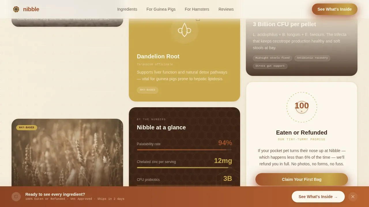
- Three rows of masonry grid cards including a video loop card, DVM pull-quote, ingredient spotlight with hand-drawn botanical illustration, coat-shine before-and-after card, popcorning guinea pig flip card, stats bento card, and a guarantee rosette card
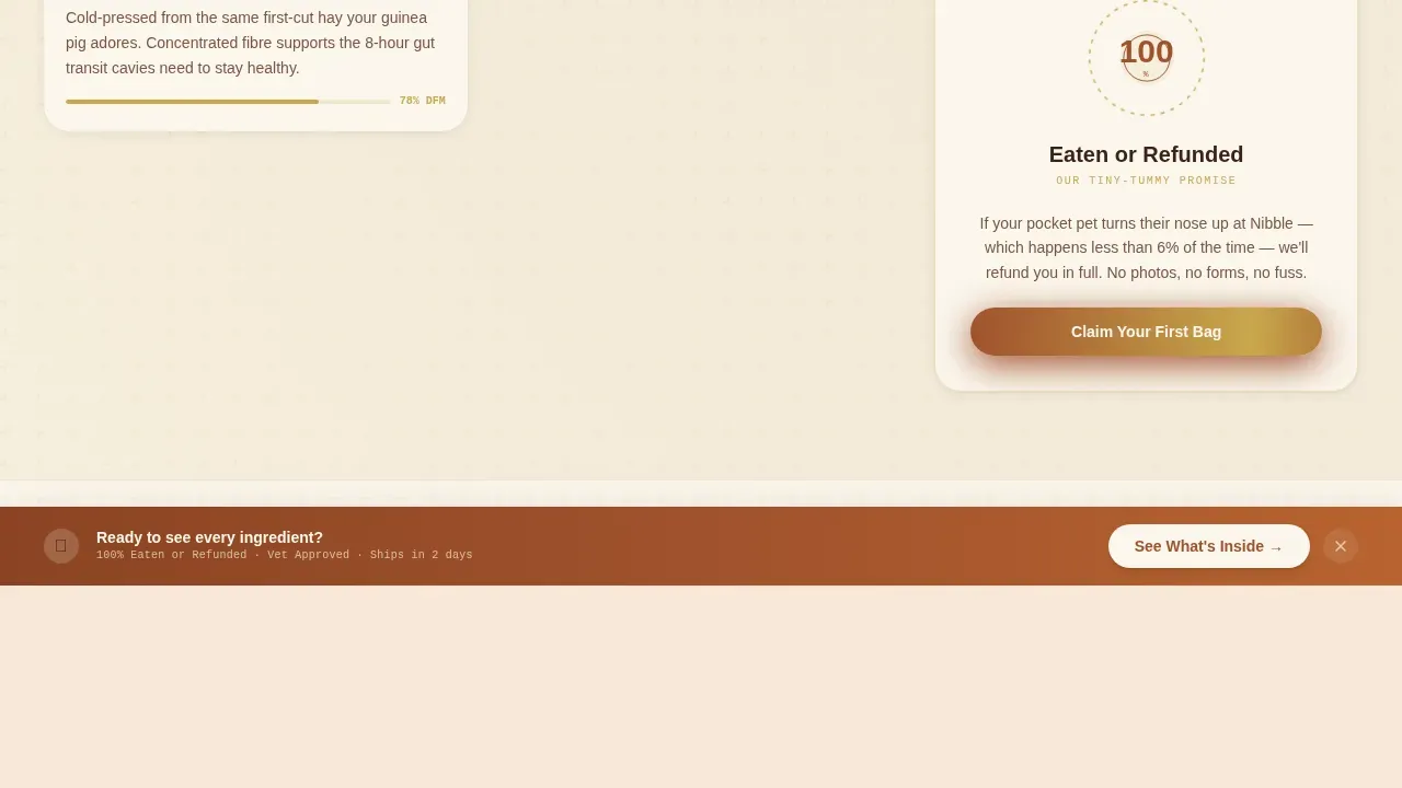
- A sticky rust-colored call-to-action bar that resurfaces after the third masonry row, plus a linear single-row footer
Feature list
This landing page template is packed with interactive, trust-building, and visually engaging features. Each one is designed to serve a specific moment in a pocket-pet parent's browsing journey, from first impression to final click.
Masonry Grid Layout with Surprise and Delight Cards
The core of this landing page is a Pinterest-style masonry grid that varies card height, accent color, and content type across three rows. Cards carry rust borders, gold "Vet Approved" and "Hay-Based" tags, and a quilted geometric tile background. No two adjacent cards feel alike, so the eye keeps moving and the page never gets boring. This kind of fun, discovery-led layout resonates deeply with research-obsessed pet owners.
Card Flip and Hover Expansion Animations
One card flips on hover to reveal a micro-animation of a guinea pig popcorning. Another expands into a before-and-after coat-shine comparison. A third rotates through an ingredient spotlight featuring a hand-drawn dandelion root illustration. These interactions make the landing page feel alive without requiring a video-heavy build, keeping the page loading experience smooth.
Hero Section with Lifestyle Shot and Floating Headline
The hero is a tabletop lifestyle photograph: a pair of hands breaking open a supplement pellet while a curious teddy-bear hamster stands on hind feet, nose twitching. Natural window light and shallow depth of field give the picture an editorial quality. The headline "Tiny bodies. Mighty nutrition." drifts in over the negative space in a rounded geometric sans-serif.
Sticky Call-to-Action Bar
After the third masonry row, a rust-colored sticky bar slides into view carrying the "See What's Inside" call-to-action. This resurface moment is intentional. By the time a buyer reaches this point, they have already seen the video proof, the DVM quote, and the guarantee badge, so the bar arrives when trust is already earned. No form, no friction, just one confident click.
Three Trust Signal Cards Placed Strategically
Trust is built inside the grid, not in a separate testimonials section. A short video loop shows a hamster eagerly eating the pellet. A pull-quote from an exotic-vet DVM sits beside it. A "100% Eaten or Refunded" guarantee badge with a geometric rosette border closes the trust cluster. Together, these three cards do the persuasion work so the call-to-action never feels like a push.
Ingredient Deep-Dive Cards
Three dedicated masonry cards cover the core ingredients: timothy hay extract, chelated minerals, and gut-friendly probiotics. Each card is a self-contained ingredient story with its own accent color and badge. Small-batch production allows for better sourcing of ingredients, and these cards make that story visible and believable to a buyer who cares deeply about what goes into their pet's food.
Page sections overview
| Section | Purpose |
|---|---|
| Hero cinematic tabletop | Capture attention with lifestyle photography and the primary translucent call-to-action |
| Masonry row one | Build early trust with a video loop, DVM pull-quote, and ingredient spotlight card |
| Masonry row two | Deepen engagement with coat-shine comparison, guinea pig flip card, and a stats bento |
| Masonry row three | Deliver ingredient detail for timothy hay, chelated minerals, and probiotics plus the guarantee rosette |
| Sticky call-to-action bar | Resurface the "See What's Inside" button after row three when buyer trust is established |
| Linear single-row footer | Close the page with a clean, minimal brand footer |
Design & branding system
The visual identity follows a Playful Geometric theme built on a Parchment and Rust color system. The palette feels like a kraft mailer spilling sample pouches onto a sun-faded wooden desk: earthy, handcrafted, and full of warmth. Typography choices are bold, modern, and clean so they match the brand's geometric style while staying easy to read. High-quality visuals and geometric patterns combine to give every card a quilted, tactile depth that mass-produced templates simply cannot replicate.
- Color palette: warm parchment cream (#F5EEDC) for backgrounds, oxidized rust (#A0522D) for headlines and primary buttons, dried-hay gold (#C9A84C) for accent badges and icons, and burrow-dark espresso (#3B2316) for body text
- Typography: Plus Jakarta Sans for headlines, DM Sans for body copy, and IBM Plex Mono for badges and labels; together they create a playful yet readable typographic system
- Geometric shapes including hexagons, soft triangles, and offset circles tile behind product cards in subtle parchment-on-cream patterns, giving each masonry block a hand-crafted visual texture
Mobile & speed optimization
The template is designed desktop-first for the masonry layout, with a graceful mobile stack that reorders cards into a single readable column. CSS animations are the preferred approach for card flips, scroll reveals, and the marquee ticker, which keeps the page loading lean. Intersection Observer powers scroll-triggered reveals so animations only fire when a card enters the viewport.
- Desktop-first masonry grid that stacks gracefully into a single-column layout on smaller screens, preserving the brand experience across devices
- CSS-driven card flip animations, hover expansions, and scroll reveals reduce reliance on heavy JavaScript and keep the page loading fast
- Static hero image with Intersection Observer triggers for masonry row reveals, so animations stay smooth without blocking the initial page load
How this template helps you convert
This landing page is built around a single conversion goal: get a devoted pocket-pet parent from curious browser to confident buyer with as little friction as possible. The layout sequences trust signals before the call-to-action, so the "See What's Inside" button always arrives after credibility is already established.
- The hero's translucent call-to-action button captures early intent from buyers who are already excited, while the masonry grid below holds everyone else long enough to build trust through video proof, a DVM endorsement, and a no-risk guarantee
- The sticky rust call-to-action bar resurfaces precisely after row three, the moment when an engaged buyer has seen ingredient depth, coat-shine results, and the rosette guarantee badge, turning passive interest into an active click through to the product detail page
- By removing forms and putting the full ingredient breakdown behind a single click, the template removes every point of hesitation and delivers buyers directly to a one-click purchase
Other information about this template
This template draws from the best practices of modern, pet-focused direct-to-consumer brands for design inspiration. If you have ever browsed a carefully curated pet store online and felt the joy of discovering a brand that truly understands your life as a pocket-pet parent, that is the feeling this template is built to recreate. Small-batch pet supplements have higher quality ingredients compared to mass-produced options, and this landing page is designed to make that story visible at every scroll moment.
The template is well-suited for founders who want to use AI-powered tools or no-code platforms to launch quickly. No-code and low-code platforms let users build production-ready landing pages from natural-language prompts, and this template slots into that world naturally. AI tools can significantly reduce the time required to launch a landing page for pet supplements, and having a polished starting point like Nibble means you spend your gas on storytelling, not on building from a blank canvas.
Vibe coding is a growing approach in the world of pet supplement brands. It focuses on the emotional connection between a product and its users, which is exactly what pocket-pet parents respond to. Pet supplement brands benefit from this approach by creating memorable interactions that foster a sense of community among pet owners. Building that community around your brand can foster loyalty that goes far beyond a single bottle of supplements.
Storytelling is one of the most effective strategies for small-batch supplement brands. Think about the moment a grandmother first sees her grandchild's excitement over a new pet, or the night a devoted dad panic-searches soft cecotropes because his guinea pig seems off. These emotional moments are what your brand is really serving. This template gives you the visual structure to tell those stories across every card in the masonry grid, whether you are a husband-and-wife team running a home-based operation or a small co-op of exotic-vet practitioners.
- The Nibble Playful Geometric Small Batch Pet Supplement Landing Page Template is categorized under Pet and Animal, specifically the Hamster and Guinea Pig Health Supplement niche
- The template includes "Vet Approved" and "Hay-Based" gold badge labels, a "100% Eaten or Refunded" guarantee rosette, and a DVM pull-quote card ready for your brand's social proof
- Kelly, a pocket-pet parent community organizer, and similar early adopters in various places across online guinea pig forums are the kind of buyers this landing page is built to win
- The template supports a Click-Through landing page direction: no forms, no email capture, just a clean path from the masonry grid to the product detail page and cart
- Small-batch supplements typically have fewer preservatives and artificial ingredients than mass-produced alternatives, and the ingredient deep-dive cards are purpose-built to communicate this difference clearly
- The production process for small-batch pet supplements involves more care and attention to detail, and this template's artisan visual language reflects that care at every scroll point
Theme
Playful Geometric
Creative direction
Surprise & Delight
Color system
Parchment & Rust
Style
Masonry/Pinterest
Direction
Click-Through
Page Sections
Masonry Grid with Surprise and Delight Cards
Card Flip and Hover Expansion Interactions
Cinematic Hero with Lifestyle Photography
Sticky Rust Call-to-action Bar
Three Strategic Trust Signal Cards
Ingredient Deep-dive Card Set
Related questions
Is this template designed only for guinea pig and hamster supplement brands?
Does the template include the flip card and ingredient rotation animations?
Can I launch this landing page using a no-code or AI-powered tool?
How does the sticky call-to-action bar work?
What typography and color assets are included in the design system?