Japanese Architecture Blog Website Template
Niwa is a single-page landing page template for a Japanese landscape design studio. Built on an asymmetric 60/40 grid, it unfolds as a philosophical manifesto, guiding architects, hoteliers, and collectors through layered sections toward a sliding inquiry panel. The editorial magazine aesthetic pairs Fraunces serif headlines with an iridescent accent palette for a tone that is austere, tactile, and quietly memorable.
by Rocket studio
Quick summary
Niwa is a landing page template crafted for a premium Japanese landscape design practice. It uses an asymmetric 60/40 grid and a slow-scroll manifesto structure to build conviction before asking for commitment. Collage-style headers, scroll-linked reveals, and a sliding inquiry panel make it a strong fit for studios working in the luxury residential and hospitality market.
Who this template is for
This template suits creative professionals whose work speaks through restraint. The design language and inquiry flow are built for practices that sell ideas before they sell services.
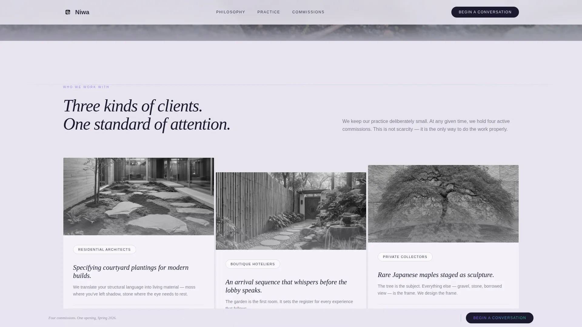
- Residential architects and landscape designers specifying courtyard plantings for modern builds
- Boutique hoteliers and hospitality consultants who need an arrival experience that communicates quality before a lobby does
- Private collectors or garden curators seeking a refined digital presence for sculptural planting commissions
What problem this template solves
Many luxury design studios rely on portfolio websites that list services and show photographs but fail to communicate a philosophy. Clients who commission high-value outdoor spaces want to trust a point of view before they pick up the phone. This template solves the gap between showing work and earning belief.
- Standard portfolio layouts feel transactional; this template unfolds as a design manifesto that demonstrates thinking, not just results
- Generic contact forms create friction; the sliding inquiry panel opens with a single open-ended prompt that filters serious clients naturally
- Early-stage leads get a secondary capture path through a gated downloadable PDF, keeping the pipeline warm without pushing a hard conversion
What you get with this template
You get a complete single-page layout structured as a sequential philosophical argument. Every section is designed to earn the next scroll, building toward a clear lead-generation moment.
- A collage hero header with layered botanical fragments, a vertical editorial serif headline, and iridescent accent shimmer
- A multi-chapter manifesto body that alternates 60/40 and 40/60 column arrangements, punctuated by a full-width atmospheric video section
- A sliding inquiry panel with a project-type selector, footprint field, and optional image upload, plus a separate PDF gating modal for earlier-stage visitors
Feature list
This section highlights the core capabilities built into this template as described in the source brief.
Collage Scrapbook Hero Header
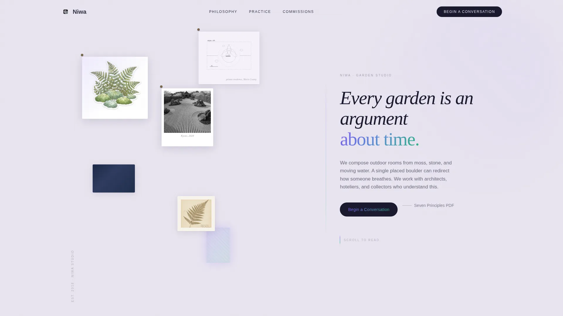
The header uses a layered collage composition across the 60-column. Hand-torn botanical illustrations, a polaroid of raked karesansui gravel, an indigo linen swatch, a pressed fern, and a pencil site-plan sketch are pinned at slight rotations over a pearl background. One fragment carries an iridescent shimmer at its edge. A vertical editorial serif headline occupies the 40-column.
Manifesto Scroll Structure
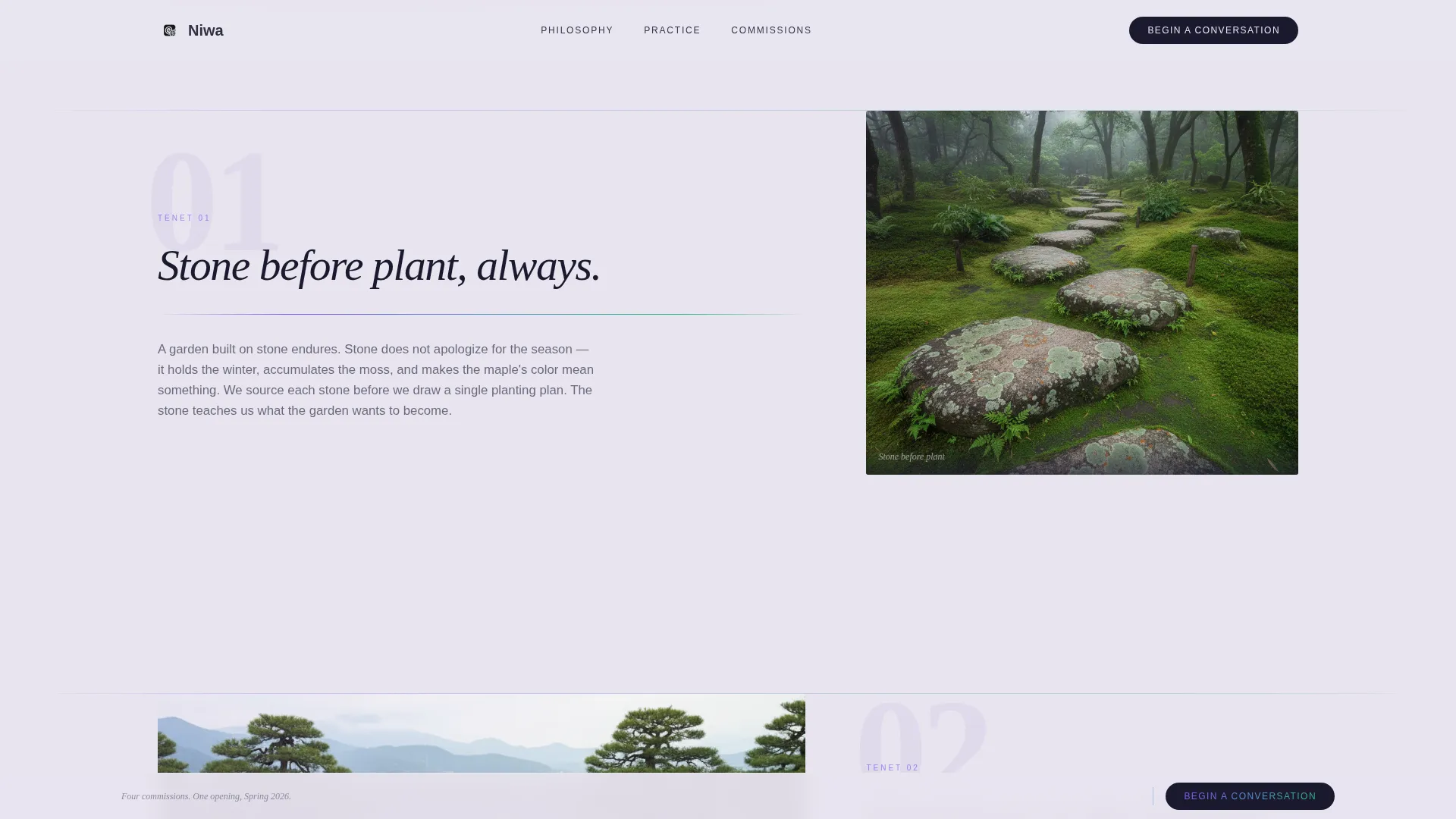
The page body unfolds in chapters. Each chapter pairs a bold design belief in the 60-column with a single quiet photograph in the 40-column. The grid inverts at mid-scroll, and a full-width cinematic video section bleeds edge to edge before the layout reasserts itself for the final conviction chapter. The pacing is deliberate and sequential.
Sliding Inquiry Panel
The primary call to action opens a sliding panel form rather than navigating away. The first field is an open-ended prompt asking visitors to describe their site in one sentence. Subsequent fields cover project type, approximate garden footprint, and an optional image upload for site photos.
PDF Lead Capture Modal
A secondary conversion path offers a downloadable guide gated by email only. This captures earlier-stage visitors who are not ready to commission but want to engage with the designer's thinking. It keeps the lead pipeline active without requiring a full inquiry commitment.
Fixed Scroll call to action Bar
A minimal fixed bar persists during scroll, repeating the primary call to action. The bar stays unobtrusive against the editorial layout and ensures the inquiry entry point is always reachable without breaking the manifesto reading rhythm.
Iridescent Accent System
The iridescent gradient runs from a deep violet to a muted green and appears sparingly across hover states, section dividers, and button glows. Fragment float rotations and scroll-linked reveals respond to scroll velocity, giving the page a sense of physical presence without visual clutter.
Page sections overview
| Section | Purpose |
|---|---|
| Collage Hero Header | Establishes editorial tone and introduces the studio's central design statement |
| Manifesto Chapter One | Presents the first design belief paired with a proof photograph in a 60/40 split |
| Manifesto Chapter Two | Inverts the grid to 40/60 and states the second philosophical tenet |
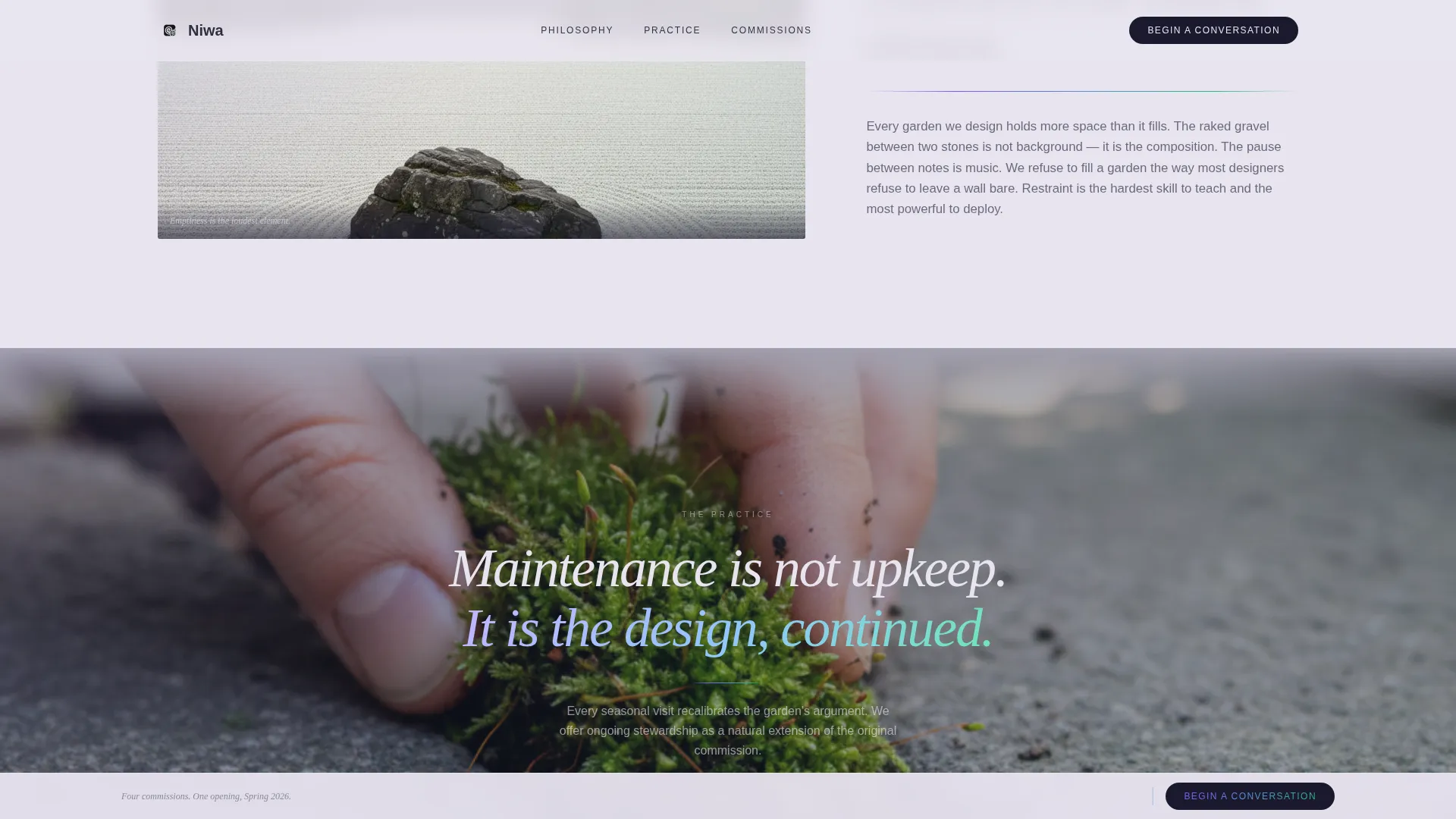
| Atmospheric Video Section | Full-width cinematic break showing hands pressing moss and water finding level |
| Manifesto Chapter Three | Final conviction statement with client-type references and primary call to action |
| Ultra-Minimal Footer | Horizontal footer with essential links, kept subordinate to the manifesto content |
Design & branding system
The visual identity is built on an editorial magazine sensibility filtered through Japanese wabi-sabi principles. Pearl dominates open space, sumi ink holds all typography, and the iridescent gradient appears only where emphasis is earned.
- Color palette: pearl (#E8E4F0) as the dominant ground tone, sumi ink (#1A1A2E) for headlines and body text, wet-stone charcoal (#34344A) for supporting surfaces, and an iridescent accent gradient (#7F5AF0 to #2CB67D) used sparingly on hover states, dividers, and button glows
- Typography: Fraunces serif for editorial headlines with elegant tracking, DM Sans for body copy, creating a contrast between the contemplative and the practical
- Layout: an asymmetric 60/40 grid that inverts at key moments, with deliberate negative space treated as a compositional element rather than empty area
Mobile & speed optimization
The template is designed desktop-first, reflecting how architects and design professionals review work on large screens. Mobile rendering is handled gracefully so the layout remains coherent on smaller viewports.
- Scroll-linked animations use Intersection Observer and GPU-accelerated transforms, keeping motion smooth without blocking the reading experience
- The collage header and manifesto columns reflow for narrower screens, preserving hierarchy and typographic clarity
- The sliding inquiry panel and PDF modal adapt to touch interaction so mobile visitors can still complete either conversion path
How this template helps you convert
The page is built around a single goal: moving a thoughtful visitor toward a meaningful inquiry. Every structural decision serves that aim.
- The manifesto structure builds trust gradually. By the time a visitor reaches the primary call to action, they have absorbed a complete design philosophy, making the leap to inquiry feel like a natural next step rather than a sales prompt.
- Two distinct conversion paths serve visitors at different readiness levels. The sliding inquiry panel captures clients ready to commission, while the PDF gate captures those still forming their brief, ensuring no interested visitor leaves without a connection point.
Other information about this template
This template is part of a curated collection of architecture and design landing pages built for premium creative practices. It is suited to studios where the design conversation begins long before a site visit.
- The template style is classified as an asymmetric grid, editorial magazine theme, with a manifesto creative direction and collage scrapbook header concept
- The color system is labeled AI Iridescent, referring to the palette logic where the gradient accent behaves like light on water rather than a conventional brand color
- The landing page direction is lead generation, meaning the layout sequence and all interactive elements are structured to capture qualified inquiries
- The niche intersection is Japanese landscape designer within the Japanese architecture subcategory of the architecture and design category
- The template uses Fraunces and DM Sans typefaces, which must be loaded separately if your build environment does not include them by default
- No pricing is displayed in the template; the layout assumes a consultation-first business model where budget conversations happen after initial contact
Theme
Editorial Magazine
Creative direction
Manifesto
Color system
AI Iridescent
Style
Asymmetric Grid (60/40)
Direction
Lead Generation
Page Sections
Collage Scrapbook Hero Header
Multi-chapter Manifesto Layout
Sliding Inquiry Panel
PDF Gated Lead Capture
Fixed Minimal Scroll Bar
Iridescent Accent and Scroll Animation System
Related questions
Who is this landing page template designed for?
What does the sliding inquiry panel include?
What is the PDF lead capture modal for?
Is this a single-page layout or a multi-page website?
Can I adapt this template for a landscape or architecture practice outside Japan?



