Wholesome Food Truck Landing Page Template
Graze is an artisan paleo food truck landing page template built for operators who sell real-ingredient food and mean it. The page opens with a cinematic full-bleed food photo, pulls visitors through a sensory scroll of macro dish shots, and funnels them to a weekly schedule map or a catering inquiry form. Luxe Minimal design. Zero compromise on visual quality.
by Rocket studio
Quick summary
Graze is a hero-dominant landing page template designed for artisan paleo food trucks. It leads with a full-bleed overhead food photo, guides visitors through a slow sensory scroll of dish close-ups, and routes them toward two clear actions: finding the truck on a live map or booking a catering drop for their team. The design is editorial, intentional, and built to make food feel tangible before a single word is read.
Who this template is for
This landing page template is built for food truck operators who take their ingredients as seriously as their design. It fits businesses that serve a health-conscious crowd and need a page that earns trust fast, not one that looks like every other food landing page template on the market.
- Paleo food truck owners serving farmers' markets, tech campuses, and urban lunch crowds
- Operators running direct-to-consumer sales alongside business-to-business catering programs
- Health-focused restaurant and food service brands building a digital presence for the first time
What problem this template solves
Most food truck landing page options are cluttered, generic, or built for fast-food volume. They bury the food under nav bars, pop-ups, and competing calls to action. Graze solves a specific problem: how do you make someone feel hungry through a screen and then move them to act, without noise getting in the way?
- The food gets lost behind interface clutter on standard templates, so visitors leave before they connect with the product
- There is no clear funnel split between find-the-truck intent and book-for-catering intent, so both audiences land on the same page and neither converts well
- Mobile-first design is often ignored, even though approximately 89% of food searches happen on mobile devices, making slow or desktop-heavy pages a serious liability
What you get with this template
You get a single-page, click-through landing page template built around one goal: sell the bite first, then collect the booking. Every section earns the next. Every visual choice supports the food, not the frame around it. This is a complete, ready-to-customize template that includes all the layout structure described below.
- A full-bleed cinematic hero section with a fade-in headline and no navigation to distract from the food
- A sequential dish scroll section set with macro close-up photography placeholders, each paired with a single sensory sentence
- A sticky terracotta call-to-action pill that surfaces after the first scroll and a secondary catering call to action that appears after the fourth dish section
Feature list
This landing page template ships with a focused set of features drawn directly from the Graze brief. Each one serves the core purpose: move a hungry visitor to either find the truck or book it for their team.
Full-Bleed Cinematic Hero Section
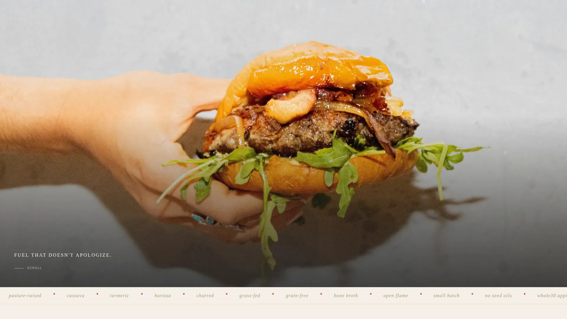
The hero fills ninety percent of the viewport with a single overhead food photograph. No logo, no navigation bar, no competing elements. A single-line headline fades in at the bottom of the frame in thin uppercase bone-white type. The visual weight of the food does all the early selling. A stunning hero image of the signature dish is essential for food truck pages, and this template is built entirely around that principle.
Sequential Sensory Dish Scroll
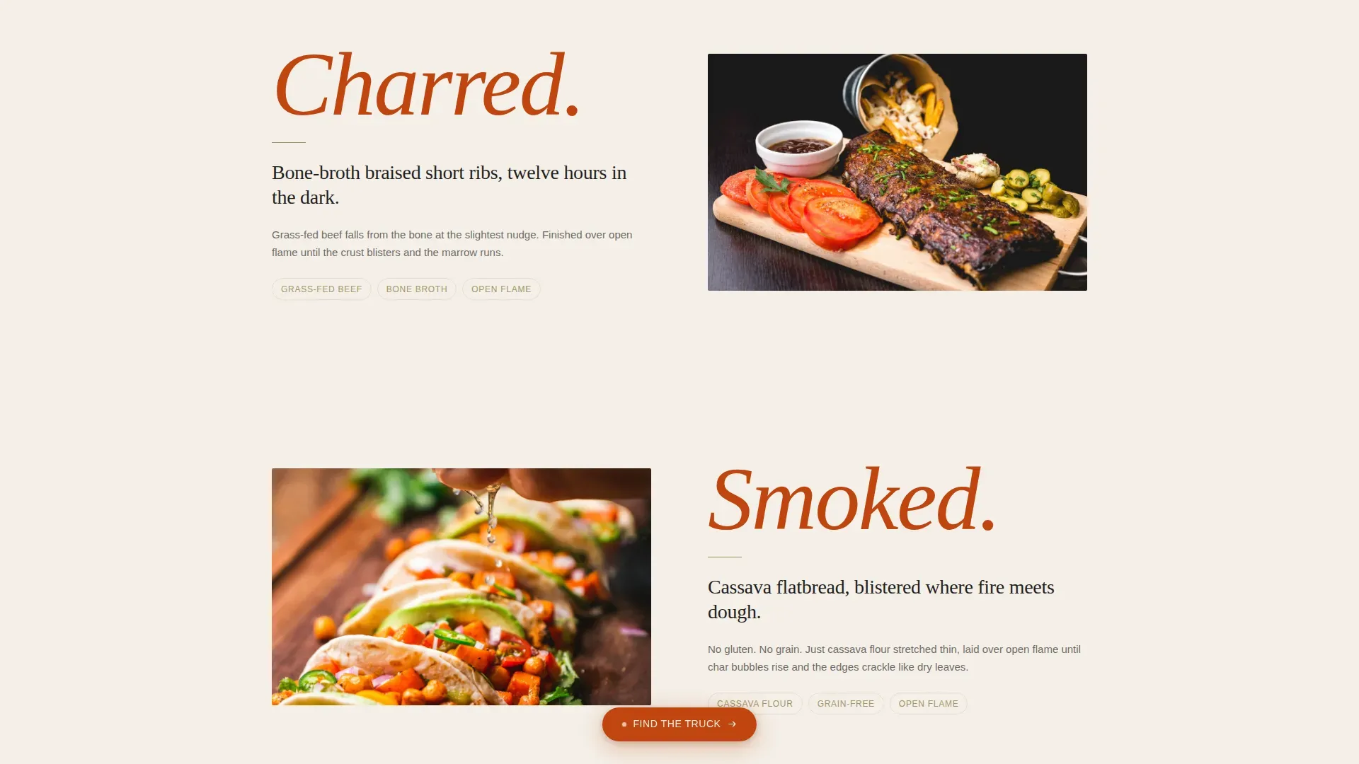
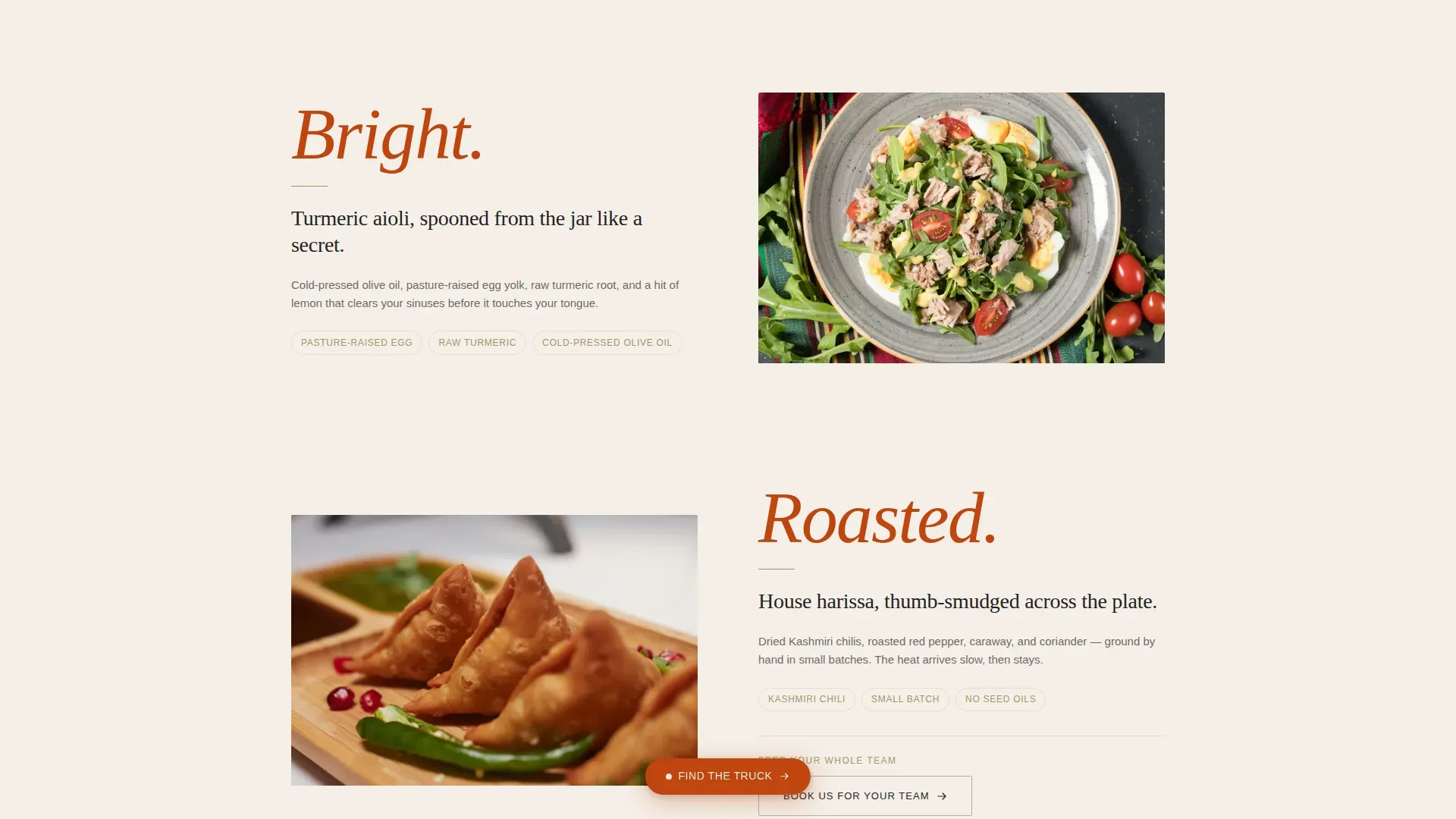
After the hero, the page enters a slow, editorial procession. Each section introduces one dish through a macro close-up photograph placeholder paired with a single sentence that names the aroma or texture before the ingredient. Charred. Smoked. Bright. Roasted. The rhythm tightens as dishes get more intimate, pulling visitors deeper by scent memory rather than menu logic. This scroll structure keeps people on the page and builds appetite before any commercial message appears.
Sticky Click-Through Call-to-Action Pill
A terracotta pill button appears as a sticky element after the visitor scrolls past the hero. It links directly to an embedded map showing the truck's weekly stops. This is the primary call to action: "Find the Truck." A prominent call-to-action button is one of the most important elements for food truck page engagement, and this template keeps it visible throughout the scroll without interrupting the editorial experience.
Deferred Catering Call to Action
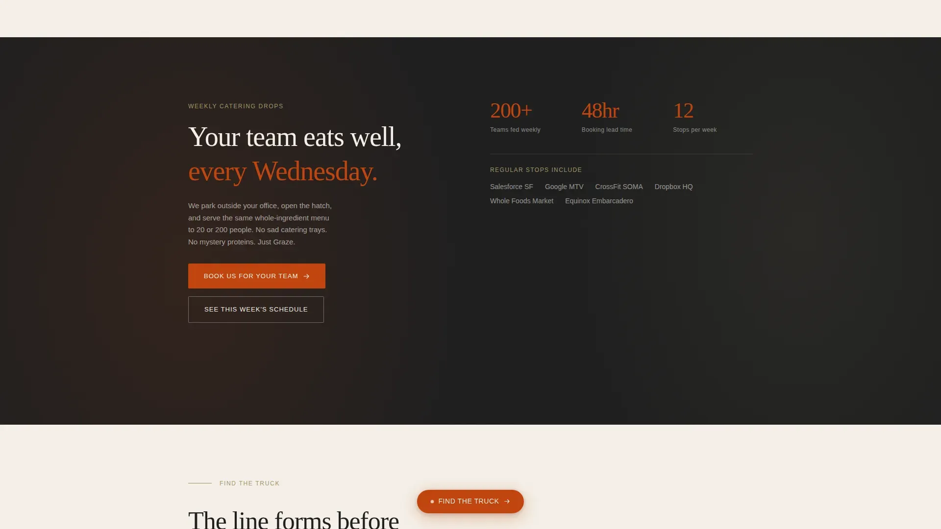
The secondary call to action, "Book Us for Your Team," surfaces only after the fourth dish section. By that point, catering credibility has been built through the food itself. The landing page does not include a form. Instead, it clicks through to a separate destination page that collects company name, headcount, and preferred drop-off day. The page sells the bite; the next page handles the booking.
Truck Proof Section
The final frame of the scroll widens from intimate macro shots back out to a full view of the matte-black truck itself. The hatch is open. A line is forming. This social proof moment is structural, not decorative. It answers the unspoken question every new visitor has: does this truck actually draw a crowd? The answer is visible, not stated.
Luxe Minimal Layout System
The layout is built on a strict visual grammar. Bone white dominates the open space. Charcoal carries all typography. Terracotta fires the calls to action and hover states. Sage appears in dividers and iconography like a sprig beside the plate. Fraunces serves as the editorial serif headline typeface. DM Sans handles body copy and interface labels. Every element is stripped to only what is essential.
Page sections overview
| Section | Purpose |
|---|---|
| Hero full-bleed | Opens with a cinematic overhead food photo and a single fade-in headline to set tone and appetite |
| Short Ribs dish | Macro close-up of bone-broth braised short ribs with a single "Charred" scent sentence |
| Flatbread dish | Macro close-up of cassava-flour flatbread with a single "Smoked" scent sentence |
| Turmeric Aioli dish | Macro close-up of turmeric aioli in a mason jar with a single "Bright" scent sentence |
| Harissa jar + catering call to action | Final dish macro plus the "Book Us for Your Team" call-to-action reveal |
| Truck proof shot | Wide frame of the open truck with a visible queue to validate demand |
| Minimal footer | Horizontal footer with essential links, no heavy navigation |
Design & branding system
Graze uses the Sunset Mesa color system, a palette that feels like a clay plate set on a rough-hewn mesquite board at golden hour. The visual identity is Luxe Minimal: every element that is not doing essential work is removed. The result is a food landing page that feels like an editorial spread rather than a menu board.
- Scorched earth terracotta (#C1440E) fires all calls to action and hover states; sunbleached bone (#F5F0E8) dominates open space; smoked charcoal (#1E1E1E) carries all type; dried herb sage (#A3956B) appears in dividers and iconography
- Fraunces is the editorial serif used for headlines, bringing warmth and authority; DM Sans handles all body copy and interface elements with clean legibility
- The creative direction is Taste and Aroma: every visual and typographic choice is made to make the food feel present, warm, and real before the visitor reads a single word
Mobile & speed optimization
Approximately 89% of food searches happen on mobile devices. This landing page template is built mobile-first, because a food truck audience is almost always reaching from a phone while standing in a parking lot, deciding where to eat in the next ten minutes. The template uses scroll-linked parallax, Intersection Observer reveals, and a sticky call-to-action pill optimized for thumb reach.
- Mobile-first layout ensures the hero, dish scroll, and call-to-action pill all render correctly on small screens without horizontal overflow or content collapse
- Image optimization through Next.js Image handles the large food photography without degrading load time on a mobile device or a slow connection
- CSS scroll-behavior and no heavy third-party libraries keep the animation system fast and smooth across every device type
How this template helps you convert
The Graze landing page template is a click-through page, not a form page. Its entire structure is built to earn intent before asking for action. Visitors arrive, they feel the food, they trust the truck, and then they click. The conversion logic is sequenced, not simultaneous.
- The hero section sets a clear value proposition with a single bold headline and a full-bleed food image, establishing what the truck stands for in the first three seconds of every visit
- The sticky "Find the Truck" pill stays visible throughout the dish scroll, giving the primary audience a low-friction path to the weekly schedule and location map at any point in the journey
- The deferred "Book Us for Your Team" call to action surfaces only after enough food credibility has accumulated, so the office manager or catering buyer arrives at the inquiry form already convinced, not skeptical
Other information about this template
This template was built at the intersection of the Paleo Food Truck niche, the Food and Beverage category, and the Paleo Food and Dining subcategory. It carries a strong intersection match score and was designed with both direct-to-consumer lunch buyers and business-to-business catering clients in mind. The following details cover additional context that will help you decide if this template fits your needs.
- The page is localized for the United States market, using USD and English throughout, making it ready to use for any domestic food truck operation without localization adjustment
- Animation is set to high: the template includes scroll-linked parallax, Intersection Observer section reveals, and hover states on all interactive elements, creating a live editorial feel as visitors scroll
- The footer follows a minimal horizontal pattern with no heavy navigation, keeping the focus on the two primary calls to action throughout the entire page experience
- Social proof is structural in this template. The truck-with-queue photo section and implied catering client callouts build demand credibility without requiring written testimonials, though the design can support them if needed
- This template is ideal for operators who love their food and want a page that communicates that love immediately, whether the visitor is a CrossFit coach looking for a post-workout lunch or an office manager building a weekly catering plan for a team that cares about what they eat
- The template name is Graze, and its full marketplace listing names it the graze artisan paleo food truck landing page template, which accurately reflects its niche, creative direction, and delivery scope
- Food truck branding is built into the page DNA. The Sunset Mesa palette, the Fraunces serif, and the matte-black truck photography all communicate a consistent brand story that helps potential customers understand if this truck is right for them before they ever read the menu
- A great food truck logo and consistent branding tell the world what you stand for. This template is designed to carry that story visually, so your color choices, food photography, and headline all reinforce one another across every section
- The template is compatible with teams that are just getting started in the food truck space as well as established operators looking to upgrade a dated or cluttered landing page to something that matches the quality of their food
- Because this is a click-through landing page template rather than a form-embedded page, it naturally keeps the page clean and clutter-free, which is critical for guiding visitors toward a single, confident action rather than overwhelming them with too many choices at once
- The dish scroll design means the menu is highlighted prominently and sensory storytelling replaces a flat list, which is far more effective at building appetite and intent than a standard digital menu display
- Operating context such as hours, weekly stop names, and location information lives on the destination pages the calls to action link to, keeping the landing page focused on food and feeling rather than logistics
- For teams building out a full food truck digital presence, this landing page template pairs well with a separate schedule page, a catering inquiry form page, and social media channel links added in the footer
Theme
Luxe Minimal
Creative direction
Taste & Aroma
Color system
Sunset Mesa
Style
Hero-Dominant (90/10)
Direction
Click-Through
Page Sections
Full-bleed Cinematic Hero Section
Sequential Sensory Dish Scroll
Sticky Terracotta Call-to-action Pill
Deferred Catering Call to Action
Truck Social Proof Section
Luxe Minimal Sunset Mesa Layout
Related questions
Does this template include a booking form?
Is this template suitable for a food truck that also does catering?
How does the sensory dish scroll section work?
Can I customize the colors and typography?
Is this template designed for mobile users?



