Japanese Cuisine & Dining Professional Website Template
Noren is a hero-dominant landing page template built for charcoal-grilled izakaya restaurants. It uses a Warm Artisan color palette rooted in deep lacquer blacks, smoked cedar browns, and sun-faded noren pinks to create an atmosphere that feels less like a website and more like ducking under a split curtain into a lantern-lit room. Every section funnels visitors toward a single reservation action.
by Rocket studio
Quick summary
Noren is a single-page landing page template designed for an izakaya restaurant. It opens with a cinematic full-bleed hero photograph and follows a Sensory Appeal scroll arc through taste, sound, and touch before landing on a reservation call to action. The Desert Rose color system and film-grain aesthetic do the heavy lifting, turning first impressions into genuine desire to eat there tonight.
Who this template is for
This template is built for restaurant owners, operators, and hospitality designers who want to communicate the soul of a Japanese izakaya before a visitor even reads a word. It suits anyone opening a counter-style dining bar, a grilled skewer concept, or a sake-focused casual dining room.
- Izakaya owners and neighborhood bar operators who want a landing page that feels discovered rather than designed.
- Food and beverage designers building reservation-first pages for intimate Japanese cuisine restaurants.
- Hospitality entrepreneurs and chefs launching a new dining concept who need immediate atmosphere and a direct path to booking.
What problem this template solves
Most restaurant landing pages feel flat. They list a menu, drop an address, and call it done. That approach works fine for a fast-casual counter, but it fails completely for the kind of intimate izakaya where the room itself is part of what customers are paying for. Visitors arrive curious. They leave unconvinced because no page ever made them feel what the space actually tastes like.
Noren solves this by treating the landing page as a sensory experience, not a directory listing. Each section isolates one sense and saturates it, moving visitors from street-level curiosity to reservation intent without ever making them feel sold to.
- Izakaya restaurants struggle to communicate atmosphere online. This template converts that feeling into scroll-driven visual storytelling.
- Generic restaurant pages bury the call to action. Noren surfaces the reservation button at the hero, after the food gallery, and as a fixed bar on mobile, so the moment a visitor decides, the path is already there.
- Operators lose bookings to friction. This template removes all form fields from the page and passes the visitor directly to an external booking tool with a single tap.
What you get with this template
You get a fully built single-page layout with five primary content sections and a minimal footer. Every design decision, from the typography pairing to the scroll-linked background darkening, is already made. Your job is to swap in your photography, your menu descriptions, and your reservation link.
The template includes:
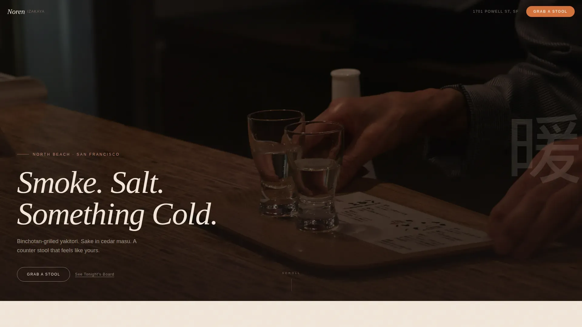
- A cinematic full-bleed hero section with a ghost call-to-action button, film-grain overlay, and a vertical Japanese character watermark bleeding off the right edge.
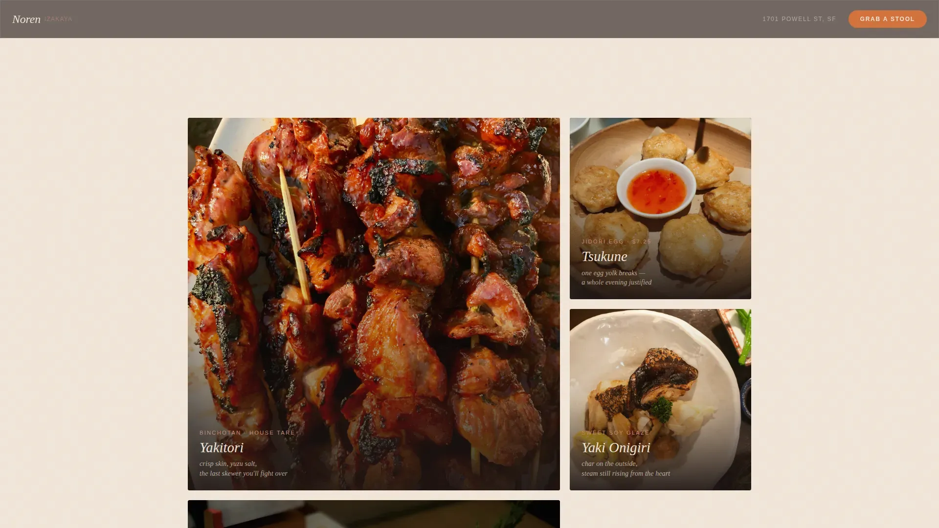
- A Taste section with a close-up food photography gallery and one-line haiku-style dish descriptions for items like grilled skewers, sashimi plates, and seasonal side dishes.
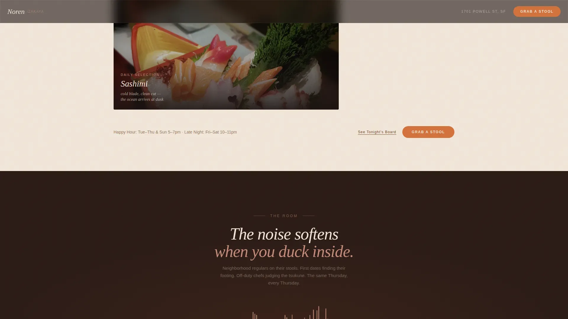
- An Atmosphere section with a dark background, amber lighting treatment, and a waveform animation suggesting the murmur of conversation and clinking glass.
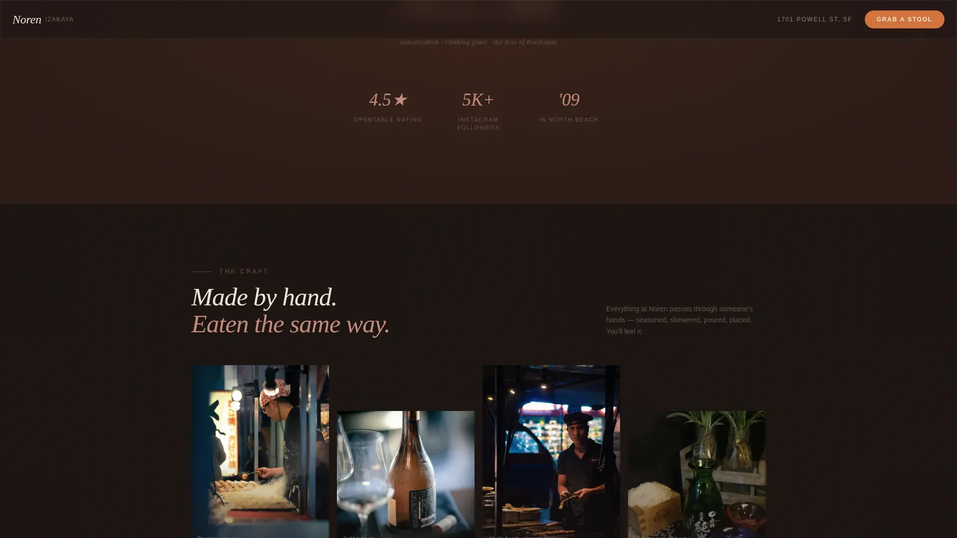
- A Hands and Touch gallery showing the chef at the grill, hands wrapping ceramics, and close-ups of the cooking process.
- A Reservation section with an ember-orange primary call-to-action button and a secondary text link that opens a lightbox displaying the daily specials chalkboard photo.
Feature list
This template is built on a small number of deliberate, high-impact features. Each one serves the single purpose of moving a curious visitor toward a confirmed reservation.
Cinematic Full-Bleed Hero
The hero section fills ninety percent of the viewport with a warm-shifted, grain-visible photograph shot at counter eye level. Shallow depth of field keeps yakitori skewers and a sake masu box sharp in the foreground while the chef's hands and the grill glow softly behind. A headline fades in after a breath: "Smoke. Salt. Something Cold." The ghost call-to-action button appears over the image without competing with it, giving visitors an immediate path to reserve a stool.
Sensory Scroll Arc
The page follows a deliberate creative direction that isolates one sense per section. Taste comes first, with close-up food photography and haiku-style descriptions of dishes like grilled chicken skewers, grilled fish, sashimi, and seasonal vegetables. Sound arrives next as a dark waveform animation. Touch closes the arc with a gallery of hands at the grill and around ceramics. The background grows progressively darker and warmer as the visitor scrolls, mimicking the feeling of moving deeper into an izakaya as the evening progresses.
Daily Board Lightbox
A secondary text link, "See Tonight's Board," opens a lightbox that displays a chalkboard photo of daily specials. This feature creates a sense of scarcity and gives visitors one more concrete reason to commit before closing the tab. It communicates the izakaya's use of seasonal ingredients and rotating dishes without requiring a full digital menu build.
Ember-Orange Reservation Button
The primary call-to-action button appears in three locations: as a ghost button on the hero, as a solid ember-orange button after the food gallery, and as a fixed bottom bar on mobile devices after fifty percent scroll. The charcoal ember orange accent color (#D4713A) is the only cool-free, high-contrast touch in an otherwise earthy palette. It draws the eye naturally without shouting.
Film-Grain and Scroll-Linked Darkening
The template uses a film-grain texture overlay on the hero image to evoke a photograph taken by someone sitting at the bar. As the visitor scrolls, the page background shifts progressively from the brushed sake-cup cream of the upper sections toward the deep lacquer black of the reservation section. This scroll-linked darkening is a core part of the Sensory Appeal creative direction and requires no visitor interaction to activate.
GSAP Entrance Animations and Parallax
Section entrances use GSAP-powered animations for smooth, staggered reveals. The waveform SVG in the Atmosphere section animates on scroll. Parallax movement is applied to the hero image layer. Native CSS smooth scroll handles the rest of the page transitions for speed, with GSAP reserved only for the more complex interactive moments.
Page sections overview
| Section | Purpose |
|---|---|
| Hero Full-Bleed | Establish brand identity instantly with a cinematic counter-level photograph and ghost call-to-action button |
| Taste Food Gallery | Showcase close-up dish photography with haiku-style descriptions to evoke appetite and quality |
| Atmosphere Waveform | Communicate the sound and mood of the izakaya dining room using dark background and animated waveform |
| Hands Touch Gallery | Build sensory connection through photography of cooking hands, ceramics, and the grill |
| Reservation Call-to-Action | Convert scroll interest into a confirmed booking via ember-orange button and daily board lightbox |
| Minimal Footer | Provide essential location, hours, and contact details in a clean linear layout |
Design & branding system
The Desert Rose color system is the foundation of every visual decision in this template. The palette reads like a handmade ceramic glaze: nothing cool, nothing digital, every tone pulled from clay, flame, and aged hinoki wood. The top of the page immediately establishes the brand's identity through color and typography before a single word is read. Brand storytelling is built into the visual language itself. The noren, as a symbol of reputation and a welcoming space, is honored through the warmth and handcraft quality of every element.
- Color palette: deep lacquer black (#1A1210), smoked cedar (#6B4226), sun-faded noren pink (#C48A7A), brushed sake-cup cream (#F2E6D9) as the dominant background, and charcoal ember orange (#D4713A) on hover states and reservation buttons. These bold colors carry earthy warmth and set the mood without a single cool tone.
- Typography: DM Sans for body text and interface labels paired with Fraunces in serif italic for headlines, dish names, and atmospheric copy. The combination reads as warm artisan rather than corporate or clinical.
- Texture and grain: a film-grain overlay on the hero, warm-shifted photography throughout, and a vertical Japanese character watermark bleeding off the right edge of the hero section.
Mobile & speed optimization
Noren is built mobile-first. The fixed bottom call-to-action bar on mobile devices activates after fifty percent scroll, which keeps the reservation path visible without interrupting the sensory experience of reading through each section. The layout adapts cleanly across screen sizes, with the full-bleed hero, gallery grids, and waveform section all reflowing for smaller viewports.
- Mobile-first layout: the fixed bottom bar with the "Grab a Stool" call-to-action appears on mobile after fifty percent scroll, keeping conversion accessible without cluttering the upper experience.
- Performance approach: native CSS smooth scroll handles standard page transitions. GSAP is used selectively for complex animation moments such as the hero entrance, waveform SVG, and parallax layer, keeping the overall animation footprint intentional and lean.
- Image and visual treatment: the film-grain overlay, scroll-linked background darkening, and parallax hero are all handled through layered CSS and targeted GSAP calls rather than heavy video files or background autoplay, keeping the page load approach clean and practical.
How this template helps you convert
The Noren template is designed around a single conversion goal: getting a visitor to tap the reservation button. Every layout decision, every color choice, every section sequence exists to support that one outcome. Restaurants that use a reservation-first page structure with a strong sensory hook consistently convert higher than pages that lead with text-heavy menus or general information.
- The call-to-action appears three times: as a ghost button on the hero, as a solid ember-orange button after the food gallery, and as a fixed mobile bar after fifty percent scroll. No visitor can miss it regardless of where they stop reading.
- The daily board lightbox adds urgency. Seeing handwritten specials on a chalkboard photo creates the sense that tonight's menu is limited, seasonal, and worth showing up for. It gives the undecided visitor a concrete reason to commit before closing the tab.
- The scroll arc is designed to build desire progressively. Visitors who reach the reservation section have already been walked through taste, sound, and touch. By the time they see the call-to-action button, the decision feels natural rather than pressured.
Other information about this template
This template is built specifically for the izakaya dining format. Understanding how a Japanese izakaya works helps you present it accurately to your audience. Izakayas are casual Japanese pubs that serve a wide variety of food and drinks in a relaxed, social setting. Unlike Western dining rooms where the full meal arrives in a fixed sequence, customers at an izakaya often order food little by little throughout the evening, grazing through small dishes, side dishes, and rotating drinks as the night unfolds.
Izakayas may serve an otoshi, a small complimentary appetizer that also functions as a seat fee, when customers are first seated. Common menu items include grilled fish, sashimi, chicken yakitori, grilled vegetables, sushi rolls, shellfish preparations, and side dishes known as otsumami. Drinks tend to be the center of the experience, with sake, shochu, Japanese whisky, beer, and now craft cocktails all appearing on a modern izakaya menu. The bill is often split evenly among the group, making the izakaya a natural choice for after-work gatherings, first dates, and casual dinner with friends.
This template supports the full range of what a Japanese izakaya needs to communicate. It can accommodate a menu that highlights signature dishes alongside curated sake pairings. The lightbox feature is well-suited to the rotating daily board format common in izakayas that focus on seasonal ingredients sourced from specific regions of Japan.
The design elements of this template draw from traditional Japanese aesthetics while remaining contemporary. Photos should capture the izakaya vibe through traditional visual cues like noren curtains and lanterns. The open kitchen and bar area visible in the hero photograph foster a sense of community and transparency that customers at this type of restaurant actively look for. The counter seating, chairs arranged close to the grill, and the narrow room layout are all part of the izakaya's identity and are reflected in the hero shot's framing.
The Noren Warm Artisan Izakaya Landing Page Template is also useful for restaurateurs who want to understand what separates a genuinely effective restaurant landing page from a generic one. Innovative restaurant concepts nowadays often blend culinary traditions and design ideas from across Japan and beyond. This template was designed with that blend in mind: it can stand alongside concepts ranging from a focused yakitori counter to a broader izakaya that serves ramen, sashimi, salads, grilled meat including beef and pork cuts, and a rotating selection of seasonal dishes.
If you are building a restaurant landing page and your concept has a second floor dining room, outdoor seating, or a private booth area in addition to the main counter, you can adapt the Page Sections area to reflect those details. The footer's minimal linear layout is the right place to surface your location, hours, and contact line. The open kitchen concept is already baked into the hero's framing, so customers arrive at the reservation section with a clear picture of the space they are booking into.
Restaurants serving lunch alongside dinner can note their service hours clearly in the footer section. Operators running a tasting menus format or a set omakase course alongside their a la carte izakaya menu can use the daily board lightbox to communicate that distinction without a full menu page build.
This template does not include a built-in reservation form. All booking paths pass the visitor to an external reservation tool via a single call-to-action click. No data is collected or processed on-page by the template itself.
- The template's scroll-linked darkening and waveform animation are included as pre-built interactive components.
- The lightbox for the daily board is included and styled to match the Desert Rose color system.
- The fixed mobile bottom bar is included and activates at the fifty percent scroll threshold.
- All five primary content sections and the minimal footer are included in the base template layout.
Theme
Warm Artisan
Creative direction
Sensory Appeal
Color system
Desert Rose
Style
Hero-Dominant (90/10)
Direction
Click-Through
Page Sections
Cinematic Full-bleed Hero Section
Sensory Scroll Arc Layout
Daily Board Lightbox
Three-point Reservation Call to Action
Desert Rose Color System
GSAP and SVG Animation Suite
Related questions
Can I use this template without a professional photographer?
Does this template include a built-in online reservation system?
Is this template suitable for izakaya restaurants that serve both lunch and dinner?
Can the color palette be changed to match a different brand?
What types of dishes work best in the food gallery section?



