Certified Document Notary Landing Page Template
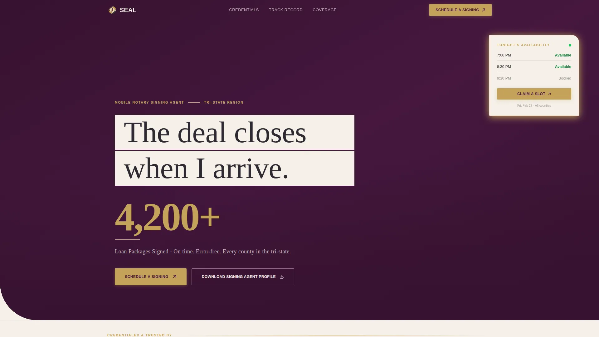
Seal is a zigzag landing page template built for mobile notary signing agents. It leads with bold performance statistics, alternates content and proof blocks in a structured layout, and drives title company coordinators and loan officers toward a scheduling action. The editorial color system and serif typography create an atmosphere of legal authority and quiet confidence.
by Rocket studio
Quick summary
Seal is a single-page notary landing page template designed for mobile signing agents who serve title companies, lenders, and real estate attorneys. It opens with a press-style credentials banner, anchors every section in a large performance metric, and closes every content block with a direct scheduling prompt. The result is a page that earns trust before asking for a click.
Who this template is for
This template is built for independent mobile notary signing agents who handle high-volume, time-sensitive work for professional clients. It speaks the language of coordinators and closers, not general consumers.
- Mobile notary signing agents serving title companies and lender networks
- Notary professionals who handle loan packages, refinances, and real estate closings
- Signing agents who need a credentialed, professional web presence to win B2B referrals
What problem this template solves
Busy title coordinators and loan officers do not have time to read long bios. They need proof of reliability, speed, and coverage area before they will schedule an appointment. Most notary websites bury that proof or skip it entirely.
- No clear performance data means coordinators move on to the next name on their list
- A weak or generic layout fails to communicate the agent's reliability to compliance-minded professionals
- No direct booking path means interested clients leave without converting
What you get with this template
The Seal template delivers a fully structured, stats-first landing page layout with alternating content sections, clear calls to action, and an editorial visual identity. Every element is designed to move a professional client from first impression to scheduled appointment.
- A press mentions header banner displaying credential and platform nameplates in a masthead-style row
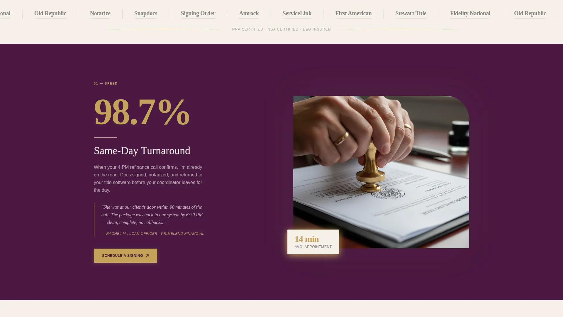
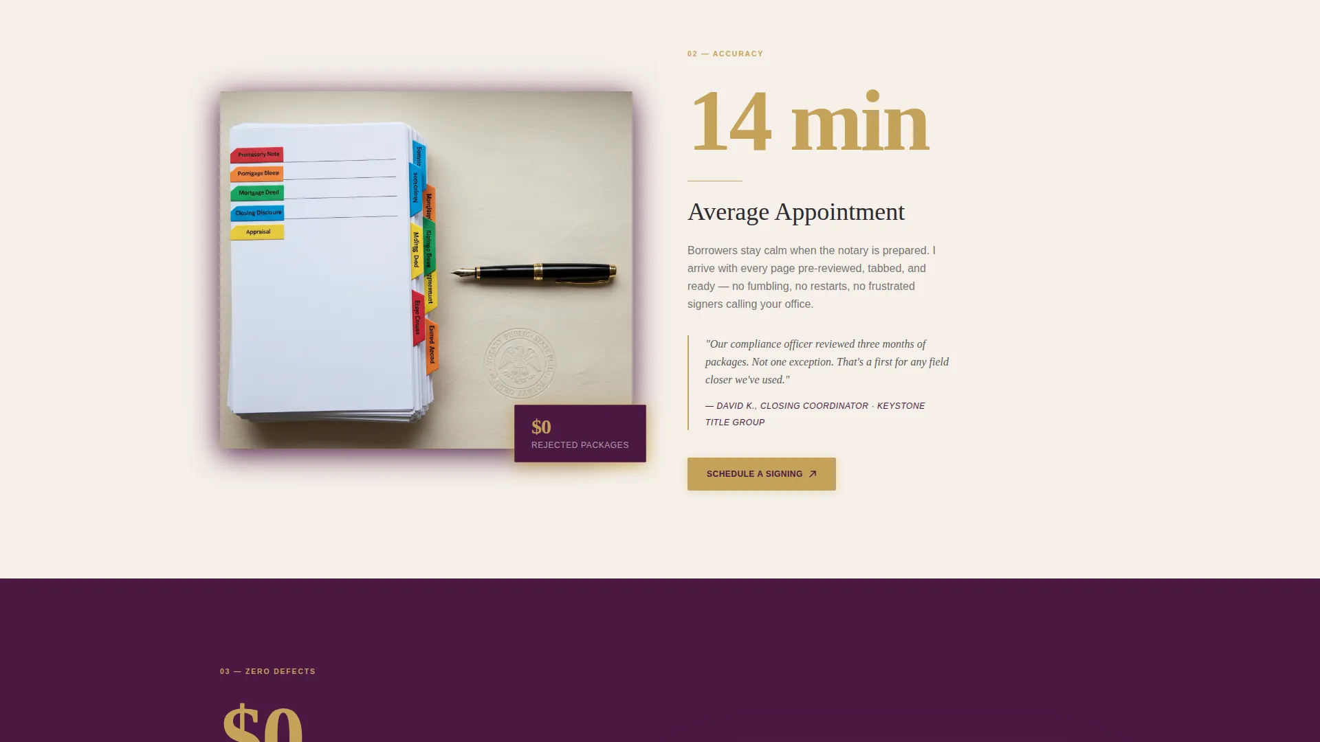
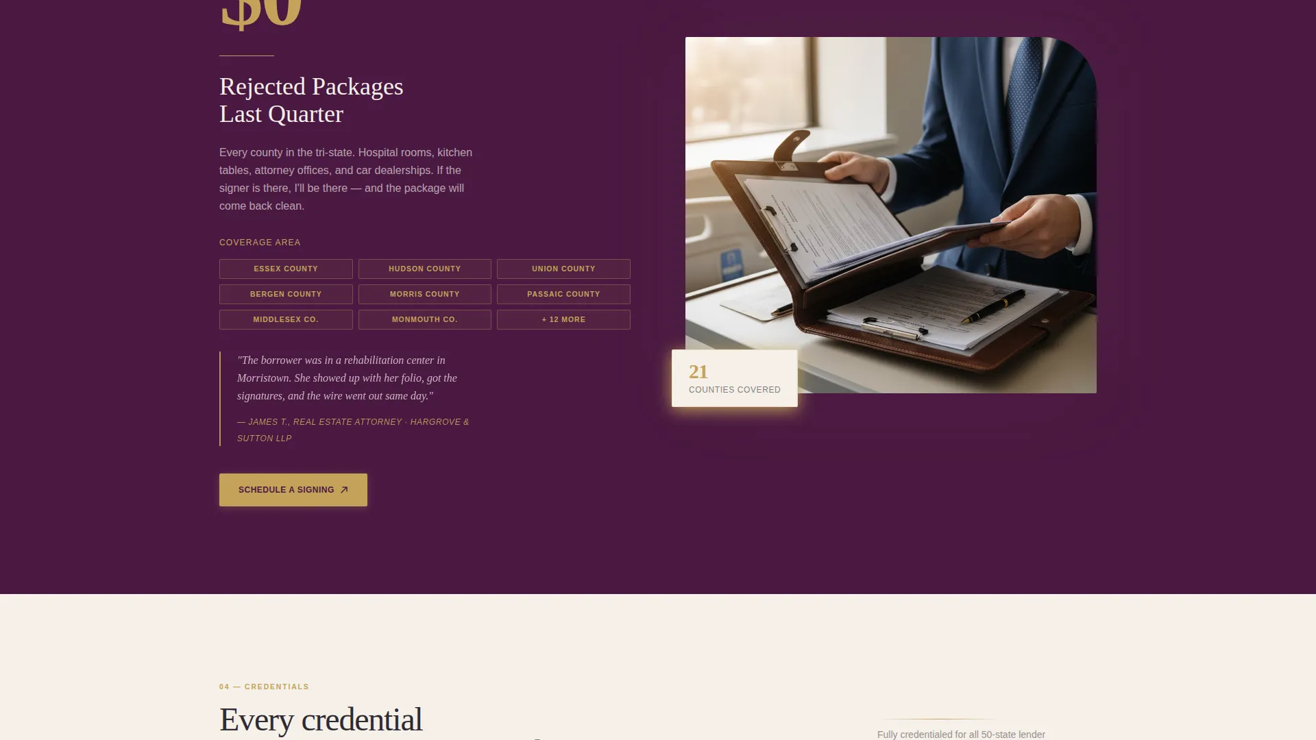
- Four alternating zigzag sections, each anchored by a large gold-accented performance metric and a contextual proof column
- Primary and secondary calls to action placed at every section junction, linking to a booking calendar and a downloadable signing agent profile
Feature list
A paragraph of context: each feature below maps directly to a design or layout decision described in the source brief. Nothing here is speculative. Every item reflects a deliberate structural or visual choice built into this template.
Stats-First Zigzag Layout
Each content section leads with an oversized, gold-accented performance number. The metric loads first, the context column follows. This sequence matches how a coordinator scans a page: number first, explanation second.
Press Mentions Header Banner
The header opens as an editorial masthead row. It displays logos or nameplates of title companies, lender networks, and signing platforms where the agent holds credentials. This establishes authority before the visitor reads a single word of body copy.
Repeating Scheduling Calls to Action
The primary call to action, "Schedule a Signing," appears beneath the header statistic and repeats at every zigzag junction. Each instance is styled in gold on plum for high visual contrast. A secondary text link offers a downloadable one-page signing agent profile for compliance files.
Pull-Quote Proof Columns
Every alternating stat section includes a proof column. This column contains a brief case narrative or a client testimonial styled as a pull-quote with attribution. The format mirrors the rhythm of a legal brief: claim, then exhibit.
Editorial Serif Typography at Billboard Scale
The hero statistic is set in large serif type. Subheadings, pull-quotes, and gold rule dividers follow the same editorial magazine system. The overall typographic hierarchy guides the eye from the biggest proof point down to the booking action.
Booking-Optimized Page Architecture
The page is structured as a click-through flow aimed at scheduling. The layout front-loads four layers of proof before the page ends, so that by the third stat block, a coordinator's remaining question is availability, not qualification.
Page sections overview
| Section | Purpose |
|---|---|
| Press Mentions Banner | Display credential nameplates to establish authority immediately |
| Hero Stat Block | Lead with the headline performance number and primary booking call to action |
| Speed Stat Section | Show same-day turnaround metric with supporting context column |
| Accuracy Stat Section | Present error-free track record with a client pull-quote |
| Coverage Stat Section | Communicate geographic reach with a brief case narrative |
| Credentials Stat Section | Close the argument with certification and platform credentials |
| Final Booking call to action | Repeat the scheduling prompt with secondary profile download link |
Design & branding system
The visual identity follows an editorial magazine theme with a plum executive color palette. The system feels like the endpapers of a leather-bound legal volume: rich and dignified without being loud or cold.
- Deep plum (#4A1942) anchors alternating section backgrounds; warm parchment (#F5F0E8) breathes between them for visual rhythm
- Muted gold (#C4A35A) appears on accent numbers, pull-quote marks, divider rules, and call-to-action hover states, functioning like an embossed notary seal catching light
- Charcoal ink (#2D2A32) is used for all body text, maintaining contrast and readability across both plum and parchment backgrounds
Mobile & speed optimization
The zigzag layout is designed to reflow gracefully on smaller screens. Stat blocks and proof columns stack vertically, keeping the logic of the page intact: big number first, context below.
- Alternating section bands maintain visual separation on mobile without relying on complex grid behavior
- Call-to-action buttons remain prominent and tappable at every section break, preserving the booking flow on any device
- The editorial typography hierarchy scales cleanly, keeping the headline statistic dominant even on compact viewports
How this template helps you convert
The page is engineered as a prosecutorial argument. Each section adds one more exhibit to the case for scheduling this signing agent tonight rather than waiting until tomorrow.
- The press mentions banner and hero statistic answer the first question a coordinator asks: is this person credentialed and proven? That answer arrives before any scrolling begins.
- Each subsequent stat block deepens a specific trust dimension, speed, accuracy, coverage, and credentials, so that hesitation shrinks with every section the visitor reads.
- By placing the primary call to action at every section junction in high-contrast gold on plum, the template ensures a motivated visitor never has to search for the next step.
Other information about this template
This template is well-suited to notary signing agents who operate across multiple counties and need a web presence that speaks directly to compliance-focused professional clients. The layout works equally well for agents who are new to building a client roster and for established agents looking to upgrade from a plain directory listing.
- The secondary call to action supports a downloadable one-page PDF signing agent profile, which is a common requirement for title company compliance files
- The template structure supports linking the primary booking button to an external scheduling tool such as a calendar booking page pre-filtered by county and appointment type
- The design system and section order can be adapted for related notary service specializations, including loan signing, estate document signings, and general mobile notary work
Theme
Corporate Precision
Creative direction
Testimonial Mosaic
Color system
Navy Authority
Style
Single Column Flow
Direction
Booking/Scheduling
Page Sections
Stats-first Zigzag Layout
Press Mentions Header Banner
Repeating Booking Calls to Action
Pull-quote Proof Columns
Editorial Serif Typography System
Booking-optimized Page Flow
Related questions
Who is this landing page template designed for?
What makes this template different from a generic service page?
Can I use this template if I am just starting out as a signing agent?
How does the booking call to action work in this template?
Is the page layout suitable for mobile visitors?



