Authoritative Nutritionist Landing Page Template
Nourish is an editorial-style nutritionist landing page template built for clinical credibility and high-intent client conversion. It pairs FAQ-driven content with testimonial mosaic tiles, credential badge displays, and a layered call-to-action flow. The result is a page that reads like a peer-reviewed journal and feels like a private consultation, designed to earn trust before it asks for a booking.
by Rocket studio
Quick summary
Nourish is a single-page editorial template for authoritative nutritionist practices. It combines a credential badge header, FAQ-and-testimonial mosaic layout, and a progressive call-to-action structure. The design follows a Charcoal and Amber palette that feels clinical and warm at once. Every section is built to build trust, answer real questions, and move a reader toward booking.
Who this template is for
This template is built for nutrition professionals whose clients arrive with complex, unresolved health histories. It suits practitioners who need their online presence to communicate depth, not just availability.
- Clinical nutritionists and registered dietitians with board certifications or publication credentials
- Nutrition coaches serving high-demand client profiles such as executives, postpartum mothers, or endurance athletes
- Solo practitioners or small practices ready to replace a generic bio page with an authoritative resource hub
What problem this template solves
Most nutritionist pages look like appointment schedulers. They list services and add a contact form. That approach fails with high-intent clients who have already tried multiple interventions and need proof of expertise before they reach out.
- Visitors leave without converting because the page does not demonstrate clinical depth or real client outcomes
- Credentials and published work are buried or styled so plainly they carry no visual weight
- There is no narrative structure to move a cautious, research-aware visitor toward a booking decision
What you get with this template
You get a fully structured editorial landing page that presents clinical authority visually and contextually. Every layout decision serves the goal of building layered trust across a single scroll.
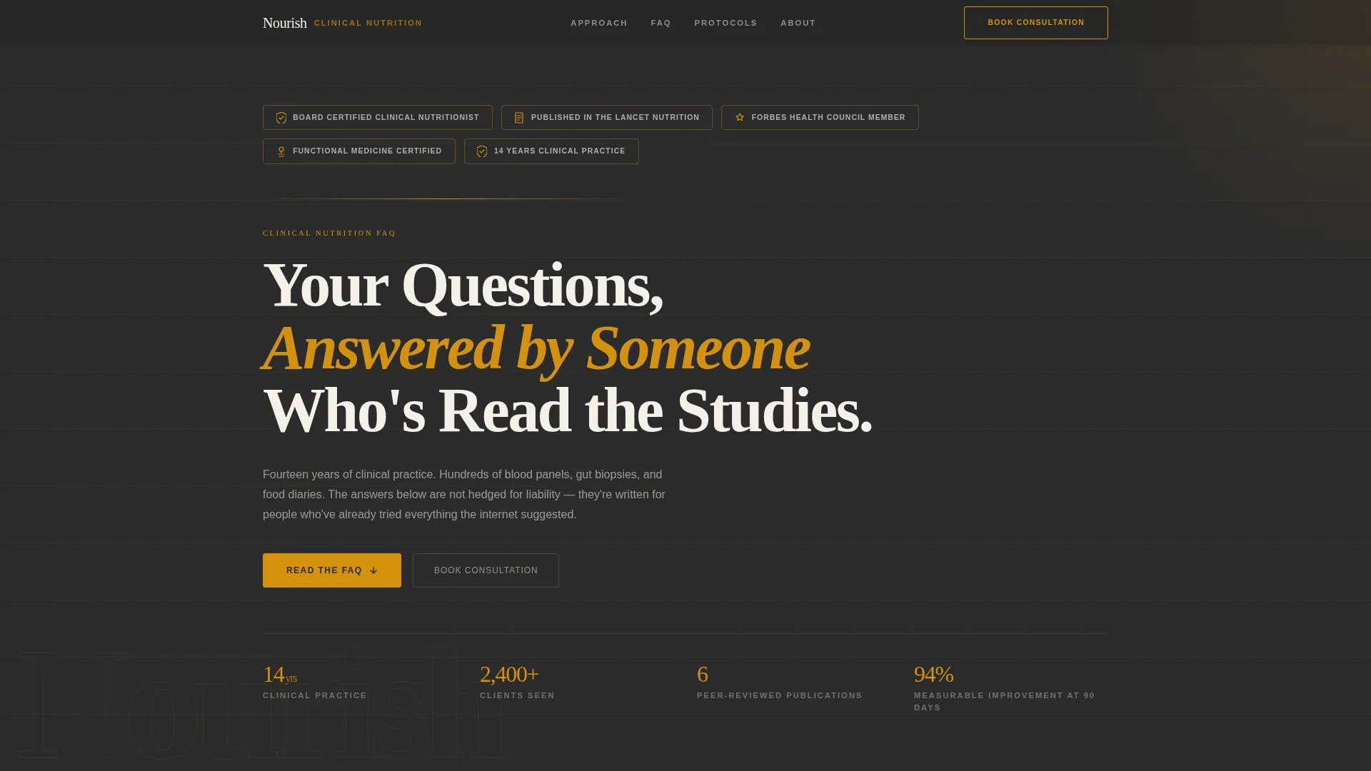
- A credential badge header with monochrome amber line-art shields displaying certifications and publication marks
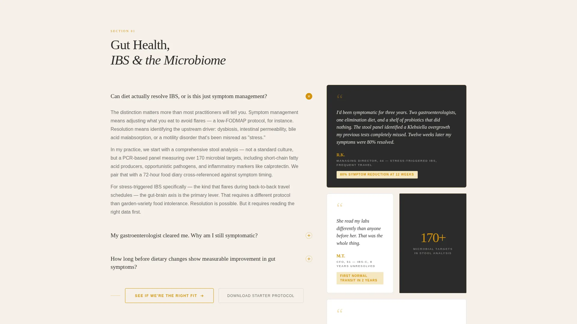
- An FAQ-and-testimonial mosaic layout where each clinical answer is paired with a real client pull-quote tile
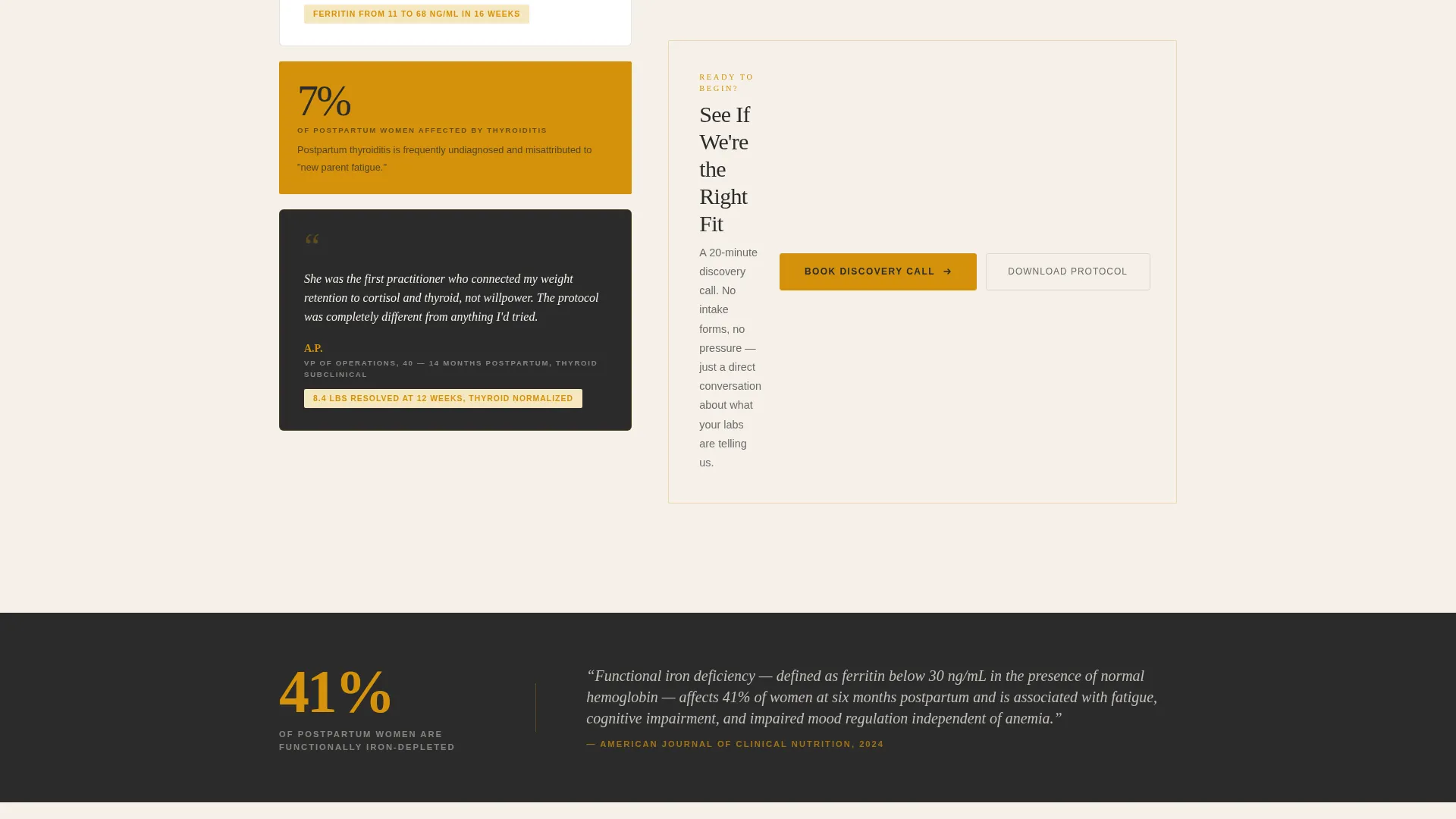
- Two conversion paths: a primary call-to-action button leading to a consultation booking page, and a secondary email-capture path for a downloadable starter protocol
Feature list
This section covers the core layout and design capabilities built into the Nourish template.
Credential Badge Header Display
The header opens with a horizontal row of credential shields and publication marks arranged across a deep charcoal field. Each badge uses monochrome amber line art, giving certifications the visual weight they deserve. A sharp serif editorial headline sits below, grounding authority in a direct, readable statement.
Testimonial Mosaic Layout
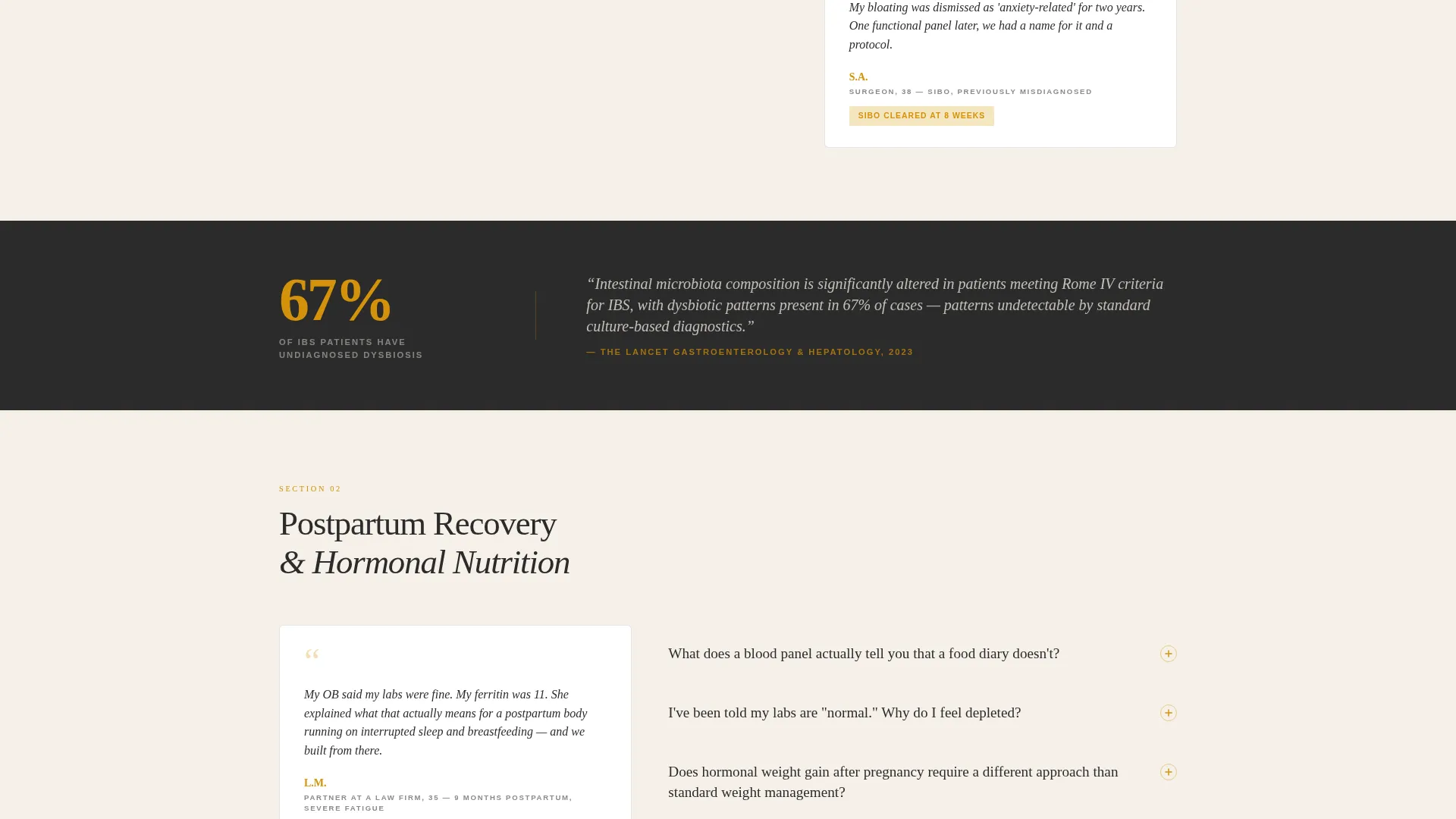
Every FAQ answer is immediately followed by a mosaic tile containing a client pull-quote, initials, personal context, and one measurable outcome. Tiles shift in width and placement as the user scrolls, creating an unpredictable visual rhythm. This structure prevents the page from reading like a static FAQ archive.
Progressive Call-to-Action Structure
The primary call-to-action, "See If We're the Right Fit," appears first as a subtle amber-bordered button after the third FAQ. It then resurfaces with increasing visual weight after each testimonial cluster. This graduated approach builds commitment without pressure.
Amber Divider Strips with Citations
Full-width amber divider strips run between FAQ clusters. Each strip carries a single statistic or journal citation. This gives the page the cadence of a peer-reviewed article presented in editorial clothing.
Secondary Email-Capture Path
A secondary conversion path labeled "Download the Starter Protocol" targets visitors who are not yet ready to book. It captures email contact details without requiring a full consultation commitment. Both paths coexist without competing visually.
Charcoal and Amber Visual System
The entire page is built on a four-color palette: deep boardroom charcoal for headers and dividers, warm parchment for content columns, liquid amber for pull-quotes and hover states, and muted graphite for body text. Amber appears sparingly, only where the eye needs directing.
Page sections overview
| Section | Purpose |
|---|---|
| Credential Badge Header | Establishes clinical authority with certification shields and an editorial headline |
| FAQ Answer Blocks | Delivers clinically grounded answers to high-intent visitor questions |
| Testimonial Mosaic Tiles | Pairs each answer with a real client voice, context, and measurable outcome |
| Amber Citation Dividers | Reinforces credibility with journal statistics between FAQ clusters |
| Primary call to action Button | Moves ready visitors toward a consultation booking page |
| Secondary Email Capture | Offers a starter protocol download for visitors not yet ready to commit |
Design & branding system
The visual identity follows an Executive Suite theme. Every color and typographic choice is designed to feel like a medical reference text, not a wellness blog.
- The four-color palette uses deep charcoal (#2B2B2B) for structure, warm parchment (#F5F0E8) for content breathing room, liquid amber (#D4920B) for focal accents, and muted graphite (#6B6B6B) for body text
- Typography is anchored by a sharp serif for headlines and editorial pull-quotes, reinforcing the authoritative journal aesthetic throughout the page
- Amber is applied sparingly: links, credential markers, call-to-action borders, and pull-quote highlights only, preserving its visual impact
Mobile & speed optimization
The Nourish template is structured for clean rendering across screen sizes. The mosaic tile layout adapts its shifting widths and placements to maintain visual rhythm on smaller displays.
- Mosaic tiles reflow responsively so pull-quotes and client context remain readable on mobile screens without breaking the editorial grid
- Full-width amber divider strips maintain their proportional presence on all viewports, keeping the citation cadence intact as users scroll on any device
- The two-path conversion structure remains accessible on mobile, with both the primary call to action button and the secondary download path clearly visible without scrolling conflicts
How this template helps you convert
The Nourish template builds a conversion case through stacked evidence rather than a single hard sell. By the time a visitor reaches the final call-to-action, the question is no longer whether the practitioner is qualified.
- The credential badge header resolves authority immediately. Visitors with complex health histories assess trust within the first few seconds of landing on a page. Displaying board certifications and publication marks in a visually weighted header answers that assessment before a single FAQ is read.
- The FAQ-and-mosaic structure builds layered proof with each scroll. Clinical answers demonstrate knowledge; testimonial tiles demonstrate real outcomes. Together they serve the skeptical, research-aware client who needs both dimensions before reaching out.
- The progressive call-to-action placement meets visitors at their own readiness level. Early visitors who are convinced quickly can act after the third FAQ. Those who need more evidence encounter the call to action again, with greater visual weight, after each testimonial cluster.
Other information about this template
The Nourish template is well-suited for nutritionist practices that operate in premium or clinical market segments. It is designed to replace a generic online presence with a page that actively participates in the consultation process.
- The template supports a nutritionist booking page flow by directing all primary call to action clicks to a separate, detailed consultation scheduling page rather than embedding a form inline
- It is built around an editorial and magazine layout direction, making it distinct from standard service-page templates in the professional services category
- The page structure reflects a sidebar companion concept adapted for single-column scroll, keeping credential context visible and persistent throughout the reading experience
- This template fits naturally within a nutritionist online presence strategy where trust-building content and conversion design must work together on a single page
Theme
Service Utility
Creative direction
Expert Panel
Color system
Charcoal & Amber
Style
Sidebar Companion
Direction
Partnership/B2B
Page Sections
Credential Badge Header with Amber Line Art
FAQ and Testimonial Mosaic Layout
Progressive Call-to-action Placement
Amber Citation Divider Strips
Secondary Email-capture Conversion Path
Related questions
Does this template include a booking form on the page?
Can I replace the credential badges with my own certifications?
What two conversion paths does this template offer?
Who is this landing page template designed to attract?
Can a nutritionist without publications still use this template?



