Health Coach FAQ Landing Page Template
Nourish is a calming, FAQ-driven health coach landing page template built for a solo practitioner. It uses a zigzag alternating layout to walk visitors through real wellness questions, pair each with a clear answer and a downloadable resource, and guide burned-out professionals, new mothers, and pre-diabetics toward booking a free discovery call.
by Rocket studio
Quick summary
Nourish is a single-page health coach template with a quiet, organized feel. It opens with a manifesto header, flows through alternating question-and-answer sections, and closes each conversation loop with a gentle call to action. The design communicates calm competence before the visitor reads a single word of copy.
Who this template is for
This template is built for a solo health coach running a one-woman practice. It works especially well if your clients come to you confused, tired, and looking for someone to finally give them a straight answer.
- Solo health coaches offering one-on-one nutrition or wellness guidance
- Practitioners whose clients are burned-out professionals, new mothers, or newly diagnosed pre-diabetics
- Health coaches who want to earn trust through the quality of their free content before asking for a booking
What problem this template solves
Most wellness websites overwhelm visitors with too many options, too much jargon, and no clear next step. People who land on a health coach page are often already exhausted. They do not need more noise. They need to feel heard and handed a clear path forward.
- Visitors leave confused because the page does not answer the questions already in their heads
- A generic service page does not build enough trust to convert a hesitant, burned-out visitor into a booked call
- Coaches lose potential clients because their page looks like every other wellness site and gives no reason to stay
What you get with this template
You get a complete single-page layout designed around real client questions. Every section is purposeful, every visual choice reinforces calm, and the page flows toward one clear action: booking a free 20-minute discovery call.
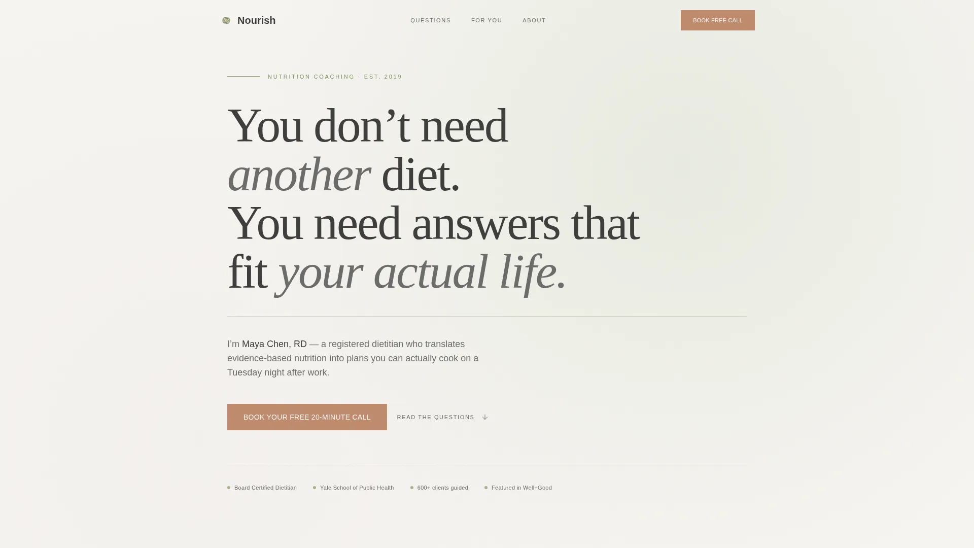
- A manifesto-style header with a bold serif quote, a sage divider line, and a one-sentence coach introduction
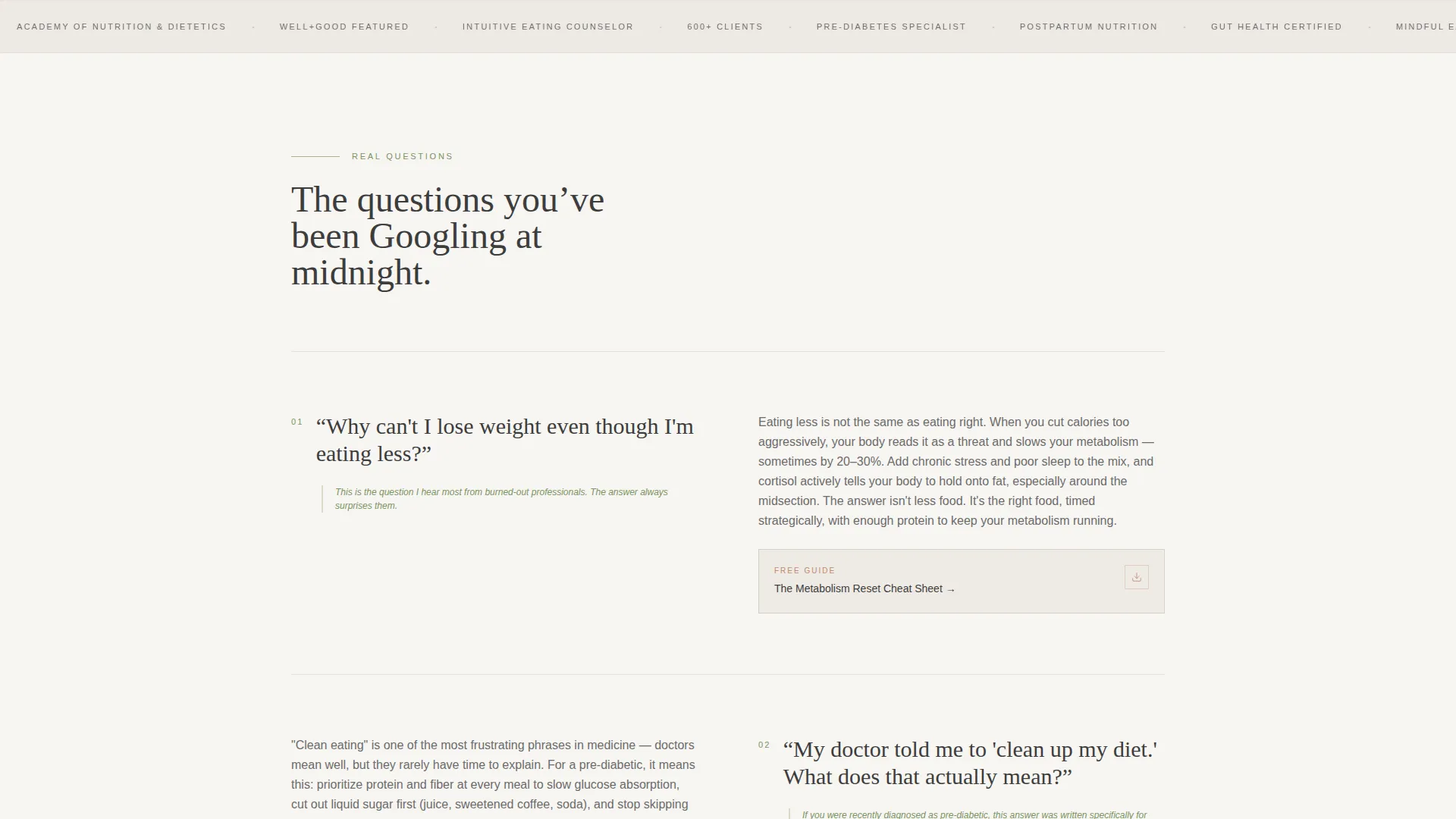
- A zigzag alternating section layout where each block pairs a real client question with a jargon-free answer and a linked downloadable resource
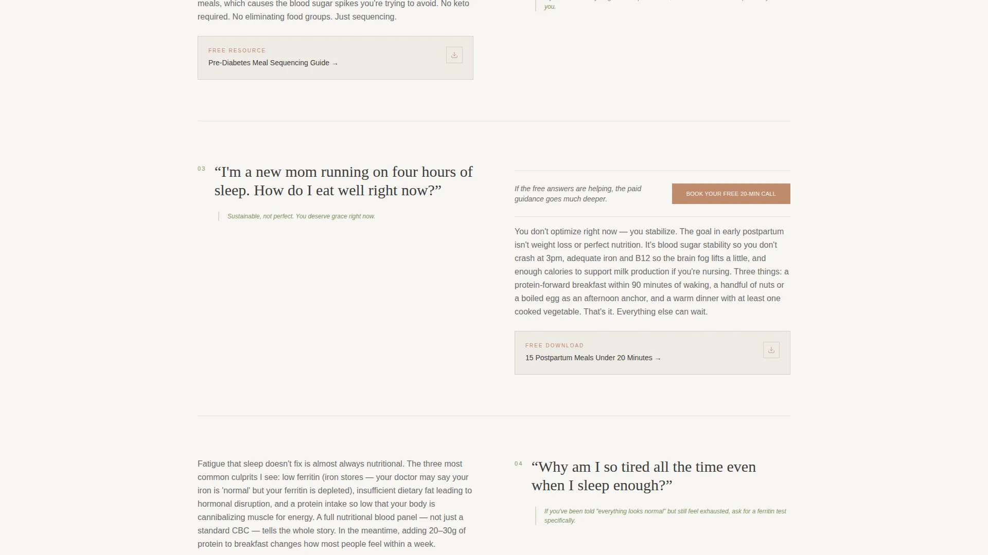
- A persistent but understated call-to-action button that reappears at every third alternating section without feeling pushy
Feature list
This template is designed to make a solo health coach look organized, trustworthy, and deeply competent from the first scroll.
Manifesto Quote Header
The header opens with a single large serif statement set against a warm white background. No competing image. Below the quote, a thin sage dividing line leads to a one-sentence subhead that names the coach and her credential. The whitespace is intentional and generous, giving the visitor room to settle in.
Zigzag FAQ Section Layout
Each alternating section is anchored by one real client question on one side and a clear, plain-language answer on the other. The layout flips with each section so the scroll feels like a natural conversation rather than a wall of text. Emotional stakes escalate from curiosity to frustration to hope as the visitor moves down the page.
Linked Downloadable Resource Cards
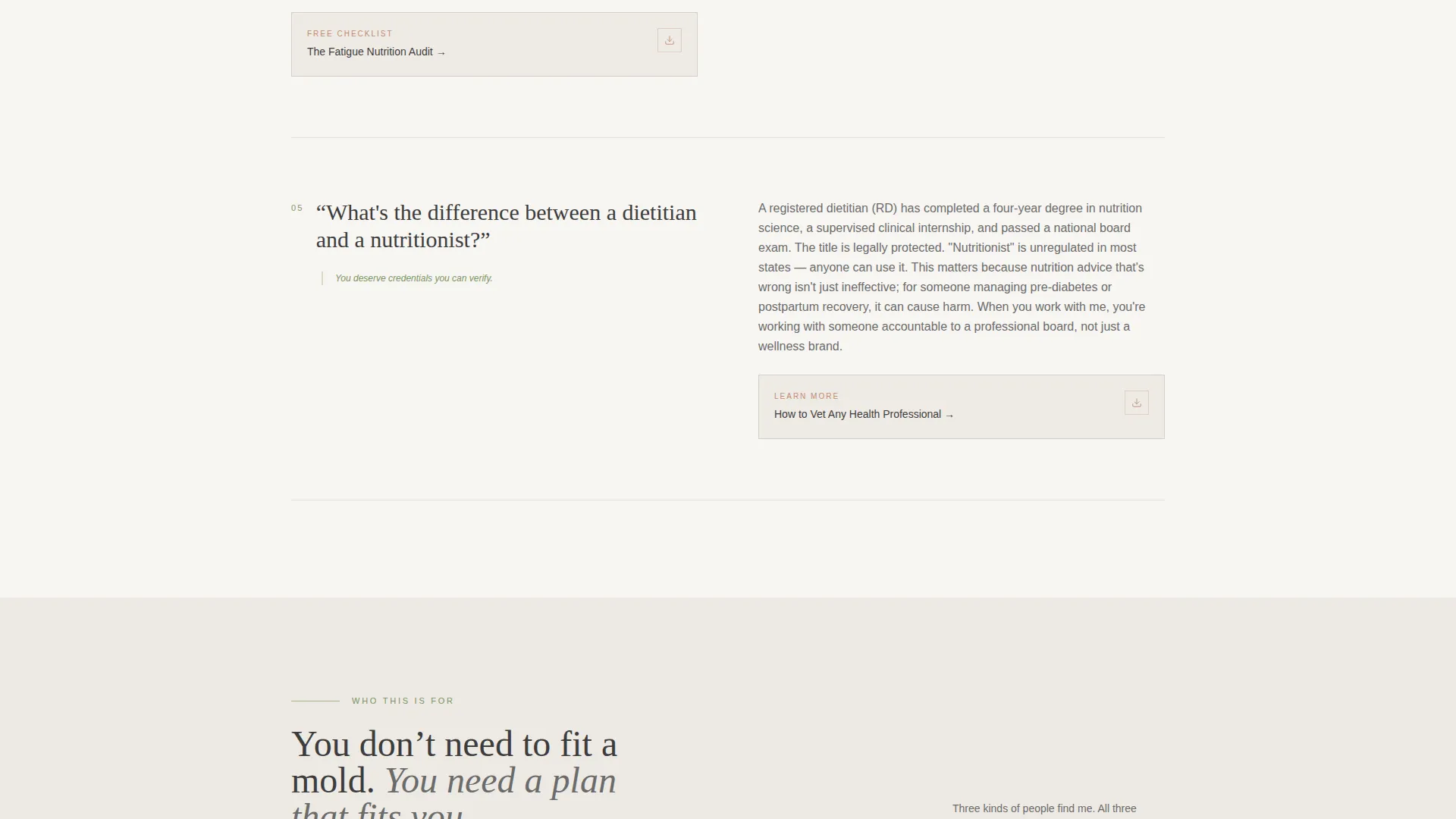
Each FAQ section includes a linked resource card styled in terracotta. These cards point to downloadable guides or tools relevant to the question in that section. They add immediate value and reinforce the coach's expertise before any money changes hands.
Persistent Discovery Call call to action
The primary call-to-action button, styled in terracotta, appears first beneath the manifesto header. It then resurfaces at every third zigzag section as a gentle, non-intrusive reminder. The page carries no form. The button leads directly to an external scheduler.
Escalating Emotional Scroll Rhythm
The section sequence is deliberately structured. Questions move from low-stakes curiosity at the top to deeper frustration in the middle to genuine hope near the bottom. This mirrors the emotional arc of a real coaching conversation and makes the visitor feel understood before they have said a word.
Cloud Canvas Color System
The full palette is built into the template. Warm white fields, muted sage accents, charcoal body text, and terracotta interactive elements work together to create a visual tone that feels unhurried and quietly authoritative. No color decisions are left to chance.
Page sections overview
| Section | Purpose |
|---|---|
| Manifesto Quote Header | Opens with a bold serif statement and coach credential to establish voice and trust immediately |
| Primary call to action Block | Places the discovery call button directly beneath the header for visitors ready to act |
| FAQ Zigzag Section 1 | Addresses a curiosity-level client question with a plain-language answer and a resource card |
| FAQ Zigzag Section 2 | Escalates to a frustration-level question; layout flips for visual rhythm |
| Mid-page call to action Reminder | Reintroduces the terracotta call-to-action button after the third zigzag section |
| FAQ Zigzag Section 3 | Addresses a hope-oriented question as emotional stakes peak |
| Final call to action Block | Closes the page with a calm, confident invitation to book the free call |
Design & branding system
The visual identity follows a Service Utility theme built on the Cloud Canvas color system. Every color and typographic choice is intentional, reinforcing the feeling of a well-organized, calm, and competent practice.
- Warm white (#F7F5F2) for open backgrounds, muted sage (#A3B18A) for section dividers and icon accents, charcoal (#3D3D3D) for body text, and terracotta (#C08B6E) reserved for buttons and linked resource cards
- Large airy serif type for the header manifesto quote, creating visual weight and emotional resonance without any competing imagery
- A linen-journal aesthetic overall, designed to feel breathable, unhurried, and quietly trustworthy on first impression
Mobile & speed optimization
The alternating layout is structured to restack cleanly on smaller screens. Each zigzag section becomes a vertically stacked block, keeping the question-then-answer reading order intact on mobile devices.
- The single-column mobile view preserves the conversational scroll rhythm that drives the page's emotional arc
- Resource cards and call-to-action buttons remain clearly visible and tappable at all standard mobile screen sizes
- Generous whitespace reduces visual clutter on small screens and keeps the calm, breathable tone consistent
How this template helps you convert
This template earns trust before it asks for anything. The conversion strategy is built into the content structure itself, not into aggressive popups or hard-sell language.
- The manifesto header qualifies visitors immediately. The right person reads that quote and feels seen, which increases the chance they keep scrolling.
- Each FAQ section demonstrates genuine expertise through the quality of its free answers. Visitors reason that if the free content is this useful, the paid guidance must be even better, which is exactly the mindset that drives a booking.
- The terracotta call-to-action button reappears at consistent intervals so that whenever a visitor feels ready, the next step is always one scroll away.
Other information about this template
This template is a strong fit for health coaches who want a polished online presence without building a multi-page site from scratch. It is designed as a focused click-through landing page with one conversion goal: the free discovery call.
- The page connects to an external scheduling tool such as a Calendly-style booking page, keeping the experience frictionless
- No contact form lives on this page, which removes a common hesitation point and keeps the visitor's attention on the conversation
- The template suits a practice positioned around realistic, sustainable nutrition guidance rather than trend-driven or program-heavy wellness brands
- It works equally well for coaches launching a new practice and for established coaches who want a cleaner, more focused web presence
Theme
Service Utility
Creative direction
FAQ-Driven
Color system
Cloud Canvas
Style
Zigzag/Alternating
Direction
Click-Through
Page Sections
Manifesto Quote Header
Zigzag FAQ Section Layout
Linked Downloadable Resource Cards
Persistent Discovery Call Button
Escalating Emotional Scroll Structure
Cloud Canvas Color System
Related questions
Can I customize the FAQ questions to match my own coaching topics?
Does this template include a booking form or scheduler?
How many alternating FAQ sections does the layout include?
Is this template suitable for a health coach who also sells digital products?
Can I update the color palette to match my existing brand?



