Whole30 Meal Delivery Landing Page Template
Nourish is a hero-dominant landing page template built for Whole30 meal delivery services. It pairs full-bleed food photography with a Neo-Retro Warm Stone palette, an inline meal selector, and a sticky call-to-action bar. The result is a food delivery landing page that builds appetite, earns trust, and moves visitors toward their first box without friction.
by Rocket studio
Quick summary
Nourish is a single-page, hero-dominant food delivery landing page template designed for clean-eating meal delivery brands. It uses cinematic lifestyle photography, a warm analog visual identity, and a live meal-selector form to drive direct sales. Every section is built to make healthy food feel irresistible and ordering feel effortless.
Who this template is for
This template fits founders and operators running a Whole30 meal delivery service, a clean-eating subscription box, or any healthy food delivery brand that competes on quality and convenience.
- Whole30 meal delivery services targeting busy professionals, new moms, and athletes
- Direct-to-consumer food brands that plan to sell online without a complex multi-page site
- Food entrepreneurs who want a polished landing page without the cost of custom development
What problem this template solves
Selling healthy food online is harder than it looks. Visitors arrive hungry for proof: proof the meals taste good, proof the ingredients are clean, proof the ordering process is simple. A generic landing page fails on all three counts.
- Visitors leave before converting because the page feels clinical, not appetizing
- Compliance claims like "no sugar, no soy, no dairy" get buried instead of anchored at the top
- The path from curiosity to checkout is too long, causing drop-off before the form ever loads
What you get with this template
You get a fully structured, design-ready landing page with every section pre-built and every visual decision already made. The page is desktop-first with strong mobile layout support, so your food photography gets the real estate it needs on every screen.
- A 90-viewport-height hero section with a lifestyle image, headline, and primary call-to-action card
- An inline meal-selector form with live price display, dietary add-ons, delivery day picker, and zip code field
- A sticky bottom call-to-action bar, a weekly menu grid, an ingredients trust section, a social proof section, and a site footer
Feature list
This landing page template is built around appetite-driven design and direct-sales conversion. Below are the core capabilities that make it work.
Cinematic Hero Section
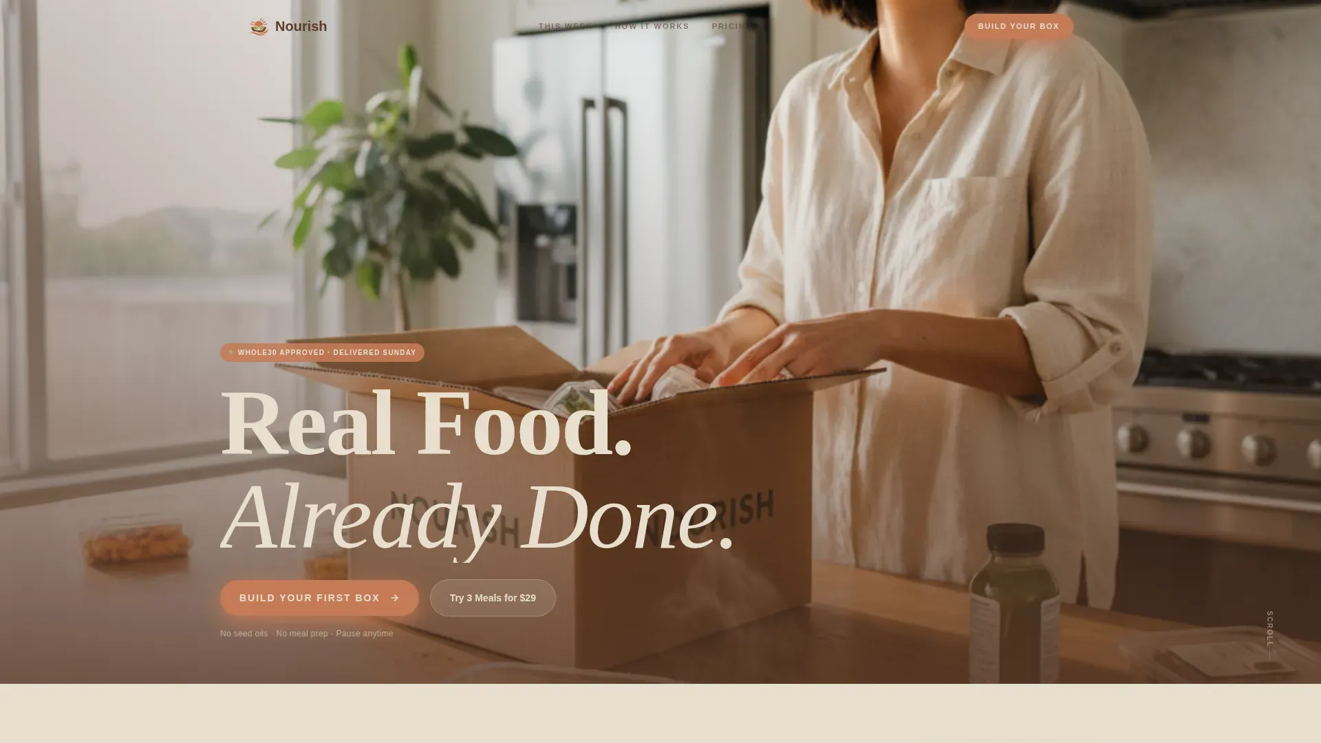
The hero occupies ninety percent of the viewport with a full-bleed lifestyle photograph. A rounded slab-serif headline fades in over the lower third using a GSAP line-reveal animation. A floating call-to-action card sits below the headline, giving visitors an immediate path to the meal selector.
Inline Meal Selector Form
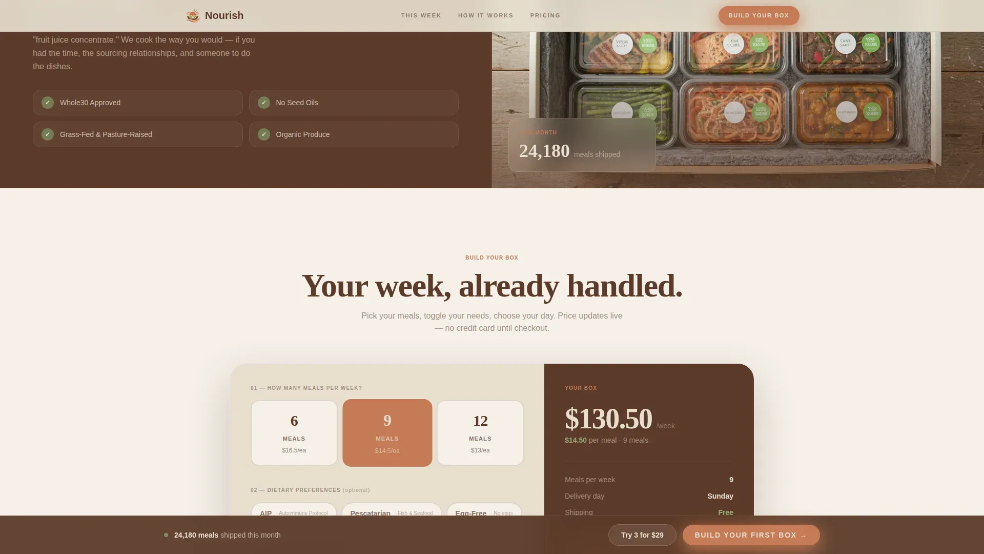
Visitors choose 6, 9, or 12 meals per week, toggle dietary add-ons such as AIP, pescatarian, or egg-free options, pick a delivery day, and enter their zip code. Price per meal updates live as each selection changes. The credit card field appears only after preferences are set, reducing early friction.
Sticky Call-to-Action Bar
After the second scroll, a sticky bottom bar appears with the primary call-to-action button. It stays visible as visitors explore the page, so the path back to the form is never more than one tap away. This keeps conversion intent high throughout the full landing page experience.
Weekly Menu Plate Grid
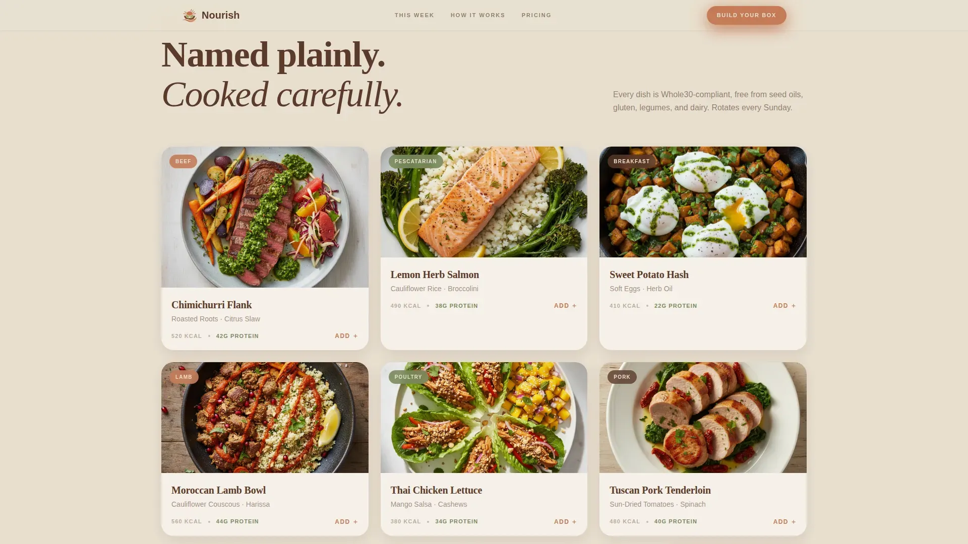
A full-bleed overhead photo grid displays the current weekly menu. Each plate is labeled plainly: dish name, protein, and sides. The grid builds appetite and doubles as social proof that the recipes rotate and stay interesting week to week.
Social Proof and Trust Strip
Three testimonials represent real customer archetypes. Reviews highlight non-scale victories like increased energy and reduced inflammation rather than weight loss. A Whole30 Approved badge, delivery partner logos, and a real-time meals-shipped counter form a trust strip that supports the compliance message.
Low-Commitment Entry Path
A secondary call-to-action offers a trial option beside the trust strip. This gives hesitant visitors a lower-stakes way to try the service before committing to a full weekly plan, which can improve overall conversion on the landing page.
Page sections overview
| Section | Purpose |
|---|---|
| Hero Lifestyle Shot | Anchors appetite and delivers headline with primary call-to-action |
| Weekly Menu Grid | Displays plate shots and named recipes to build craving |
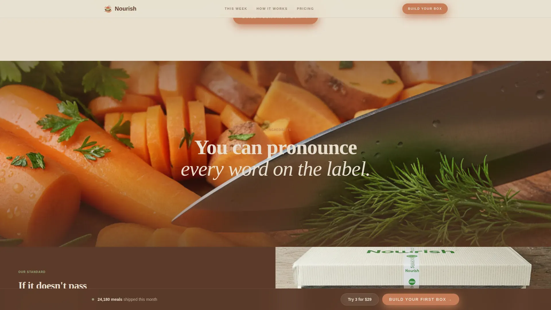
| Ingredients Trust Block | Shows butcher-block zoom and box-sealing sequence with compliance proof |
| Meal Selector Form | Lets visitors build their box, pick add-ons, and see live pricing |
| Social Proof Section | Posts testimonials, trust badges, and meals-shipped counter |
| Site Footer | Horizontal flow footer with navigation links and brand identity |
Design & branding system
The visual identity follows a Neo-Retro theme. Think a 1970s California cookbook shot on a sandstone patio, warm and analog, but pushed through a modern lens. Every plate, every surface, every shadow feels touchable.
- Color system: sun-bleached linen (#E8DFD0) background, terracotta clay (#C47B56) primary actions, smoked walnut (#5B3A29) foreground text, muted avocado (#7A8B5E) secondary accents
- Typography: Fraunces rounded slab-serif for headlines, DM Sans for body copy
- Scroll animation rhythm: zoom in on ingredients, pull back to the sealed delivery box, repeat; each section transition is scroll-triggered to keep the sensory experience building
Mobile & speed optimization
The template is desktop-first by design, since food photography needs generous screen space to display at its best. Mobile layout is fully supported, with the hero, menu grid, and meal-selector form all adapting cleanly to smaller screens.
- Hero image is priority-loaded so the lifestyle shot appears instantly on page load
- Food photography grids use lazy loading so later plate images do not slow the initial landing page render
- The sticky call-to-action bar and inline form are touch-friendly on mobile, keeping the path to purchase clear for users ordering from their phones
How this template helps you convert
A healthy food delivery landing page only works when every design decision points toward one action. This template structures that journey deliberately.
- The hero creates immediate appetite and trust. The lifestyle shot, clean headline, and floating form card give visitors a reason to stay and a clear next step before they scroll.
- The meal selector reduces decision fatigue. Visitors build their own box step by step, see a live price, and only reach the payment field after they are already committed to their preferences.
- The trust strip closes remaining doubt. The Whole30 Approved badge, real customer feedback, and a meals-shipped counter answer the compliance and reliability questions that typically cause visitors to leave a food delivery landing page without converting.
Other information about this template
This template sits in the Food and Beverage category, specifically the Whole30 Food and Dining subcategory. It is the Nourish Clean Whole30 Meal Delivery Landing Page Template, built for the direct-to-consumer meal delivery niche.
- The template supports a family-friendly healthy food plan. Recipes are portioned to yield multiple servings, so a husband, a partner, or a household can eat well from a single weekly box without leftovers going to waste
- Meal planning is key to Whole30 success, and this landing page makes that message central. The page positions the service as the answer to the planning burden, not just a grocery shopping replacement
- The page structure follows proven healthy food delivery landing page design principles: high-quality imagery first, strict no-dairy and no-added-sugar messaging near the top, transparent ingredients list, and a bold call-to-action at every key scroll point
- Explicitly stating "No Dairy, Grains, Soy, or Added Sugar" on the landing page assures users of full compliance and removes the most common objection before it forms
- The community angle is present through social proof. Customers share feedback that mirrors the encouragement found in Whole30 meal prep communities, where participants support each other and explore new recipes together
- Gut health, energy, and lifestyle improvements appear in the testimonial section rather than weight-focused claims, keeping the messaging aligned with Whole30 program values
- The template comes free of bloated code. You can shop the template, customize the Warm Stone palette to match your brand, and post the page without waiting on a developer
- Using this food delivery landing page template can save meaningful time and money compared to building a custom site from scratch
- A scoop of good design goes a long way: the template gives you a professional, efficient foundation so you can focus on the food, not the code
- Note that the template includes a built-in contact form section within the footer flow, giving customers a direct way to reach your team. Note also that the page is not connected to any backend system by default; you will need to link your own payment and delivery services
Theme
Neo-Retro
Creative direction
Immersive Visual
Color system
Warm Stone
Style
Hero-Dominant (90/10)
Direction
Direct Sales
Page Sections
Cinematic Hero with Line-reveal Animation
Live Inline Meal Selector
Sticky Bottom Call-to-action Bar
Overhead Menu Plate Grid
Ingredients Trust and Compliance Section
Social Proof Strip with Trust Badges
Related questions
Can I customize the colors and fonts in this template?
Does the meal selector form connect to a payment processor automatically?
Is this template suitable for a healthy food delivery service that is not strictly Whole30?
How does the sticky call-to-action bar behave on mobile devices?
Can this landing page support a trial offer alongside the main weekly plan?



