Eating Disorder Care Booking Website Template
Nourish is a clinical recovery education landing page template designed for eating disorder care platforms. It combines a warm, medical-clarity aesthetic with a structured Problem→Solution Arc, a three-step Recovery Education Assessment, and a streamlined booking form. The result is a supportive, trust-building experience for patients, parents, and providers who need clear answers between appointments.
by Rocket studio
Quick summary
Nourish is a single-page landing page template built for clinical education platforms that serve people navigating eating disorders. It guides visitors from confusion to comprehension through a gentle assessment, a side-by-side comparison table, escalating learning modules, and a booking form framed entirely around the visitor's agenda.
Who this template is for
This template is designed for health and wellness professionals who provide education and care around eating disorders. It speaks directly to the people sitting on both sides of the recovery journey.
- Dietitian practices and nutritionist-led programs that want to connect with newly diagnosed adults and provide clear, science-backed support between appointments.
- Parents and caregivers searching for trustworthy resources after their teenager's first clinical encounter with eating disorders.
- Therapists and treatment providers who need a credible, assignable community resource for clients in early or ongoing recovery.
What problem this template solves
Clinical language creates distance. People who have just heard a diagnosis for the first time often leave the appointment with more questions than answers. They wait days for a follow-up, search in stress at midnight, and encounter pages that either over-medicalize or under-explain.
- There is no safe, plain-language space that translates what a dietitian or treatment team actually said into something a patient can hold onto.
- Parents feel shut out of the recovery process, uncertain how to create a supportive home environment without causing harm.
- Providers lack a polished, trustworthy landing page that can showcase their program and improve engagement between sessions.
What you get with this template
Nourish gives you every section needed to provide clarity, build trust, and move visitors toward a booked appointment or a free module. The layout is designed to ease visitors into understanding at a pace that feels human.
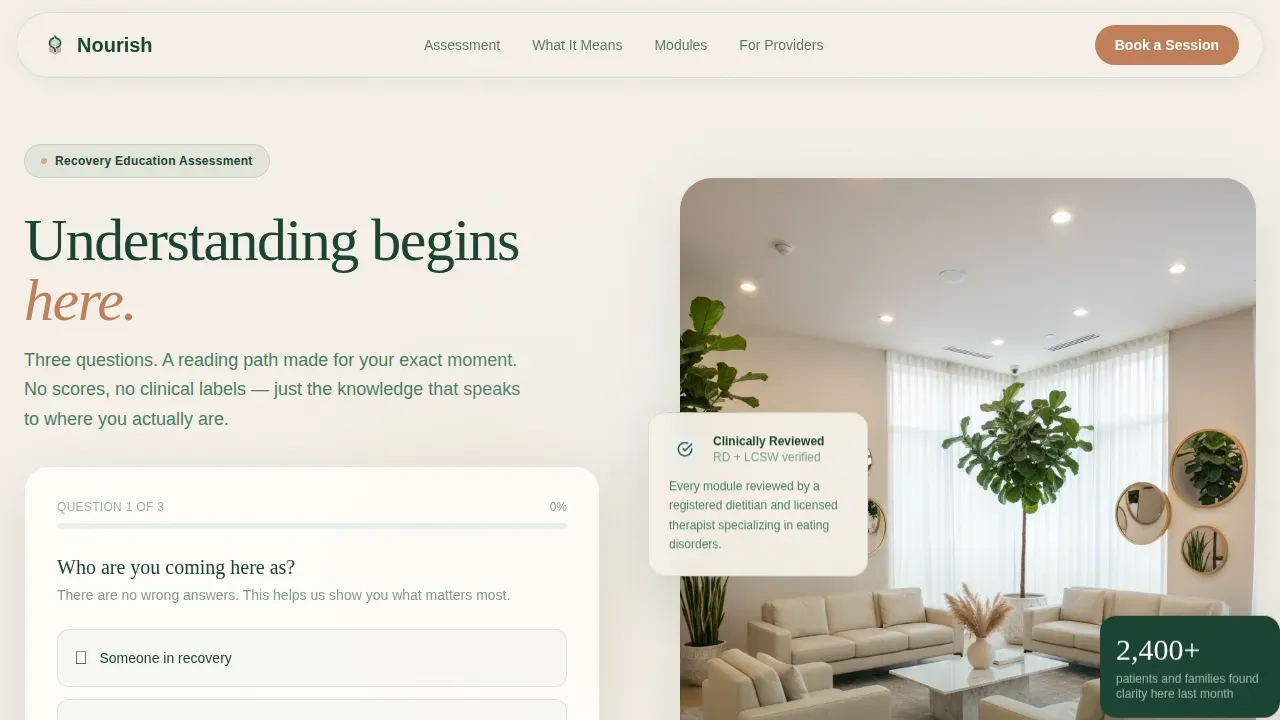
- A three-step Recovery Education Assessment in the hero section, with a sage progress bar and personalized reading pathway based on role, stage of treatment, and primary concern.
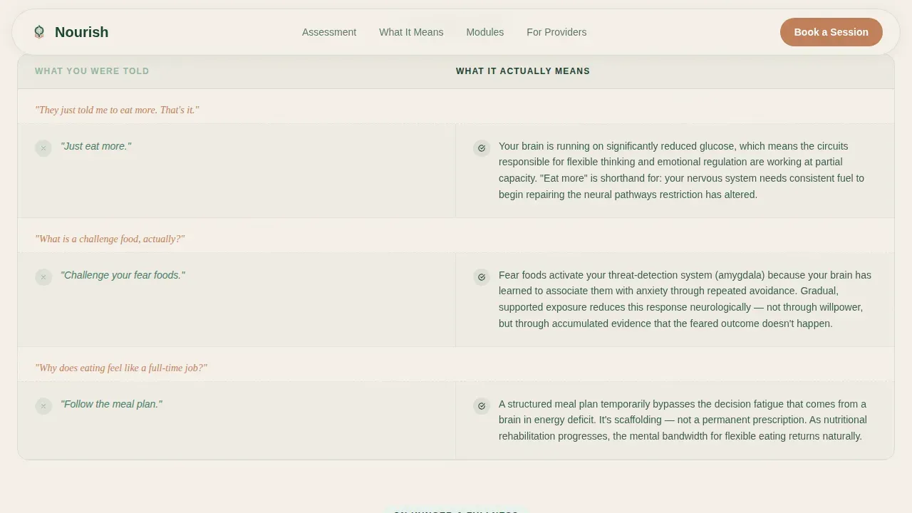
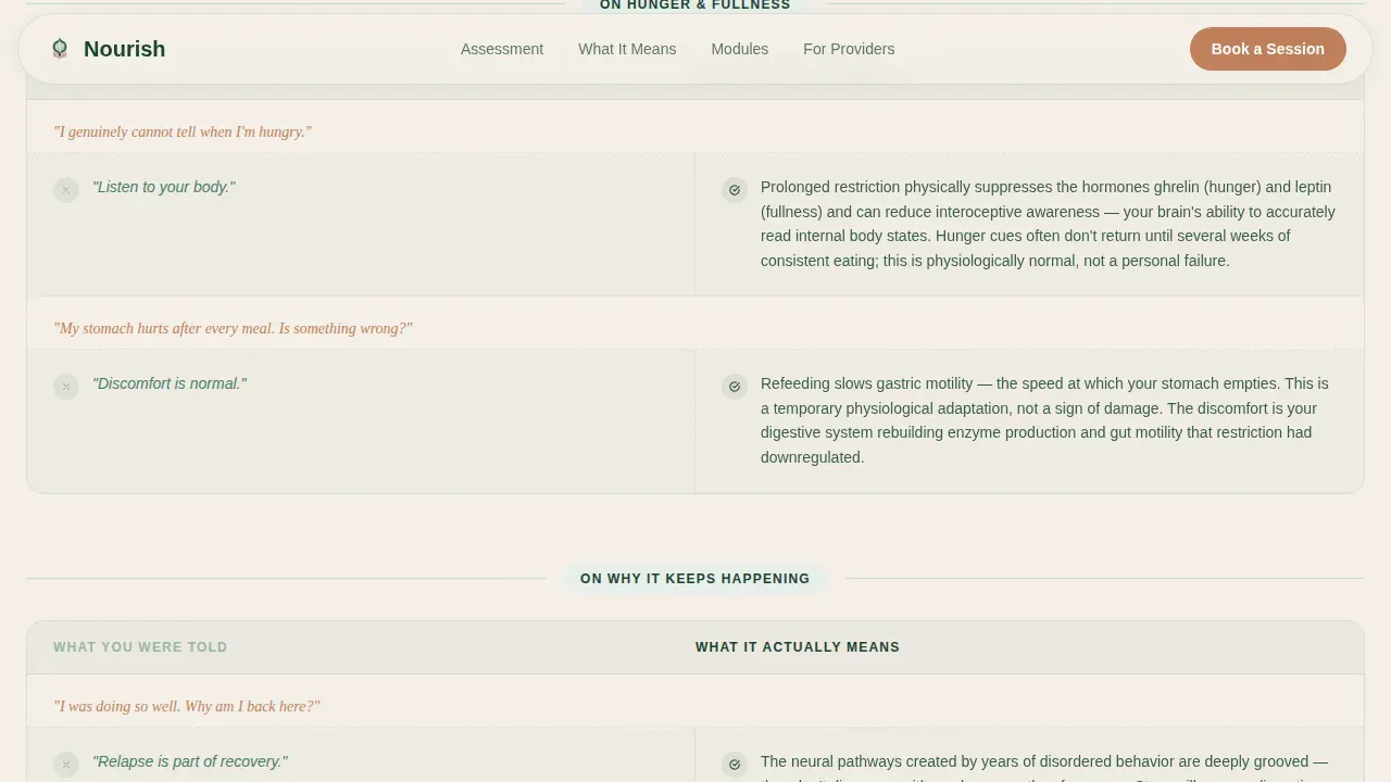
- A side-by-side comparison table that unpacks clinical shorthand into plain-language explanations, helping users navigate the gap between what they were told and what it actually means.
- A three-field booking form with open-text entry designed to make the appointment feel like the visitor's agenda, not the clinic's.
Feature list
This template's features are purpose-built for the eating disorder care space. Each one is designed to improve trust, ease decision-making, and provide a clear path forward.
Three-Step Recovery Education Assessment
The hero opens with a simple, interactive calculator. Visitors answer three gentle questions: their role, their stage of treatment, and their primary concern. The tool returns a personalized reading pathway, matching each member of the community to the modules most relevant to their moment. No scores, no clinical labels.
Comparison Table with Plain-Language Explanations
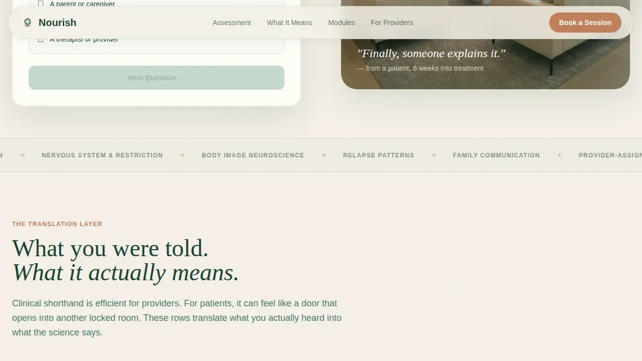
The core section of the program is a structured comparison table. The left column presents the clinical shorthand patients actually hear from their support team. The right column unpacks each phrase into two-sentence explanations grounded in physiology. Each row is designed to create a sense of recognition and build confidence row by row.
Escalating Module Depth Preview
Three topic areas showcase the program's learning arc, from nutrition basics through interoception to relapse neuroscience. Each module opens with a patient-voiced question written in clay-colored type, followed by a calm clinical answer. This structure helps users watch their understanding develop in real time and feel confident about continuing.
Booking Form Designed Around the Visitor
The primary call to action reads "Book Your First Session." The form asks for a name, a preferred format (video call, in-person, or self-paced), and a single open-text field: "What question do you most want answered?" This framing signals care and expertise from the first point of contact.
Secondary Call to Action for Mid-Funnel Visitors
A second call to action, "Start Your Free Module," sits at the midpoint of the page. It gives visitors who are not yet ready to commit an opportunity to connect with the program's value before they drop off.
Trust Signal and Social Proof Section
The layout includes space for module count indicators, provider trust badges, and a patient-voiced testimonial. These elements provide the safety signals that matter most to anxious first-time visitors navigating an unfamiliar health landscape.
Page sections overview
| Section | Purpose |
|---|---|
| Hero Assessment Calculator | Greets visitors with a three-step role and concern quiz that returns a personalized module pathway |
| Comparison Table | Unpacks clinical shorthand into plain-language, physiology-grounded explanations row by row |
| Module Depth Preview | Showcases three escalating learning topics using patient-voiced openers and calm clinical answers |
| Booking Form | Captures name, format preference, and the visitor's top question to frame the appointment as theirs |
| Footer | Delivers a clean horizontal flow with navigation and supporting links |
Design & branding system
The visual identity follows a Medical Clarity theme rooted in the Forest Trust color system. The palette is designed to feel clinical enough to trust and organic enough to breathe in.
- Deep Evergreen (#1B4332) anchors headers and navigation; Soft Sage (#95B8A2) carries secondary text and table borders; Warm Birch White (#F5F0E8) opens the background; Grounding Clay (#C17F59) is reserved for calls to action, patient-voiced questions, and progress indicators.
- Typography pairs DM Sans for body copy with Fraunces serif headings, creating a sense of warmth and expertise without sacrificing clarity.
Mobile & speed optimization
The majority of this template's users will arrive on a phone, often in a car after an appointment, or at midnight searching for answers under stress. The layout is designed with this in mind.
- The design is mobile-first, with large tap targets, a single-column scroll flow, and a step-transition quiz that keeps focus on one question at a time.
- Scroll-reveal animations and table row stagger are built at medium intensity to keep the page feeling alive without slowing the first paint on a mobile connection.
How this template helps you convert
Every section of this landing page is designed to move a hesitant, anxious visitor toward a clear and confident next step.
- The assessment calculator creates immediate personalization, making visitors feel seen before they have read a single line of program copy. This reduces the urge to leave and keeps users engaged with the content.
- The comparison table builds credibility row by row. By the time visitors reach the booking form, they have already experienced the program's care and expertise firsthand through the language on the page.
Other information about this template
The Nourish clinical recovery education landing page template is a minimal health and wellness template designed to showcase a recovery program with clarity and warmth. Nourish is built to help users navigate the eating disorder care space with confidence, giving dietitians, nutritionists, and providers a platform that can improve how they connect with their audience.
- Nourish is designed to provide a supportive, plain-language experience for patients, parents, friends, and providers who want to understand eating disorders without jargon. The template can showcase provider expertise and build community trust from the first scroll.
- The program structure supports telehealth and in-person practice equally. Subscription-based tools and software built on this template can provide ongoing support, scale with a practice's needs, and offer features for backend integrations as the program grows.
- Nourish supports learning pathways for users across a decade of treatment stages, from pre-diagnosis through deep recovery. It provides an incredible opportunity to develop a covered, school-of-thought approach to care that improves health outcomes and keeps the future of recovery education centered on the person.
- Clinical recovery education landing pages should display trust signals, keep forms simple, and use plain language. Nourish delivers all of this. The booking form is intentionally minimal, capturing only essential information to improve completion rates and reduce drop-off. Insurance information and other sensitive fields are left out to keep the first point of contact safe and welcoming.
- Effective clinical recovery education must act on the principle that empathy and authority can coexist. Nourish is designed based on this principle, making it simple for any health coach, registered dietitian, or nutritionist to state their program's value without condescension.
Theme
Medical Clarity
Creative direction
Problem→Solution Arc
Color system
Forest Trust
Style
Comparison Table
Direction
Booking/Scheduling
Page Sections
Three-step Recovery Education Assessment
Plain-language Comparison Table
Escalating Module Depth Preview
Agenda-framed Booking Form
Mid-funnel Secondary Call to Action
Trust Signal and Social Proof Block
Related questions
Who is the primary audience for this landing page template?
Can this template support both in-person and telehealth programs?
What makes the comparison table section effective?
Is this template suitable for providers who are not designers?
How does the booking form reduce friction for anxious visitors?



