Nourish — Diabetic Meal Kit Landing Page Template
The Nourish Pastoral Calm Diabetic Meal Kit Landing Page Template is a hero-dominant, single-page design built for direct-to-consumer diabetic meal kit subscriptions. It leads with an emotionally warm lifestyle hero, an Origin Story narrative arc, a registered-dietitian-backed method section, subscriber proof, and a three-step inline box configurator. The pastoral color system and serif typography create trust without a clinical feel.
by Rocket studio
Quick summary
The Nourish Pastoral Calm Diabetic Meal Kit Landing Page Template gives founders a complete, conversion-ready single page that feels like a Sunday morning in a country kitchen rather than a medical brochure. Every section is built to meet people where they are emotionally and walk them confidently toward building their first box.
Who this template is for
This template was designed for a very specific kind of founder. If you are building a direct-to-consumer food subscription that centers on diabetes management, blood sugar stability, or carb-conscious living, this is the page structure your audience deserves.
- Founders launching a diabetic-friendly meal kit subscription in the United States who want to sell directly without a marketplace middleman.
- Health and wellness entrepreneurs whose target subscribers include newly diagnosed Type 2s, long-managed Type 1s, gestational and pre-diabetic individuals, and adult children worried about a parent's health.
- Registered dietitians, small farms, or food brands ready to create a premium, trust-first subscription offering around nutritious, glycemic-tested meals.
What problem this template solves
People living with diabetes face a quiet, exhausting kind of pain every single day. The mental math of every meal, the cold dread of a bad blood panel result, the hunger for food that feels like real food and not a clinical prescription. Women and men managing diabetes often feel afraid that eating well means giving up pleasure at the dinner table. Adult children searching for answers on behalf of a mother or father feel equally lost. A generic landing page template cannot carry that emotional weight. This one is built to.
- It removes the sterile, clinical visual language that makes people feel like a patient rather than a person, replacing it with warm pastoral design that promotes comfort and trust.
- It structures the page as a human story first and a sales page second, so visitors realize the brand understands their life before they are ever asked to buy anything.
- It provides a clear, low-anxiety path from emotional resonance to action, including a three-step box configurator that reduces cognitive load and a secondary gift-box flow for concerned family members.
What you get with this template
You get a fully structured, hero-dominant single-page layout with every section planned, every interaction designed, and every content block positioned to move the right reader toward the right action. The template covers the complete subscriber journey from first impression to first purchase.
- A full-viewport lifestyle hero with an arch image gallery entrance and a primary call-to-action button, followed by a pinned secondary call-to-action that stays gently visible after the second scroll.
- A scrolling Origin Story narrative section, a Nourish Method trust section, a social proof section with subscriber blood-panel screenshots and handwritten thank-you cards, and a three-step inline box configurator with a carb-target slider and delivery cadence selector.
- A gift-box conversion flow for secondary visitors, a linear single-row footer, and GSAP ScrollTrigger-powered reveal animations that walk the visitor through the page like chapters in a book.
Feature list
This template includes a set of purpose-built components that directly serve the diabetic meal kit use case. Each feature was chosen to reduce visitor anxiety, build genuine trust, and guide people toward subscribing.
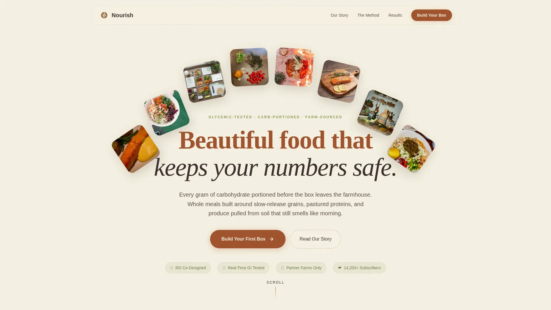
Full-Viewport Lifestyle Hero with Arch Gallery
The hero section fills ninety percent of the viewport with a warm, golden-hour lifestyle image. The art direction shows a woman in her late fifties mid-laugh at a sunlit counter, a continuous glucose monitor visible on her arm, a meal of roasted salmon and quinoa in front of her, and small beautiful imperfections on the counter around her. An arch image gallery entrance animation plays on load, drawing the eye naturally downward. The primary "Build Your First Box" call-to-action button sits directly beneath the hero so visitors do not have to walk far to take the first step.
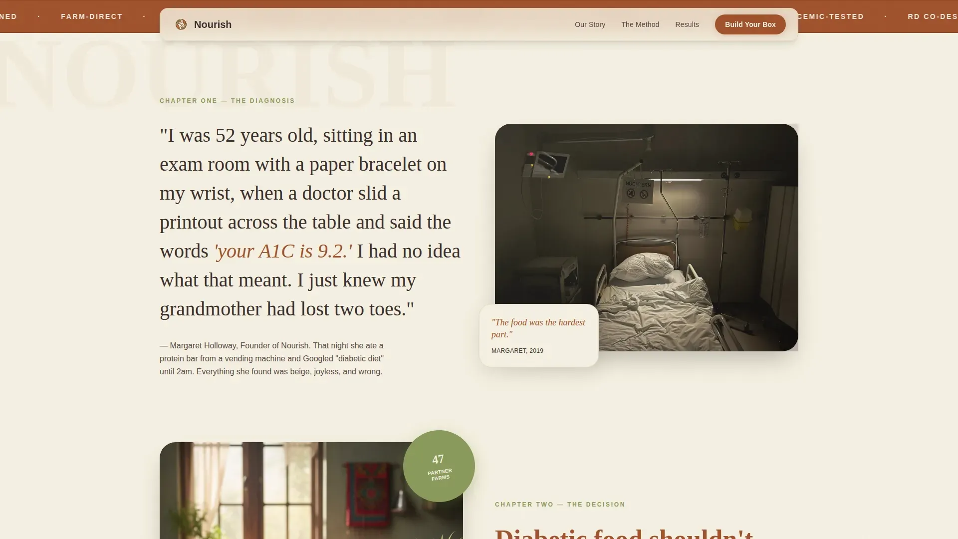
Origin Story Narrative Section
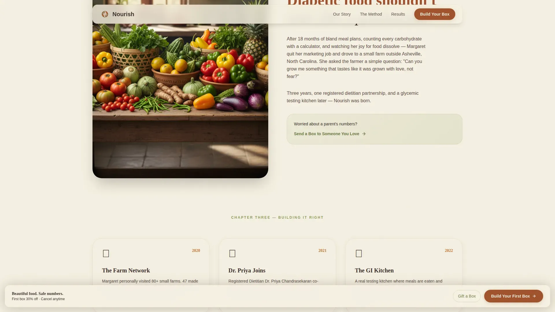
Below the hero, a serif-set founder story unfolds in chapters as the visitor scrolls. It opens with the diagnosis moment, moves through the pain of bland "diabetic food," and builds toward the decision to create something better. Each chapter is revealed through GSAP ScrollTrigger animations that feel like turning the pages of a book. This section earns trust by showing scars first and science second, which is the truth of how people actually connect with a brand that understands their life.
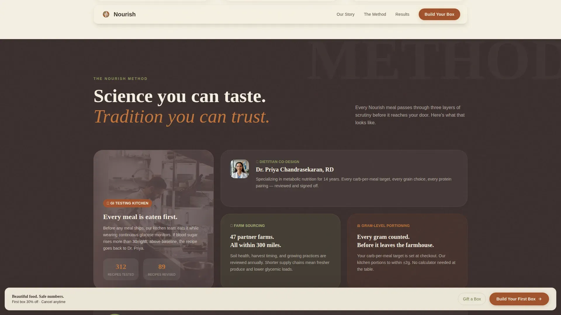
Nourish Method Trust Section
This section introduces the three pillars standing behind every box: the glycemic testing kitchen where meals are eaten and blood-glucose levels are tracked in real time, the registered dietitian who co-designs every recipe, and the sourcing partnerships with small farms whose produce arrives tasting of morning soil. Trusted credentials are prominently displayed here. Each pillar is presented as a short, skimmable block so visitors can absorb the method without feeling like they are reading a nutrition textbook.
Subscriber Proof Section
Social proof in this template goes beyond a row of star ratings. It includes subscriber blood-panel screenshots shared with permission, handwritten thank-you cards photographed on the same wooden table from the hero, named testimonials with photos, and a live counter showing active subscription numbers. These elements remind every new visitor that real people with real health histories have found genuine relief and joy through this service. Testimonials that emphasize emotional relief are particularly powerful here because they connect with visitors who feel afraid and alone in managing their condition.
Three-Step Inline Box Configurator
The configurator reduces the ordering process to three calm, sequential steps. Step one selects household size and diabetes type. Step two sets carb-per-meal targets using a slider with dietitian-recommended defaults already filled in, so the visitor does not feel lost. Step three chooses weekly or biweekly delivery, with the first box discounted thirty percent. A simple three-step graphic reduces cognitive load and keeps the process from feeling overwhelming. Meal previews display prominent carb counts, fiber totals, and protein macros so subscribers always know what they are eating.
Gift-Box Conversion Flow
A secondary conversion path sits below the founder's story for the adult children and friends who arrive on this page worried about a mother, a father, or a partner. The gift-box flow asks only for a recipient address and a short handwritten-note field, converting concern into action without requiring a long commitment. This path acknowledges a real segment of visitors and gives them a meaningful, low-friction way to connect care with the people they love.
Page sections overview
| Section | Purpose |
|---|---|
| Lifestyle Hero | Establish emotional warmth and primary call-to-action |
| Origin Story | Build founder trust through narrative chapters |
| Nourish Method | Demonstrate dietitian, farm, and testing credentials |
| Subscriber Proof | Validate service through blood panels and testimonials |
| Box Configurator | Guide visitors through a three-step subscription setup |
| Gift Box Flow | Convert secondary visitors with a care-driven gift path |
| Linear Footer | Close the page with clean, minimal navigation links |
Design & branding system
The visual identity of this template is built entirely around pastoral calm. Nothing here feels clinical or cold. Every color, typeface, and spacing decision is borrowed from the warmth of a country kitchen, not a hospital room. The goal is for the visitor to feel held, not processed.
- The color system uses aged parchment cream (#F5F0E1) across all backgrounds, warm rust (#A0522D) on headlines and primary buttons, deep loam brown (#3B2F2F) for body text, and a quiet sage (#8A9A5B) for secondary accents and iconography, creating a palette that promotes comfort and communicates the slow food philosophy of the brand.
- Typography is set in Fraunces for all serif headlines, giving the page the weight and warmth of a hand-lettered recipe, while DM Sans handles all body copy for clean, comfortable reading across every screen size.
- Ample whitespace is used throughout the design to create an organized, uncluttered feel, giving each section room to breathe and allowing visitors to sit with the content rather than feel rushed past it.
Mobile & speed optimization
The template is designed desktop-first with strong mobile consideration built in from the start. Many of the people who will land on this page are older adults managing a long-term health condition, and a significant portion of them will arrive on a phone rather than a laptop. The layout adapts to serve them with the same warmth and clarity they would experience on a larger screen.
- Server Components handle all static content sections, keeping the page light and fast on initial load, while Client Components power the interactive configurator and gift-box flow so interactivity does not slow down the rest of the experience.
- The full-viewport hero, the arch gallery, and the scrolling narrative sections are built to reflow cleanly on smaller screens, so the emotional journey does not break when a visitor is standing at a kitchen counter reading on a phone rather than sitting at a desk.
- High-quality, warm, and bright imagery is used throughout to create a serene visual experience that renders well across devices and screen sizes, supporting the pastoral calm theme without sacrificing loading performance.
How this template helps you convert
This template is conversion architecture designed around the specific psychology of a diabetic meal kit subscriber. It does not rush the sale. It earns it.
- The page leads with empathy before it leads with a product. The lifestyle hero, the founder's Origin Story, and the Nourish Method section build a sense of genuine understanding and shared history before asking anything of the visitor, which means by the time someone reaches the configurator, they already feel like the brand knows their life.
- The three-step configurator and the pinned call-to-action button work together to keep the path to purchase always visible but never aggressive. Clear calls to action guide users forward at every scroll depth, and the thirty-percent first-box discount gives the visitor a concrete, time-sensitive reason to sign up today rather than wait.
- The gift-box flow unlocks a second conversion lane that a standard meal kit landing page leaves on the table. Adult children searching for ways to support a parent's health can take action immediately without navigating through a full subscription setup, which means the page converts both the person living with diabetes and the people who love them.
Other information about this template
The Nourish Pastoral Calm Diabetic Meal Kit Landing Page Template sits at the intersection of emotional storytelling and practical health education. It is built for the United States market, priced in USD, and uses Imperial measurements throughout. The following details give additional context for buyers evaluating this template.
- The template supports a slow food philosophy in its branding, with the sourcing section designed to highlight connections to small farms and the kind of morning-fresh produce that makes a difference in both flavor and glycemic impact. Ingredients like fatty fish such as salmon and mackerel, which are rich in omega-3 fatty acids, quinoa, beans, dark leafy greens, berries, and avocados fit naturally into the meal stories this page is built to tell.
- Mindful cooking is woven into the content direction. Mindful cooking encourages visitors to focus on the present moment while preparing meals, and this philosophy is reflected in the recipe card aesthetic, the ingredient-forward imagery, and the educational content blocks that teach subscribers about what is in their box and why it matters for their body and their blood pressure.
- Meal planning can reduce stress and anxiety by providing structure and organization, and the three-step configurator is designed with this truth in mind. Dietitian-recommended defaults are pre-filled to spare subscribers the decision fatigue that makes living with diabetes so exhausting in daily life.
- Nutritional planning is essential for managing specific dietary needs. Each meal preview in the configurator displays prominent carb counts, fiber totals, and protein macros. An ingredient exclusion approach, clearly stating which foods are left out for health safety, gives subscribers and their families the medical reassurance they need to feel confident in every box.
- The page provides immediate context around blood sugar management without making unsupported medical claims. Subscriber blood-panel screenshots shared with permission, alongside handwritten thank-you cards and a live subscription counter, give the page the community and science it needs to gain trust from even the most cautious visitor.
- Education and teaching are embedded in the template structure. The Nourish Method section explains the glycemic testing kitchen, the registered dietitian partnership, and the farm sourcing process in plain language. This educational layer helps visitors gain the knowledge they need to feel safe choosing this service, rather than feeling afraid of the wrong choice.
- The template is appropriate for food and beverage brands in the diabetic-friendly dining niche who want to promote a subscription model and create a lasting community around shared stories of living well with diabetes. The gift-box flow extends the brand's reach into the networks of friends and family members who are already talking about the service on behalf of someone they love.
- Animation is set at a medium-high intensity using GSAP ScrollTrigger reveals for the narrative chapters, an arch gallery entrance on the hero, and a marquee element. These motion choices support a sense of gentle momentum through the page without creating the cold, fast-paced energy of a tech product launch.
Theme
Pastoral Calm
Creative direction
Origin Story
Color system
Parchment & Rust
Style
Hero-Dominant (90/10)
Direction
Direct Sales
Page Sections
Full-viewport Lifestyle Hero with Arch Gallery
Origin Story Narrative Arc
Nourish Method Trust Section
Subscriber Proof with Live Counter
Three-step Inline Box Configurator
Gift-box Conversion Flow
Related questions
Who is this landing page template designed for?
What sections are included in this template?
Does this template include a way to convert gift purchasers?
How does the three-step box configurator work?
Can I customize the colors and typography in this template?



