Editorial Nutritionist Landing Page Template
Nourish is an editorial-style landing page template built for nutritionists who practice clinical, lab-informed nutrition. It pairs a bold serif typographic layout with a charcoal and amber color system to communicate authority and warmth. The page guides visitors from a commanding headline through practitioner profiles, comparison tables, and a gated starter guide download, all in one scroll.
by Rocket studio
Quick summary
Nourish is a single-page landing page template designed for clinical nutritionists and functional nutrition practices. It combines editorial magazine aesthetics with a structured conversion flow. Visitors move from a confident headline to practitioner profiles, a comparison table, and a lead-capture download, all without leaving the page.
Who this template is for
This template suits nutrition professionals who work with complex, specific client needs. It is built for practitioners who want their page to reflect genuine clinical depth, not generic wellness messaging.
- Functional and clinical nutritionists offering lab-informed meal plans and supplement protocols
- Nutrition practices serving postpartum clients, pre-diabetic patients, and endurance athletes
- Solo practitioners or small teams who want an editorial, high-trust first impression
What problem this template solves
Most nutrition landing pages look identical. They use stock photos of salad bowls and vague promises about "feeling your best." This template solves the credibility gap between what a clinical nutritionist actually does and what their website communicates.
- Generic templates fail to show the difference between personalized protocols and off-the-shelf meal plans
- Visitors have no structured way to compare what a specialist offers versus standard nutrition advice
- Practices lose leads because there is no clear, low-commitment entry point for cautious visitors
What you get with this template
You get a full single-page layout that functions as both a trust-building editorial experience and a lead-generation tool. Every section is purposefully sequenced to move a skeptical visitor toward action.
- A giant centered serif headline section, editorial practitioner profile spreads, and a structured comparison table
- A gated PDF download form with a segmentation dropdown and a secondary ungated content path
- A charcoal and amber design system with parchment backgrounds, amber pull-quote accents, and clay-toned secondary elements
Feature list
This template is built around a clear set of functional components drawn directly from the design brief. Each one serves a specific role in the visitor journey.
Giant Centered Headline Header
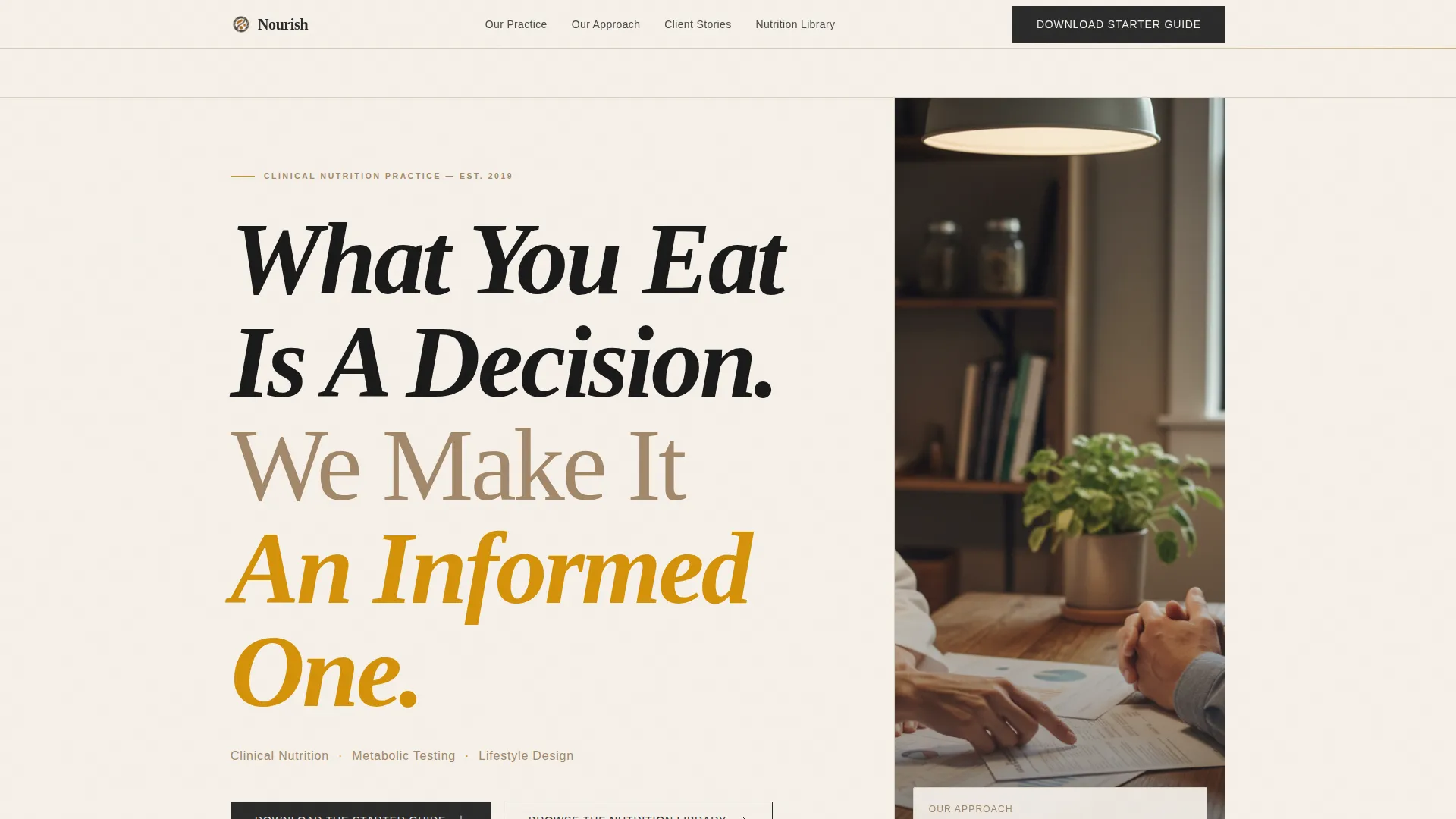
The header fills the viewport with a single bold serif statement. No image competes with the typography. A single-line subhead beneath it introduces the three practice pillars in a spaced, masthead-style layout.
Editorial Practitioner Profile Spreads
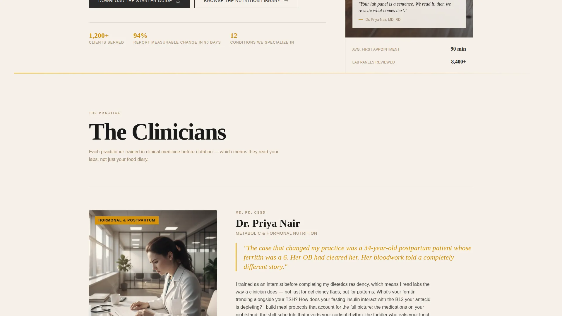
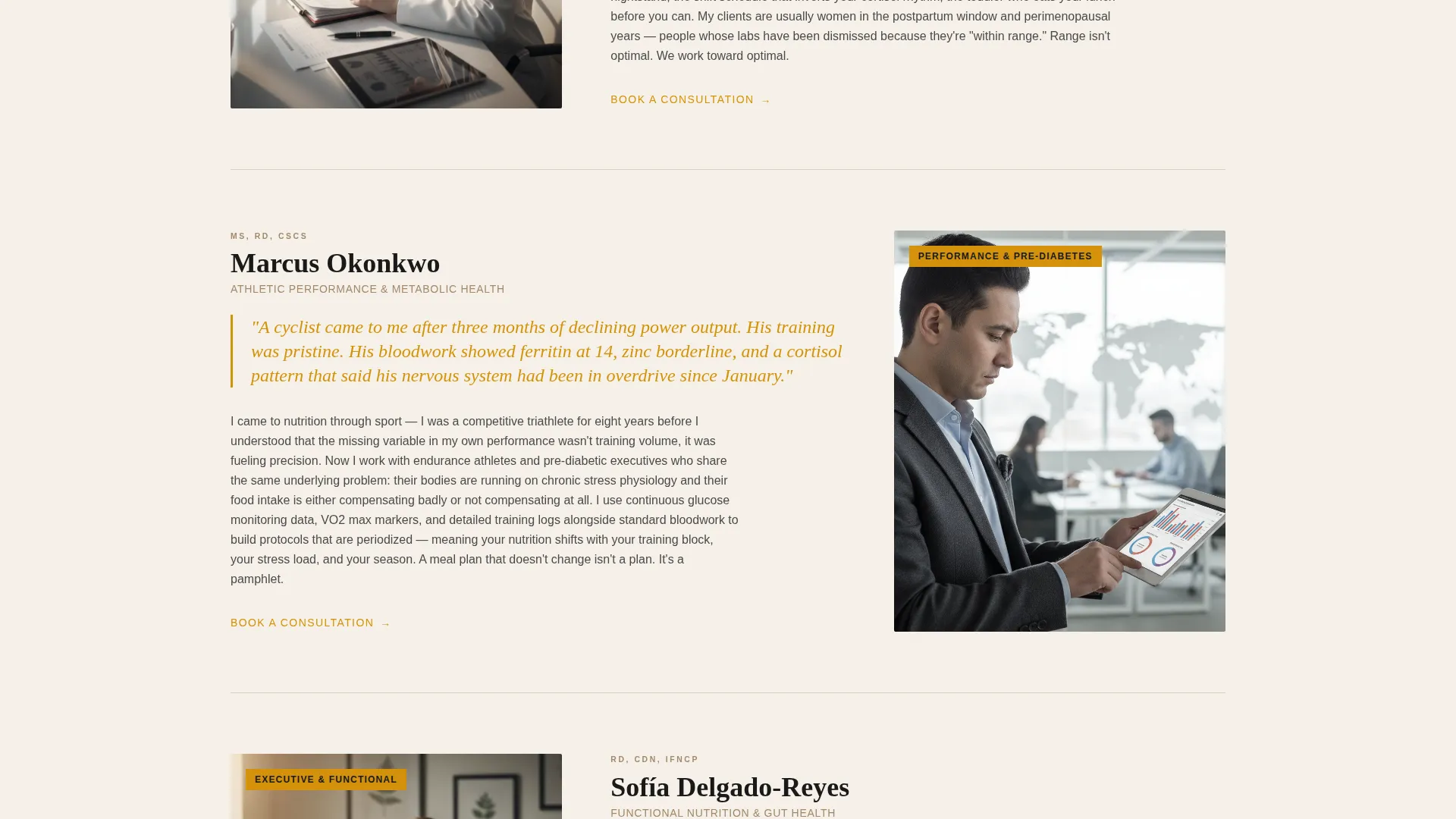
Each nutritionist is presented as a full editorial spread rather than a headshot grid. The layout includes a portrait taken mid-consultation, a clinical specialty pull-quote in amber, and a short first-person paragraph about a formative case.
Structured Comparison Table
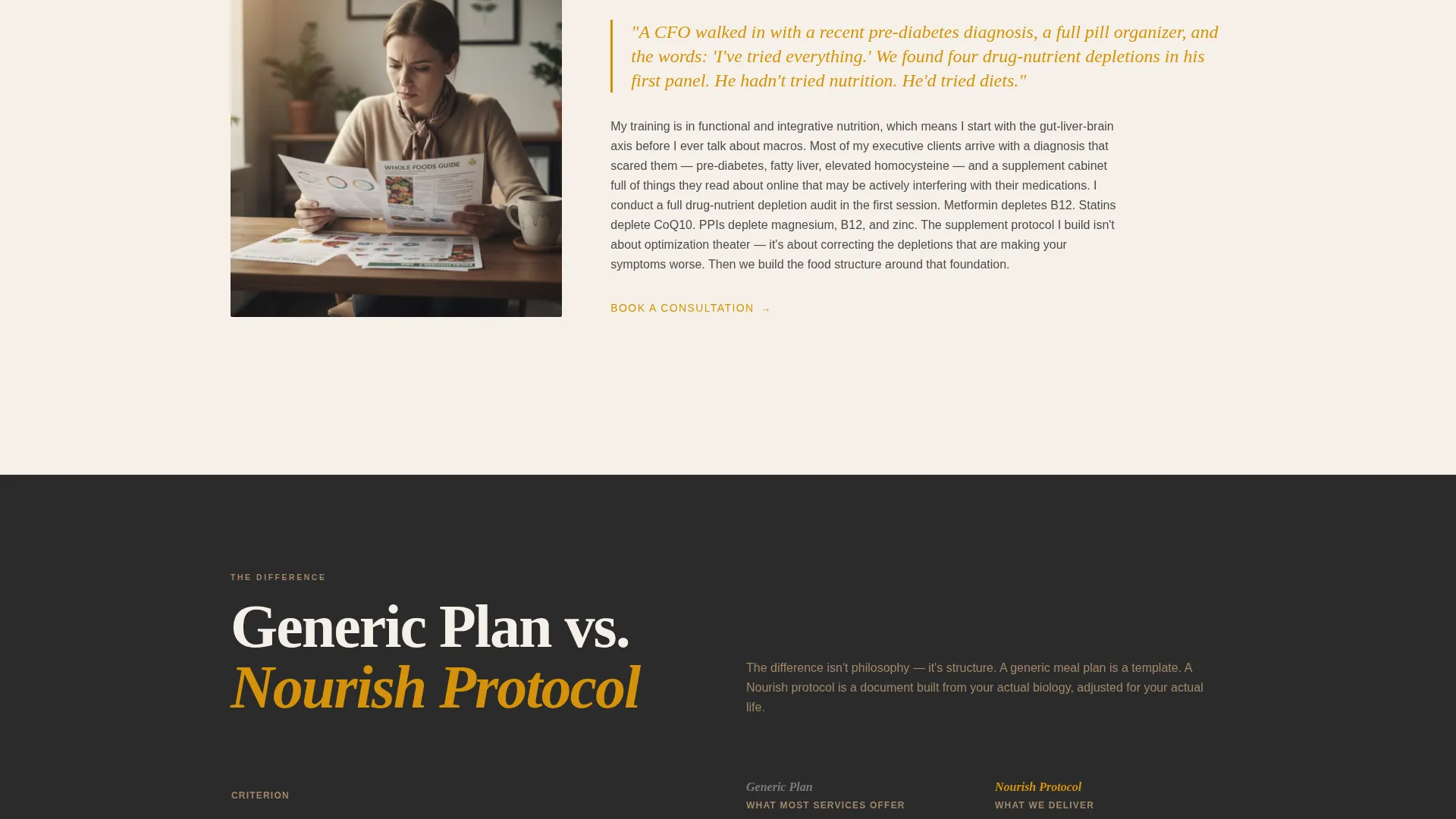
A dedicated comparison table sits between practitioner profiles. It contrasts generic meal plans against the practice's personalized protocols using specific columns such as "accounts for medications," "adjusts for cycle phase," and "includes grocery budget."
Gated Starter Guide Download
The primary call to action offers a free 12-page PDF guide on reading your own bloodwork. It is gated behind an email field and a single dropdown asking visitors what brought them to the page, with options including hormonal changes, athletic performance, and recent diagnosis.
Secondary Ungated Content Path
A secondary call to action invites visitors to browse the Nutrition Library. This links to ungated articles, giving hesitant visitors a trust-building step before they commit to sharing their email.
Pull-Quote and Data Highlight System
Amber-colored pull-quotes and highlighted data points are used throughout the page to surface key clinical claims and practitioner insights. This keeps readers engaged as they scroll through longer editorial sections.
Page sections overview
| Section | Purpose |
|---|---|
| Headline Header | Opens with bold serif statement and three-pillar subhead |
| Practitioner Profile Spread | Introduces each nutritionist with portrait, specialty, and case story |
| Comparison Table | Contrasts generic plans with personalized protocols side by side |
| Starter Guide Download | Captures leads via email and segmentation dropdown |
| Nutrition Library Link | Offers ungated articles as a secondary trust-building path |
Design & branding system
The visual identity is built around an editorial magazine aesthetic. It feels like a thoughtfully printed cookbook written by someone with a clinical background, serious and credible but warm enough to linger over.
- Color palette: deep editorial charcoal (#2B2B2B) for body text, warm parchment (#F5F0E8) as the primary background, liquid amber (#D4920B) for pull-quotes and data highlights, and muted clay (#A3886A) for secondary interface elements
- Typography: large-weight serif fonts dominate headlines and pull-quotes, giving the page a carved, authoritative feel that print-quality editorial layouts are known for
Mobile & speed optimization
The template is structured to remain readable and well-proportioned on smaller screens. The editorial layout adapts so that the comparison table and profile spreads stay clear and functional on mobile devices.
- Comparison table columns are designed to reflow cleanly so visitors on phones can still read protocol differences without horizontal scrolling
- The headline typography scales down proportionally, preserving the confident visual impact without overflowing viewport widths
How this template helps you convert
The page is designed as a content and resource destination. It builds enough trust through editorial depth that visitors feel informed before they are asked for anything.
- The comparison table makes the value of personalized protocols immediately obvious through structure, removing the need for persuasive copy to do all the heavy lifting
- The gated starter guide with a segmentation dropdown gives the practice a qualified lead and a clear signal of what each new subscriber needs, right from the first interaction
Other information about this template
This template fits naturally within the professional services category, specifically for nutritionist online presence use cases. It is built as a single landing page, not a multi-page site, so all content lives in one structured scroll.
- The template style draws from a sidebar companion and expert panel creative direction, meaning the practitioner profiles and comparison content work together as a unified editorial system
- The design theme is service utility, keeping the page functional and information-rich rather than decorative
- This layout supports a content and resource destination strategy, where the page earns trust before making a conversion ask
- The header concept is a giant headline approach, which means typography carries the first impression rather than hero imagery
Theme
Service Utility
Creative direction
Expert Panel
Color system
Charcoal & Amber
Style
Sidebar Companion
Direction
Partnership/B2B
Page Sections
Giant Centered Serif Headline Header
Editorial Practitioner Profile Spreads
Structured Protocol Comparison Table
Gated Starter Guide Download Form
Secondary Ungated Content Path
Amber Pull-quote and Data Highlight System
Related questions
Can I use this template if I am a solo nutritionist rather than a team practice?
What is the 12-page starter guide included in the template?
Can I change the comparison table columns to reflect my own services?
Who is the target audience this template is designed to speak to?
Does the Nutrition Library link connect to a built-in blog on the page?



