Advanced Dietitian Appointment Booking Website Template
Nourish is a split-screen landing page template built for evidence-based dietitians who serve real patients with real conditions. It uses a case study narrative structure to build trust through relatable client stories, a warm Ink & Paper visual identity, and two clear calls to action that move visitors toward booking an intake appointment.
by Rocket studio
Quick summary
Nourish is a single-page, split-screen template designed for dietitians offering location-specific nutrition counseling. It pairs warm editorial photography with patient case stories, educational margin-note asides, and a conversion flow built around two calls to action. The design feels like a well-read textbook, not a clinical brochure.
Who this template is for
This template is built for registered dietitians and nutrition counselors who work with medically complex or life-stage-specific patients. It suits practitioners who want their online presence to reflect clinical depth, not generic wellness messaging.
- Dietitians treating postpartum mothers, newly diagnosed Type 2 diabetics, or post-surgical patients
- Solo practitioners or small practices building a location-specific service page
- Nutrition counselors whose work is grounded in lab results, medical histories, and real meal planning
What problem this template solves
Most dietitian websites look and feel identical. They rely on stock photography, vague promises, and a single "Book Now" button that asks for trust the page has not yet earned. Patients with real medical concerns need more before they commit.
- Visitors cannot see themselves in generic wellness copy and leave without acting
- Practitioners have no clear way to demonstrate clinical thinking through their website layout
- There is no structured path for visitors who are interested but not yet ready to book
What you get with this template
This template gives you a complete, section-led landing page that builds credibility through narrative before asking for a click. Every section has a specific job, and the layout keeps visitors reading from the header all the way to the intake call to action.
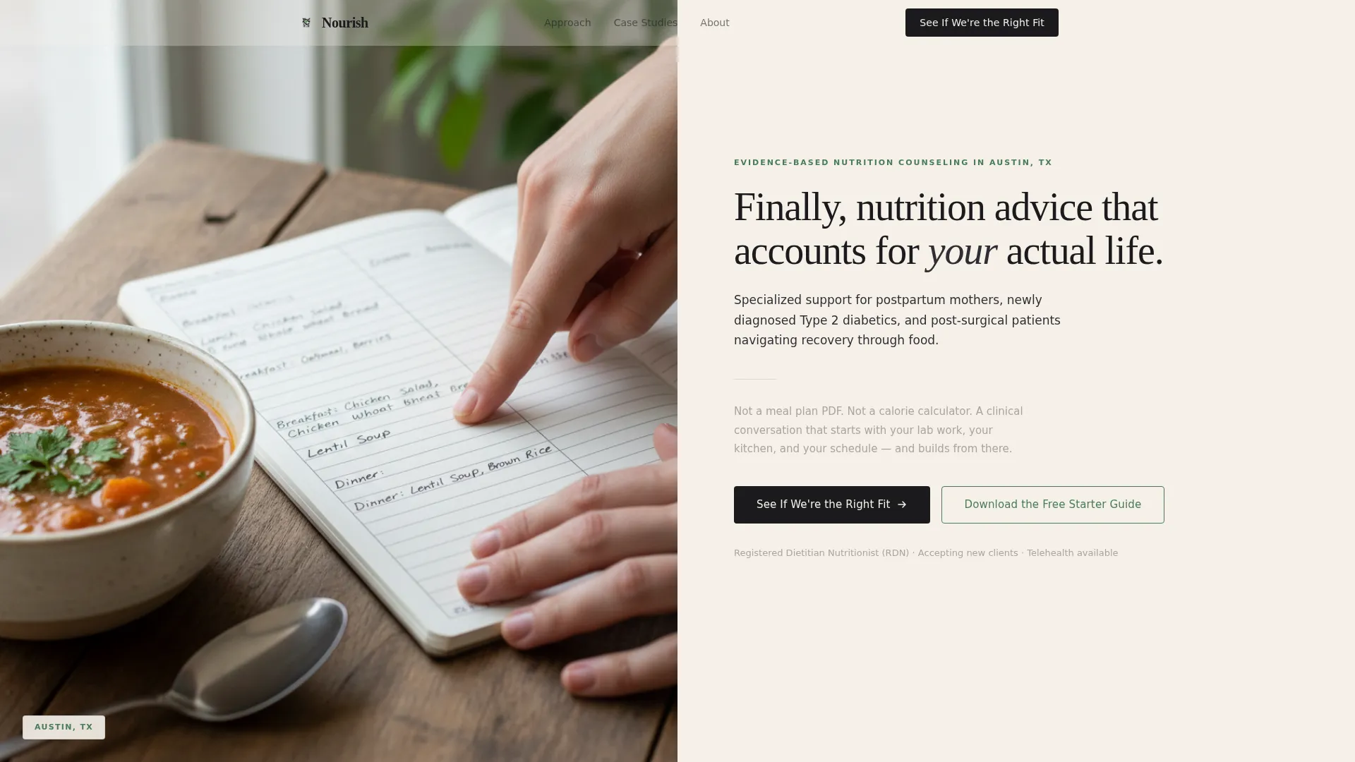
- A half-page photo and text header with a location-specific headline and condition-focused subheading
- Five scrollable case study sections, each with a diagnostic left panel and an outcome right panel
- Two primary calls to action and one email-capture secondary call to action
Feature list
This template is built around a deliberate content architecture. Each feature serves the goal of turning a curious visitor into a confident patient.
Split-Screen Case Study Layout
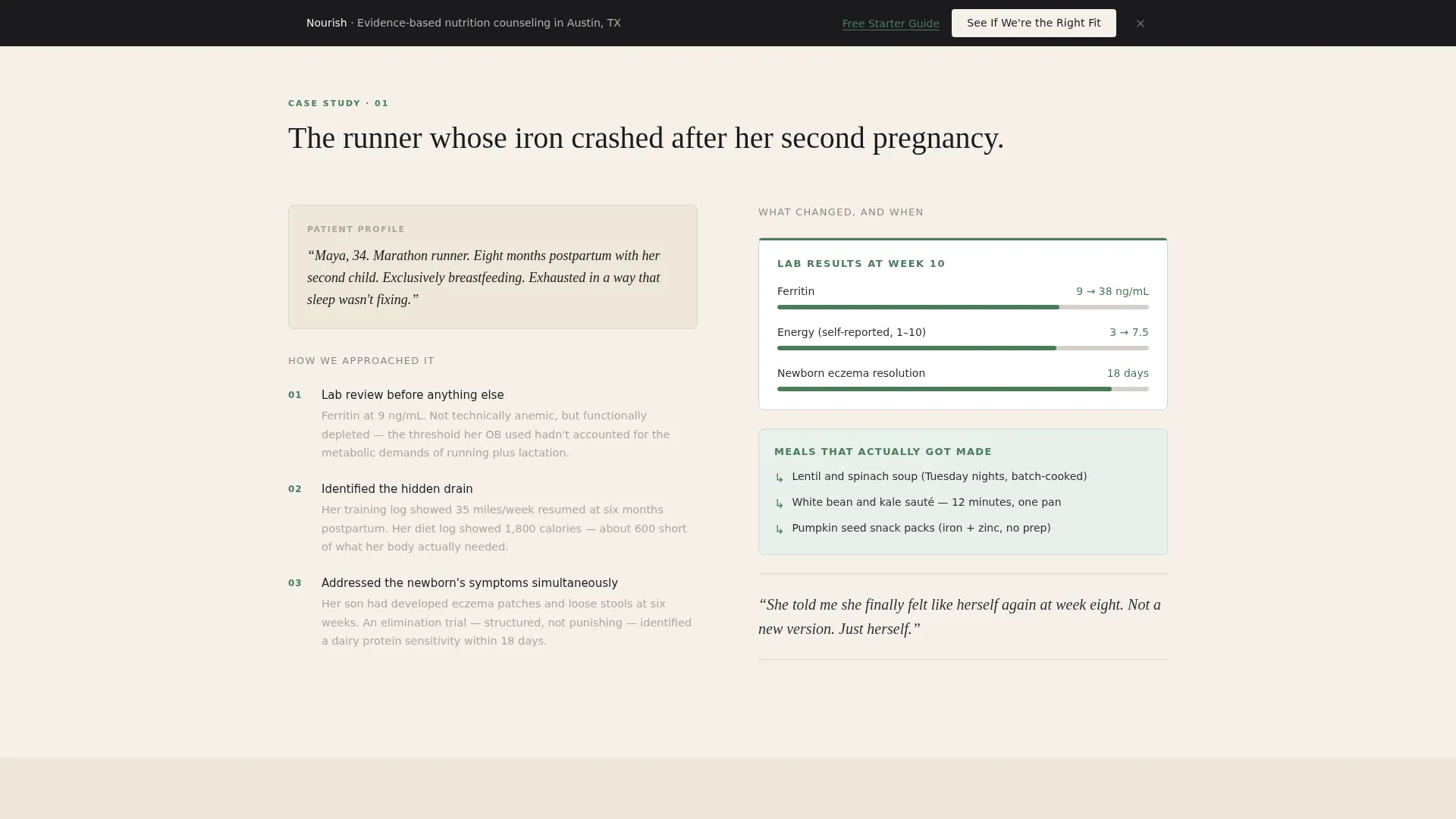
Each case study section uses a 50/50 split layout. The left panel walks through the diagnostic process for a specific patient archetype. The right panel reveals measurable outcomes: lab numbers, meals that got made, and how many weeks it took to feel different.
Location-Specific Hero Header
The header combines a warm, naturally lit photograph on the left with a serif headline on the right. The headline is structured for a specific city and names the three most common conditions treated. This immediately signals relevance to local visitors searching for specialized care.
Educational Margin-Note Asides
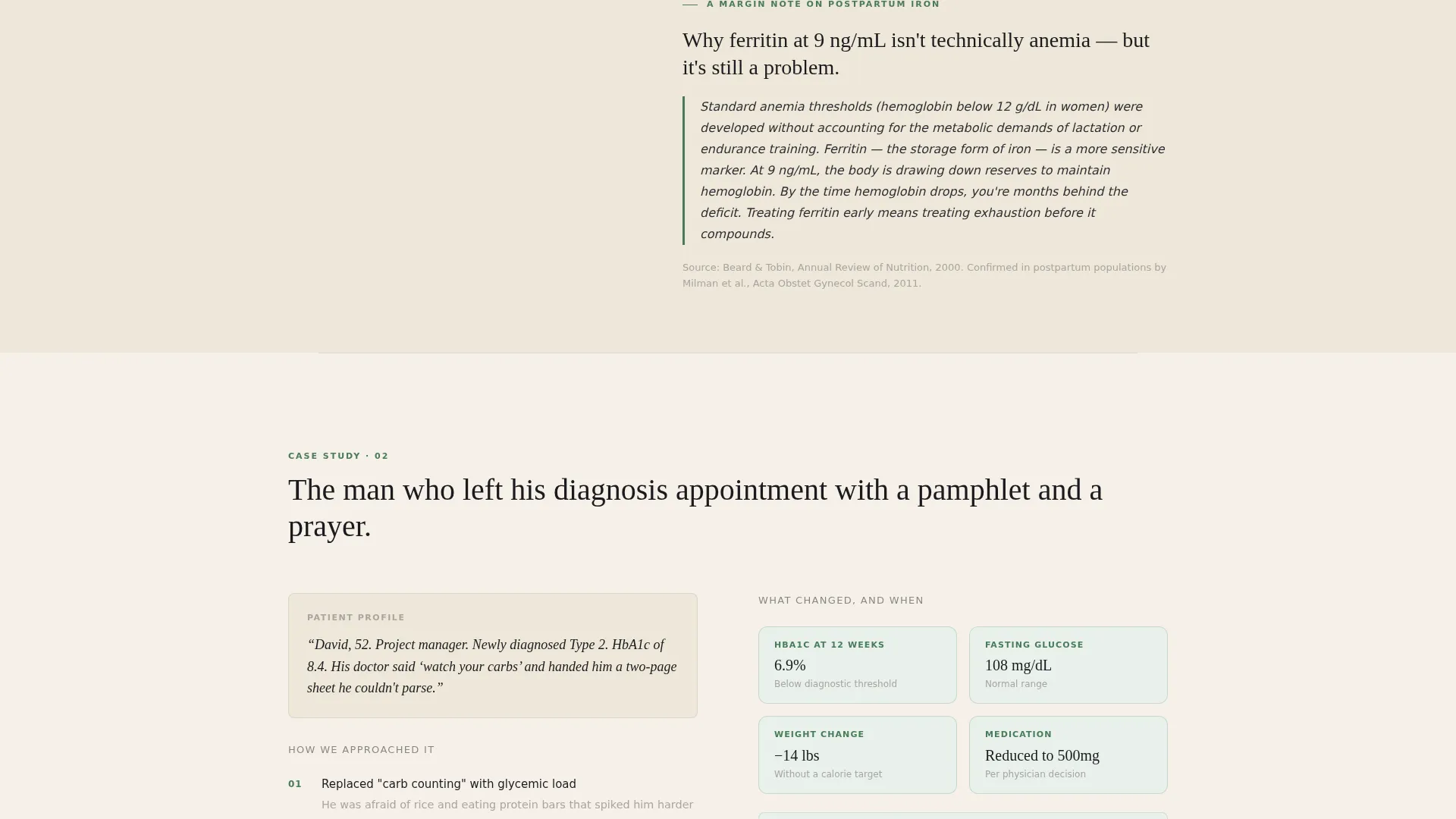
Between case study sections, short plain-language science explanations appear styled as textbook margin notes. These asides give visitors enough clinical context to understand why the approach works without overwhelming them with jargon.
Dual Call-to-Action Conversion Flow
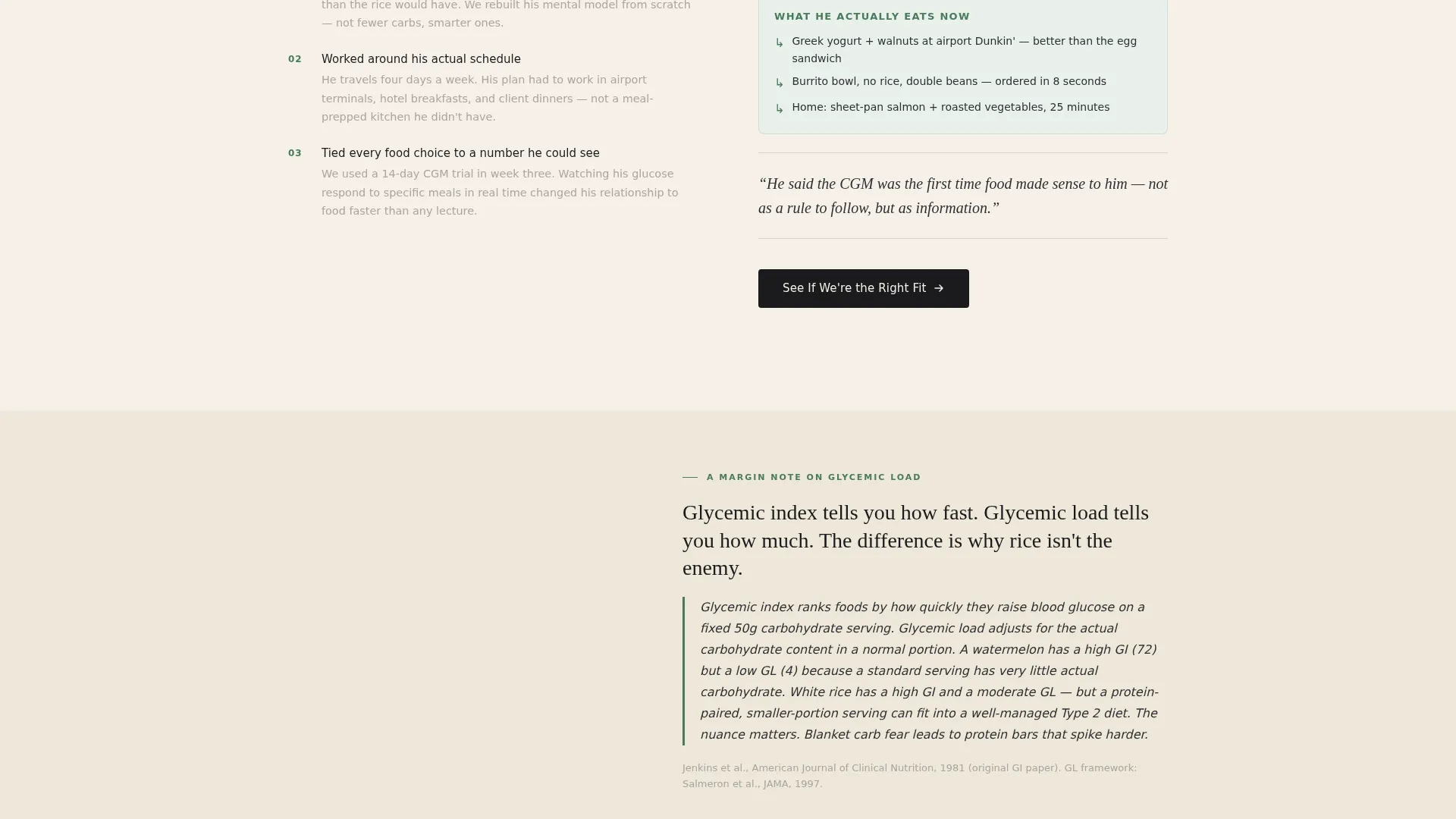
The primary call to action, "See If We're the Right Fit," appears after the second and final case studies. It links to a detailed intake questionnaire. The secondary call to action, "Download the Free Starter Guide," captures emails from visitors who are not yet ready to commit.
Ink & Paper Visual Identity System
The color palette uses deep manuscript black, warm parchment, marginalia gray, and annotation green. These four values are applied consistently across headlines, body text, dividers, and interactive elements. The result feels authoritative and approachable at the same time.
Serif-Led Editorial Typography
Headlines are set in a serif typeface styled like a chapter title in a reference book. This typographic choice reinforces the Educational Guide theme and signals that the content is substantive, not superficial.
Page sections overview
| Section | Purpose |
|---|---|
| Hero Header | Introduces location, conditions treated, and the dietitian's human presence |
| Case Study One | Presents the first patient archetype with diagnostic process and outcome |
| Educational Aside One | Explains the science behind case one in plain, margin-note language |
| Case Study Two | Presents the second patient archetype; primary call to action appears after this section |
| Educational Aside Two | Provides a second plain-language science note between case studies |
| Case Study Three | Adds a third patient story to establish a pattern of results |
| Educational Aside Three | Continues the margin-note science series for context |
| Case Study Four | Deepens cumulative proof with a fourth patient archetype |
| Case Study Five | Completes the five-case sequence; final primary call to action follows |
| Email Capture Section | Offers the free starter guide to visitors not ready to book |
Design & branding system
The visual identity follows an Educational Guide theme built entirely on the Ink & Paper color system. Every design decision reinforces the feeling of a trusted, well-used nutrition reference rather than a polished commercial website.
- Deep manuscript black (#1B1B1E) for headlines and body text; warm parchment (#F5F0E8) as the dominant background
- Marginalia gray (#A9A4A0) for dividers and secondary labels; annotation green (#4A7C59) for links, highlights, and interactive cues
- Serif typography for headlines paired with clear body type, styled to evoke a chapter title in a clinical reference book
Mobile & speed optimization
The template is structured so that the split-screen layout adapts cleanly for smaller screens. The narrative scroll remains readable and the calls to action stay prominent regardless of device size.
- The 50/50 split panels reflow into a single-column stack on mobile without losing the case study structure
- Photography and text blocks are sized to display clearly on both desktop and phone screens
- Calls to action remain visible and accessible throughout the scroll on all screen sizes
How this template helps you convert
The conversion strategy is built into the content architecture itself. Visitors are not asked to trust the practice until the page has given them genuine reasons to do so.
- Five sequential case studies build cumulative proof, moving the visitor from skepticism to recognition as they see their own situation reflected in a real patient story.
- The primary call to action, "See If We're the Right Fit," is placed only after the second and final case studies, so it arrives when trust is already established rather than demanded upfront.
Other information about this template
This template is a strong fit for dietitians building or refreshing a service area page that needs to rank and convert locally. The content structure supports both new practice launches and established practitioners replacing a generic website with something more clinically specific.
- The intake questionnaire link and email capture form are placeholder-ready and can be pointed to any booking or form tool the practitioner uses
- The five case study slots are designed to be filled with anonymized but specific real patient stories; generic placeholder stories are included as structural guides
- The template is built as a single landing page, not a multi-page site, making it straightforward to publish and maintain
- City and condition names in the hero header are fully editable, making the template reusable for practitioners serving multiple locations
Theme
Educational Guide
Creative direction
Case Study Narrative
Color system
Ink & Paper
Style
Split Screen (50/50)
Direction
Click-Through
Page Sections
Split-screen Case Study Layout
Location-specific Hero Header
Educational Margin-note Asides
Dual Call-to-action Flow
Ink & Paper Color System
Serif-led Editorial Typography
Related questions
Can I customize the patient case studies with my own client stories?
Does this template include the intake questionnaire or email capture form?
Is this template suitable for a dietitian just starting their practice?
Can I adapt this template for more than one city or service area?
What kind of photography works best in the hero header?



