Evidence-Based Health Coach Landing Page Template
Nourish is an editorial-style health coach landing page built around a transparent, evidence-based methodology. It features a dark full-bleed header, a three-tier comparison table, and an inline lead capture form offering a free Readiness Guide PDF. The layout guides burned-out professionals and postpartum mothers from first impression to booked discovery call through calm, authoritative design.
by Rocket studio
Quick summary
Nourish is a single-page health coach booking template designed for practitioners whose work is grounded in data, not diet trends. It presents a three-tier coaching comparison table, an editorial scroll experience, and a primary call to action built around a free downloadable Readiness Guide. The page earns trust before it asks for anything.
Who this template is for
This template is built for health coaches who lead with science and need a page that communicates depth and credibility instantly. It suits practitioners working with clients whose health needs are specific, not generic.
- Evidence-based health coaches offering structured, assessment-led programs
- Coaches serving high-achieving professionals, postpartum mothers, or pre-diabetic clients
- Solo practitioners who want a refined, editorial presence without a full website build
What problem this template solves
Most health coach pages either look like generic wellness blogs or aggressive sales funnels. Neither builds the kind of trust that converts a skeptical, burned-out professional into a paying client. This template solves the credibility gap.
- Visitors leave other pages unsure of what the coaching process actually involves
- Prospects cannot compare tiers or understand what they are paying for at each level
- Generic pages fail to speak to clients who have already tried the standard advice
What you get with this template
You get a complete, scroll-driven landing page with every structural component pre-built and ready to customize. The layout is editorial in character and practical in function.
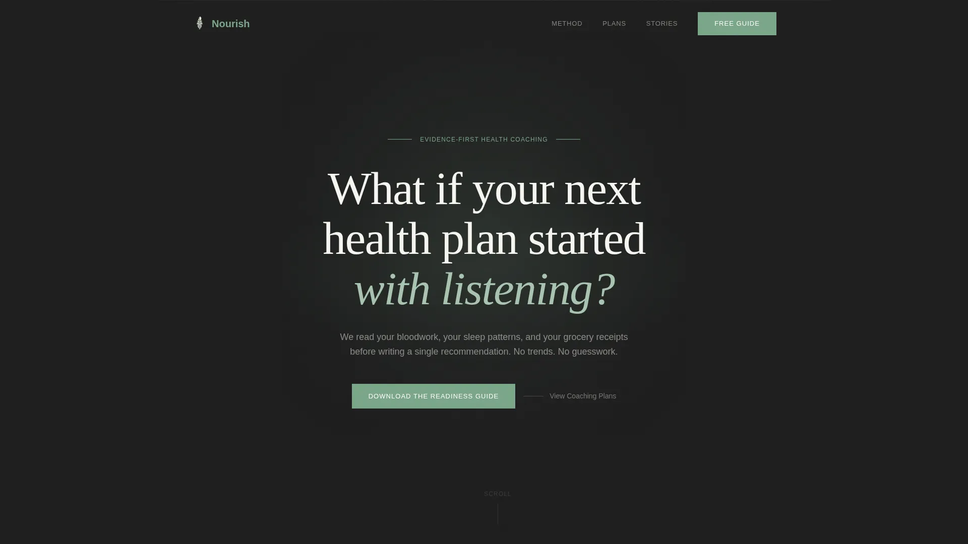
- A dark full-bleed header section with a centered serif headline and a soft eucalyptus glow
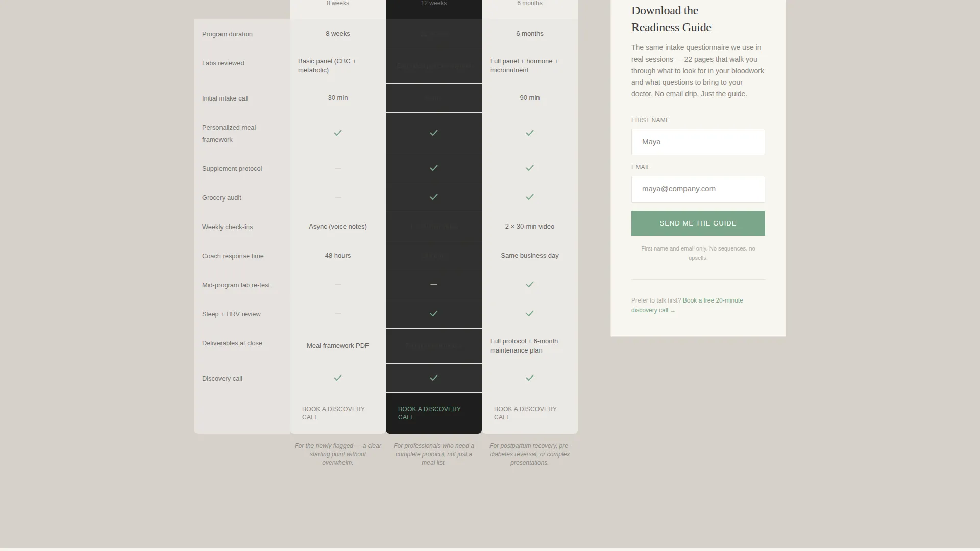
- A three-column coaching comparison table showing weekly activities, assessments, check-ins, and deliverables per tier
- An inline lead capture form for the Readiness Guide PDF, positioned beside the comparison table
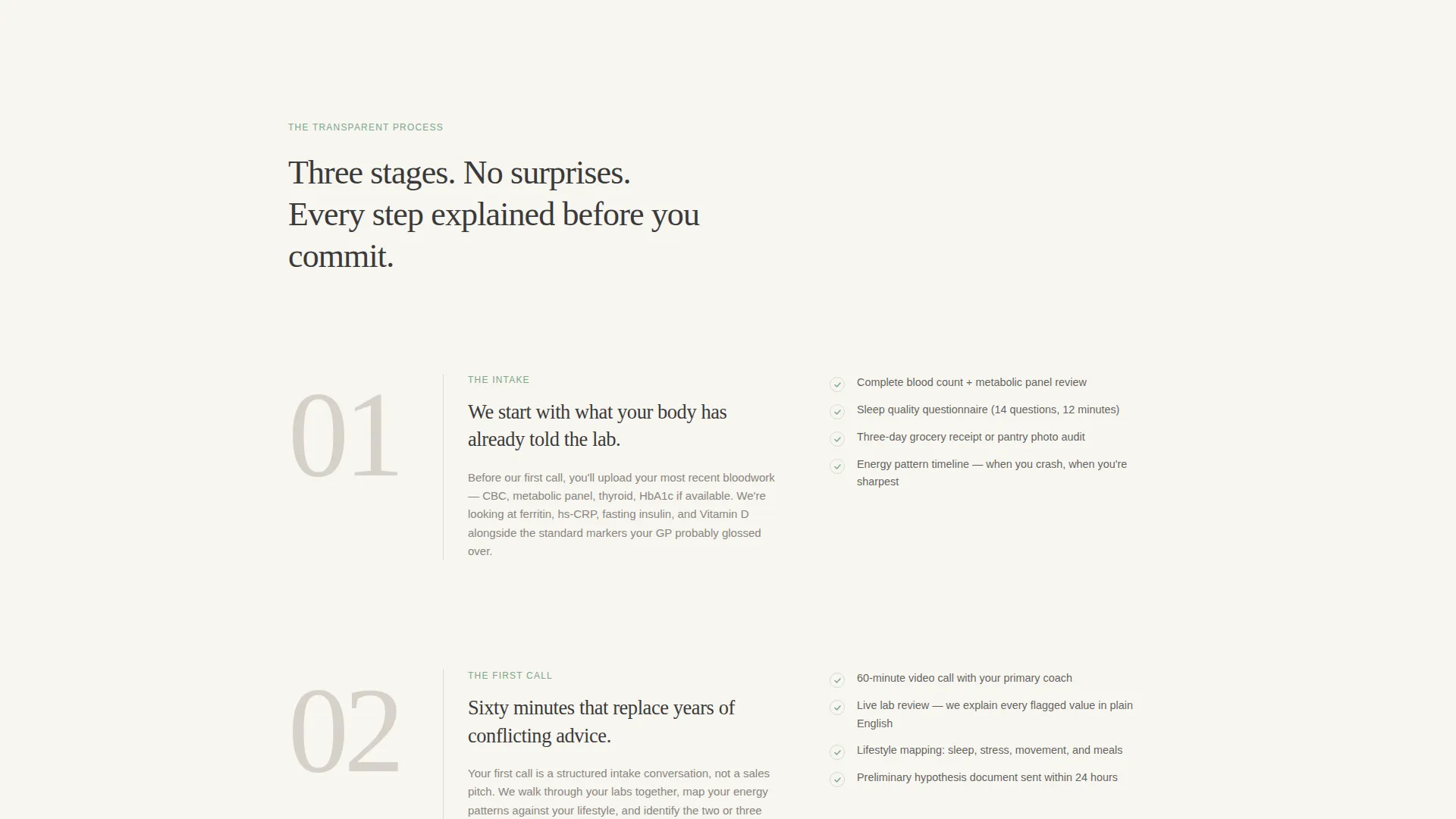
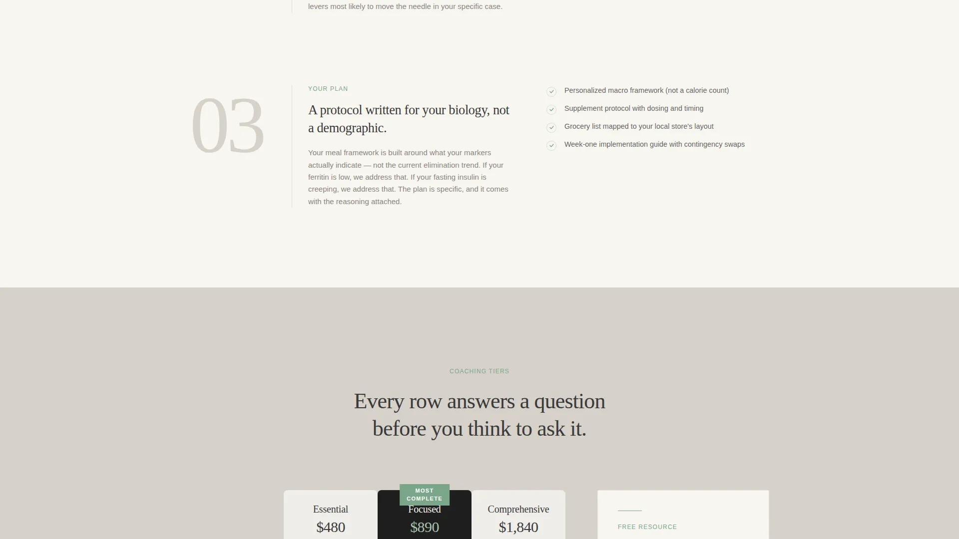
- Numbered editorial spread sections that reveal the intake methodology layer by layer
- Secondary "Book a Discovery Call" call-to-action buttons beneath each plan column linking to a calendar embed
Feature list
This template packs every component a health coach needs to present a credible, conversion-ready offer in a single, scrollable page.
Dark Full-Bleed Editorial Header
The header fills the full viewport in deep charcoal with a radial eucalyptus green glow behind a large serif headline. The effect is quiet and biological, like light through a leaf. No photography is needed.
Three-Tier Coaching Comparison Table
The comparison table lays three coaching tiers side by side. Each column shows exactly what happens each week, which assessments are included, how many check-ins occur, and what deliverables the client receives. It answers buyer questions before they form.
Inline Readiness Guide Lead Capture
A lightweight inline form sits beside the comparison table. It collects first name and email only, then delivers the free Readiness Guide PDF. The placement lets visitors reference tier details while deciding whether to download.
Numbered Intake Methodology Spreads
Scrolling through the page feels like reading a long-form feature article. Each numbered section peels back one layer of the coaching process, covering lab reviews, intake questionnaires, and what a first call covers.
Per-Column Discovery Call calls to action
Each tier column carries its own "Book a Discovery Call" button. These link to a calendar embed so interested visitors can move from comparison to booking in a single scroll.
Cloud Canvas Color System
The page uses a restrained four-color palette: soft warm white, muted charcoal, pale dove gray, and eucalyptus green. Backgrounds alternate between warm white and dove gray to create editorial rhythm without visual noise.
Page sections overview
| Section | Purpose |
|---|---|
| Dark Header Frame | Establishes tone and presents the primary headline with a soft eucalyptus glow |
| Intake Process Spreads | Reveals the coaching methodology through numbered editorial sections |
| Comparison Table | Lets visitors evaluate three coaching tiers side by side with full detail |
| Inline Lead Capture | Collects first name and email in exchange for the free Readiness Guide PDF |
| Discovery Call calls to action | Provides a direct booking path beneath each tier column via calendar embed |
Design & branding system
The visual identity follows an Editorial Magazine theme using the Cloud Canvas color system. Every design decision prioritizes restraint, weight, and typographic clarity over decoration.
- Palette: warm white (#F7F5F0), muted charcoal (#3A3A3A), pale dove gray (#D6D1CA), and eucalyptus green (#7BA68A) for buttons and highlighted plan features
- Typography: large editorial serif for headlines, clean body type for readability, with section rhythm created through alternating warm white and dove gray backgrounds
- No photographs or illustrations; visual interest comes entirely from type, light, and color proportion
Mobile & speed optimization
The template is structured to remain readable and functional on smaller screens, keeping the editorial rhythm intact across devices.
- Single-column stacking ensures the comparison table and lead capture form remain usable on mobile viewports
- Minimal decorative assets mean the page loads without heavy image dependencies
- The alternating section backgrounds and typographic hierarchy guide mobile readers through the scroll naturally
How this template helps you convert
The entire page is sequenced to move a skeptical visitor toward action through transparency rather than pressure. Every layout decision serves the conversion path.
- The Readiness Guide lead magnet does the selling passively: by the time a visitor finishes the PDF, they have already started the real intake process, making the decision to book feel like a natural next step.
- The comparison table removes pricing ambiguity by showing exactly what each tier delivers, which reduces hesitation and shortens the decision cycle for detail-oriented clients.
- The "Book a Discovery Call" button under each tier column gives visitors a clear, low-commitment action at the moment they feel most informed.
Other information about this template
This template is well suited for health coaches who want a professional online presence in the health coach booking page space without building a multi-page site. It is designed as a focused, single-page experience.
- The template fits the Professional Services category and is built specifically for the health coach online presence subcategory
- The Transparent Process creative direction makes it equally effective for nutritionists, functional medicine practitioners, and registered dietitians with structured coaching programs
- The free Readiness Guide PDF concept is built into the page layout; coaches supply their own PDF content to personalize the lead magnet
- The calendar embed placeholder supports any booking tool a coach already uses, without requiring a specific platform
Theme
Editorial Magazine
Creative direction
Transparent Process
Color system
Cloud Canvas
Style
Comparison Table
Direction
Content/Resource
Page Sections
Dark Full-bleed Editorial Header
Three-tier Coaching Comparison Table
Inline Readiness Guide Lead Capture
Numbered Intake Methodology Spreads
Per-column Discovery Call Buttons
Cloud Canvas Color System
Related questions
Do I need to provide my own Readiness Guide PDF?
Can I change the three coaching tiers to match my own program structure?
Is this template suitable for a coach who does not review lab work?
How does the Book a Discovery Call button work?
What makes this layout different from a standard pricing page?



