PTSD Nutrition Program Landing Page Template
Nourish is a sidebar companion landing page template built for a 12-week trauma-informed nutrition program. It pairs a soft editorial visual identity with a Problem-to-Solution scroll arc, a low-friction booking form, and a secondary email-capture path. The design speaks directly to veterans, first responders, and trauma survivors navigating food and nervous system challenges.
by Rocket studio
Quick summary
Nourish is a single-page template designed for a trauma-informed PTSD nutrition program. It uses a sidebar companion layout, a warm Cloud Canvas color system, and a deliberate Problem-to-Solution Arc to guide visitors from recognizing their struggle to booking a free discovery call. Every design decision prioritizes calm over clinical.
Who this template is for
This template serves practitioners and program creators who work at the intersection of trauma recovery and nutritional wellness. It is built for voices that need to earn trust before asking for a commitment.
- Nutritionists and dietitians running trauma-informed eating programs for veterans or first responders
- Wellness coaches and therapists offering structured food-as-medicine programs to trauma survivors
- Mental health clinicians seeking a referral-ready resource page for clients with stress-driven disordered eating
What problem this template solves
Most nutrition landing pages lead with meal plans and transformation promises. That approach actively alienates people whose nervous systems associate food with threat. This template solves the trust gap before the pitch ever appears.
- Visitors with trauma histories need to feel seen before they will scroll past a hero section
- The cortisol-sugar cycle, sensory overload in grocery aisles, and 2 a.m. fridge raids need to be named plainly, not prettified
- A standard booking form with lengthy intake questions creates friction for an audience that has already filled out too many clinical forms
What you get with this template
You get a complete, section-led landing page built around a sidebar companion layout. The main content column and the persistent sidebar work together to carry both emotional narrative and practical program information at the same time.
- A five-section page structure covering the hero, problem arc, science bridge, program structure, and client voices
- A lightweight three-field booking form and a secondary email-capture path for a downloadable meal plan
- A stacked typographic hero, scroll-fade section transitions, and a sticky sidebar call-to-action that travels with the visitor
Feature list
This template ships with a focused set of components. Each one is chosen to match the emotional register and conversion goals of a trauma-informed nutrition program.
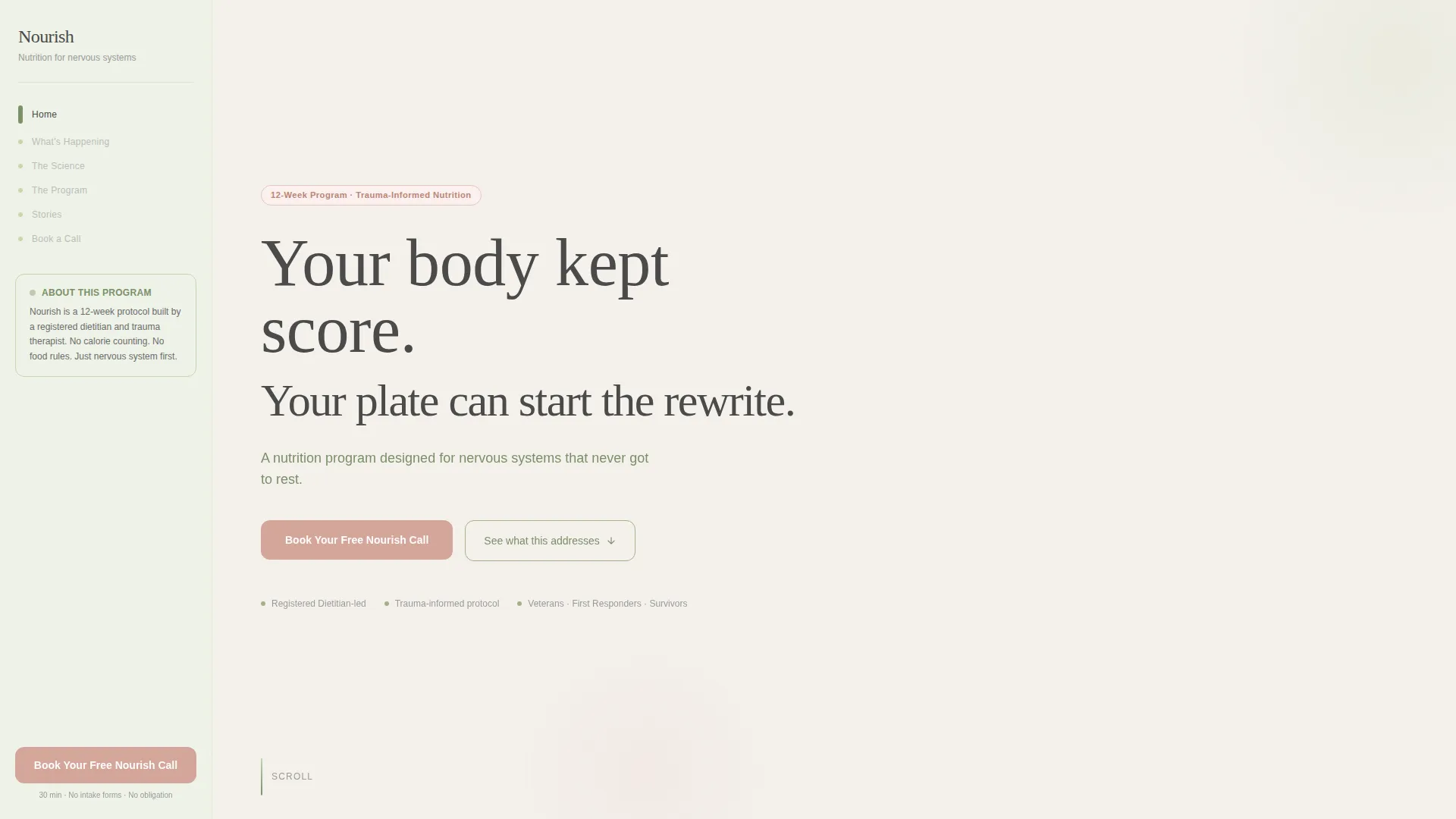
Stacked Type Tower Hero
The hero uses no image. Three lines of typography build downward like a slow exhale. Display serif text carries the headline while smaller accent lines in sage hold the supporting copy. The hierarchy earns attention without demanding it.
Sidebar Companion Layout
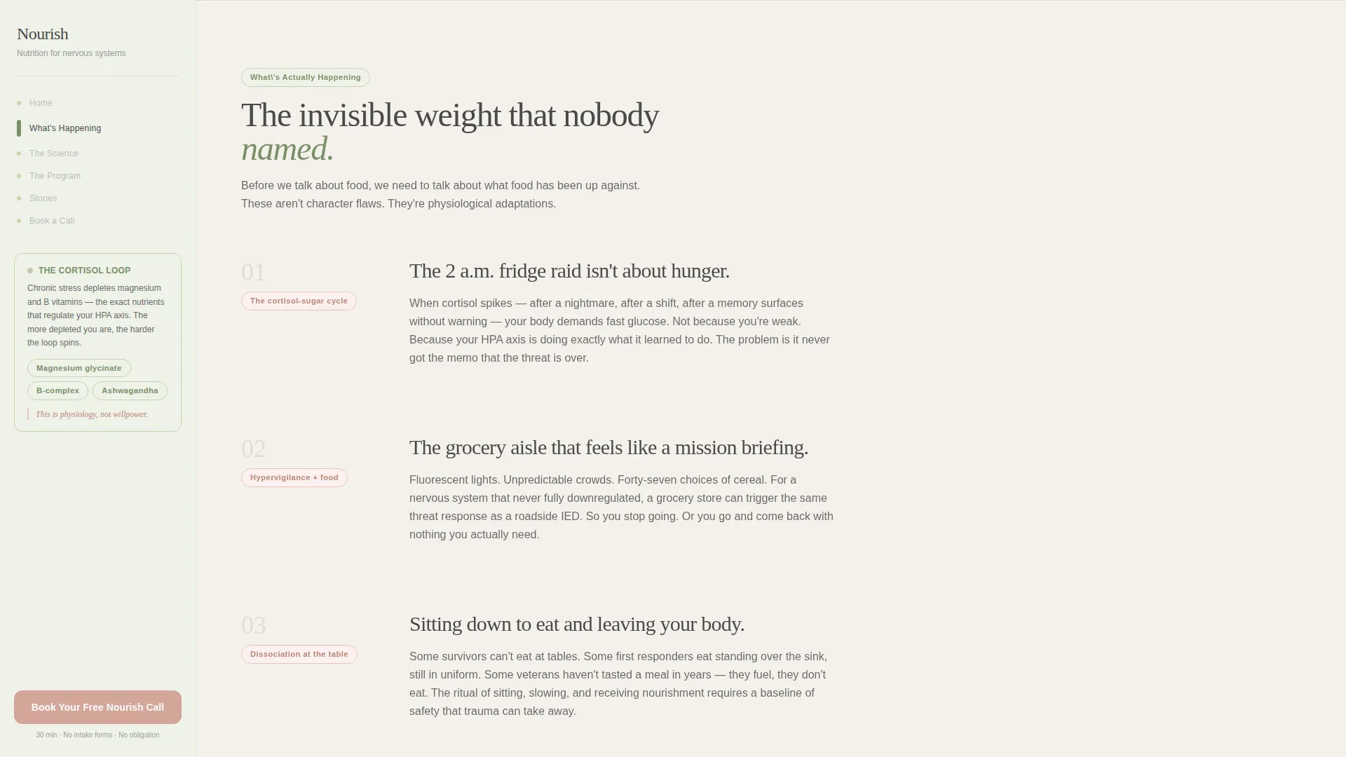
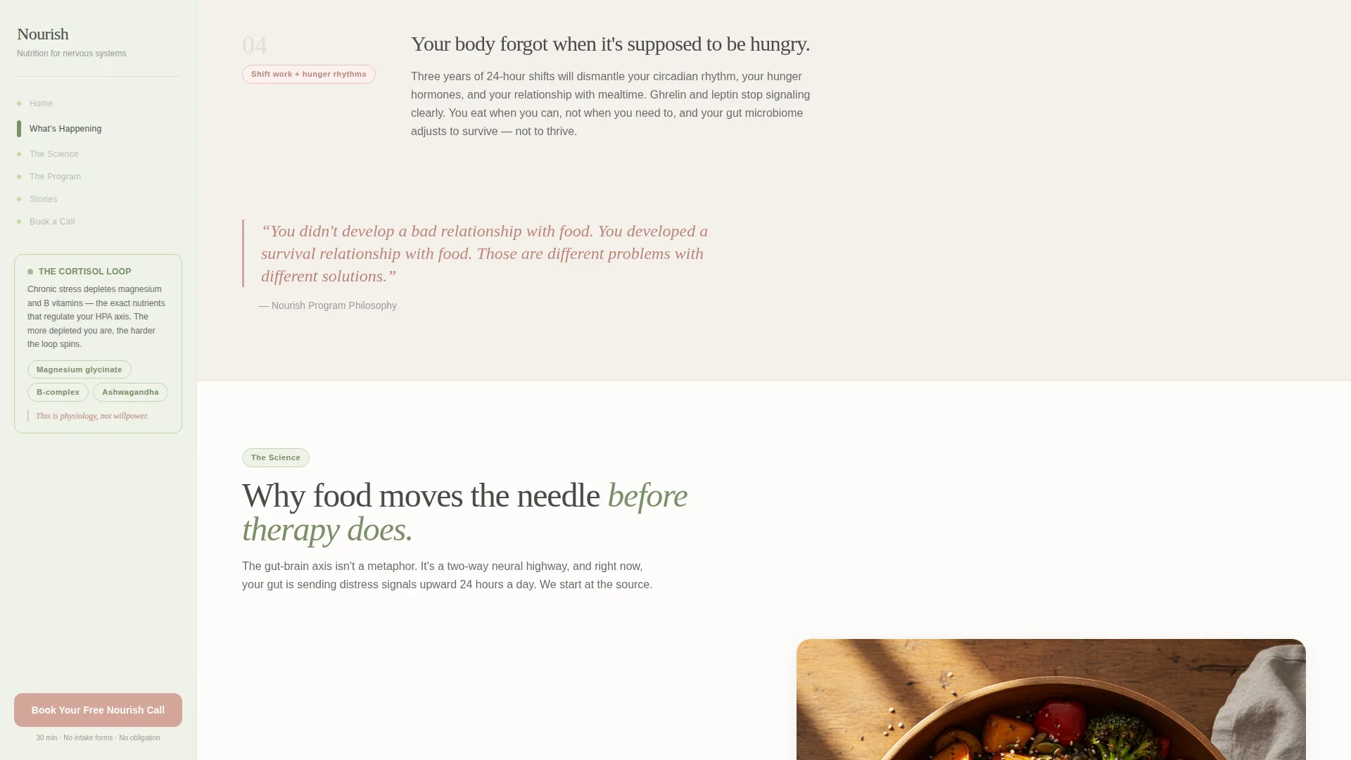
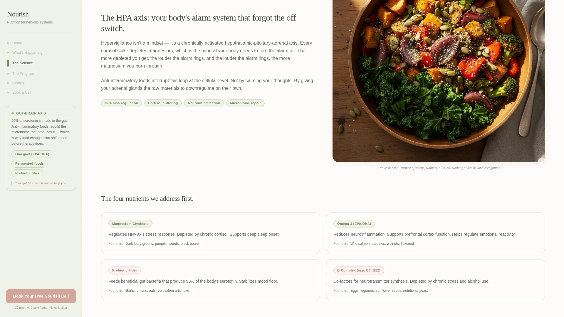
A persistent vertical sidebar runs alongside the main content column. It carries science micro-annotations, nutrient callouts, weekly plan previews, and a fixed booking call-to-action that stays visible as the visitor scrolls through the problem arc.
Problem-to-Solution Scroll Arc
Sections are sequenced to name invisible struggles first and then shift tone as the visitor moves forward. Early sections address the cortisol-sugar cycle and sensory overload. Later sections introduce the 12-week structure, meal imagery, and week-by-week outcome specifics.
Low-Friction Booking Form
The booking form asks three things only: first name, preferred day of week via dropdown, and one optional open-text field. No medical history, no intake questionnaire. The form is designed for an audience that finds clinical paperwork a barrier to care.
Secondary Email Capture Path
A downloadable "3-Day Calm Plate" meal plan is offered inline or via modal for visitors who are not yet ready to speak with a human. The email exchange gives the program a second conversion path without adding pressure to the primary booking flow.
Client Voice Notes Section
Transcribed client voice notes appear in italic type with an intimate, first-person tone. Specific outcome markers such as "By week four" give social proof a concrete timeline rather than vague testimonial language.
Page sections overview
| Section | Purpose |
|---|---|
| Hero type tower | Opens with stacked serif headlines and a sidebar call-to-action |
| Problem arc | Names cortisol cycles, sensory overload, and trauma eating patterns |
| Science bridge | Explains gut-brain axis with nutrient callouts and download offer |
| Program structure | Presents 12-week arc with meal imagery and weekly previews |
| Client voices | Shares italic voice notes and primary booking call-to-action |
Design & branding system
The visual identity follows an Educational Guide theme using the Cloud Canvas color system. The palette is intentionally the opposite of a clinical waiting room.
- Warm mist white (#F4F1EC) fills the background; soft graphite (#4A4A4A) handles body text; muted sage (#A3B18A) marks progress indicators and section accents; blush (#D4A59A) is reserved for calls-to-action and pull-quotes
- Fraunces display serif handles headlines while DM Sans handles body copy, creating a linen-journal warmth that pairs editorial softness with readability
- The sidebar carries the sage tone as a quiet vertical anchor while the main column breathes in open mist white
Mobile & speed optimization
The sidebar companion layout is designed desktop-first and requires a viewport of at least 768 pixels to display correctly. On smaller screens, the sidebar stacks gracefully beneath the main content column.
- Static content sections use server components to minimize unnecessary script loading
- Scroll behavior and sticky sidebar positioning rely on minimal JavaScript
- The mobile stack preserves the full section sequence, including the booking form and email-capture path, without losing the narrative arc
How this template helps you convert
The template is built around two conversion paths running in parallel. Neither path applies pressure to an audience that is already cautious about committing to a new program.
- The primary path is a three-field booking form that appears first beneath the hero and then persists as a fixed call-to-action in the sidebar, keeping the invitation present without being intrusive
- The secondary path offers a downloadable "3-Day Calm Plate" meal plan in exchange for an email address, catching visitors who need proof of the program's understanding before agreeing to a call
Other information about this template
This template is built to serve a specific and underserved audience within the broader health and medical category. A few practical notes for anyone evaluating it.
- The PTSD nutrition and diet program niche sits at a meaningful intersection of trauma-informed care and food science, making tonal precision as important as layout structure
- The template is categorized under Health and Medical, specifically PTSD Care, and is suited for direct-to-consumer enrollment as well as referral use by VA counselors and mental health clinicians
- The booking call-to-action label "Book Your Free Nourish Call" and the download label "3-Day Calm Plate" are included as placeholder copy that can be adapted to match your actual program naming
Theme
Educational Guide
Creative direction
Problem→Solution Arc
Color system
Cloud Canvas
Style
Sidebar Companion
Direction
Booking/Scheduling
Page Sections
Stacked Type Tower Hero
Sidebar Companion Layout
Problem-to-solution Scroll Arc
Low-friction Booking Form
Secondary Email Capture Path
Client Voice Notes Section
Related questions
Who is this landing page template designed for?
Can I use this template if I offer a different program length or structure?
How does the sidebar work on mobile devices?
What does the booking form collect?
Is the downloadable meal plan document included in the template?



