Raw Food Meal Delivery Landing Page Template
The Nourish Luxe Raw Food Meal Delivery landing page template is a single-column, gallery-style landing page built for premium raw food delivery brands. It combines a cinemagraph hero, editorial meal exhibits, floating testimonials, and an interactive meal planner to guide every person who visits from pure craving to confident booking, all wrapped in a Japanese Zen visual identity.
by Rocket studio
Quick summary
The Nourish template is a single-column landing page designed for premium raw food meal delivery services. It opens with a cinemagraph hero, moves through a deliberate gallery walk of meal exhibits, and closes with a frictionless booking tool. Every section earns attention through restraint, beautiful food photography, and considered white space, so clicking "Build Your Week" feels like a natural next step rather than a forced decision.
Who this template is for
This landing page was built for founders, creative directors, and brand teams running a premium raw food meal delivery service. If your product is architecturally plated, cold-pressed, or dehydrated at low temperatures to preserve living nutrition, this template speaks your language. It is equally suited to wellness entrepreneurs who want their healthy food landing page to feel less like a restaurant menu and more like a curated gallery.
- Raw food meal delivery brands targeting biohackers, postpartum wellness clients, and design-conscious urban professionals
- Wellness chefs and nutritionists launching a direct-to-consumer subscription meal service in coastal US cities
- Creative studios building client sites for specialty food brands that prioritize editorial presentation over conventional e-commerce layouts
What problem this template solves
Most healthy food delivery landing pages either look too clinical or too casual. They list dishes in a grid, stack generic nutrition bullet points, and push a call-to-action before the person on the page has had a chance to feel anything. The result is low trust and high bounce. For a premium raw food service, that is a costly mismatch. Visitors arrive curious but leave unconvinced, not because the food is wrong, but because the page failed to make it irresistible.
This template solves that problem by letting beauty do the selling first. It slows the scroll deliberately, building desire through visual storytelling before ever asking for a commitment.
- Removes the pressure-first pattern of typical food delivery landing pages by placing the call-to-action only after three full meal exhibits
- Replaces generic nutrition copy with ingredient poetry and named testimonials that read like wall placards in a fine-dining gallery
- Provides a structured booking flow, day selector, meal count, allergen grid, and date picker, so that once a person is ready to eat, the path forward is clear and frictionless
What you get with this template
You get a complete, production-ready single-column landing page with every section, animation, and interactive component already in place. The visual identity is fully defined. The typography, color palette, spacing, and motion timing are set so your brand can step in immediately. No need to build a meal planner modal from scratch or figure out how to sequence the scroll rhythm. The template handles the basics of persuasion architecture so you can focus on your food.
- A five-section landing page: cinemagraph hero, three-meal gallery walk with floating testimonials, cold-process philosophy strip, interactive meal planner call-to-action, and a minimal footer
- A Japanese Zen color system with stone white backgrounds, wet ink typography, tatami warm accents, and shiso leaf reserved exclusively for calls-to-action and ingredient highlights
- A ready-to-deploy booking modal with delivery day selection, per-day meal count (one, two, or three), a visual allergen icon grid, and a first delivery date picker
Feature list
This landing page delivers a focused set of features drawn directly from the editorial, booking-first brief. Each component was chosen because it earns trust, builds craving, or removes friction at the moment of commitment.
Cinemagraph Hero with Timed Text Reveal
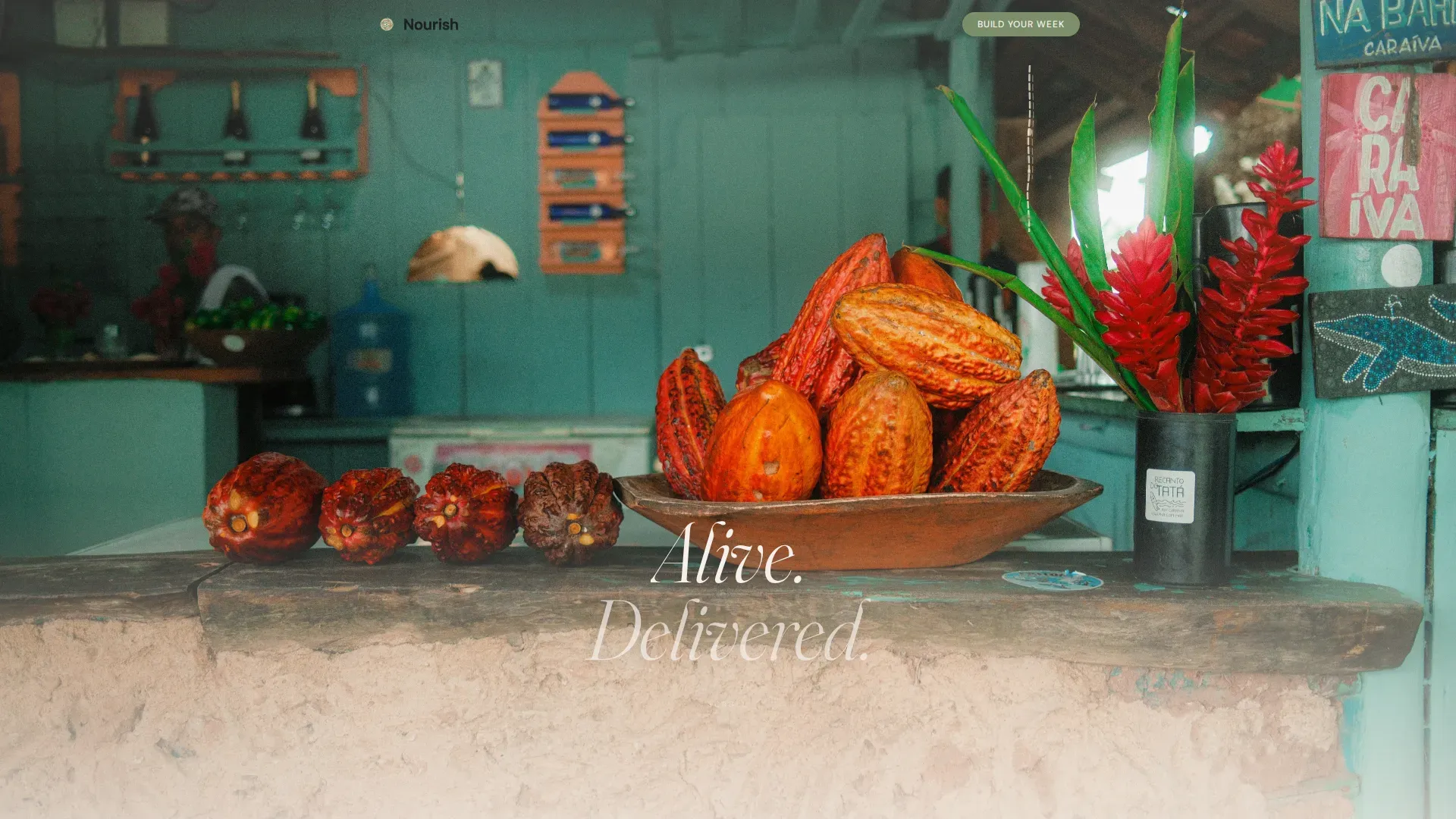
The hero opens on an overhead shot of a raw cacao and dragon fruit bowl on pale concrete. Everything is still except a ribbon of cold-pressed coconut nectar falling in a continuous loop, catching light as it lands and making tiny micro-herbs tremble. No headline appears for the first four seconds. Then two words fade in at featherweight tracking: "Alive. Delivered." This combination of motion restraint and delayed copy is one of the most effective ways to hold attention on a healthy food delivery landing page without saying a word about nutrition or recipes.
Gallery Walk Meal Exhibit Sections
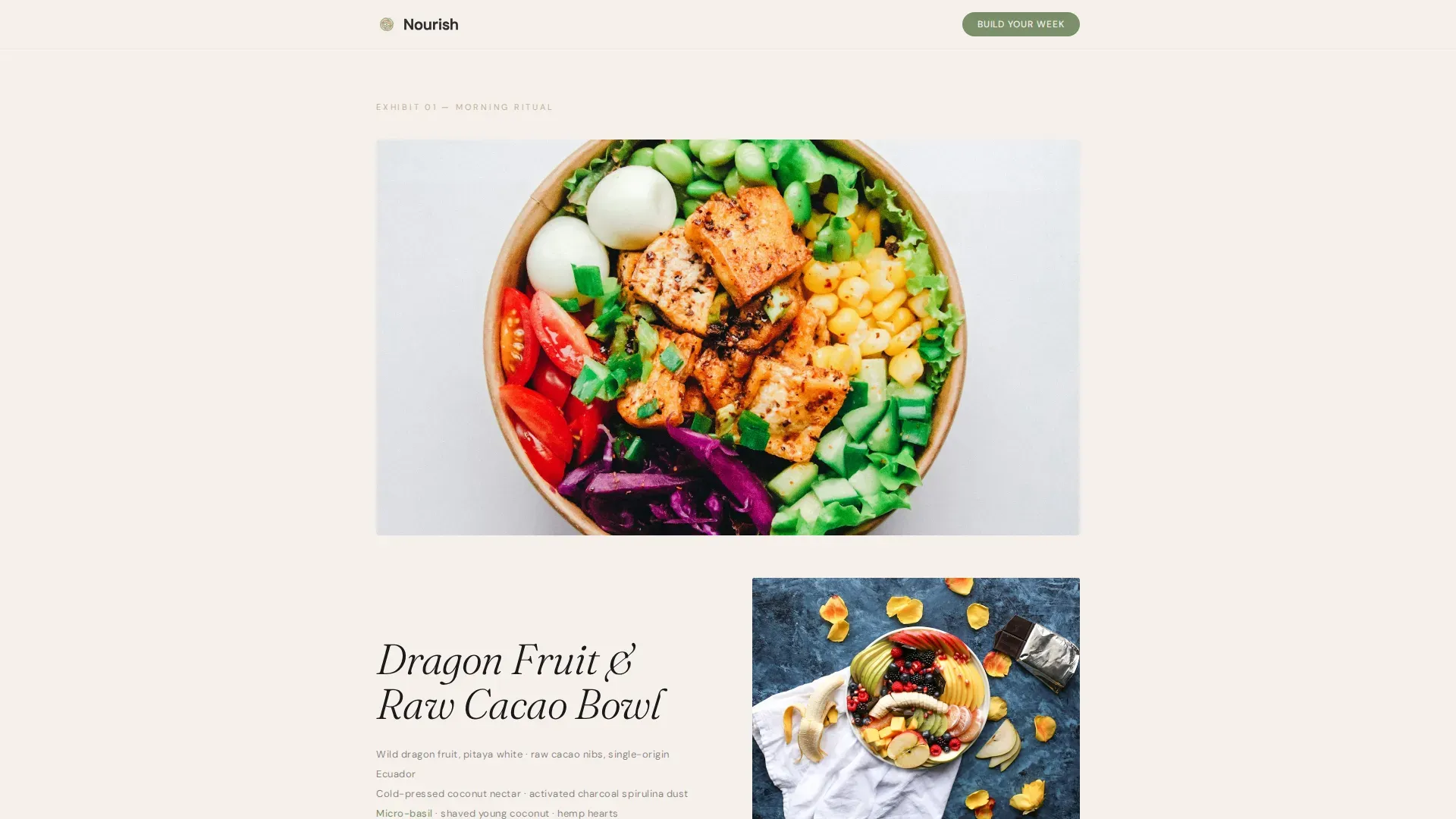
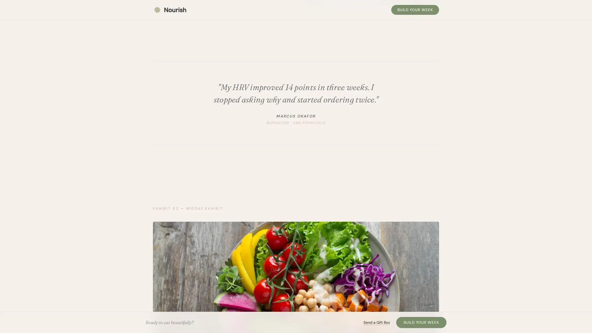
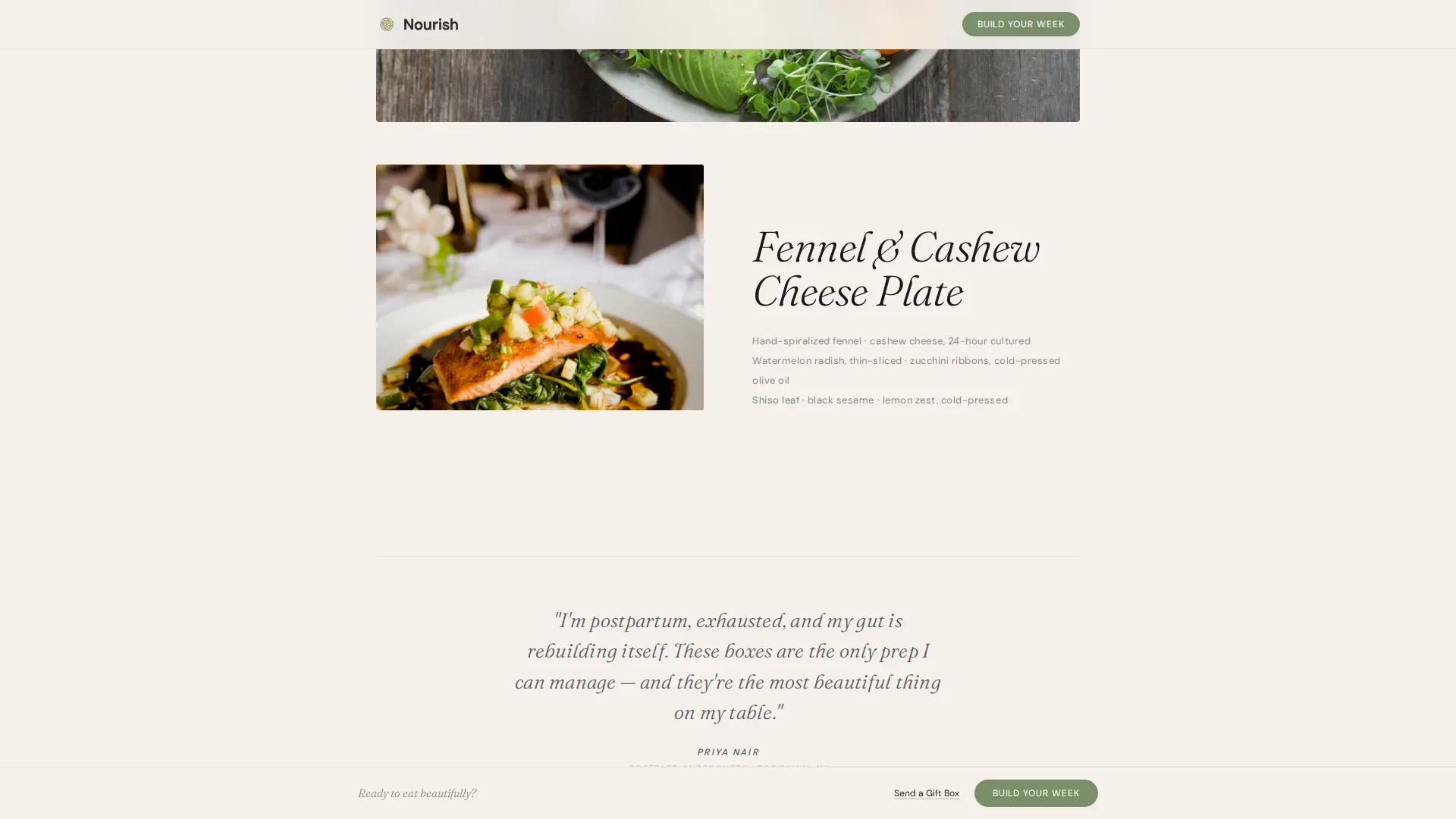
Three meal exhibits form the emotional core of the landing page. Each exhibit opens with a full-width, wide-angle shot of a single dish, plated with the care of a still-life painting. A tight macro follows immediately, revealing a specific texture: the translucent curl of a shaved fennel ribbon, the fracture line of a raw cashew cheese, or the soft fold of a hand-spiralized zucchini ribbon. Brief ingredient poetry sits beneath each image in small, unhurried type. Between exhibits, single-line testimonials from named clients float like wall placards. The rhythm is deliberate. Every person who scrolls this section should feel the same quiet they experience when they dine somewhere truly exceptional.
Interactive Meal Planner Booking Modal
The primary call-to-action, "Build Your Week," appears after the third meal exhibit and stays pinned gently at scroll bottom. Tapping it opens a calendar-style meal planner modal. Visitors select their preferred delivery days, choose how many meals they want per day (one, two, or three), flag allergens from a visual icon grid, and pick their first delivery date. A secondary path, "Send a Gift Box," appears as an underlined text link beneath the primary button for visitors who want to dine by proxy and send a gift to friends or family. This dual-path structure captures both direct subscribers and gift buyers without cluttering the call-to-action zone.
Cold-Process Philosophy Strip
Between the gallery walk and the booking call-to-action sits a horizontal philosophy strip laid out in a sparse, considered format. This section carries the brand's cold-process credentials: cold-pressing, hand-spiralizing, and dehydrating at precisely 115 degrees Fahrenheit to preserve living enzymes and full nutrition. Raw food diets are rich in vitamins and minerals because heat-sensitive nutrients remain intact. Eating raw foods can enhance digestion because the natural enzymes stay active. This strip is where the landing page balances mouth-watering visuals with the educational content needed to overcome any misconceptions about raw diets.
Floating Testimonial Wall Placards
Named client testimonials are placed between each meal exhibit, styled like wall text in a contemporary gallery. They do not appear as a stacked review block. Each testimonial is a single line attributed to a real person by name, floating in generous white space. This social proof approach feels editorial rather than transactional, which matches the brand's luxury positioning. A well-structured landing page should include customer testimonials to build trust, and this template does exactly that without disrupting the visual flow.
Minimal Footer with Social Links
The footer follows a superhuman minimal pattern: social icons and copyright line centered on stone white. Nothing else. No secondary navigation, no promotional banners, no distracting links. The decision to strip the footer back to its most basic elements is intentional. By the time a person reaches the bottom, the food has done the selling. The footer simply closes the page with the same calm confidence the rest of the template projects.
Page sections overview
| Section | Purpose |
|---|---|
| Cinemagraph Hero | Opens with motion and delayed headline to hold immediate attention |
| Gallery Walk Exhibits | Presents three raw meal exhibits in editorial still-life format |
| Floating Testimonials | Places named client quotes between exhibits as wall-placard social proof |
| Philosophy Credentials Strip | Communicates cold-process method and raw nutrition credentials |
| Meal Planner Call-to-Action | Opens booking modal with day, meal count, allergen, and date selection |
| Gift Box Secondary Path | Offers "Send a Gift Box" text link for visitors buying for someone else |
| Minimal Footer | Centers social icons and copyright on stone white with no clutter |
Design & branding system
The visual identity follows a Japanese Zen color system built around four values, each with a defined role. Stone white (#F5F0EB) covers every background, giving the page the cool, deliberate air of a gallery. Wet ink (#1A1A1A) handles all typography at considered weights, keeping the type clean and authoritative without being cold. Tatami warm (#C4B098) appears in divider lines, subtle shadows, and secondary text, the way an unglazed ceramic bowl adds warmth to a kaiseki table without demanding attention. Shiso leaf (#7B8F6A) is reserved exclusively for calls-to-action and fresh ingredient highlights, so every time it appears, the eye responds instinctively.
- Typography uses Fraunces for editorial serif headlines and DM Sans for body copy and labels, a pairing that balances warmth with functional clarity
- Animations include the cinemagraph drizzle loop, a four-second text-reveal delay on the hero headline, Ken Burns motion on selected images, and scroll-triggered reveal transitions throughout the gallery walk
- The overall aesthetic references a kaiseki counter at golden hour: unglazed ceramic, linen napkins, one perfect garnish, and white space treated as a design element rather than empty air
Mobile & speed optimization
The template is designed desktop-first to honor the editorial layout's need for a wider canvas, but it delivers full mobile parity so every person who visits on a smartphone has the same unhurried, beautiful experience. The gallery walk, meal planner modal, and floating testimonials all reflow cleanly for smaller screens.
- Lazy loading is applied to the image-heavy gallery sections so the hero and above-the-fold content load with priority, keeping the initial experience smooth
- The hero image uses object-cover positioning with priority loading, ensuring the cinemagraph overhead shot renders fully before the four-second text reveal begins
- The meal planner modal is touch-optimized, with the allergen icon grid, day selector, and date picker all sized and spaced for comfortable finger navigation on mobile devices
How this template helps you convert
The conversion strategy in this landing page is built on restraint, not pressure. The page earns the click by making the food undeniable before it asks for anything. This approach is highly effective for premium healthy food brands because it builds desire through beauty and trust through transparency, so the call-to-action arrives as relief rather than interruption.
- The cinemagraph hero and gallery walk sections create genuine craving for the food before any pricing or subscription detail appears, so by the time the "Build Your Week" button is visible, the person is already mentally committed. High-quality images of meals significantly enhance the appeal of a landing page for meal delivery services, and this template is structured around that principle from the very first frame.
- The cold-process philosophy strip and floating testimonials provide the trust layer that converts craving into confidence. Ingredient transparency with descriptions like "cold-pressed" and dehydrated at 115 degrees Fahrenheit builds the kind of credibility that a generic restaurant-style menu page cannot. A compelling value proposition, delivered this clearly, removes the last hesitation before a visitor chooses to subscribe or send a gift box.
- The "Build Your Week" modal removes every remaining friction point at the moment of commitment. Visitors can select delivery days, set meal counts per day, flag allergens from a visual icon grid, and choose their first delivery date in a single, guided flow. Urgency in calls-to-action can enhance conversions, and the pinned scroll-bottom placement of the primary call-to-action keeps the booking option consistently visible without ever feeling intrusive.
Other information about this template
This template is built inside a category where most competitors rely on conventional restaurant-style grid layouts. Those layouts work well for everyday food delivery apps, but they do not serve a premium raw food brand the way an editorial gallery format does. The Nourish template is specifically positioned at that intersection: healthy food delivery landing page design that performs like a luxury brand campaign rather than a takeout site.
The keyword phrase "nourish luxe raw food meal delivery landing page template" describes this template exactly and uniquely. No generic food service template offers this combination of cinemagraph hero, gallery walk structure, and integrated meal planner modal in a single-column flow.
Several practical notes for builders and brand teams working with this template:
- The template supports a single-column flow landing page structure, making it straightforward to customize within standard web-builder environments without needing to manage complex multi-column grid logic
- The philosophy strip is a natural location to add certification icons such as USDA Organic or Non-GMO markers, as recommended for building customer trust on premium healthy meal delivery pages, if those credentials apply to the brand
- The "Send a Gift Box" secondary path is already built into the call-to-action zone and requires only copy and destination URL updates to activate for gift purchasing flows
- The menu of meals shown in the gallery walk is fully customizable; each exhibit slot accepts a wide-angle food photograph, a macro texture photograph, and a short block of ingredient poetry, making it easy to rotate seasonal dishes, highlight specialty recipes, or update the offering for different delivery windows
- The allergen icon grid in the meal planner modal can be adapted to reflect the specific allergen categories relevant to the brand's actual recipes and ingredient sourcing, including common flags such as nuts, gluten, and nightshades
- Subscription tier details, meal frequencies, and plan customization options can be introduced within the meal planner modal or added as a brief supporting section between the philosophy strip and the booking call-to-action, depending on the brand's offer structure
- The template's design system is built around four precisely defined color values, and the color roles are intentional: using shiso leaf outside of call-to-action and ingredient highlight contexts will reduce the visual impact of the booking button and secondary gift link
- The floating testimonial format is designed for single-line quotes attributed to named individuals; longer block testimonials are not recommended in these placements as they interrupt the gallery rhythm the template depends on for its persuasive pacing
- For teams considering promotional offers, urgency-based copy such as a first-delivery discount can be layered into the booking modal header or introduced as a slim announcement strip above the hero without disrupting the overall visual identity
- The footer pattern is intentionally stripped to social icons and copyright only; adding navigation links or secondary promotions to the footer area will shift the calm, resolved tone the design system creates at the end of the scroll journey
The template is a strong fit for US-based coastal urban brands (New York, Los Angeles, San Francisco) targeting the premium direct-to-consumer wellness segment, where the overlap between design-conscious consumers and health-optimizing subscribers is highest. It is also adaptable for brands in other English-language markets where a luxe minimal aesthetic resonates with health-conscious clientele who expect their food to taste as beautiful as it looks.
Theme
Luxe Minimal
Creative direction
Gallery Walk
Color system
Japanese Zen
Style
Single Column Flow
Direction
Booking/Scheduling
Page Sections
Cinemagraph Hero with Delayed Text Reveal
Editorial Gallery Walk Meal Exhibits
Interactive Meal Planner Booking Modal
Floating Testimonial Wall Placards
Cold-process Philosophy Strip
Japanese Zen Four-color Design System
Related questions
Can I customize the meals shown in the gallery walk sections?
Does the meal planner modal handle allergen flags out of the box?
Is this landing page suitable for a gift purchase flow?
How does this template communicate raw food nutrition credentials?
Can I add subscription plan tiers or pricing details to this template?



