Chronic Pain Care Specialist Professional Website Template
Nourish is a single-column landing page template built for a twelve-week dietitian-led nutrition protocol targeting women with chronic joint pain, nerve pain, and fibromyalgia. It opens with bold clinical metrics, walks visitors through a transparent biomarker-driven process, and closes with an eight-question inline assessment that delivers a personalized inflammation profile before asking for an email.
by Rocket studio
Quick summary
Nourish is a single-column flow landing page for a twelve-week nutrition protocol led by registered dietitians. It combines oversized clinical metrics, a transparent step-by-step program walkthrough, real anonymized blood panel data, and a fully interactive inline assessment. The page is designed for women in their forties and fifties dealing with chronic joint pain, nerve flares, or fibromyalgia.
Who this template is for
This template is purpose-built for dietitians, nutrition clinics, and health practitioners offering evidence-based programs for chronic pain. It speaks directly to a skeptical audience that has already tried self-directed approaches and is ready for clinical structure.
- Registered dietitians running twelve-week protocols for chronic joint pain or fibromyalgia
- Health practitioners targeting women aged forty to fifty-five with inflammatory conditions
- Nutrition program founders who want proof-first, quiz-led conversion flows
What problem this template solves
Women managing chronic pain have often cycled through elimination diets, printed food lists, and inconclusive specialist visits. They arrive at a new program with high skepticism and low patience for vague wellness promises. This template earns trust by showing evidence before asking for anything.
- Standard landing pages hide the process behind vague testimonials and stock imagery
- Visitors need to feel informed, not sold to, before they will engage with a health program
- Generic templates lack the clinical credibility signals that a chronic pain audience requires
What you get with this template
The template delivers a complete, mobile-first single-column landing page with every section pre-structured for a twelve-week nutrition protocol. Each section is designed to reduce skepticism and build confidence progressively as the visitor scrolls.
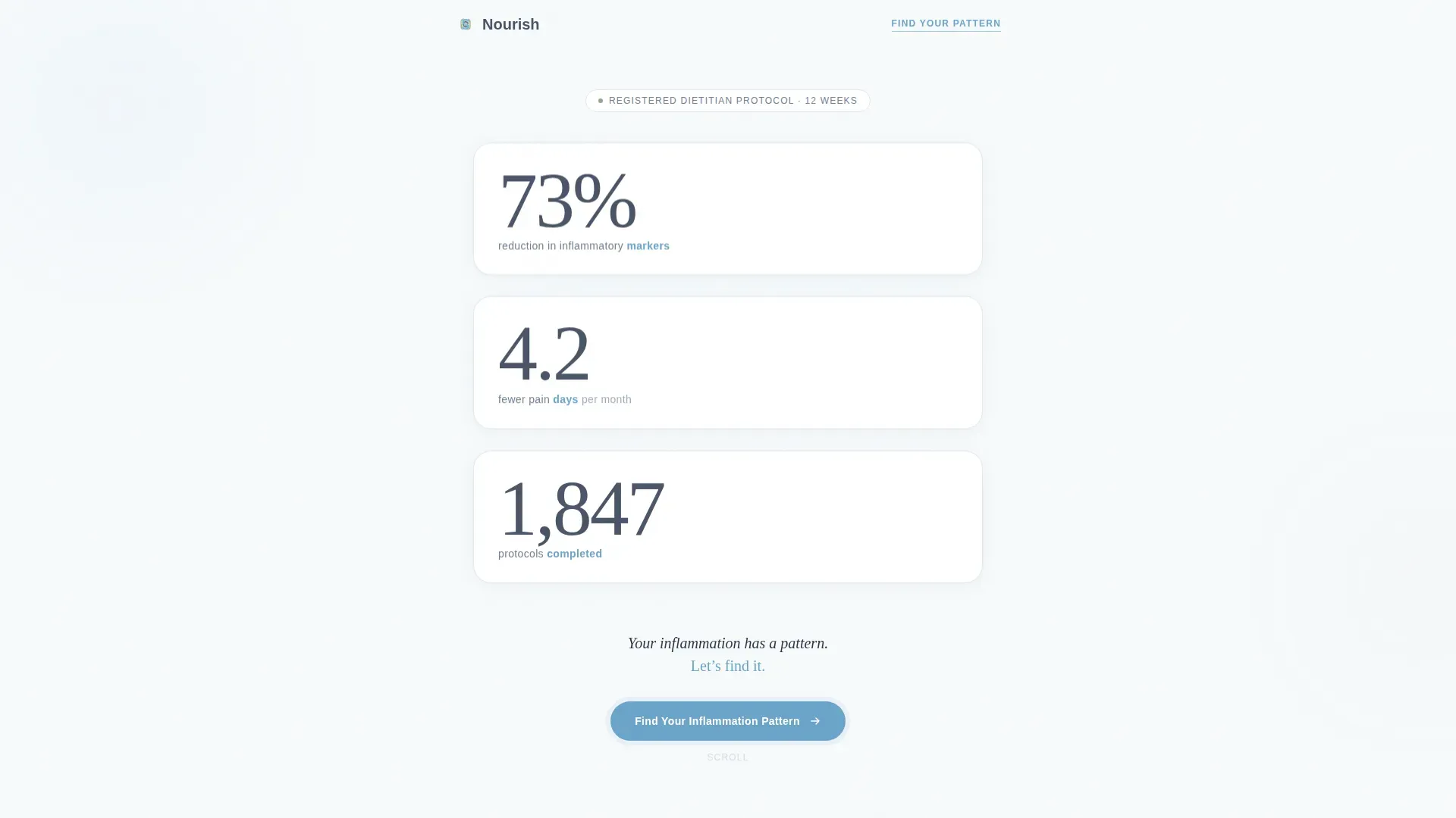
- A hero section with three oversized clinical metrics and a grounding tagline
- A transparent program walkthrough covering biomarker panels, a sample protocol week, and a real before-and-after blood panel
- A fully interactive eight-question inline assessment with a progress bar and results delivered before any email gate
Feature list
This template includes several purpose-built features that match the needs of a clinical chronic pain nutrition program.
Floating Metrics Hero
Three oversized statistics open the page against cloud white. Key metric words are typeset in sky blue to draw the eye. No photography, no stock imagery. Just numbers that speak for themselves.
Transparent Process Sections
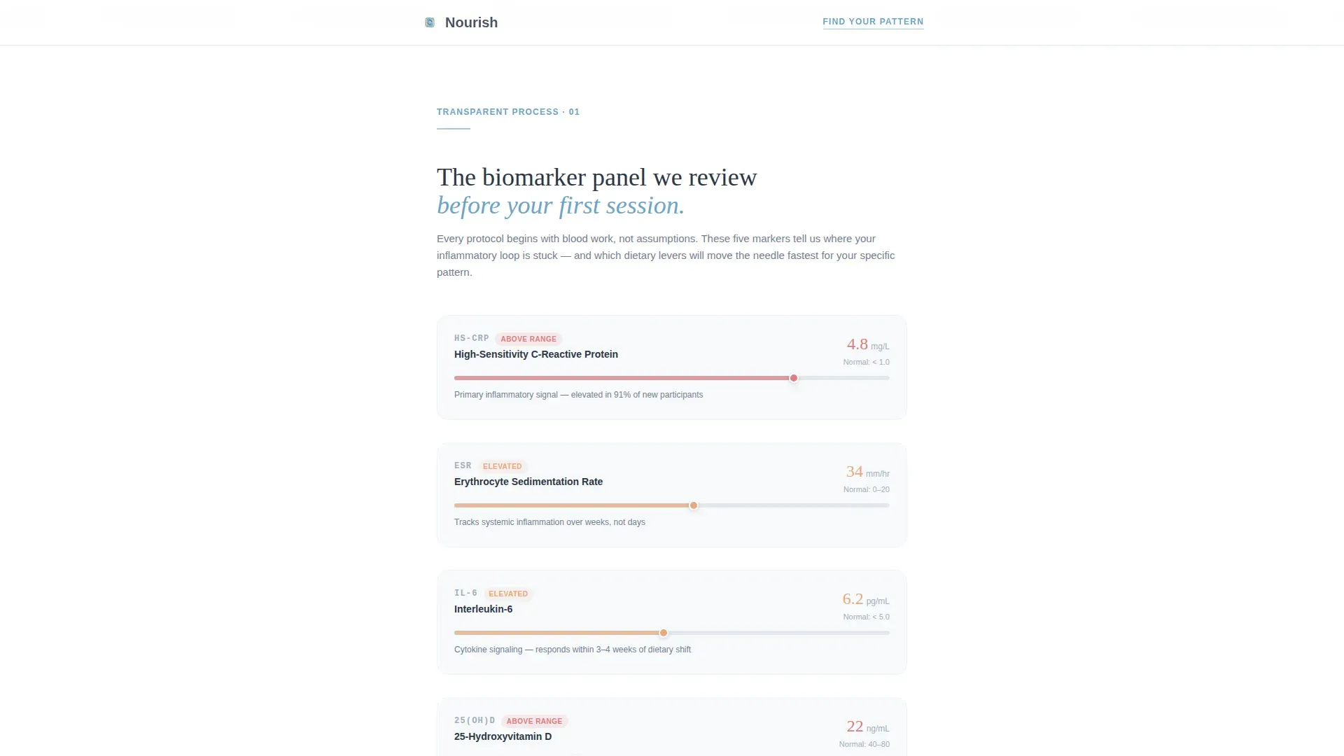
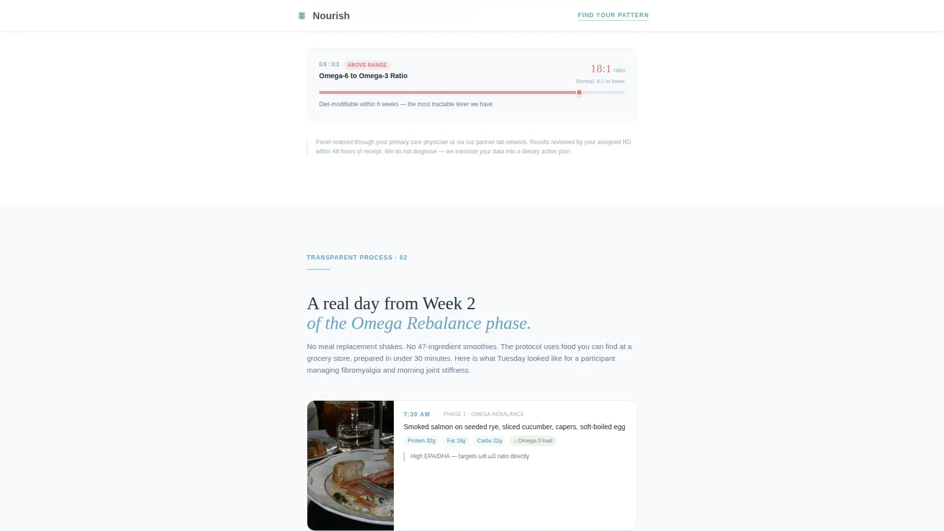
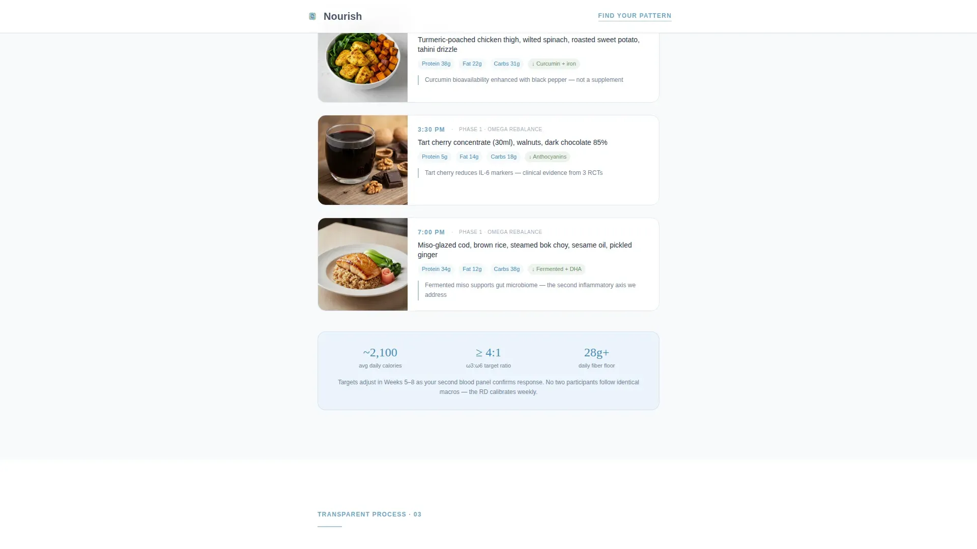
Three sequential content sections peel back the program layer by layer. The biomarker panel section shows labeled lab ranges. The sample week section includes real meal photographs with macro callouts. The before-and-after section presents anonymized but unedited participant blood panels.
Sage-Toned Testimonial Blocks
Graduate testimonials appear on a muted sage background. They are written as pull quotes tied to specific outcomes rather than general praise. This placement creates a rhythm of clinical honesty softened by real human voices.
Inline Eight-Question Assessment
The quiz runs entirely within the single-column flow. Questions appear one at a time with a sky blue progress bar advancing overhead. Topics covered include pain type, duration, current dietary approach, suspected trigger foods, sleep quality, medication status, prior lab work, and goal framing.
Results Before Email Capture
The assessment delivers a personalized inflammation profile category and a recommended starting tier before requesting an email address. This sequence earns the visitor's contact information by giving genuine value first.
Mobile-First Single Column Layout
The entire layout is structured as a single column, optimized for the mobile devices that the target demographic primarily uses. Scroll reveals and staggered quiz question animations are built into the interaction design.
Page sections overview
| Section | Purpose |
|---|---|
| Hero Metrics Block | Opens with three clinical statistics and a single grounding tagline |
| Biomarker Panel Section | Shows the actual lab panel dietitians review with labeled ranges |
| Sample Protocol Week | Walks through a real week of the program with meal photos and macros |
| Before and After Panel | Presents anonymized participant blood panels side by side |
| Graduate Testimonials | Sage-toned pull quotes tied to specific participant outcomes |
| Inline Quiz Assessment | Eight-question flow delivering personalized inflammation profile results |
| Linear Footer | Single-row footer with essential links and program information |
Design & branding system
The visual identity follows an Organic Flow theme built around a Slate and Sky color system. Typography pairs Fraunces as the serif display face with DM Sans for body text, creating a balance between clinical authority and approachable warmth.
- Cloud white (#F7FAFC) provides generous breathing room between content blocks
- Weathered slate gray (#4A5568) anchors body text and grounding sections; therapeutic sky blue (#6BA4C9) highlights buttons, progress indicators, and key metric words
- Muted sage (#8FAE8B) sets the background tone for testimonial blocks and success markers
Mobile & speed optimization
The template is structured with a mobile-first priority, reflecting that the target demographic primarily accesses health content on their phone. Static content sections and the interactive quiz are separated by component type to keep the experience smooth on smaller screens.
- Single-column flow naturally adapts to narrow viewports without layout shifts
- Scroll reveal animations and staggered quiz question transitions are calibrated at a medium intensity to avoid overwhelming mobile users
- Server components handle static sections while the client-side quiz component manages interactivity independently
How this template helps you convert
The conversion architecture is designed around progressive trust. Each section gives the visitor more information before asking anything of them, and the final call to action delivers value before collecting an email address.
- The hero metrics section establishes credibility in the first three seconds, replacing vague promises with specific clinical outcomes that the target audience can evaluate
- The transparent process sections reduce doubt by showing exactly what the program involves, including real data, so visitors feel informed rather than marketed to
- The inline assessment converts by delivering a personalized result first, earning the visitor's email address only after demonstrating that the program understands their specific situation
Other information about this template
This template is categorized under Health and Medical, specifically within the Chronic Pain Care subcategory and the Chronic Pain Nutrition and Diet Program niche. It is localized for English-language audiences in the United States, using imperial measurements and USD pricing conventions.
- The quiz and results flow is built with high interactivity in mind, using spotlight card animations and staggered question reveals
- The footer follows a linear single-row pattern, keeping the end of the page clean and uncluttered
- The overall aesthetic is described as stepping onto a flagstone patio after rain, cool, open, and clear; this guides every spacing and color decision in the template
Theme
Organic Flow
Creative direction
Transparent Process
Color system
Slate & Sky
Style
Single Column Flow
Direction
Quiz/Assessment
Page Sections
Floating Clinical Metrics Hero
Transparent Process Walkthrough
Sage-toned Testimonial Blocks
Inline Eight-question Assessment
Value-first Email Capture
Mobile-first Single Column Layout
Related questions
What kind of program is this template designed for?
How does the email capture work in this template?
Can I use this template without the quiz feature?
Is this template optimized for mobile users?
What visual style does this template follow?



