Premium Low-Sodium Wellness Landing Page Template
The Mineral Clean Low-Sodium Supplement Booking Landing Page Template is a masonry-style, single-page design built for low-sodium supplement brands. It pairs a Neo-Retro Desert Apothecary visual system with a conversion-focused booking flow, guiding health-conscious visitors from an emotional origin story through transparent label comparisons and into a free sodium audit consultation.
by Rocket studio
Quick summary
This supplement landing page template is purpose-built for low-sodium health brands. It uses a warm masonry layout, storytelling-led scroll flow, and a primary booking call to action. The design converts empathy into action, moving visitors from a founder's origin story through ingredient transparency and into a scheduled consultation with minimal friction.
Who this template is for
This template is ideal for direct-to-consumer wellness brands that serve medically-managed customers. The design and supplement landing page structure speak directly to audiences counting every milligram. A well-designed supplement website can attract and retain customers who need more than generic product claims.
- Dialysis patients and hypertension-managed individuals tracking daily sodium intake
- Postpartum mothers whose discharge instructions include sodium monitoring
- Health-conscious runners and athletes following a low-sodium or DASH diet
What problem this template solves
Most supplement landing page designs treat all buyers the same. That approach fails health-restricted audiences who need clear labeling, transparent ingredient panels, and genuine trust before they sign up or book anything. The design of a supplement website plays a pivotal role in engaging visitors and driving conversions, especially for medically sensitive product categories.
- Hidden sodium in mainstream vitamins and supplements creates real risk for these users
- Generic landing pages bury the Supplement Facts panel instead of leading with it
- Visitors leave before booking because trust is never established early enough
What you get with this template
You get a fully structured supplement landing page with five distinct content sections, a masonry card layout, and a booking form. Every section is crafted to build credibility before the call to action appears. Customer testimonials enhance the credibility of the website and support the booking conversion path.
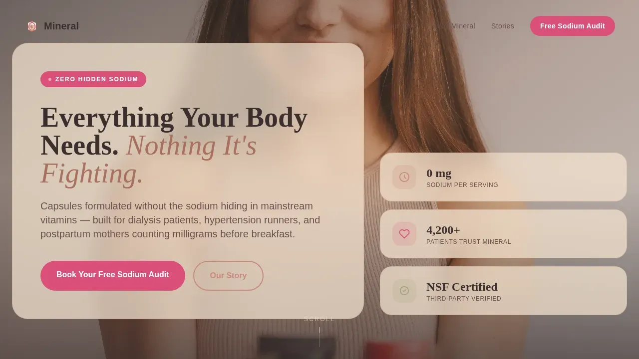
- A cinematic lifestyle hero section with headline overlay and grain texture treatment
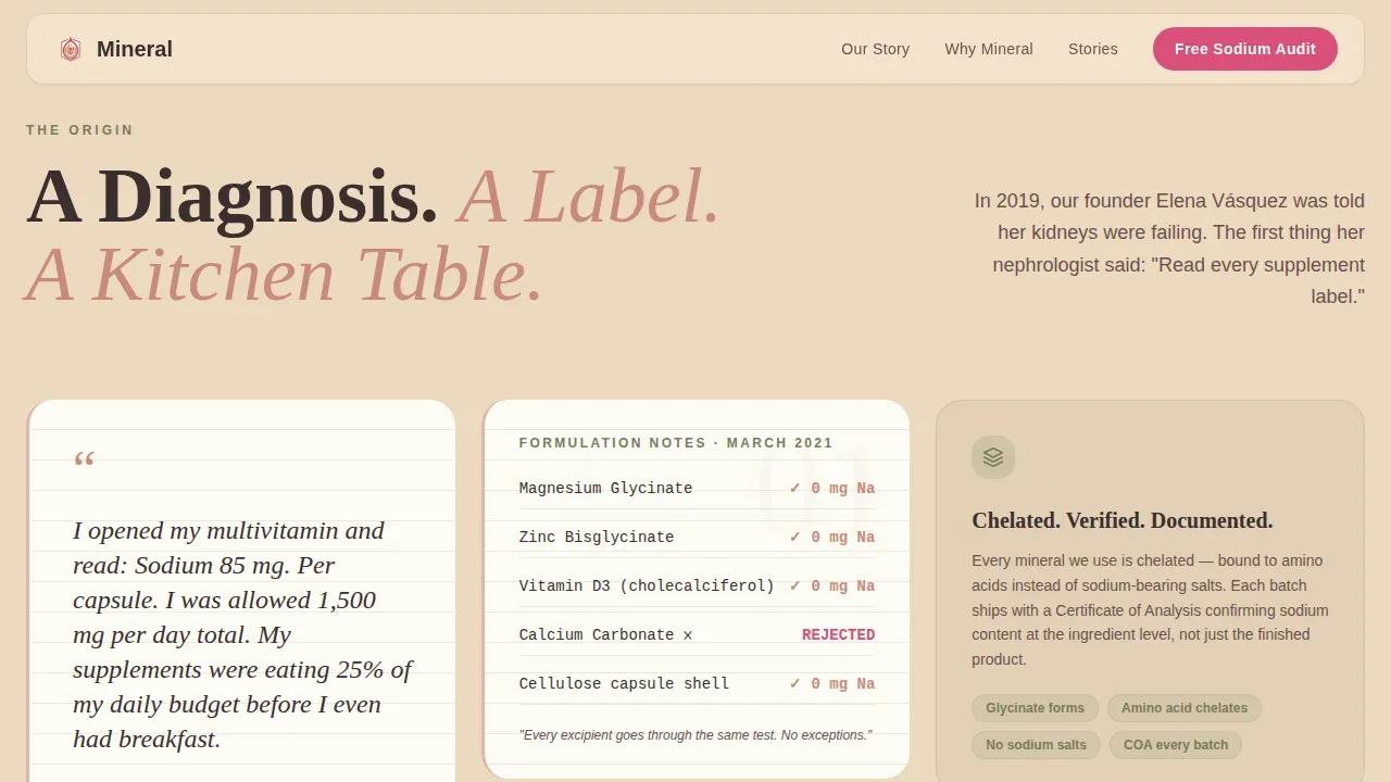
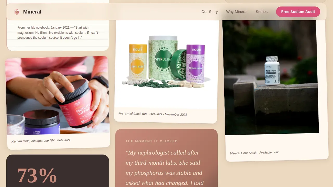
- An asymmetric masonry origin story block with lab notebook and ingredient card tiles
- A "Book Your Free Sodium Audit" booking form collecting name, email, supplement count, and health concern
Feature list
A clean layout with engaging visuals improves the user experience on supplement pages. This template delivers that through six tightly scoped features.
Masonry Origin Story Layout
Each masonry tile functions as a story chapter. Scanned lab notebook pages, ingredient close-ups, customer video testimonial cards, and label comparison tiles stack asymmetrically in a bento-style grid. GSAP scroll reveals and staggered card entrances animate the flow naturally.
Label Comparison Section
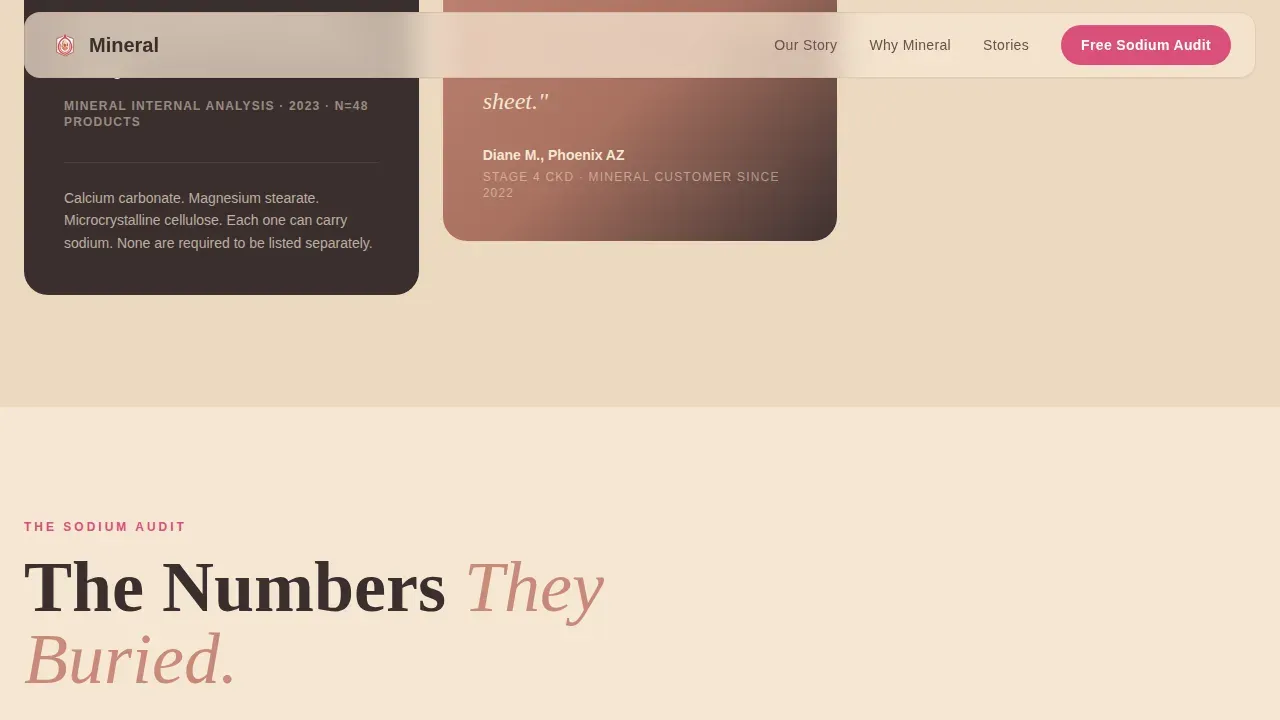
Side-by-side nutrition label panels show competitors' sodium counts crossed out in prickly pear magenta. This section communicates ingredient transparency directly, covering the Supplement Facts panel in the way an FDA-required disclosure should, alongside a clear no-go list of excluded additives. Prominent product information effectively communicates the benefits of supplements.
Booking Form with Consultation Flow
The primary call to action is a 15-minute sodium audit form. It collects name, email, a supplement count dropdown, and a primary health concern field. A secondary path links to a "Build My Stack" guided quiz, adding a unique feature that helps personalize health solutions for each visitor.
Lifestyle Hero Section
A 35mm-style lifestyle photograph anchors the top of the page. The composition uses lifted shadows and warm grain. The headline fades in over the image using a rounded vintage-pharmacy serif. This header design signals clinical trust and warmth at the same time.
Three-Story Testimonial Block
Three customer stories represent dialysis, runner, and postpartum use cases. Each testimonial uses a border-left treatment for visual hierarchy. Social proof through customer feedback and trust signals builds credibility before the booking ask appears.
"Build My Stack" Quiz Path
A secondary conversion path guides users through a short quiz to find the right supplements for their needs. Unique features like user-friendly quizzes can personalize health solutions on supplement pages and improve time on site.
Page sections overview
| Section | Purpose |
|---|---|
| Hero Lifestyle Shot | Opens with warm cinematic photo, grain overlay, and fading headline |
| Origin Story Masonry | Asymmetric bento tiles covering founder story and lab process |
| Label Comparison Panel | Side-by-side sodium disclosure with competitor callouts |
| Customer Testimonials | Three bordered story cards covering dialysis, runner, postpartum |
| Booking Form | Sodium audit form with supplement count dropdown and health field |
| Linear Footer | Single-row footer with brand identity and navigation links |
Design & branding system
The visual identity follows a Neo-Retro Desert Apothecary theme. A cohesive brand identity is important for supplement websites to attract health-conscious consumers. Typography uses Fraunces for serif headlines and DM Sans for body copy, creating a clean contrast between warmth and legibility.
- Desert Rose color system: adobe cream (#F5E6D3) backgrounds, terracotta (#C98A7A) card frames, prickly pear magenta (#D94F7A) buttons, and deep mesquite (#3B2F2F) body text
- Sage brush (#A3A380) anchors section dividers; grain texture overlay runs across the hero
- Fraunces rounded serif headlines reference vintage pharmacy label aesthetics; DM Sans keeps body information readable and grounded
Mobile & speed optimization
The mobile-first design for this landing page minimizes distractions and keeps users focused on the booking path. The target demographic searches for health supplement information on phones, making a responsive, thumb-friendly layout essential. Images are optimized and Server Components handle static sections.
- Staggered masonry card entrances adapt gracefully to narrow screen widths
- Booking form fields are sized and spaced for easy mobile input without zooming
- GSAP animations are scoped to avoid layout shift on smaller devices
How this template helps you convert
The design earns trust before it asks for anything. Visually appealing layouts are crucial for supplement websites to engage users, and this template uses every section to move visitors closer to booking.
- The origin story and label comparisons do the convincing early, so the booking form feels like a natural next step rather than a sales gate.
- The "Build My Stack" quiz gives non-ready visitors a low-commitment secondary path, keeping them on the page and signed into the brand experience.
Other information about this template
This template is well-suited for creating a supplement landing page on an ecommerce Shopify landing setup or any comparable platform. It supports use cases beyond low-sodium lines, including any body enhancement product, diet product, or weight loss supplement brand that needs to lead with health transparency. Customizable HTML templates for supplement products help users quickly set up a professional-looking website, and this template follows that same principle. Templates designed for supplement landing pages often include features like responsive design and clean layouts, and this one delivers both.
- Suitable as a health supplement landing page for wellness products across dialysis nutrition, electrolyte balance, and kidney-safe supplement categories
- Can support supplement landing pages for vitamins, mineral capsules, and sugar-free, zero-calorie formulas with no artificial preservatives
- The Suppke Landing Page template is designed for body enhancement and weight loss products; this template serves a more medically-adjacent wellness niche with equivalent design quality
- Relevant for brands whose supplements deliver electrolytes including Potassium, Magnesium, Chloride, and Calcium without excess sodium
- Fresh branding assets and the masonry page structure help users stand out in search results and protect brand identity against generic supplement site competitors
- Signs of trust like lab-tested claims, FDA-required Supplement Facts panels, and non-GMO callouts can all be incorporated into the template's label comparison and testimonial sections
Theme
Neo-Retro
Creative direction
Origin Story
Color system
Desert Rose
Style
Masonry/Pinterest
Direction
Booking/Scheduling
Page Sections
Masonry Origin Story Layout
Label Comparison Section
Sodium Audit Booking Form
Lifestyle Hero with Grain Overlay
Three-story Testimonial Block
Build My Stack Quiz Path
Related questions
Can I customize the booking form fields in this template?
Does this template work for supplement brands beyond low-sodium products?
What makes this different from a standard product landing page?
Is this template ready to use without a developer?



