Organic Business Blog Website Template
Kibble is a modular card-grid landing page template built for boutique organic pet food shops. It pairs an editorial flat-lay header with a side-by-side ingredient comparison journey, live product cards, a sticky order bar, and a scroll-triggered email capture. Warm sunset tones and clean serif typography give it the feel of a premium pantry you actually trust.
by Rocket studio
Quick summary
Kibble is a single-page landing page template designed for organic pet food retailers. It guides visitors through a visual ingredient comparison, then opens into a modular product card grid with "Add to Bowl" call-to-action buttons. A sticky bottom bar and subscription upsell round out the conversion flow, all wrapped in a warm, minimal aesthetic.
Who this template is for
This template is built for small-batch and boutique pet food brands that take ingredient quality seriously. It speaks directly to detail-driven shoppers, not impulse buyers.
- Independent organic pet food shop owners selling certified-organic treats, supplements, and meal bases
- Pet nutrition brands wanting to educate first-time buyers before driving a purchase
- New or growing e-commerce sellers who need a polished, story-led product page without custom development
What problem this template solves
Most pet food landing pages lead with price or generic product photos. They skip the "why" that skeptical, ingredient-conscious shoppers need before they commit. This template closes that gap.
- Visitors arrive unsure whether organic pet food is worth the premium, and the comparison layout answers that question visually before asking for a sale
- Shops lose potential subscribers because there is no natural moment to introduce a recurring order offer
- Generic "Add to Cart" language feels transactional for a brand built on care and ritual
What you get with this template
You get a fully structured, section-led landing page ready to adapt to your product catalog and brand voice. Every component connects to a clear point in the buyer journey.
- A full-bleed overhead flat-lay header with a fade-in serif headline and shallow depth-of-field styling
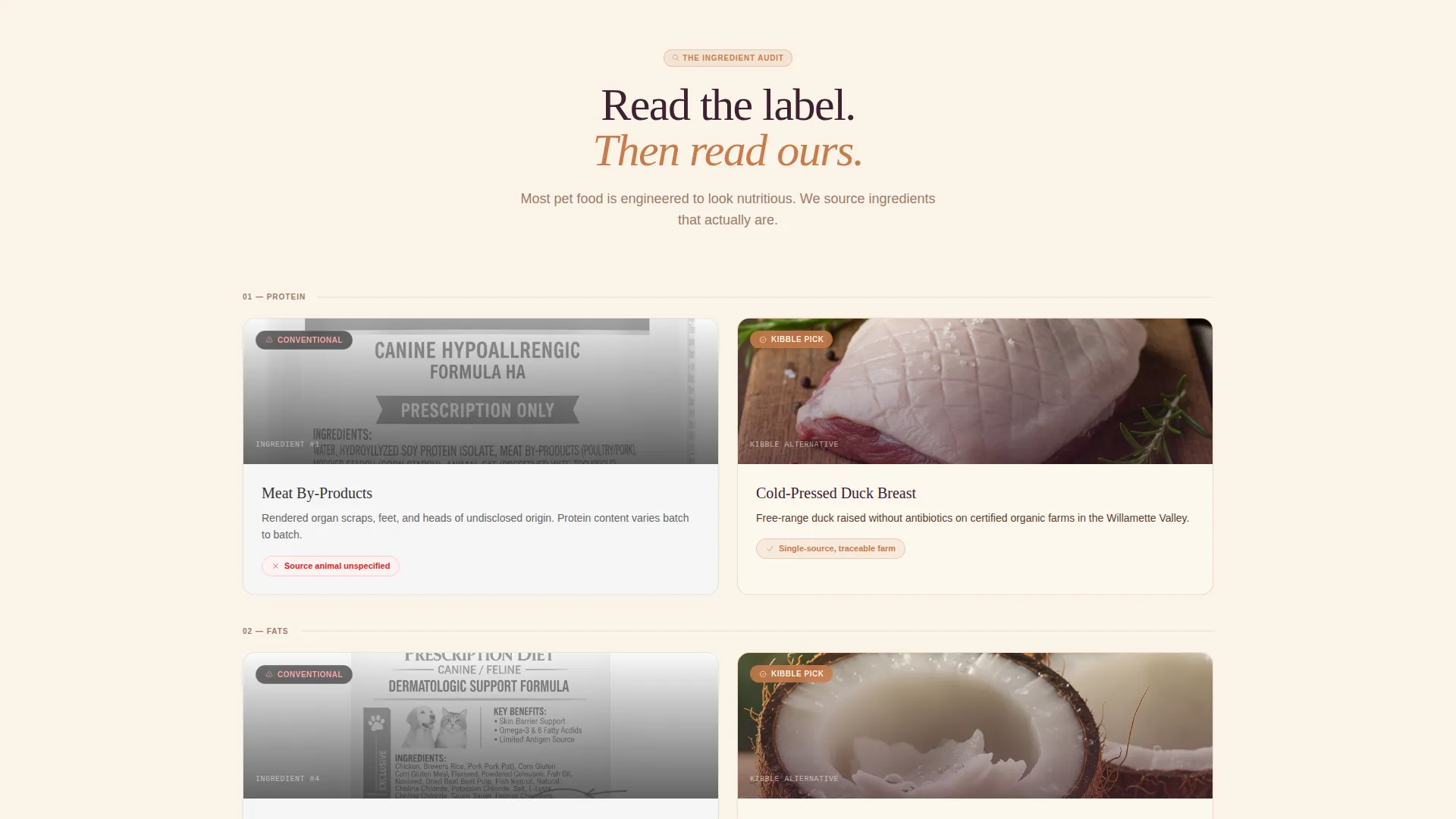
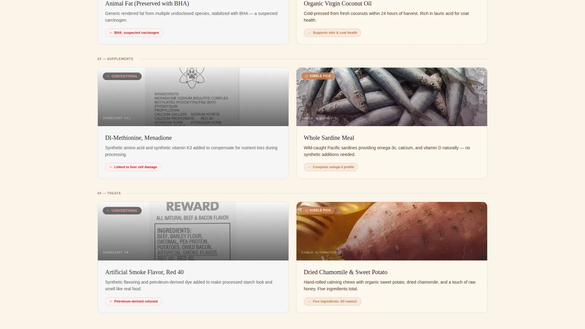
- A modular comparison card section that pairs conventional ingredient labels against whole organic alternatives across protein, fats, supplements, and treats
- A live product card grid with "Add to Bowl" quick-add buttons, a sticky bottom order bar, a "Build a Monthly Box" subscription upsell, and a scroll-triggered email capture offering a first-purchase discount
Feature list
This template packs purposeful components into one clean, scrollable page. Each feature earns its place by moving a visitor one step closer to buying.
Full-Bleed Flat-Lay Header
The header opens with a styled overhead photograph: a raw wooden cutting board, freeze-dried ingredients, a torn kraft paper pouch, and a soft paw reaching into frame. A single serif headline fades in after the first visual beat, setting an editorial tone before any product is shown.
Ingredient Comparison Card Rows
Modular card rows place a clinical conventional-label close-up on the left beside a whole organic ingredient photograph on the right. The layout progresses through protein, fats, supplements, and treats, building a visual case for quality that lands before any copy needs to argue it.
Live Product Card Grid
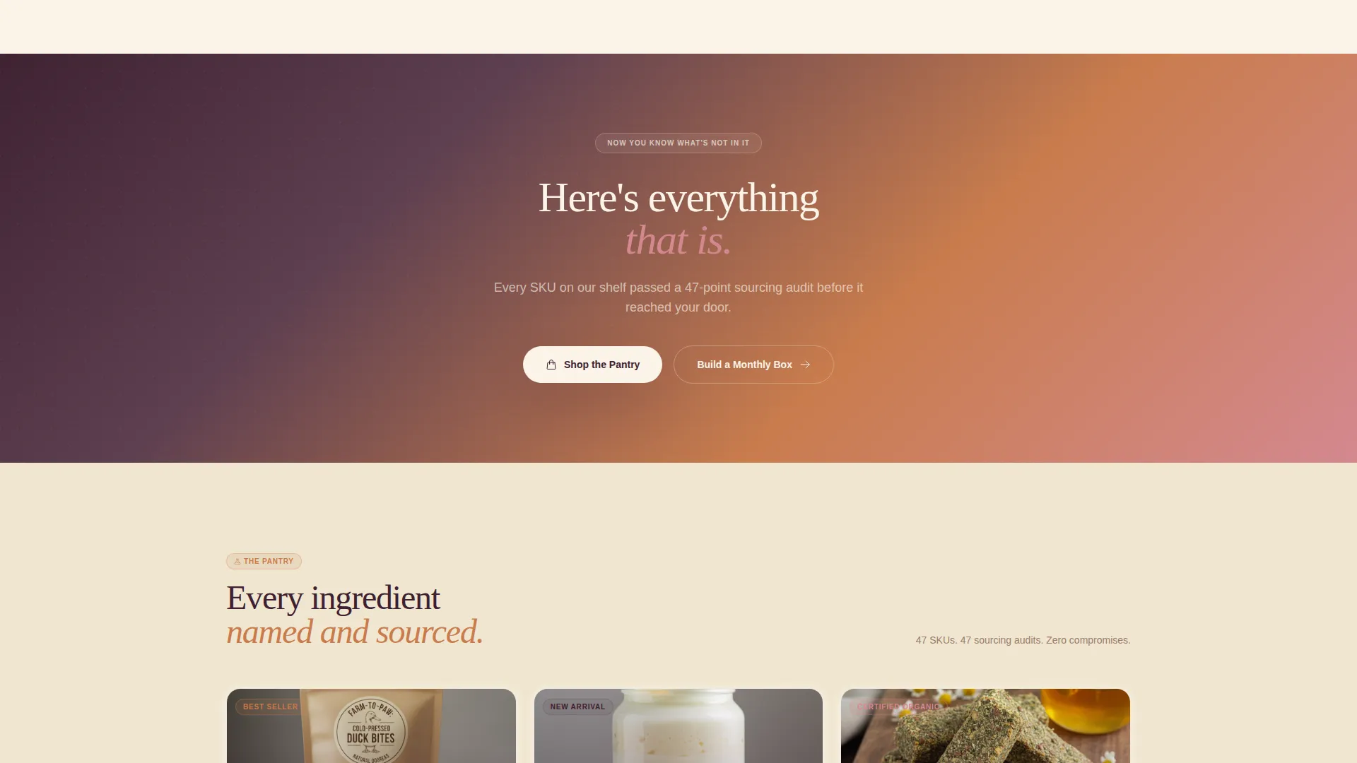
After a full-width gradient divider shifts the mood from education to shopping, product cards appear with photography, brief descriptions, and "Add to Bowl" quick-add buttons. The grid is modular, so product rows can be added or removed to match catalog size.
Sticky Bottom Order Bar
A persistent bar at the bottom of the viewport tallies the running order total as visitors add items. It surfaces the "Build a Monthly Box" subscription call to action, making the upsell feel like a natural next step rather than an interruption.
Scroll-Triggered Email Capture
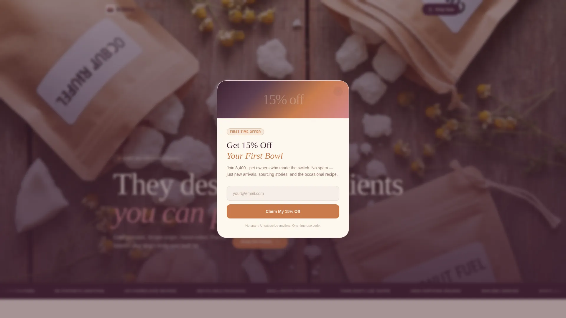
After visitors pass the comparison section, a single-field email prompt appears offering 15 percent off a first order. The ask is timed to arrive only after the page has already shifted how the visitor thinks about ingredients, making the offer feel earned.
Sunset Gradient Color System
The palette moves through warm linen, soft terracotta, dusky rose, and deep plum. Colors are applied with purpose: linen as background, terracotta on cards and hover states, dusky rose for badges and sale tags, and deep plum for all headline and navigation text.
Page sections overview
| Section | Purpose |
|---|---|
| Full-bleed header | Opens with editorial flat-lay photo and fade-in serif headline |
| Comparison card rows | Side-by-side conventional versus. organic ingredient journey |
| Gradient divider | Shifts tone from education to active product browsing |
| Product card grid | Modular quick-add cards with "Add to Bowl" buttons |
| Sticky order bar | Persistent tally with subscription upsell call to action |
| Email capture overlay | Scroll-triggered discount offer for first-time visitors |
Design & branding system
The visual identity follows a Luxe Minimal theme that feels like a farmhouse kitchen at golden hour. Every color decision supports legibility and warmth without competing with product photography.
- The four-tone palette uses warm linen (#FAF3E8) as the primary background, soft terracotta (#C97B4B) on cards and hover states, dusky rose (#D4878F) for badges and sale indicators, and deep plum (#3D2030) for headlines and navigation
- Typography leads with a clean serif for headlines to anchor the editorial quality, while body copy stays light and readable against the linen background
- Imagery guidelines call for overhead flat-lay photography, whole recognizable ingredients, shallow depth of field on lifestyle elements, and kraft paper packaging details to reinforce the handcrafted pantry feel
Mobile & speed optimization
The modular card grid adapts cleanly to narrower viewports, keeping the comparison journey and product cards readable on any screen size.
- Card rows reflow from side-by-side desktop columns to stacked single-column layouts on smaller screens, preserving the visual argument without horizontal scrolling
- The sticky bottom bar remains anchored at the bottom of the mobile viewport, keeping the order tally and subscription call to action within thumb reach throughout the scroll
How this template helps you convert
Every section of this template is sequenced to build confidence before asking for action. The result is a page that earns each click rather than demanding it.
- The comparison card journey resolves the ingredient skepticism that educated pet-food shoppers arrive with, so they reach the product grid already convinced of the quality difference
- The "Add to Bowl" language and sticky order bar keep the buying experience consistent with the feeding ritual the brand represents, reducing the friction that generic cart language creates
- The scroll-triggered email capture fires only after the comparison section, capturing contact details from visitors who are already engaged and primed for the first-purchase discount offer
Other information about this template
This template sits within the Retail and E-Commerce category, under the Organic Business subcategory. It is built around a Direct Sales landing-page direction, meaning the page is designed to move visitors from awareness to purchase in a single scrollable session.
- The Card Grid (Modular) template style means individual product card rows and comparison rows can be updated or reordered to reflect seasonal catalog changes or promotional priorities
- The Luxe Minimal theme and Full-Bleed Photo header concept make this template well suited to any premium organic consumable brand, not exclusively pet food
- The "Build a Monthly Box" subscription upsell component is a structural element within the sticky bar and can be relabeled to match any recurring-order naming convention used by the shop
Theme
Luxe Minimal
Creative direction
Flash Deal
Color system
Lavender Dream
Style
Card Grid (Modular)
Direction
Direct Sales
Page Sections
Full-bleed Flat-lay Header
Ingredient Comparison Card Rows
Live Product Card Grid
Sticky Bottom Order Bar
Scroll-triggered Email Capture
Sunset Gradient Color System
Related questions
Can I use this template for a pet food brand that is not fully certified organic?
How many products can the card grid display?
Is the email capture field connected to a mailing list tool?
Can the 'Add to Bowl' button text be changed?
Does the comparison card section only work for pet food?



