Advanced Eating Disorder Care Appointment Booking Website Template
Nourish is a warm, zigzag landing page built for eating disorder specialist clinics. It guides frightened visitors through a five-phase recovery pathway using alternating sections, soft organic visuals, and minimal-friction lead capture. The primary call to action is a confidential consultation booking. A secondary path offers a downloadable family guide gated by email only.
by Rocket studio
Quick summary
Nourish is a single-page template designed for eating disorder specialist clinics. It uses a zigzag alternating layout to walk visitors through five recovery phases, from first contact to living again. The page is built around radical warmth, named fears, and a booking form that asks as little as possible from someone who is already carrying a great deal.
Who this template is for
This template is built for clinics and practitioners who treat eating disorders and want a patient-facing landing page that leads with empathy before it leads with services.
- Eating disorder specialist clinics offering multidisciplinary care for conditions including anorexia, bulimia, ARFID (Avoidant/Restrictive Food Intake Disorder), and binge eating
- Independent therapists, dietitians, and psychiatrists who want a warm referral or intake page
- Healthcare providers whose visitors are frightened, ambivalent, or arriving at midnight on a phone looking for a first step
What problem this template solves
Most healthcare landing pages feel like intake forms. They list credentials, use clinical acronyms, and ask too much too soon. For someone with an eating disorder, that coldness is enough to close the tab. This template solves the trust gap before it becomes a barrier.
- Visitors arrive with specific, unspoken fears: being judged, being weighed immediately, being forced to eat things they are not ready for
- The page names those fears out loud so the visitor feels seen before they have said a word
- The lead capture form asks only three things, keeping the first step feel as small as it actually is
What you get with this template
You get a fully structured, single-page layout with every section already positioned and purposefully ordered. The design system, copy architecture, and conversion logic are all built in.
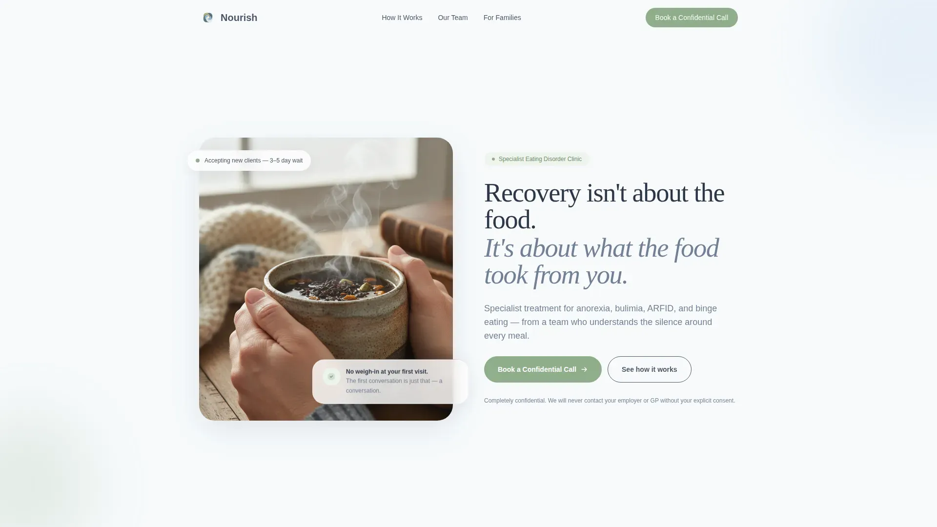
- A half-page photo and text hero section with a headline, supporting line, and primary call-to-action button
- Five zigzag alternating content sections that move visitors through a named recovery pathway
- A fixed bottom call-to-action bar that fades in after the second section, a three-field booking form, and a secondary email-gated PDF download path for family members
Feature list
This section describes the core built-in capabilities of the Nourish template.
Zigzag Alternating Recovery Pathway
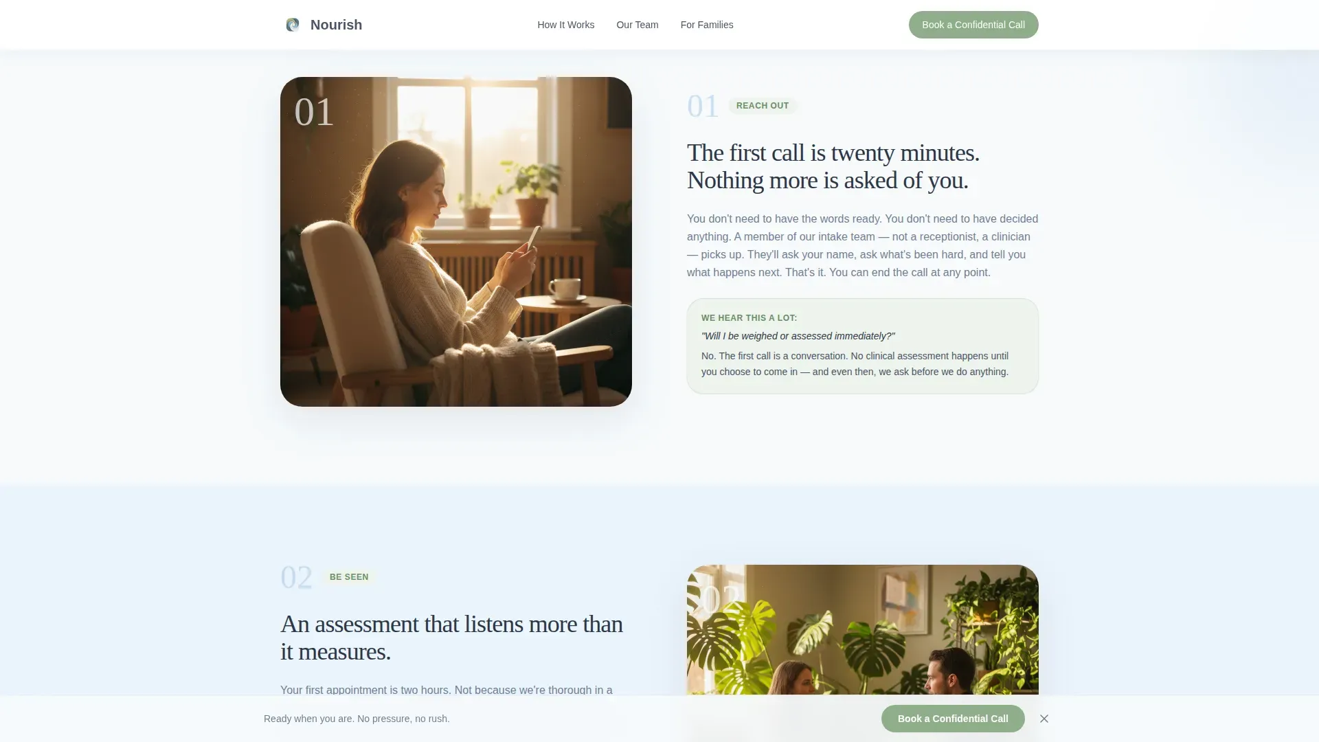
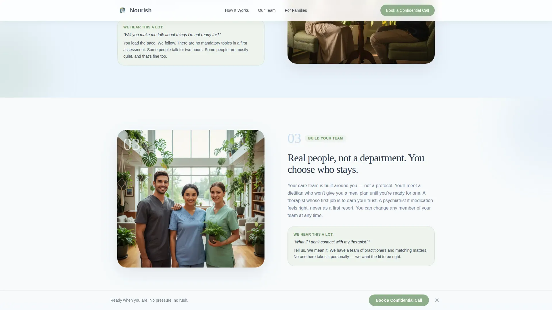
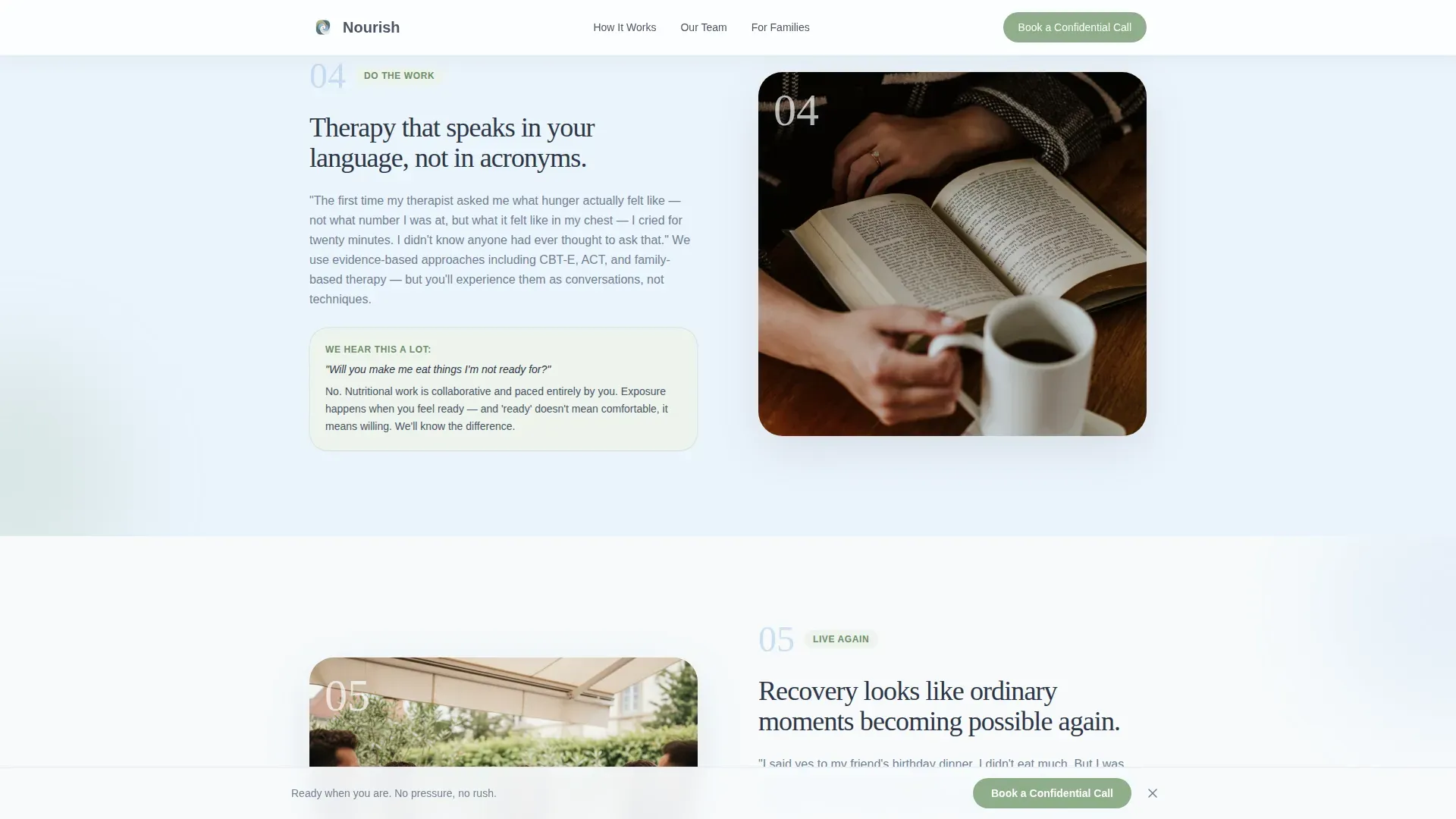
Five numbered sections alternate image and text left to right, creating a slow, steady rhythm. Each phase has a name: Reach Out, Be Seen, Build Your Team, Do the Work, and Live Again. The layout guides the eye without rushing the visitor.
Half-Page Hero with Split Layout
The header splits into a softly lit photograph on the left and a rounded serif headline on the right. The headline speaks directly to what the food took, not just what the food is. A primary call-to-action button sits immediately below the headline.
Named-Fear Copywriting Structure
Each zigzag section answers the unspoken question that belongs to that phase of recovery. The template prompts you to address fears like judgment, clinical coldness, and being forced to move faster than feels safe. This structure builds trust section by section.
Minimal Three-Field Booking Form
The lead capture form asks for a first name, a preferred phone or email, and one optional open-text field. The optional field is labeled to signal that the clinic listens before it prescribes. Fewer fields mean fewer reasons to close the tab.
Secondary PDF Download Path
A downloadable guide titled "A Guide for Families: What to Say and What Not To" is gated by email only. This path captures loved ones who are not ready to call but are searching for guidance. It widens the clinic's reach without adding friction to the primary conversion flow.
Fixed Understated Call-to-Action Bar
A bottom bar carrying the "Book a Confidential Call" button fades in gently after the visitor scrolls past the second section. It stays visible without demanding attention, keeping the primary action reachable at every point on the page.
Page sections overview
| Section | Purpose |
|---|---|
| Hero: Photo Split | Establish emotional tone and present the primary call to action |
| Reach Out | Show what the first confidential call sounds like and ease fear of judgment |
| Be Seen | Introduce the multidisciplinary assessment without clinical language |
| Build Your Team | Name the real roles and show team portraits with first-person quotes |
| Do the Work | Describe therapy approaches through client-voiced vignettes |
| Live Again | Show recovery moments and social proof through testimonial vignettes |
| Footer | Minimal single-row footer with essential links |
Design & branding system
The visual identity follows an Organic Flow theme. Nothing on the page should feel clinical, stark, or rushed. Every design decision reinforces the same message: there is no hurry here.
- Color palette: weathered slate (#4A5568) for body text, cloud white (#F7FAFC) for open backgrounds, quiet sky blue (#A0C4E8) for section transitions and accent illustrations, and muted sage (#8FAE8B) for call-to-action buttons and progress indicators
- Typography: rounded serif headlines for warmth and weight, paired with a clean sans-serif body font for readability; backgrounds alternate between cloud white and a pale sky blue wash, never stark, never clinical
- Generous whitespace is treated as a design element throughout; the page is never crowded or visually demanding
Mobile & speed optimization
Many visitors will arrive at night, on a phone, in a private browsing tab. The template is built mobile-first to meet them where they are.
- The layout reflows cleanly on small screens; the zigzag alternation adjusts so images and text stack in a natural reading order
- The fixed call-to-action bar remains accessible on mobile without covering critical content; the booking form is thumb-friendly with large tap targets
- Animations are kept low to medium intensity, using gentle fade-in-up scroll behavior that does not distract or feel jarring on slower connections
How this template helps you convert
The page is designed to reduce abandonment at every scroll point, not just at the form.
- The hero section earns attention immediately by naming what the food took, not just what the clinic treats; a visitor who feels understood is far less likely to leave before reading further
- The five-phase recovery pathway answers fears in sequence, so by the time a visitor reaches the booking form, the biggest objections have already been gently addressed
- Two conversion paths, a confidential call booking and a family guide download, mean the page can capture both the person who is ready to call and the parent who is not ready yet but desperately needs somewhere to start
Other information about this template
This template was built at the intersection of the Health and Medical category, the Eating Disorder Care subcategory, and the Eating Disorder Specialist Clinic niche. It is purpose-built for this audience and this emotional context, not adapted from a general healthcare layout.
- The Step-by-Step Guide creative direction means the page functions as a visual and emotional journey, not a brochure
- The Slate and Sky color system was chosen specifically to feel like the air after rain: clean, softened, and unhurried
- The template style is Zigzag/Alternating, which creates a gentle reading rhythm suited to visitors who may be in a fragile or uncertain emotional state
- The lead generation direction is reflected in every structural decision: minimal form fields, two conversion paths, a persistent call-to-action bar, and copy that never uses the word "fix"
Theme
Organic Flow
Creative direction
Step-by-Step Guide
Color system
Slate & Sky
Style
Zigzag/Alternating
Direction
Lead Generation
Page Sections
Zigzag Alternating Recovery Pathway
Half-page Hero with Split Layout
Named-fear Copy Architecture
Minimal Three-field Booking Form
Email-gated Family Guide Download
Fixed Persistent Call-to-action Bar
Related questions
Can I use this template for a practice that treats only one type of eating disorder?
Does the template include working booking form functionality?
How does the email-gated family guide download work?
Is this template suitable for a clinic that also offers remote appointments?
What makes this different from a general healthcare landing page template?



