Eating Disorder Care FAQ & Common Questions Website Template
Nourish is a warm, FAQ-driven landing page template built for eating disorder telehealth services. It uses a zigzag alternating layout, real recovery statistics, and quietly honest copy to guide visitors from fear to a first step. The primary call to action is a confidential screener. A free Recovery Guide download offers a gentler second path.
by Rocket studio
Quick summary
Nourish is a single-page telehealth landing page template designed for eating disorder recovery services. It opens with real statistics, moves through a zigzag FAQ layout that answers hard questions in order of emotional weight, and closes with two low-commitment conversion paths. The design feels warm and grounded, never clinical.
Who this template is for
This template is built for healthcare providers, virtual clinics, and therapist-led practices that offer eating disorder recovery services online. It speaks directly to the people most likely to search in private and most afraid to make a call.
- Virtual eating disorder clinics connecting patients with licensed therapists and registered dietitians
- Telehealth platforms offering structured recovery programs for young adults and adults in mid-life
- Healthcare practices looking to build trust with visitors before asking for any personal details
What problem this template solves
Most healthcare landing pages lead with intake forms and insurance fields. For someone researching an eating disorder in secret at 2 AM, that is enough to close the tab. This template flips the structure entirely.
- It answers the real questions visitors are too afraid to ask a person, before asking for anything in return
- It removes the pressure of commitment by offering a five-question screener and a free guide as the only two conversion steps
- It builds trust section by section, so a visitor who arrives frightened leaves feeling like the page understood them
What you get with this template
You get a fully structured, single-page landing page layout with every section pre-built and ready to customize. The content architecture is designed around the emotional journey of someone considering eating disorder support for the first time.
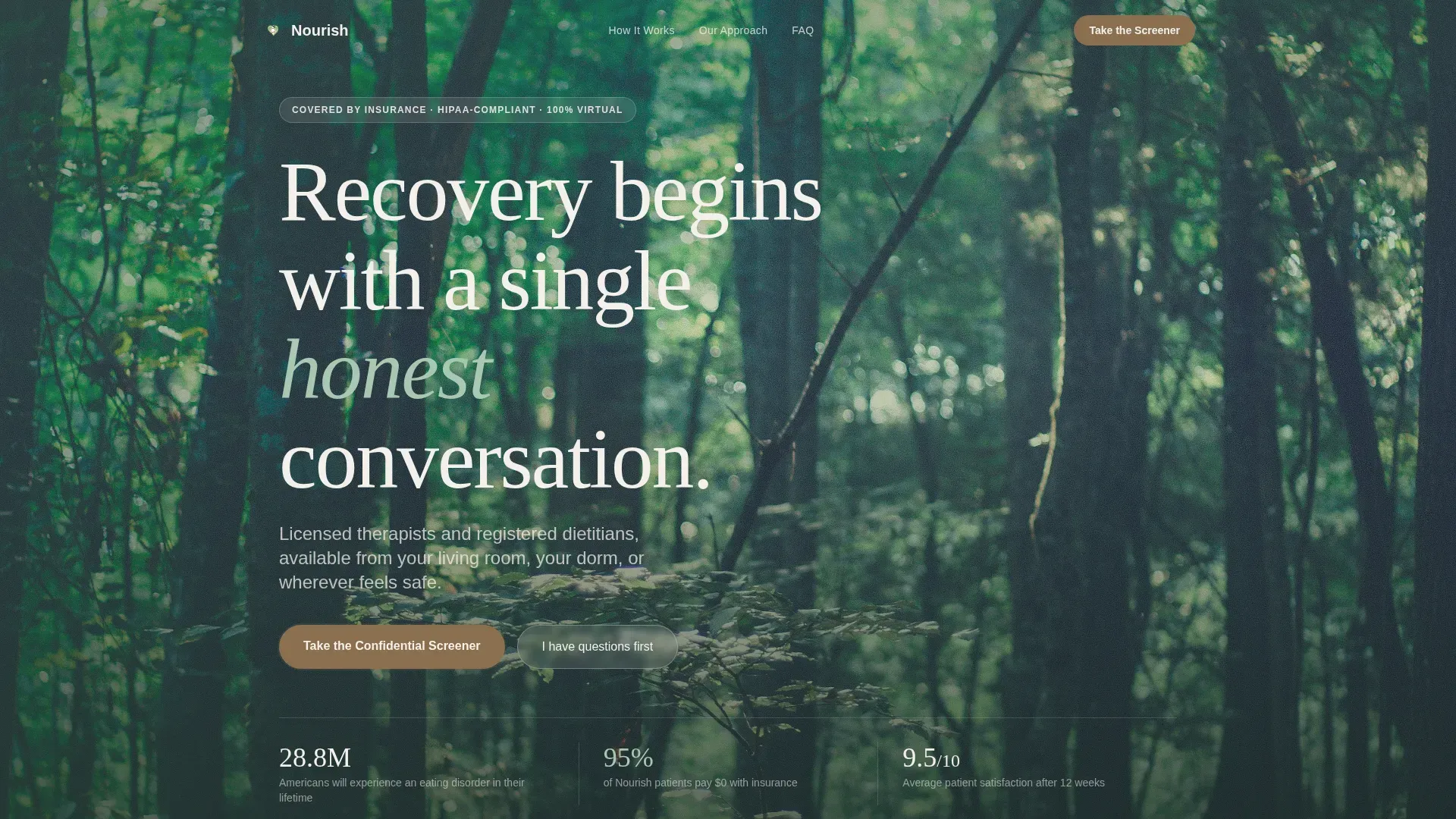
- A hero section with floating statistics and a warm serif headline leading to the confidential screener call to action
- Four zigzag FAQ sections, two stat breather panels, a how-it-works alternating visual block, and a dual call-to-action footer section
- A Forest Trust color system applied consistently across backgrounds, interactive elements, typography, and spacing
Feature list
Zigzag FAQ Layout
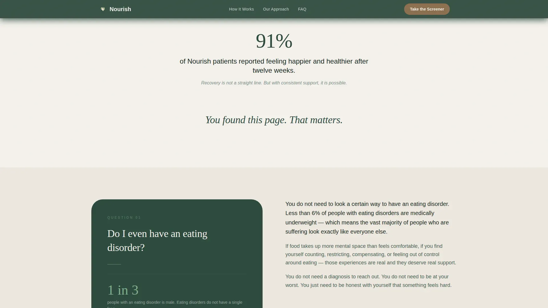
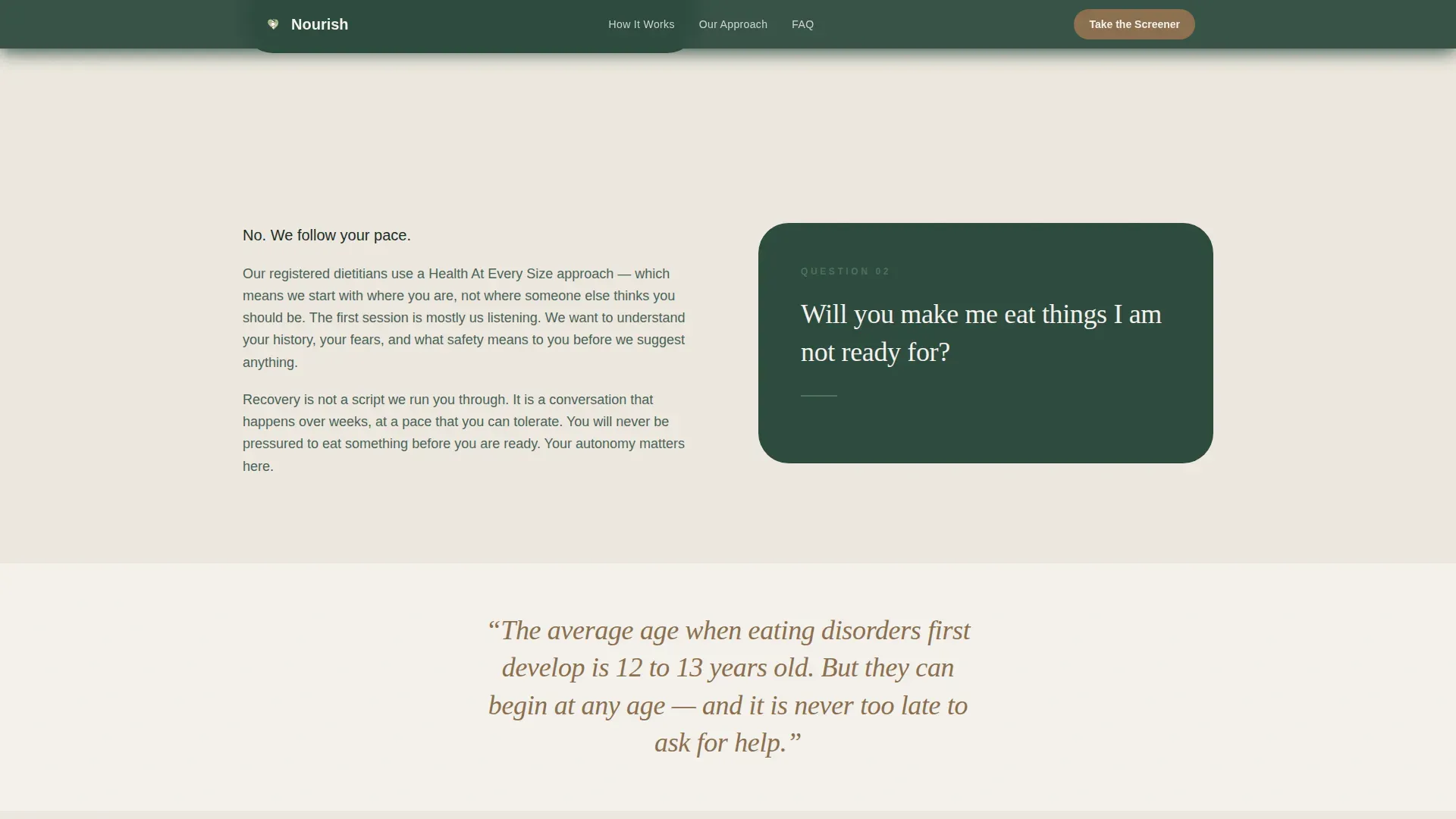
Each FAQ section poses one real question as the heading and unfolds the answer on the alternating side. The rhythm creates a two-sided conversation. Questions move from curiosity to logistics to the emotional core, deepening trust with each section.
Stats and Metrics Hero
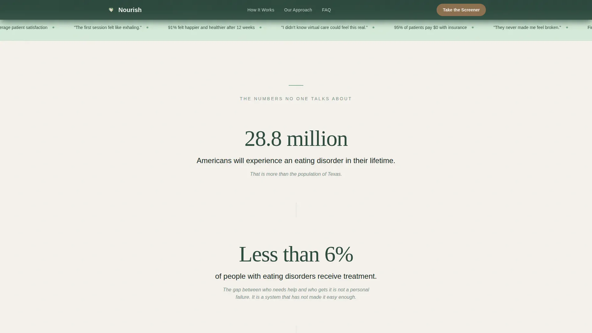
The header opens with three research-backed statistics rendered in soft fern on birch white. Each figure appears on its own line with generous spacing. The section closes with a single line of moss-colored text: "You found this page. That matters."
Confidential Screener Call to Action
The primary conversion element is a five-question self-assessment tool. It appears first after the third FAQ section and again at the bottom of the page. It asks nothing intrusive before delivering a result and a suggested next step.
Free Recovery Guide Download
A secondary conversion path offers a downloadable PDF guide. It requires only a first name and email address. There is no phone number field, no insurance question, and no detail that feels like a clinical commitment.
Stat Breather Panels
Single-statistic panels in umber text appear between FAQ pairs. They slow the scroll pace and validate the reader's experience with one focused, honest number at a time.
Mobile-First Scroll Design
The layout is built for a phone screen first. Sections are sized for thumb scrolling, text is set at a comfortable reading size, and the sticky header keeps navigation visible without dominating the viewport.
Page sections overview
| Section | Purpose |
|---|---|
| Hero with Stats | Opens with floating research statistics and the primary screener call to action |
| Stats Breather Panel | Slow-scroll numbered truths in moss text on birch white |
| FAQ Zigzag One | Addresses "Do I even have an eating disorder?" |
| FAQ Zigzag Two | Addresses "Will you make me eat things I'm not ready for?" |
| Mid-Page Call to Action | First screener button appearance paired with an umber stat panel |
| FAQ Zigzag Three | Addresses "Can my parents see what I tell my therapist?" |
| FAQ Zigzag Four | Addresses "What if I've tried recovery before and failed?" |
| How It Works | Alternating visual process blocks, not a numbered timeline |
| Final Call to Action | Screener button plus Recovery Guide name-and-email download form |
| Footer | Logo and tagline left, navigation links right |
Design & branding system
The visual identity follows an Organic Flow theme built around a Forest Trust color palette. Every color choice references the feeling of a temperate forest, not a waiting room. Nothing is sterile or fluorescent.
- Deep moss (#2D4A3E) anchors backgrounds and the sticky navigation bar; soft fern (#7FAE8C) marks safe interactive surfaces; birch white (#F4F1EC) creates breathing room between sections
- Umber (#8B6F4E) warms all buttons, links, and call-to-action elements like sunlit bark on a forest floor
- Typography pairs Fraunces serif for headlines with DM Sans for body text, balancing warmth with readability
Mobile & speed optimization
The page is designed to be read on a phone, under covers, in the dark. Section sizing, font scale, and tap targets are all calibrated for that context first.
- Static content sections are built as Server Components to minimize JavaScript load
- Scroll-linked stat counters, gentle fade-ins, and staggered stat appearances use custom easing for smooth, low-impact animation
- The sticky header stays visible during scroll without crowding the reading area on small screens
How this template helps you convert
The page earns every click by answering fears before asking for anything. Conversion is built into the structure, not bolted onto it at the end.
- The zigzag FAQ flow addresses progressively harder fears, so a visitor who reaches the mid-page call to action has already had four real questions answered in plain language
- The confidential screener is introduced as a gentle self-check, not an intake form, which lowers the perceived commitment to a single tap
- The Recovery Guide download requires only a first name and email, giving hesitant visitors a meaningful first step that does not feel like signing up for treatment
Other information about this template
This template is category-matched to Health and Medical services with a specific focus on eating disorder care. It is built for teams that understand their visitors are often in a fragile, private moment when they arrive.
- The page uses no stock photography of smiling faces; social proof comes from real research statistics and satisfaction metrics such as a 9.5 out of 10 rating and 91 percent of users reporting they felt healthier
- The template style is Zigzag/Alternating with an Organic Flow theme, making it distinctive from standard clinical health page layouts
- Copy throughout is written at a ninth-grade reading level to stay accessible without being condescending
- The footer follows an Arc Browser Split pattern with the logo and tagline on the left and navigation links on the right
Theme
Organic Flow
Creative direction
FAQ-Driven
Color system
Forest Trust
Style
Zigzag/Alternating
Direction
Content/Resource
Page Sections
Zigzag FAQ Conversation Layout
Stats and Metrics Hero Section
Confidential Screener Call to Action
Free Recovery Guide Download
Stat Breather Panels
Mobile-first Scroll Experience
Related questions
Can I customize the FAQ questions in this template?
Does this template include the screener tool itself?
Is the Recovery Guide download form built into the template?
Can this template work for a telehealth service beyond eating disorders?
What makes this template different from a standard health landing page?



