Mental Health & Psychiatry Specialist Booking Website Template
Nourish is a single-page landing page built for clinical eating disorder treatment centers. It pairs a self-drawing line-art hero with a transparent modality comparison table, guided by named clinician voices. A five-question care-level screener leads visitors to a free consultation booking. The design feels clinical enough to trust and warm enough to sit with.
by Rocket studio
Quick summary
Nourish is a landing page template for eating disorder treatment practices. It opens with an animated figure at a table, moves through a clinician-led comparison of treatment modalities, and closes with a gentle five-question screener that recommends a care level and books a consultation. Every design choice prioritizes the person arriving in the middle of the night, uncertain and not yet ready to ask for help.
Who this template is for
This template is built for clinical eating disorder treatment centers that need to communicate nuance. It serves practices that offer multiple levels of care and want visitors to locate themselves honestly rather than feel sold to.
- Outpatient, intensive outpatient, and residential eating disorder programs
- Mental health practices where clinicians want their credentials and voices to do the persuasion
- Teams serving parents, young adults, and long-term sufferers who arrive as careful, anxious researchers
What problem this template solves
Most treatment center pages force a binary: call us or leave. That pressure fails the visitor who is not yet ready to speak to anyone. This template replaces that pressure with information, transparency, and a gentle self-assessment path.
- Visitors cannot easily compare treatment modalities on a single page without being pushed toward a phone call
- People in crisis who arrive at night need an immediate non-quiz path to a human voice, separate from the main conversion flow
- Practices with named, credentialed clinicians have no natural place to surface those voices as trust signals rather than decorations
What you get with this template
You get a fully structured single-page layout that moves a visitor from uncertainty to a specific recommended care level. Every section earns its place by answering a question the visitor is already carrying.
- An animated SVG hero, a three-column modality comparison table with clinician introductions, and a recovery timeline section
- A five-question multi-step screener with slider inputs, soft fade transitions between questions, and a result page that recommends a care level
- A persistent top-bar crisis prompt in coral, a testimonial section with recovery context, and a footer with split layout
Feature list
This template ships with a coordinated set of purpose-built components. Each one is described below.
Animated Line-Art Hero
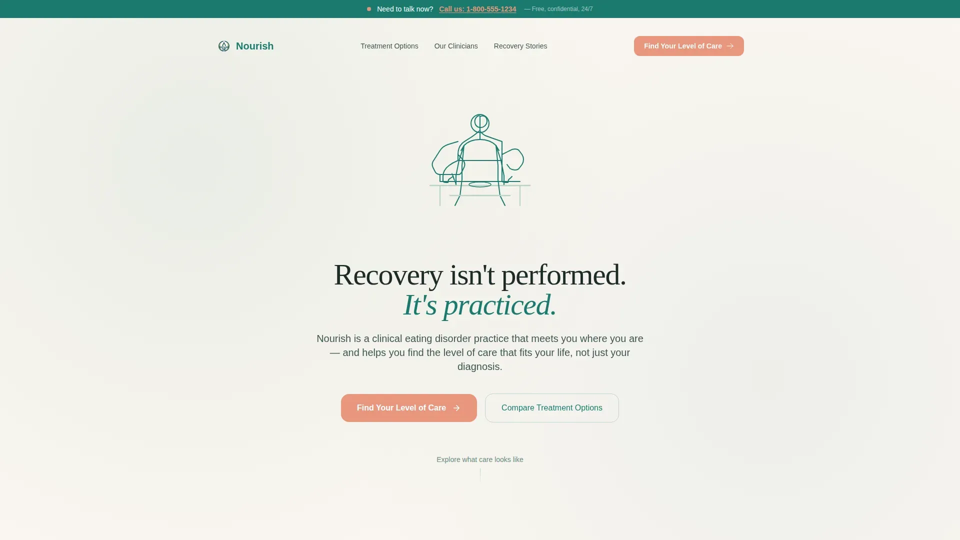
An SVG path traces the outline of a seated figure over four seconds, completing itself as if drawn in real time. The figure holds a fork with softened shoulders. A headline fades in beneath: "Recovery isn't performed. It's practiced." There is no photograph and no face, only the geometry of someone allowing themselves to eat.
Clinician-Led Comparison Table
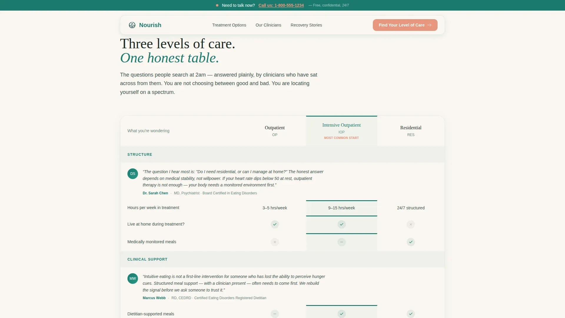
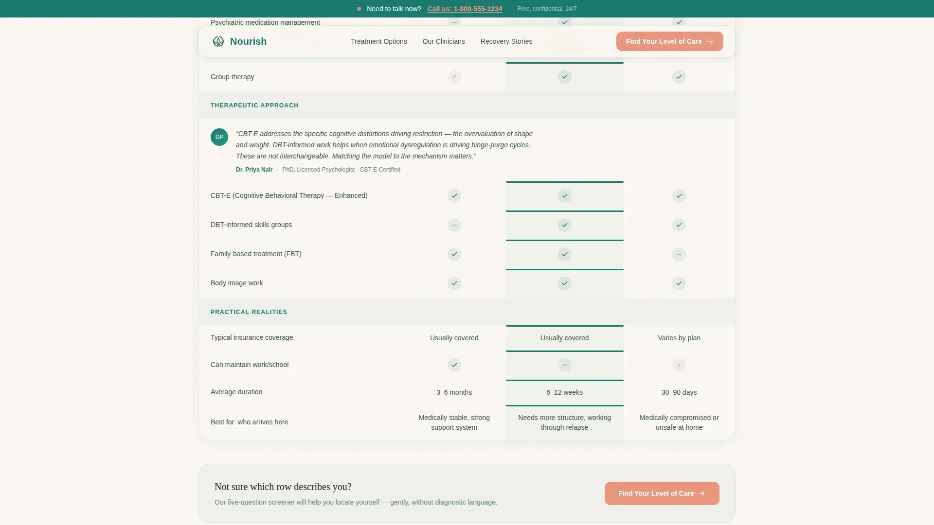
Three treatment modalities, outpatient, intensive outpatient, and residential, are compared across clinical dimensions in a structured table. Each section of the table is introduced by a named clinician: a psychiatrist, a dietitian, and a therapist. Row content is written to answer the specific questions visitors search for late at night.
Five-Question Care-Level Screener
The primary call to action opens a clinically informed screener. Questions appear one at a time with fade transitions and use scale sliders and plain-language options rather than diagnostic terms. The screener covers behavior frequency, duration, treatment history, support system, and readiness to begin. The result page recommends a care level and offers a calendar embed for a free clinical consultation.
Persistent Crisis Access Bar
A top-bar strip in coral remains visible throughout the scroll. It carries the text "Need to talk now? Call us" and ensures someone arriving in crisis never has to complete the screener to reach a human voice. This bar is separate from and independent of the main conversion flow.
Recovery Timeline Section
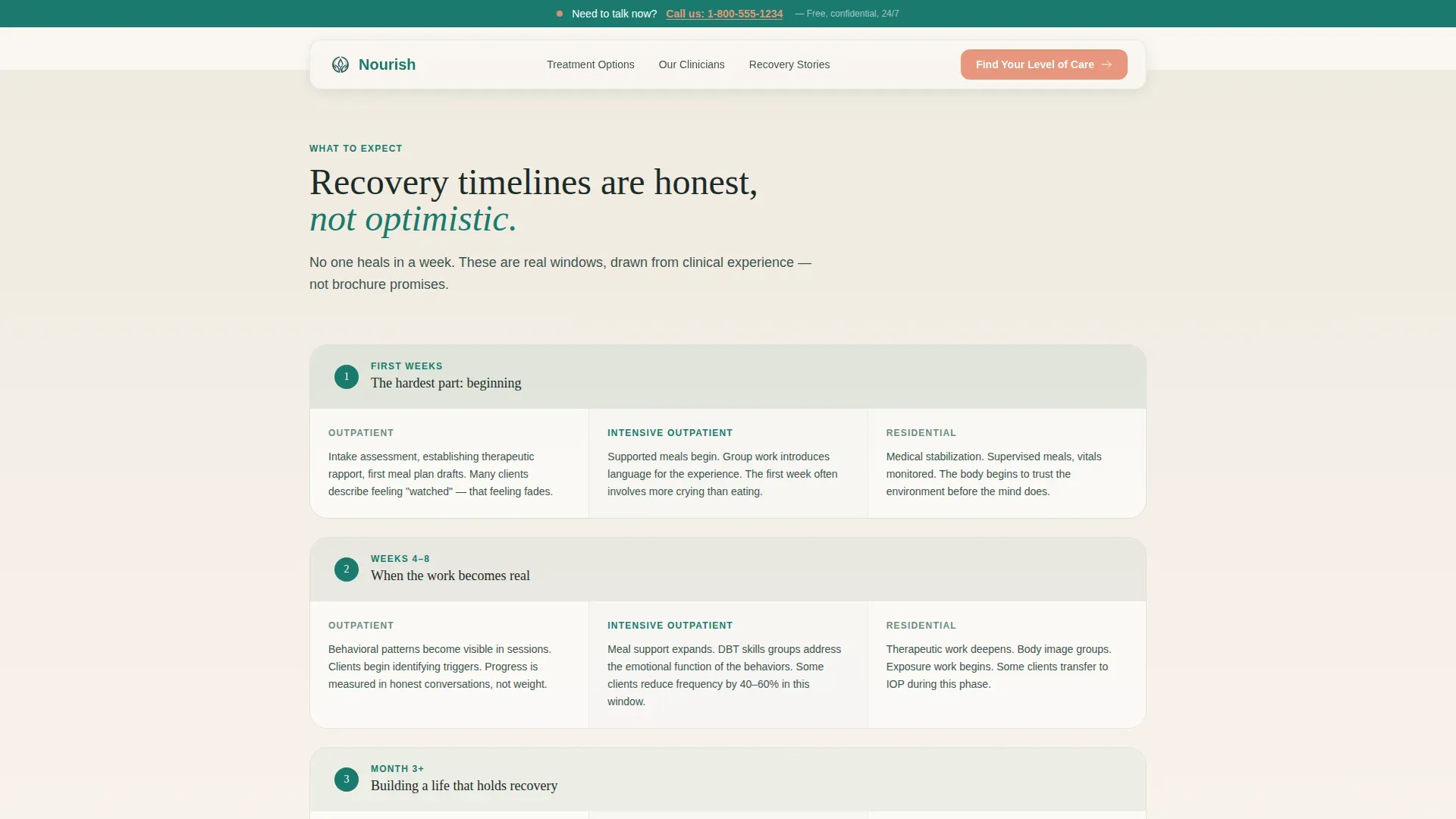
An honest row-by-row timeline presents realistic recovery duration data for each of the three modalities. This section is positioned to follow the comparison table and continue the feeling of a progressively more honest conversation as the visitor scrolls.
Voices of Recovery Section
A testimonial section presents specific quotes with real recovery context attached. Testimonials are designed to carry the weight of lived experience rather than generic endorsement language. This section reinforces the clinician credibility established earlier in the page.
Page sections overview
| Section | Purpose |
|---|---|
| Animated hero | Establishes emotional safety and introduces headline |
| Persistent crisis bar | Provides immediate human access for crisis visitors |
| Expert panel introduction | Surfaces named clinician credentials as trust anchors |
| Modality comparison table | Lets visitors locate themselves on a care spectrum |
| Recovery timelines | Delivers honest, modality-specific duration context |
| Voices of Recovery | Adds lived-experience social proof with recovery context |
| Care-level screener | Converts visitor uncertainty into a recommended care path |
| Screener result page | Pairs care recommendation with calendar consultation booking |
| Split footer | Holds logo, tagline, and navigation links |
Design & branding system
The visual identity follows a Healing Space theme. The palette is described as a treatment room with a single plant on the windowsill, clinical enough to trust, warm enough to cry in.
- Deep therapeutic teal (#1A7A6D) anchors headers and section dividers; soft sage (#B7D1C4) washes alternating background panels; warm linen white (#FAF6F1) holds body text in generous breathing room
- Gentle coral (#E8967D) appears only on calls to action, the crisis bar, and the phone number, reserved for moments that ask for courage
- Typography uses Fraunces serif for headings and DM Sans for body copy, creating a pairing that feels both clinical and approachable
Mobile & speed optimization
The template is designed mobile-first, recognizing that many visitors arrive on a phone late at night when distress is highest. Interactive components are separated so the page remains stable even as the screener loads.
- The quiz screener is built as a client-side component while static sections like the hero and comparison table use server-rendered markup, reducing the work the browser must do on load
- The persistent crisis bar is always visible on mobile, sitting at the top of the viewport regardless of scroll position
- Scroll reveal animations and the SVG path drawing are tuned for touch-screen viewing, with transitions that do not depend on hover states
How this template helps you convert
The conversion architecture is built for a cautious, research-mode visitor rather than an impulsive buyer. Every step is designed to reduce friction and increase trust before asking for anything.
- The comparison table and named clinician voices answer the visitor's research questions first, so they arrive at the screener already informed rather than still suspicious.
- The five-question screener replaces the cold phone-call ask with a self-directed path, giving the visitor a sense of agency. The result page then immediately offers a calendar embed, so the next step is booking rather than searching.
Other information about this template
This template sits at the intersection of Mental Health and Psychiatry and clinical eating disorder treatment. It is a strong fit for practices that serve multiple care levels under one roof and need a single page to communicate that range clearly.
- The footer follows an Arc Browser Split layout: logo and tagline on the left, navigation links on the right
- The template is localized for United States English, using a 12-hour time format and no currency display
- Animation intensity is high throughout, including SVG path drawing on the hero, scroll-triggered reveals on the table and timeline, and fade transitions inside the screener
- The color system is named Teal Catalyst, the creative direction is Expert Panel, the header concept is Line Art, and the landing-page direction is Quiz and Assessment
- The template style is Comparison Table within a Healing Space theme, making it well suited for practices that want clinical transparency paired with emotional warmth
Theme
Healing Space
Creative direction
Expert Panel
Color system
Teal Catalyst
Style
Comparison Table
Direction
Quiz/Assessment
Page Sections
Animated Line-art Hero
Clinician-led Comparison Table
Five-question Care-level Screener
Persistent Crisis Access Bar
Recovery Timeline Section
Voices of Recovery Section
Related questions
Can I replace the placeholder clinician names with my own team's credentials?
Does the screener store or transmit visitor answers anywhere?
Can the comparison table rows be edited to reflect our specific treatment approach?
What happens if a visitor is in crisis and does not want to take the screener?
Is this template suitable for a practice that offers only one level of care?



